Highcharts 基本曲线图;Highcharts 带有数据标签曲线图表;Highcharts 异步加载数据曲线图表
Highcharts 基本曲线图
实例
文件名:highcharts_line_basic.htm


<html>
<head>
<meta charset="UTF-8" />
<title>Highcharts 教程 | 菜鸟教程(runoob.com)</title>
<script src="http://apps.bdimg.com/libs/jquery/2.1.4/jquery.min.js"></script>
<script src="http://code.highcharts.com/highcharts.js"></script>
</head>
<body>
<div id="container" style="width: 550px; height: 400px; margin: 0 auto"></div>
<script language="JavaScript">
$(document).ready(function() {
   var title = {
      text: '城市平均气温'
   };
   var subtitle = {
      text: 'Source: runoob.com'
   };
   var xAxis = {
      categories: ['Jan', 'Feb', 'Mar', 'Apr', 'May', 'Jun',
         'Jul', 'Aug', 'Sep', 'Oct', 'Nov', 'Dec']
   };
   var yAxis = {
      title: {
         text: 'Temperature (\xB0C)'
      },
      plotLines: [{
         value: 0,
         width: 1,
         color: '#808080'
      }]
   };

   var tooltip = {
      valueSuffix: '\xB0C'
   }

   var legend = {
      layout: 'vertical',
      align: 'right',
      verticalAlign: 'middle',
      borderWidth: 0
   };

   var series =  [
      {
         name: 'Tokyo',
         data: [7.0, 6.9, 9.5, 14.5, 18.2, 21.5, 25.2,
            26.5, 23.3, 18.3, 13.9, 9.6]
      },
      {
         name: 'New York',
         data: [-0.2, 0.8, 5.7, 11.3, 17.0, 22.0, 24.8,
            24.1, 20.1, 14.1, 8.6, 2.5]
      },
      {
         name: 'London',
         data: [3.9, 4.2, 5.7, 8.5, 11.9, 15.2, 17.0,
            16.6, 14.2, 10.3, 6.6, 4.8]
      }
   ];

   var json = {};

   json.title = title;
   json.subtitle = subtitle;
   json.xAxis = xAxis;
   json.yAxis = yAxis;
   json.tooltip = tooltip;
   json.legend = legend;
   json.series = series;

   $('#container').highcharts(json);
});
</script>
</body>
</html>
以上实例输出结果为:

Highcharts 带有数据标签曲线图表
实例
文件名:highcharts_line_labels.htm
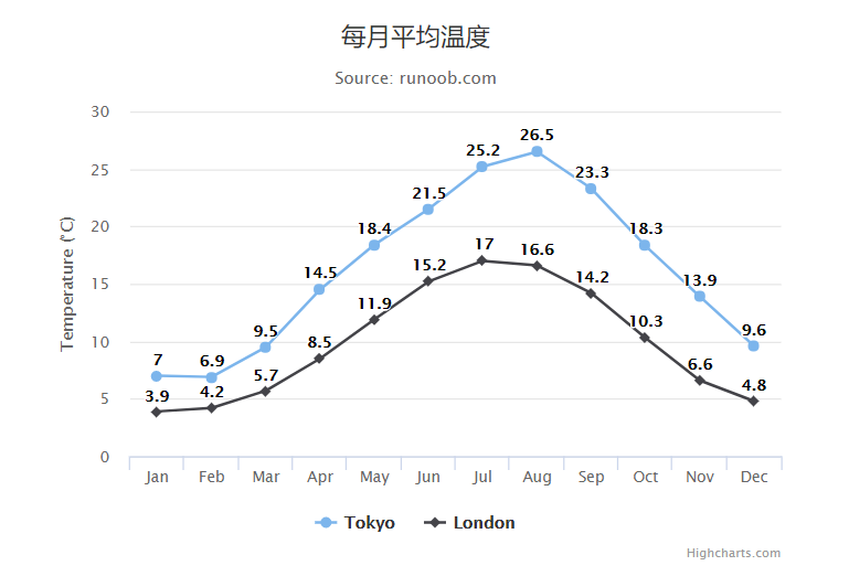
<html>
<head>
<meta charset="UTF-8" />
<title>Highcharts 教程 | 菜鸟教程(runoob.com)</title>
<script src="http://apps.bdimg.com/libs/jquery/2.1.4/jquery.min.js"></script>
<script src="http://code.highcharts.com/highcharts.js"></script>
</head>
<body>
<div id="container" style="width: 550px; height: 400px; margin: 0 auto"></div>
<script language="JavaScript">
$(document).ready(function() {
   var title = {
      text: '每月平均温度'
   };
   var subtitle = {
      text: 'Source: runoob.com'
   };
   var xAxis = {
      categories: ['Jan', 'Feb', 'Mar', 'Apr', 'May', 'Jun',
         'Jul', 'Aug', 'Sep', 'Oct', 'Nov', 'Dec']
   };
   var yAxis = {
      title: {
         text: 'Temperature (\xB0C)'
      }
   };
   var plotOptions = {
      line: {
         dataLabels: {
            enabled: true
         },
         enableMouseTracking: false
      }
   };
   var series= [{
         name: 'Tokyo',
         data: [7.0, 6.9, 9.5, 14.5, 18.4, 21.5, 25.2, 26.5, 23.3, 18.3, 13.9, 9.6]
      }, {
         name: 'London',
         data: [3.9, 4.2, 5.7, 8.5, 11.9, 15.2, 17.0, 16.6, 14.2, 10.3, 6.6, 4.8]
      }
   ];

   var json = {};

   json.title = title;
   json.subtitle = subtitle;
   json.xAxis = xAxis;
   json.yAxis = yAxis;
   json.series = series;
   json.plotOptions = plotOptions;
   $('#container').highcharts(json);

});
</script>
</body>
</html>
以上实例输出结果为:
Highcharts 异步加载数据曲线图表
导入 data.js 文件
异步加载数据需要引入以下js 文件:
<script src="http://code.highcharts.com/modules/data.js"></script>
配置
X 轴
以每周为间隔设置 X 轴:
var xAxis = {
   tickInterval: 7 * 24 * 3600 * 1000, // 一周
   tickWidth: 0,
   gridLineWidth: 1,
   labels: {
      align: 'left',
      x: 3,
      y: -3
   }
};
Y 轴
以每周为间隔设置 Y 轴:
配置两个 Y 轴:
var yAxis = [{ // 左边 Y 轴
      title: {
         text: null
      },
      labels: {
         align: 'left',
         x: 3,
         y: 16,
         format: '{value:.,0f}'
      },
      showFirstLabel: false
  },{ // 右边 Y 轴
      linkedTo: 0,
      gridLineWidth: 0,
      opposite: true,
      title: {
         text: null
      },
      labels: {
         align: 'right',
         x: -3,
         y: 16,
         format: '{value:.,0f}'
      },
      showFirstLabel: false
   }
];
plotOptions
plotOptions用于设置图表中的数据点相关属性。
 var plotOptions = {
   series: {
      cursor: 'pointer',
      point: {
         events: {
            click: function (e) {
               hs.htmlExpand(null, {
                  pageOrigin: {
                     x: e.pageX || e.clientX,
                     y: e.pageY || e.clientY
                  },
                  headingText: this.series.name,
                  maincontentText: Highcharts.dateFormat('%A, %b %e, %Y', this.x)
                     + ':<br/> ' + this.y + ' visits',
                  width: 200
               });
            }
         }
      },
      marker: {
        lineWidth: 1
      }
   }
}
实例
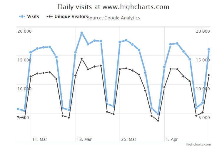
文件名:highcharts_line_ajax.html
<html>
<head>
   <title>Highcharts 教程 | 菜鸟教程(runoob.com)</title>
   <script src="http://apps.bdimg.com/libs/jquery/2.1.4/jquery.min.js"></script>
   <script src="http://code.highcharts.com/highcharts.js"></script>
   <script src="http://code.highcharts.com/modules/data.js"></script>
</head>
<body>
<div id="container" style="width: 550px; height: 400px; margin: 0 auto"></div>
<script language="JavaScript">
$(document).ready(function() {
   var title = {
      text: 'Daily visits at www.highcharts.com'
   };
   var subtitle = {
      text: 'Source: Google Analytics'
   };
   var xAxis = {
      tickInterval: 7 * 24 * 3600 * 1000, // one week
      tickWidth: 0,
      gridLineWidth: 1,
      labels: {
         align: 'left',
         x: 3,
         y: -3
      }
   };
   var yAxis = [{ // left y axis
         title: {
            text: null
         },
         labels: {
            align: 'left',
            x: 3,
            y: 16,
            format: '{value:.,0f}'
         },
         showFirstLabel: false
      },{ // right y axis
         linkedTo: 0,
         gridLineWidth: 0,
         opposite: true,
         title: {
            text: null
         },
         labels: {
            align: 'right',
            x: -3,
            y: 16,
            format: '{value:.,0f}'
         },
         showFirstLabel: false
      }
   ];

   var tooltip = {
      shared: true,
      crosshairs: true
   }

   var legend = {
      align: 'left',
      verticalAlign: 'top',
      y: 20,
      floating: true,
      borderWidth: 0
   };

   var plotOptions = {
      series: {
         cursor: 'pointer',
         point: {
            events: {
               click: function (e) {
                  hs.htmlExpand(null, {
                     pageOrigin: {
                        x: e.pageX || e.clientX,
                        y: e.pageY || e.clientY
                     },
                     headingText: this.series.name,
                     maincontentText: Highcharts.dateFormat('%A, %b %e, %Y', this.x)
                        + ':<br/> ' + this.y + ' visits',
                     width: 200
                  });
               }
            }
         },
         marker: {
            lineWidth: 1
         }
      }
   }

   var series =  [{
         name: 'All visits',
         lineWidth: 4,
         marker: {
            radius: 4
         }
      }, {
         name: 'New visitors'
      }]

   var json = {};

   json.title = title;
   json.subtitle = subtitle;
   json.xAxis = xAxis;
   json.yAxis = yAxis;
   json.tooltip = tooltip;
   json.legend = legend;
   json.series = series;
   json.plotOptions = plotOptions;

   $.getJSON('http://www.highcharts.com/samples/data/jsonp.php?filename=analytics.csv&callback=?',function(csv){var data ={
         csv: csv
      };
      json.data = data;
      $('#container').highcharts(json);});});</script></body></html>
以上实例输出结果为:

 浙公网安备 33010602011771号