
echarts

xAxis: {
    data: anameArr,
    axisLabel: {
       show: true,
        textStyle: {
          color: '#c3dbff',  //更改坐标轴文字颜色
          fontSize : 14      //更改坐标轴文字大小
        }
     },
     axisTick: {
         show: false
     },
     axisLine:{
         lineStyle:{
            color:'#315070' //更改坐标轴颜色
         }
   }
}
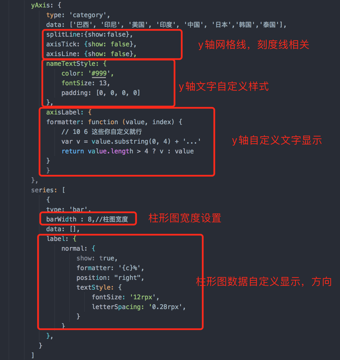
以下属性对x轴,y轴均有效:
1.取消网格线
splitLine: {
show: false
}
2.取消坐标轴刻度线
axisTick: {
show: false
}
3.取消显示坐标值
axisLabel: {
show: false
}
4.取消显示坐标轴
axisLine: {
show: false
}
5.取消显示坐标轴,坐标轴刻度,坐标值(如果是y轴,默认的网格线也会取消显示)
show: false
tooltip ={ //提示框组件
trigger: 'item', //触发类型,'item'数据项图形触发,主要在散点图,饼图等无类目轴的图表中使用。 'axis'坐标轴触发,主要在柱状图,折线图等会使用类目轴的图表中使用。
triggerOn:"mousemove", //提示框触发的条件,'mousemove'鼠标移动时触发。'click'鼠标点击时触发。'mousemove|click'同时鼠标移动和点击时触发。'none'不在 'mousemove' 或 'click' 时触发
showContent:true, //是否显示提示框浮层
alwaysShowContent:true, //是否永远显示提示框内容
showDelay:0, //浮层显示的延迟,单位为 ms
hideDelay:100, //浮层隐藏的延迟,单位为 ms
enterable:false, //鼠标是否可进入提示框浮层中
confine:false, //是否将 tooltip 框限制在图表的区域内
transitionDuration:0.4, //提示框浮层的移动动画过渡时间,单位是 s,设置为 0 的时候会紧跟着鼠标移动
position:['50%', '50%'], //提示框浮层的位置,默认不设置时位置会跟随鼠标的位置,[10, 10],回掉函数,inside鼠标所在图形的内部中心位置,top、left、bottom、right鼠标所在图形上侧,左侧,下侧,右侧,
formatter:"{b0}: {c0}<br />{b1}: {c1}", //提示框浮层内容格式器,支持字符串模板和回调函数两种形式,模板变量有 {a}, {b},{c},{d},{e},分别表示系列名,数据名,数据值等
backgroundColor:"transparent", //标题背景色
borderColor:"#ccc", //边框颜色
borderWidth:0, //边框线宽
padding:5, //图例内边距,单位px 5 [5, 10] [5,10,5,10]
textStyle:mytextStyle, //文本样式
};
————————————————
版权声明:本文为CSDN博主「痛心的丶玩笑」的原创文章,遵循CC 4.0 BY-SA版权协议,转载请附上原文出处链接及本声明。
原文链接:https://blog.csdn.net/zhen_xin_ai_ni/article/details/84103026
拐点颜色

 浙公网安备 33010602011771号