
倒计时滚动斜纹条的前端实现-基于jquery animation和css3
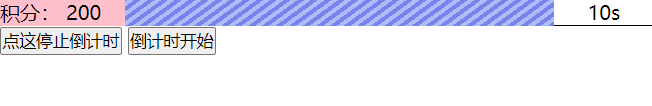
先上效果图:
0.HTML DOM结构
<div class="header">
    <div class="left">
      积分:200
    </div>
    <div class="right">
      <div class="right__timebar__wrapper">
        <div class="timebar"></div>
      </div>
      <div class="right__timeseconds">
        10s
      </div>
    </div>
  </div>
1. 斜纹条画法
线性渐变:
-webkit-linear-gradient(逆时针倾斜的角度, 颜色值 开始的位置, 颜色值 开始的位置,颜色值 开始的位置, 颜色值 开始的位置);
第一个参数除了使用倾斜角度,还可以使用“top right bottom left”,颜色值开始的位置可以用px也可以用百分数。
先随便填些数值,熟悉一下各个参数:


之后调整下渐变节点的宽度,把矩形条重复绘制(换成:-webkit-repeating-linear-gradient),再加入倾斜的角度就得到斜条纹了
.timebar {
   background: -webkit-repeating-linear-gradient(-36deg, #aabef9 0,#aabef9 0.2rem,#7c82eb 0.2rem,#7c82eb .4rem);
}

2. 两个动画效果:
背景斜纹条在动(利用background-position)、timebar相对wrapper在动(通过absolute定位+left)
CSS部分
.right__timebar__wrapper {
    width: calc(100% - 80px);
    background-color: bisque;
    position: relative;
    overflow: hidden;
  }
.timebar{
    background: repeating-linear-gradient(-36deg, #aabef9 0,#aabef9 0.2rem,#7c82eb 0.2rem,#7c82eb .4rem);
    position: absolute;
    left: 0px;
    height: 100%;
    /*有两个运动 1. 背景条纹 相对 bar运动; 2. bar相对 wrapper运动*/
    /* width 200%是为了 1运动时 不显示出来 分隔线*/
    width: 200%;
  }
JS部分
$('.timebar').animate({backgroundPositionX:totalWidth+'px',backgroundPositionY: '0px',left:totalWidth+'px'},10000,'linear');
3. 计时模块
let totalWidth = document.getElementsByClassName('right__timebar__wrapper')[0].clientWidth;
let timebar =  document.getElementsByClassName('timebar')[0];
let timeNum = document.getElementsByClassName('right__timeseconds')[0];
const totalTime = 10;
let time = totalTime;
let ctx;

function GameStart(){
    // 开始动画
     //不是所有css属性都可以用Jquery动画(animate方法)来动态改变 background-position不识别
    $('.timebar').animate({backgroundPositionX:totalWidth+'px',backgroundPositionY: '0px',left:totalWidth+'px'},totalTime*1000,'linear');
    ctx = setInterval(()=>{
      time--;
      timeNum.innerHTML=''+time+'s';if(time === 0){
        clearInterval(ctx);
        time = totalTime;
        timebar.style.width = totalWidth+'px';
      }
    },1000);
  }
4.jquery animate问题
jQuery 的 animate 虽然能直接使用 CSS 的方式来进行动画,但有些属性其实是不支持的。
该问题参考:
1.jquery的animate关于background-position属性
2.jQuery animate()方法 操作 background-position
5. 为什么使用了jq animate
5.1 transition
jq animation这里是按总倒计时时长=动画时长设置的 动画效果比较连续。
没有采用原生的transition是因为 transition结合计时器每秒触发过渡一次会有明显顿挫的感觉

附上transition写法
.timebar{
    background: repeating-linear-gradient(-36deg, #aabef9 0,#aabef9 0.2rem,#7c82eb 0.2rem,#7c82eb .4rem);
    position: absolute;
    left: 0px;
    height: 100%;
    width: 200%;
    transition: all linear 2s;
    -moz-transition: all linear 2s;
    -webkit-transition: all linear 2s;
    -o-transition: all linear 2s;
  }
function GameStart(){
    ctx = setInterval(()=>{
      time--;
      timeNum.innerHTML=''+time+'s';
     // 每秒触发 transition属性更新
      barUpdate(time);
      if(time === 0){
        clearInterval(ctx);
        time = totalTime;
        timebar.style.width = totalWidth+'px';
      }
    },1000);
  }

  function stopInterval(){
    clearInterval(ctx)
  }

  console.log(totalWidth);
  function barUpdate(time){
    let updateLeft = totalWidth - time/totalTime * totalWidth;
    console.log(updateLeft)
    timebar.style.backgroundPositionX = totalWidth*(totalTime-time)/totalTime+'px';
    timebar.style.left = updateLeft+'px';
  }
5.2 原生的animation
animation 特征是无需触发 一上来就可以加载动画 写好关键帧能够自动进行动画效果
这里的需求是有个触发动作的,如果不需要,爱探索的小伙伴也可以尝试下animation写法。
// 参考
.animation {
    animation: move 10s linear;
  }
  @keyframes move{
    0% {
      width: 100%;
    }
    100% {
      width: 0%;
    }
  }
ps:查到animation触发可以结合addClass,爱探索的小伙伴也可以自行尝试
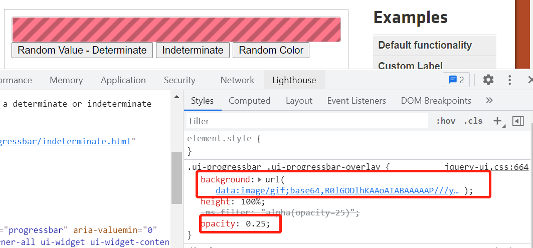
5.3: 斜条纹也可以使用gif图片(如果你有==)
实现参照 jqueryUI链接 关键部分截图如下:

 浙公网安备 33010602011771号