
css动态检测视口屏幕的尺寸
<!DOCTYPE html>
<html lang="en">
<head>
    <meta charset="UTF-8">
    <meta name="viewport" content="width=device-width, initial-scale=1.0">
    <title>css动态检测屏幕的视口尺寸</title>
    <style>
        *{
            margin: 0;
            padding: 0;
        }
        @property --vw{
            syntax: '<length>';
            inherits: true;
            initial-value: 100vw;
        }
        @property --vh{
            syntax: '<length>';
            inherits: true;
            initial-value: 100vh;
        }
        :root{
            /* 将100vw和100vh转化为px,直接使用vw,vh是不会转化为px的 */
            --w:tan(atan2(var(--vw),1px));
            --h:tan(atan2(var(--vh),1px));
        }

        body::before{
            content: counter(w) 'x' counter(h);
            counter-reset: w var(--w) h var(--h);
            font-size: 150px;
            position: fixed;
            inset: 0;
            width: fit-content;
            height: fit-content;
            margin: auto;
        }
    </style>
</head>
<body></body>
</html>
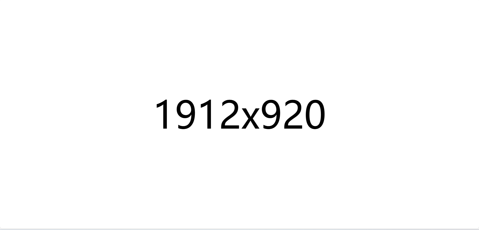
效果如下图
从网上看到的有趣的知识点,特此记录下

 浙公网安备 33010602011771号