Nuxt/Vue自定义导航栏Topbar+标签栏Tabbar组件
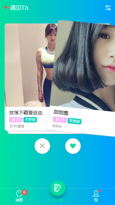
基于Vue.js实现自定义Topbar+Tabbar组件|仿咸鱼底部凸起导航
最近一直在倒腾Nuxt项目,由于Nuxt.js是基于Vue.js的服务端渲染框架,只要是会vue,基本能很快上手了。
一般移动端项目,顶部导航/底部Tab功能是少不了的。本想着使用Vant组件库,可是项目中有个类似咸鱼底部凸起导航功能,经过再三考虑还是自己造了个自定义Navbar+Tabbar组件。以便以后在其它Vue项目中也能使用。
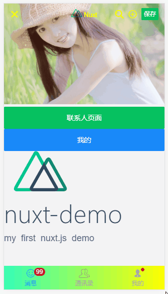
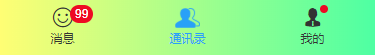
如上图:在Nuxt项目中应用效果
下面就开始进入Nuxt中创建自定义顶部导航条及底部标签栏的介绍。
◆ 开始
在components目录下新建 headerBar.vue 和 tabBar.vue 页面。

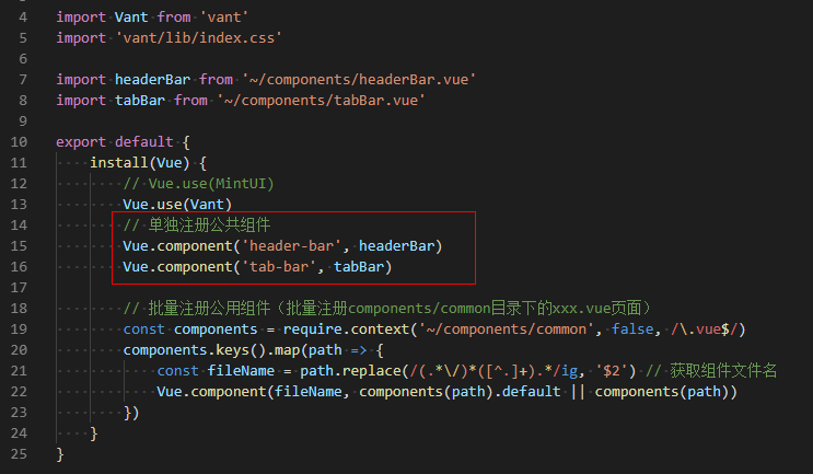
然后在 plugins 目录下的 componentsInstall.js 文件中引入即可。

◆ 自定义导航条headerBar
<template>
    <div class="header-bar" :class="{'fixed': fixed, 'transparent fixed': transparent}">
        <div class="header-bar__wrap flexbox flex-alignc" :style="{'background': bgcolor, 'color': color, 'z-index': zIndex}">
            <!-- >>返回 -->
            <div class="action hdbar-action__left isback" v-if="back && back!='false'" @click="$router.go(-1)">
                <slot name="backIco" /><slot name="backText" />
            </div>

            <!-- >>标题 -->
            <div class="hdbar-title" :class="{'center': center}">
                <slot name="title" />
            </div>

            <!-- >>搜索框 -->
            <div class="action hdbar-action__search">
                <slot name="search" />
            </div>

            <!-- >>右侧 -->
            <div class="action hdbar-action__right">
                <slot name="right" />
            </div>
        </div>
    </div>
</template>
/**
 * @Desc     Vue自定义导航条headerBar
 * @Time     andy by 2020-10-06
 * @About    Q:282310962  wx:xy190310
 */
<script>
    export default {
        props: {
            // 是否返回
            back: { type: [Boolean, String], default: true },
            // 标题
            title: { type: String, default: '' },
            // 标题颜色
            color: { type: String, default: '#fff' },
            // 背景颜色
            bgcolor: { type: String, default: '#22d59c' },
            // 标题是否居中
            center: { type: [Boolean, String], default: false },
            // 搜索框
            search: { type: [Boolean, String], default: false },
            // 是否固定
            fixed: { type: [Boolean, String], default: false },
            // 背景透明
            transparent: { type: [Boolean, String], default: false },
            // 设置层级
            zIndex: { type: [Number, String], default: '2021' },
        },
        data() {
            return {}
        },
        methods: {},
    }
</script>
支持自定义背景、颜色、图标、标题居中、搜索栏,右侧按钮支持图标/文字/图片,还可以自定义圆点、事件处理等功能。
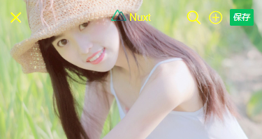


<header-bar :back="true" :bgcolor="linear-gradient(to right, #f726ff, #2acfff)" color="#ff0" center transparent>
    <template #backIco><i class="iconfont icon-close"></i></template>

    <div slot="title">
    <img src="~/assets/img/logo.png" height="16" /> <em>Nuxt</em>
    </div>

    <div slot="right" class="ml-20"><i class="iconfont icon-search"></i></div>
    <div slot="right" class="ml-20" @click="$toast('选择~~')"><i class="iconfont icon-choose"></i></div>
    <div slot="right" class="ml-20"><van-button type="primary" size="mini" @click="saveData">保存</van-button></div>
</header-bar>
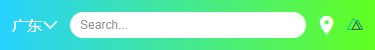
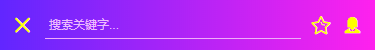
<header-bar :back="true" bgcolor="linear-gradient(to right, #6126ff, #ff21ee)" color="#ff0" center>
    <div slot="backIco"><i class="iconfont icon-close"></i></div>
    <div slot="search" class="flex-c flex1">
        <input class="ipt flex1" placeholder="Search..." value="搜索关键字..." />
    </div>
    <div slot="right" class="ml-20"> <i class="iconfont icon-shoucang"></i></div>
    <div slot="right" class="ml-20"> <i class="iconfont icon-female"></i></div>
</header-bar>
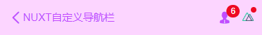
<header-bar :back="true" bgcolor="#fcd5ff" color="#c24cff" center>
    <div slot="backIco" class="flex-c"><i class="iconfont icon-arrL"></i> NUXT自定义导航栏</div>
    <div slot="right"><i class="iconfont icon-male"></i><em class="nuxt__badge">6</em></div>
    <div slot="right"><img src="~/assets/img/logo.png" height="12" /><em class="nuxt__badge-dot"></em></div>
</header-bar>

◆ 自定义底部导航tabBar
<template>
    <div class="tab-bar" :class="{'fixed': fixed}">
        <div class="tab-bar__wrap flexbox flex-alignc" :style="{'background': bgcolor}">
            <div v-for="(item,index) in tabs" :key="index" class="navigator" :class="currentTabIndex == index ? 'on' : ''" @click="switchTabs(index, item)">
                <div class="ico" :class="{'dock': item.dock}">
                    <i v-if="item.dock" class="dock-bg" :style="{'background': item.dockBg ? item.dockBg : activeColor}"></i>
                    <i v-if="item.icon" class="iconfont" :class="item.icon" :style="{'color': (currentTabIndex == index && !item.dock ? activeColor : color), 'font-size': item.iconSize}"></i>
                    <img v-if="item.iconImg" class="iconimg" :src="currentTabIndex == index && !item.dock ? item.selectedIconImg : item.iconImg" :style="{'font-size': item.iconSize}" />
                    <em v-if="item.badge" class="nuxt__badge">{{item.badge}}</em>
                    <em v-if="item.dot" class="nuxt__badge-dot"></em>
                </div>
                <div class="txt" :style="{'color': (currentTabIndex == index ? activeColor : color)}">{{item.text}}</div>
            </div>
        </div>
    </div>
</template>
<script>
  export default {
    props: {
        current: { type: [Number, String], default: 0 },
        // 背景颜色
        bgcolor: { type: String, default: '#fff' },
        // 颜色
        color: { type: String, default: '#999' },
        // 点击后颜色
        activeColor: { type: String, default: '#22d59c' },
        // 是否固定
        fixed: { type: [Boolean, String], default: false },
        // tab选项
        tabs: {
            type: Array,
            default: () => null
        }
    },
    data() {
      return {
          currentTabIndex: this.current
      }
    },
    created() {
        // 匹配当前页面
        const _pagePath = this.$route.path
        this.tabs.map((val, index) => {
            if(val.pagePath == _pagePath) {
                this.currentTabIndex = index
            }
        })
    },
    methods: {
        switchTabs(index, item) {
            this.currentTabIndex = index
            this.$emit('click', index)
            if(item.pagePath) {
                this.$router.push(item.pagePath)
            }
        }
    },
  }
</script>
支持自定义文字/图标、背景色、文字颜色/选中颜色、是否固定、点击事件(返回点击选项索引值) 等功能。
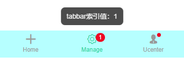
<tab-bar bgcolor="#b6ffff" @click="handleTabbar" :tabs="[
    {
        icon: 'icon-tianjia',
        text: 'Home',
    },
    {
        icon: 'icon-shezhi',
        text: 'Manage',
        badge: 1
    },
    {
        icon: 'icon-male',
        text: 'Ucenter',
        dot: true
    },
    ]"
/>
// tabbar点击事件
handleTabbar(index) {
    this.$toast('tabbar索引值:' + index);
},

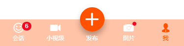
如上图:设置选项 dock: true 即可实现类似咸鱼凸起按钮效果。
<tab-bar bgcolor="#7fa1ff" color="#fff" activeColor="#fb4e30" :tabs="[
    {
        icon: 'icon-face',
        text: 'Face',
        dot: true,
        iconSize: '24px',
    },
    {
        //icon: 'icon-tianjia',
        iconImg: 'https://gw.alicdn.com/tfs/TB1CoEwVrvpK1RjSZFqXXcXUVXa-185-144.png?getAvatar=1',
        text: '咸鱼',
        dock: true,
        dockBg: '#fb4e30',
        iconSize: '.64rem',
    },
    {
        icon: 'icon-search',
        text: '搜索',
    },
    ]"
/>

ok,基于Vue/Nuxt自定义顶部/底部导航组件就介绍到这里。希望对大家有所帮助哈!😐
最后附上
Flutter/Dart沉浸式状态栏|flutter自定义导航条
本文为博主原创文章,未经博主允许不得转载,欢迎大家一起交流 QQ(282310962) wx(xy190310)

 浙公网安备 33010602011771号
 UP主小店
UP主小店