CSS 基础 学习笔记(2021.10.22~24)
CSS
目录
一、CSS的简单介绍
推荐网站:菜鸟教程
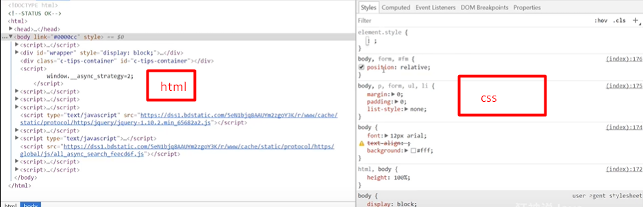
重点:选择器
二、什么是CSS和发展史
CSS: 层叠级联样式表
作用:美化网页
发展史:
css1.0
css2.0 DIV+CSS,html和css分离的思想,网页变得简单,方便SEO(网站优化)
css2.1 浮动,定位
css3.0 圆角,阴影,动画。。。
三、CSS的快速入门及优势
css优势:
- 内容和表现分离
- 网页结构表现统一,可以实现复用
- 样式十分丰富
- 建议使用独立于html的css文件
- 利于SEO,容易被搜索引擎收录
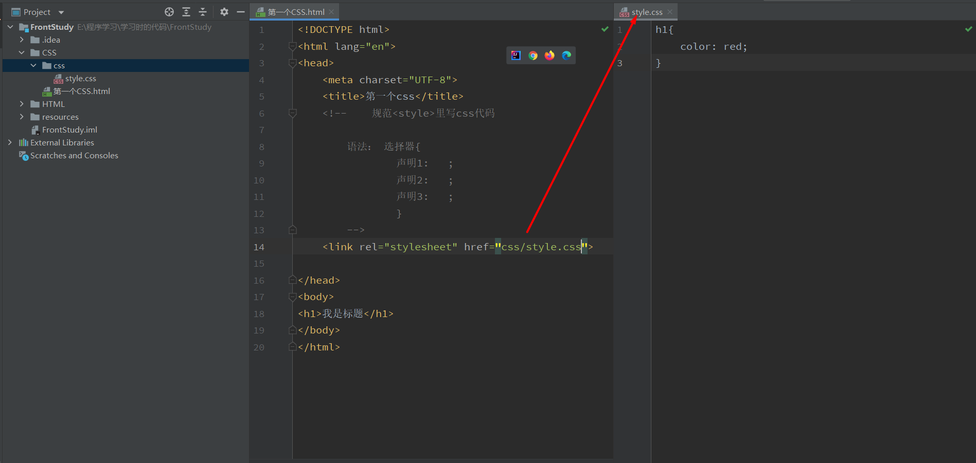
四、四种css导入方式
<!DOCTYPE html>
<html lang="en">
<head>
    <meta charset="UTF-8">
    <title>第一个css</title>
    <!--    规范<style>里写css代码

        语法: 选择器{
                声明1:   ;
                声明2:   ;
                声明3:   ;
                }

        优先级,就近原则
        -->


    <!--    第一种,链接式外部样式-->
    <link rel="stylesheet" href="css/style.css">

    <!--    第四种,导入式外部样式(不怎么用了css2.1)-->
    <style>
        @import url("css/style.css")
    </style>

    <!--    第二种,内部样式-->
    <style>
        h1{
            color:yellow;
        }
    </style>

</head>
<body>
<!--    第三种,行内样式-->
<h1 style="color:blue">我是标题</h1>
</body>
</html>
五、三种基本选择器-重要
选择页面上某一个元素或者某一类元素
<!DOCTYPE html>
<html lang="en">
<head>
    <meta charset="UTF-8">
    <title>选择器</title>
    <style>
        /* 标签选择器 */
        h1{
            color: red;
        }
        p{
            color: blue;
        }
        /* 类选择器:选择一类元素
         语法:.class{}
         */
        .one{
            color:green;
        }
        .two{
            color:yellow;
        }
        /* id选择器:选择一个指定id的元素,id式唯一的
         语法:#id{}
         */
         #hh1{
            font-size:50px;
         }

    </style>
</head>
<body>
    <h1>一级标题</h1>
    <p>段落</p>

    <p class="one" id="one">one类 idone</p>
    <p class="one" id="two">one类 idtwo</p>
    <p class="two" id="three">two类 idthree</p>
    <h1 class="one" id="hh1">one类 idhh1</h1>
    <h1 class="two" id="hh2">two类 idhh2</h1>
    <h1 class="two" id="hh3">two类 idhh3</h1>

</body>
</html>
优先级:id > class > 标签
六、层次选择器
<!DOCTYPE html>
<html lang="en">
<head>
    <meta charset="UTF-8">
    <title>层次选择器</title>
    <style>

        /*后代选择器:某个元素所有的符合条件的子代,比如body p 意思就是body中所有的p,不管第几代*/
        body p{
            color: aqua;
        }
        /*子选择器:某个元素自身次一级的子代,比如body>p 意思就是body中次一级的p,只有一代*/
        body>p{
            background: red;
        }
        /*相邻一位兄弟选择器:某个元素同父元素的下一个指定元素,比如.test + p 意思就是test同父元素的下一个p*/
        .test + p{
            background: blue;
        }
        /*通用兄弟选择器:某个元素同父元素的自身后的所有元素,比如.test ~ p 意思就是test同级中之后所有的p*/
        .test ~ p{
            background: brown;
        }
    </style>
</head>
<body>
<p class="test">p1</p>
<p>p2</p>
<p>p3</p>
<ul>
    <li><p>p4</p></li>
    <li><p>p5</p></li>
    <li><p>p6</p></li>
</ul>


</body>
</html>
七、结构伪类选择器
<!DOCTYPE html>
<html lang="en">
<head>
    <meta charset="UTF-8">
    <title>结构伪类选择器</title>
    <style>
        /* ul的第一个子元素 */
        ul li:first-child{
            background: red;
        }
        /* ul的最后一个子元素 */
        ul li:last-child{
            background: aqua;
        }
        /* p的父元素body的子代的第二个p,也就是同代的顺位第二,中间不能有别的元素,比如p7是锁定不到的*/
        p:nth-child(2){
            background: blue;
        }
        /* p的父元素body的子代的第4个p,也就是同代的顺位第四,中间可以有别的元素,比如p7是可以锁定的*/
        p:nth-of-type(4){
            background: blue;
        }
        /* 触碰到li */
        li:hover{
            color: chartreuse;
        }

    </style>
</head>
<body>
<p class="test">p1</p>
<p>p2</p>
<p>p3</p>
<ul>
    <li>p4</li>
    <li>p5</li>
    <li>p6</li>
</ul>
<p>p7</p>
</body>
</html>
八、属性选择器-重要
<!DOCTYPE html>
<html lang="en">
<head>
    <meta charset="UTF-8">
    <title>属性选择器</title>
    <style>
    /* 属性选择器
      比如:
      []中的符号:
      =:绝对等于
      *=:包含
      ^=:以开头
      $=:以结尾
      a[id=first]{
      }
      的意思是:锁定了:a标签中,id=first的元素
       */
    a{
      float: left;
      width: 50px;
      height: 50px;
      background: blue;
      margin-right: 15px;
      border-radius: 15px;
      color: black;
      text-align: center;
      line-height: 50px;
      text-decoration: none;
    }

    a[href^="1"]{
      color: brown;
    }

    a[id="first"]{
      background: red;
    }

    a[class*="link item"]:hover{
      background: cornflowerblue;
    }

    a[href$="pdf"]:hover{
      border-radius: 25px;
    }
    </style>

</head>

<body>
<a href="http://www.baidu.com" id="first">1</a>
<a href="1.jpg" class="link item">2</a>
<a href="2.jpg" class="link item active">3</a>
<a href="3.pdf" class="link item">4</a>
<a href="1.pdf" class="link">5</a>
<a href="2.pdf" class="link">6</a>
<a href="3.pdf" class="link">7</a>
<a href="123" class="link item ">8</a>
<a href="1" class="link item">9</a>
<a href="1" class="link item">0</a>
</body>
</html>
九、CSS的作用及字体样式
CSS的作用主要是用于美化网页
<!DOCTYPE html>
<html lang="en">
<head>
    <meta charset="UTF-8">
    <title>CSS作用及字体样式</title>

    <style>
    #title1{
        font-size: 50px;
    }
    .test1{
        font:oblique bold 20px/50px Arial;     /*风格(斜体等等) 粗细,大小/行高 样式 */
        font-family: "Source Code Pro", 楷体;    /*字体格式*/
        font-size: 30px;     /*字体大小*/
        font-weight: lighter;/*字体粗细*/
        color: brown;        /*字体颜色*/
    }
    </style>
</head>
<body>
欢迎学习<span id="title1">Java</span>
<p class="test1">测试字体test font</p>
</body>
</html>
十、文本样式
<!DOCTYPE html>
<html lang="en">
<head>
    <meta charset="UTF-8">
    <title>文本样式</title>
    <style>
      /*
      1. 颜色 RGB:红绿蓝,RGBA:红绿蓝透明度 A(0~1)
      2. 对齐方式
      3. 首行缩进
      4. 行高
      5. 装饰
      6. 水平对齐
      */
      .test2{
        color: rgba(163,55,17,0.5); /*文本颜色*/
        text-align: center;         /*文本对齐方式*/
        text-indent: 10em;          /*首行缩进 单位em(字符) 例子的意思是首行缩进十个字*/
        line-height: 50px;          /*行高*/
        text-decoration: line-through;  /*文本装饰,中划线*/
      }

      /*水平对齐需要两个选择,一个是test2类,一个是img标签*/
      .test2,img{
        vertical-align: middle;
      }

    </style>
</head>
<body>
<p class="test2">
  测试文本内容testfont <br>
  测试文本内容testfont

  <img src="../resources/image/a.png" height="300" width="300"/>
</p>

</body>
</html>
十一、文本阴影和超链接伪类
<!DOCTYPE html>
<html lang="en">
<head>
    <meta charset="UTF-8">
    <title>文本阴影和超链接伪类</title>
    <style>
      a{
        text-decoration: none;
        color: brown;

      }
      /*超链接伪类*/
      .bookname:hover{/*鼠标悬浮在元素上时的样式*/
        font-size: 50px;
        color: rgb(6, 239, 227);
      }
      .bookname:visited{/*鼠标点击过超文本元素上后的样式*/
        color: darkorange;
      }
      /*文本阴影效果*/
      .bookprice{
        color: orange;
        /*文本阴影参数:水平偏移 垂直偏移 模糊距离 阴影颜色*/
        text-shadow:  10px 10px 3px darkorange;
      }

    </style>
</head>

<body>
<img src="../resources/image/a.png" height="150" width="150"/>
<p><a href="#" class="bookname">这本书的名字</a></p>
<p><a href="#" class="bookprice">这本书的价格</a></p>

</body>
</html>
十二、列表样式
list-style:
none:去掉圆点
circle:空心圆
decimal:数字
square:正方形
十三、背景图像应用及渐变
<!DOCTYPE html>
<html lang="en">
<head>
    <meta charset="UTF-8">
    <title>背景图像应用及渐变</title>
    <style>
        div{
          /*背景颜色 背景图片url x轴偏移 y轴偏移*/
          background: rebeccapurple url("../resources/image/a.png") 60px 60px;/*背景图像*/
          width: 500px;
          height: 500px;
          border: black solid 3px ;
        }
        .div1{
          background-repeat: repeat-x;/*背景图像x轴平铺*/
        }
        .div2{
          background-repeat: repeat-y;/*背景图像y轴平铺*/
        }
        .div3{
          background-repeat: no-repeat;/*不平铺*/
        }
        .div4{
          background-color: #4158D0;
          background-image: linear-gradient(341deg, #4158D0 0%, #C850C0 46%, #FFCC70 100%);
        }
        .div5{
          background-color: #FFFFFF;
          background-image: linear-gradient(154deg, #FFFFFF 0%, #6284FF 32%, #FF0000 100%);
        }

        /*渐变 www.grabient.com*/

        body{
          background-color: #FFFFFF;
          background-image: linear-gradient(154deg, #FFFFFF 0%, #6284FF 32%, #FF0000 100%);
        }
    </style>
</head>
<body>
<div class="div1"></div>
<div class="div2"></div>
<div class="div3"></div>
<div class="div4"></div>
<div class="div5"></div>

</body>
</html>
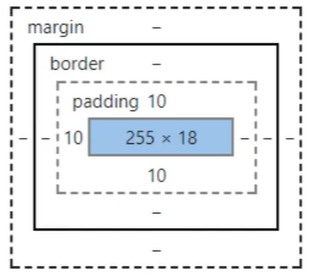
十四、盒子模型及边框使用
<!DOCTYPE html>
<html lang="en">
<head>
    <meta charset="UTF-8">
    <title>盒子模型及边框使用</title>
    <style>
        /*
        margin:外边距
          四个数: 上 下 左 右
          三个数: 上 左右 下
          两个数: 上下 左右
          一个数:上下左右
        padding:内边距
        border:边框(上面边距的内外是相对于边框的,边框是分界点)
          粗细
          样式
          颜色

          开头常见操作(初始化)
          ul,li,a,body{
          margin: 0;
          padding: 0;
          text-decoration: none;
        }
        */
        ul,li,a,body{
          margin: 0;
          padding: 0;
          text-decoration: none;
        }
        #login{
          background: cornflowerblue;
          width: 300px;
          border: #6284FF solid 1px;
          margin: 5px;
          padding: 3px;
        }
        div:nth-of-type(2) input{
          border: #cb1e00 solid 3px;
        }

    </style>
</head>
<body>
<form action="#">
<div id="login">
    <div><h2>会员登录</h2></div>
    <div><p>用户名:<input type="text"></p></div>
    <div><p>密码:<input type="text"></p></div>
</div>

</form>
</body>
</html>
十五、div居中
<!DOCTYPE html>
<html lang="en">
<head>
    <meta charset="UTF-8">
    <title>div居中</title>
    <style>
        ul,li,a,body{
          margin: 0;
          padding: 0;
          text-decoration: none;
        }


        #id1{
          /*居中*/
          margin: 0 auto;
          width: 500px;
          height: 500px;
          background-color: #85FFBD;
          background-image: linear-gradient(45deg, #85FFBD 0%, #FFFB7D 100%);

        }
    </style>
</head>
<body>
<div id="id1" ></div>

</body>
</html>
十六、圆角边框及阴影和经验分享
<!DOCTYPE html>
<html lang="en">
<head>
    <meta charset="UTF-8">
    <title>圆角边框</title>
  <style>
    ul,li,a,body{
      margin: 0;
      padding: 0;
      text-decoration: none;
    }


    #id1{
      /*从左上开始顺时针的顺序 即:左上 右上 右下 左下*/
      border-radius: 200px 150px 75px 25px;
      width: 400px;
      height: 400px;
      background-color: #85FFBD;
      background-image: linear-gradient(45deg, #85FFBD 0%, #FFFB7D 100%);
      margin: 0 auto;

    }
  </style>
</head>
<body>
<div id="id1" ></div>
</body>
</html>
十七、display和浮动
<!DOCTYPE html>
<html lang="en">
<head>
    <meta charset="UTF-8">
    <title>浮动</title>
  <style>
    .contain{
      border: solid #cb1e00 2px;
    }
    .box1{
      padding: 5px;
      border: solid #C850C0 1px;
      margin: 5px;
      display: inline-block;
    }
    .d1{
      float: left;
    }
    .d2{
      float: right;
    }
    .d3,.d4{
      float: right;
    }
  </style>
</head>
<body>
<!--行内元素可以在块级元素内,而块级元素不能再行内元素里
  display:
  block:块元素
  inline:行内(内联)元素
  inline-block:两者都有
-->
<div class="contain">
  <div class="d1 box1"><img src="../resources/image/a.png" height="102" width="198"/></div>
  <div class="d2 box1"><img src="../resources/image/a.png" height="52" width="58"/></div>
  <div class="d3 box1"><img src="../resources/image/a.png" height="12" width="18"/></div>
  <div class="d4 box1">文字</div>

</div>


</body>
</html>
十八、overflow及父级边框塌陷问题
<!DOCTYPE html>
<html lang="en">
<head>
    <meta charset="UTF-8">
    <title>Overflow以及父级边框塌陷问题</title>
    <style>
        .contain{
            border: solid #cb1e00 2px;
        }
        .box1{
            padding: 5px;
            border: solid #C850C0 1px;
            margin: 5px;
            display: inline-block;
        }
        .d1{
            float: left;
        }
        .d2{
            float: right;
        }
        .d3,.d4{
            float: right;
        }
        .contain:after{
            content:'';
            display:block;
            clear:both;
        }
    </style>
</head>
<body>
<!--父级元素塌陷解决办法:
1. 增加父级元素高度
2. 在父级元素最后的地方中加入空的div,设置样式:clean:both
3. 在父级元素后使用after伪类,设置样式clean:both
-->
<div class="contain">
    <div class="d1 box1"><img src="../resources/image/a.png" height="102" width="198"/></div>
    <div class="d2 box1"><img src="../resources/image/a.png" height="52" width="58"/></div>
    <div class="d3 box1"><img src="../resources/image/a.png" height="12" width="18"/></div>
    <div class="d4 box1">文字</div>
</div>


<!--overflow:
hidden:隐藏
scroll:滚动条
after伪类:在元素后执行css
    content:内容
    display:block
    clear:both
-->
<div style="height: 150px;width: 150px;overflow: scroll">
    <img src="../resources/image/a.png" height="202" width="308"/>
</div>


</body>
</html>
十九、相对定位的使用及练习
<!DOCTYPE html>
<html lang="en">
<head>
    <meta charset="UTF-8">
    <title>相对定位使用</title>
  <style>
    /*相对定位:仍然在标准文档流中,原来的位置会被保留
    position:relative
    top,bottom,left,right:
      在相对定位情况下,和元素的类型距离:
      比如top:-20px就会是:在自身位置的基础上,和屏幕上方的距离减少20px
    */
    body{
      padding: 20px;
    }
    div{
      padding: 5px;
      margin: 5px;
    }
    #father{
      border: black 1px solid;
    }
    #f1{
      background: rebeccapurple;
      position: relative;
      top: -15px;
    }
    #f2{
      background: #cb1e00;
      position: relative;
      right: -15px;
    }
    #f3{
      background: #FFFB7D;
      position: relative;
      bottom: -15px;
    }
  </style>
</head>
<body>
<div id="father">
  <div id="f1">第一个盒子</div>
  <div id="f2">第二个盒子</div>
  <div id="f3">第三个盒子</div>
</div>

</body>
</html>
二十、绝对定位和固定定位
<!DOCTYPE html>
<html lang="en">
<head>
    <meta charset="UTF-8">
    <title>绝对定位和固定定位</title>
  <style>
    /*绝对定位:继续xxx定位,上下左右
    1. 没有父级元素定位的前提下,相对于浏览器定位
    2. 假设父级元素存在定位我们通常相对于父级元素进行偏移
    3. 在父级元素范围内移动
    4. 绝对定位后,元素就不在标准文档流中


    固定定位:fixed:直接相对于浏览器的
    */
    #juedui{
        width: 300px;
        height: 300px;
        background: #FFFB7D;
        position: absolute;
        bottom: 0px;
        right: 0px;
    }
    #guding{
        width: 100px;
        height: 100px;
        background: #cb1e00;
        position: fixed;
        bottom: 0px;
        right: 0px;
    }
    #father{
        height: 2000px;
    }
  </style>
</head>
<body>
<div id="father">
    <div id="juedui">绝对定位</div>
    <div id="guding">固定定位</div>
</div>
</body>
</html>
二十一、z-index及透明度
<!DOCTYPE html>
<html lang="en">
<head>
    <meta charset="UTF-8">
    <title>Z-index</title>
  <style>
    /*zindex属性相当于图层属性,zindex高,哪张图在最上面,反之就在下面*/
    /*opacity:背景透明度*/
    #t1,#t2{
      width: 300px;
      height: 300px;
    }
    #t1{
      background: #FFFB7D;
      position: relative;
      z-index: 0;
    }
    #t2{
      background: #cb1e00;
      position: relative;
      top: -300px;
      opacity: 0.5;
      z-index: 1;
    }
  </style>
</head>
<body>
<div id="father">
  <div id="t1">图1</div>
  <div id="t2">图2</div>
</div>
</body>
</html>
二十二、动画及视野拓展
在源码之家、模板之家搜索并且使用、搜索canvas动画,直接使用即可。
慢慢来慢慢来

 浙公网安备 33010602011771号