

P9_组件-swiper和swiper-item的基本用法
- swiper 和 swiper-item 组件的基本使用
实现如图的轮播图效果:
![图片详情]()
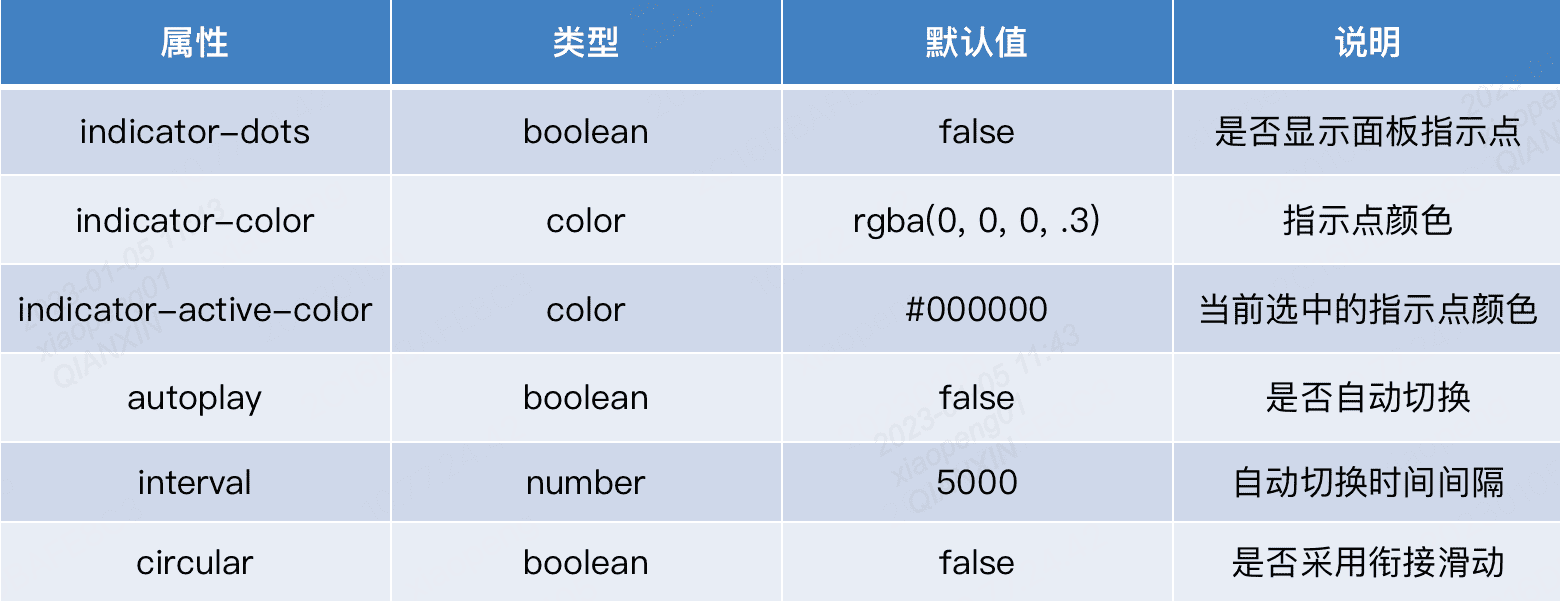
- swiper 组件的常用属性
![图片详情]()
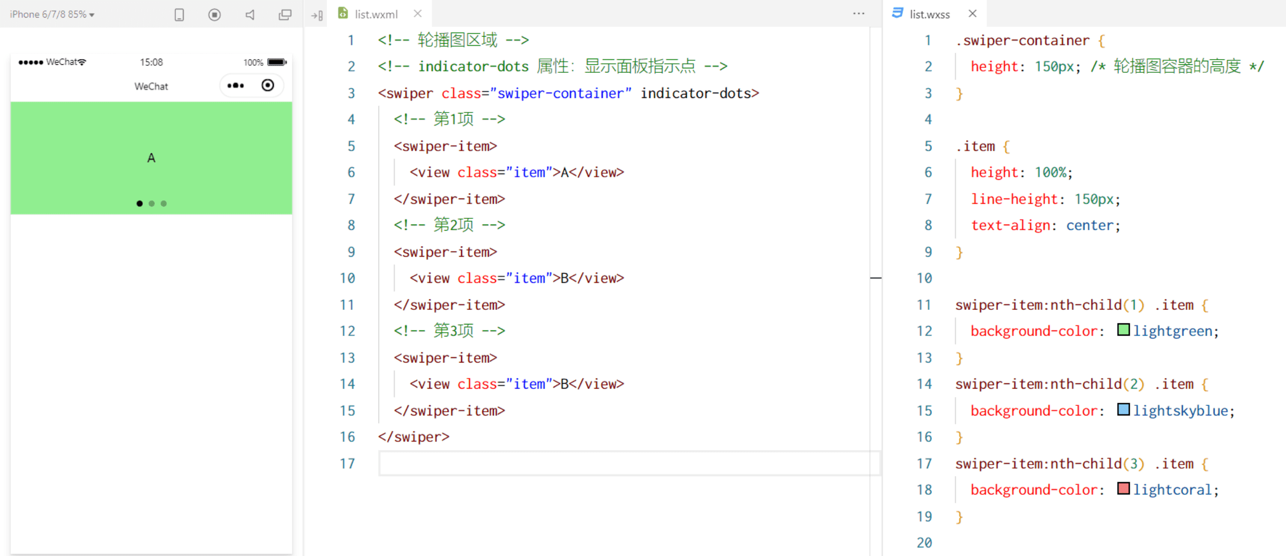
list.wxml
<swiper class="swiper-container" indicator-dots autoplay interval="1000" circular indicator-color="red" indicator-active-color="yellow">
<swiper-item>
<view class="item">A</view>
</swiper-item>
<swiper-item>
<view class="item">B</view>
</swiper-item>
<swiper-item>
<view class="item">C</view>
</swiper-item>
</swiper>
list.wxss
/* pages/list/list.wxss */
.swiper-container {
height: 150px;
}
.item {
height: 100%;
line-height: 150px;
text-align: center;
}
swiper-item:nth-child(1) .item {
background-color:lightgreen;
}
swiper-item:nth-child(2) .item {
background-color:lightskyblue;
}
swiper-item:nth-child(3) .item {
background-color:lightcoral;
}

 浙公网安备 33010602011771号