CSS3弹性盒flex布局模型
简介
传统的布局方式都是基于盒模型的
利用display、position、float来布局有一定局限性 ,比如说实现自适应垂直居中 随着响应式布局的流行,CSS3引入了更加灵活的弹性布局模型

若想让一个元素变成弹性盒只需要将其父元素.box{ display: flex;}
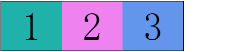
举个栗子
<div class="box">
    <div class="item1">1</div>
    <div class="item2">2</div>
    <div class="item3">3</div>
</div>
 .box{
        display: flex;
 }
父元素添加了display: flex;
子元素在父元素中呈现行排列 看起来好像子元素应用了浮动float
如果对子元素写如下css样式
.item1{
            flex-grow: 1;    //占1份
            background: red;
        }
        .item2{
            flex-grow: 5;   //占5份
            background: yellow;
        }
        .item3{
            flex-grow: 2;   //占2份
            background: mistyrose;
        }

父容器中常用属性
-
display: flex :定义一个flex容器,即设置父元素为一个弹性盒,子元素自动水平排列
-
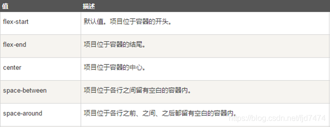
justify-content: 值 :设置或检索弹性盒子元素在主轴(横轴)方向上的对齐方式
-
align-items:值 :定义flex子项在flex容器的当前行的侧轴(纵轴)方向上的对齐方式

-
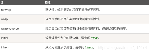
flex-wrap :值 :让弹性盒元素在必要的时候拆行
子元素常用属性
- flex-grow:number:一个数字,规定项目将相对于其他灵活的项目进行扩展的量。默认值是 0。
练习
实现如下效果

<!DOCTYPE html>
<html lang="en">
<head>
    <meta charset="UTF-8">
    <title>学习猿地课程列表页</title>

    <style type="text/css">
        body,ul,li,a{
            margin: 0;
            padding: 0;
            text-decoration: none;
            list-style: none;
        }

        body{
            background: #f4f4f4;
        }

        header{
            width: 100%;
            height: 55px;
            background: #fff;

            margin-bottom: 20px;
            box-shadow: 0px 0px 5px 5px #ccc;

        }


        .top{
            height: 55px;
            width: 60%;
            border: 1px solid red;
            margin: 0 auto;

            display: flex;
            justify-content: space-between;
        }

        header>section>section{
            border: 1px solid mistyrose;
        }

        .top_left{
            flex-grow: 1;
        }
        .top_center{
            flex-grow: 5;
        }
        .top_rigth{
            flex-grow: 2;
        }

        nav{
            height: 75px;
            width: 60%;
            margin: 0 auto;
            border-radius: 10px;
            background: #fff;
            box-shadow: 0 5px 5px #ccc;
            margin-bottom: 20px;
        }

        #content{
            width: 60%;
            margin: 0 auto;
            border: 1px solid red;

            margin-bottom: 25px;
        }

        .content{
            width: 100%;

            display: flex;
            justify-content: space-between;
            align-items: center;

            margin-bottom: 25px;
        }

        .content>section{
            width: 23%;
            height: 200px;
            border: 1px solid yellow;
        }

        #page{
            width: 60%;
            margin: 0 auto;
            display: flex;
            justify-content: center;
            margin-bottom: 20px;
        }
        #page>article{

            border: 1px solid red;
            padding: 8px 15px;
            margin-left: 5px;
        }

        footer{
            width: 100%;
            height: 370px;
            background: #ffffff;
        }
        .footer_botton{
            margin: 0 auto;
            width: 60%;
            height: 20px;
            text-align: center;
        }

        .footer{
            width: 60%;
            height: 350px;
            border: 1px solid red;
            margin: 0 auto;

            display: flex;
            justify-content: space-between;
        }

        .footer_left{
            border: 1px solid red;
            flex-grow: 3;
        }
        .footer_center{
            border: 1px solid red;
            flex-grow: 5;
        }


        .footer_rigth{
            border: 1px solid red;
            flex-grow: 1;
        }


    </style>
</head>
<body>

<!--头部-->
<header>
    <section class="top">
        <section class="top_left">1</section>
        <section class="top_center">2</section>
        <section class="top_rigth">3</section>
    </section>

</header>

<!--导航-->
<nav></nav>

<!--内容-->
<section id="content">
    <section class="content">
        <section>1</section>
        <section>2</section>
        <section>3</section>
        <section>4</section>
    </section>

    <section class="content">
        <section>1</section>
        <section>2</section>
        <section>3</section>
        <section>4</section>
    </section>

    <section class="content">
        <section>1</section>
        <section>2</section>
        <section>3</section>
        <section>4</section>
    </section>

    <section class="content">
        <section>1</section>
        <section>2</section>
        <section>3</section>
        <section>4</section>
    </section>
</section>

<!--分页-->
<section id="page">
    <article><a href="#">1</a> </article>
    <article><a href="#">2</a> </article>
    <article><a href="#">3</a> </article>
    <article><a href="#">4</a> </article>
    <article><a href="#">5</a> </article>
    <article><a href="#">6</a> </article>


</section>


<!--底部-->
<footer>
    <section class="footer">
        <section class="footer_left">1</section>
        <section class="footer_center">2</section>
        <section class="footer_rigth">3</section>
    </section>

    <section class="footer_botton">© 辽ICP备19013136号 PHP</section>
</footer>

</body>
</html>

 浙公网安备 33010602011771号