
利用 background 和 filter 模糊指定区域
背景知识:background-size: cover;,background-attachment:fixed;,filter:blur()
难题:
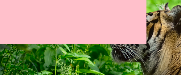
通常,我们会通过filter:blur()去实现背景高斯模糊,但是缺点很明显,整个背景都模糊了,能不能模糊其中指定的一块呢?比如:
<header>
  <div class="content"></div>
</header>
header {
  width:100vw;
  height:100vh;
  background:url('https://xianshenglu.github.io/css/img-displayed/frosted-glass-tiger.jpg') no-repeat 0/cover fixed;
}
.content {
  width:50%;
  height:50%;
  background:pink;
}
能不能只模糊 .content区域呢?
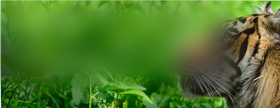
尝试:
- 通过半透明的背景和
filter:blur来实现
.content {
  width:50%;
  height:50%;
  background:rgba(255,255,255,0.5);
  filter:blur(20px)
}
当然效果是不太好的:

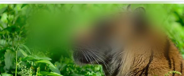
方案:
- 把
.content的背景换成和父元素一样,再使用filter:blur()即:
.content {
  width:50%;
  height:50%;
  background:url('https://xianshenglu.github.io/css/img-displayed/frosted-glass-tiger.jpg') no-repeat 0/cover fixed;
  filter:blur(20px)
}
效果:
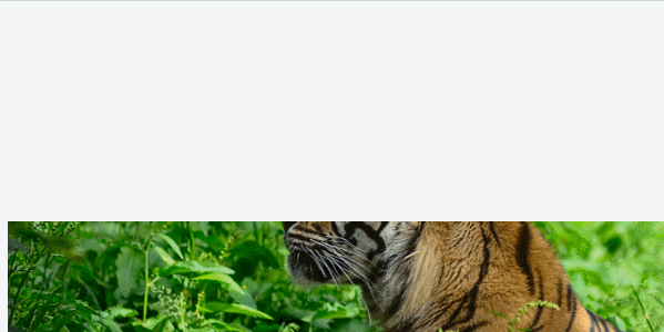
原理:
background-size:cover 和background-attachment:fixed,这两个属性搭配导致了,父子元素虽然大小不一样,但是背景是重合的,即使加上
margin-left:200px;
改变了位置,背景图还是重合的,这个时候模糊子元素就像是模糊了父元素背景的某一部分一样,如图:
这是因为:
当 background-size:cover 和background-attachment:fixed 一起被设置时,这就好比给视口设置了一个position:fixed定位的背景图,然后之前设置背景图的元素可以从它的背景中看到一部分视口的背景图,但是其他元素看不到,譬如:
header {
  width:100vw;
  height:100vh;
  margin-top:200px;
  background:url('https://xianshenglu.github.io/css/img-displayed/frosted-glass-tiger.jpg') no-repeat 0 0/cover fixed;
}
仔细看下面的 gif:
header 元素上方的 margin-top:200px;导致了空白,但是滚动的时候,背景并没有滚动,我们透过元素的滚动可以看到剩余的背景图。
参考文档:
CSS background-size: cover + background-attachment: fixed clipping background images
行文仓促,如有错误,欢迎批评指正~~~
转载请注明来源,文中所提文档可以在我的 Github 上下载~~~新博客现已迁移至 Github issues

 浙公网安备 33010602011771号