CSS3
一、什么是CSS
如何学习
1. CSS是什么
2. CSS怎么用(快速入门)
3. CSS选择器(重点加难点)
4. 美化网页(文字,阴影,超链接,列表,渐变)
5. 盒子模型
6. 浮动
7. 定位
8. 网页动画(特效)
1.1什么是CSS
Cascading Style Sheet 层叠级联样式表
CSS:表现(美化网页)
字体,颜色,边距,高度,宽度,背景图片,网页定位,网页浮动
1.2发展史
CSS1.0
CSS2.0 DIV(块)+CSS,HTML与CSS结构分离的思想,网页变得简单,SEO优化
CSS2.1 浮动,定位
CSS3.0 圆角,阴影,动画……浏览器兼容性
练习格式:
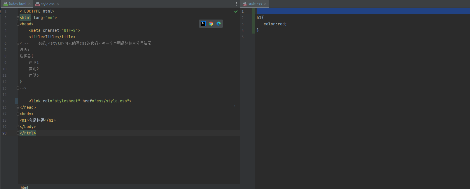
1.3快速入门
style:
<!DOCTYPE html>
<html lang="en">
<head>
    <meta charset="UTF-8">
    <title>Title</title>
<!--    规范,<style>可以编写css的代码,每一个声明最好使用分号结尾
语法:
选择器{
    声明1;
    声明2;
    声明3;
}
-->

    <style>
        h1{
            color:red;
        }
    </style>
</head>
<body>
<h1>我是标题</h1>
</body>
</html>
规范:
css优势:
1. 内容的和表现分离
2. 网页结构表现同意,可以实现复用
3. 样式十分的丰富
4. 建议使用独立于html和css文件
5. 利用SEO,容易被搜素邀请收录
1.4CSS的3种导入方式
就近原则
<!DOCTYPE html>
<html lang="en">
<head>
    <meta charset="UTF-8">
    <title>Title</title>
<!--    内部样式-->
    <style >
        h1{
            color:green;
        }
    </style>
    <link rel="stylesheet" href="css/style.css">
</head>
<body>
<!--行内样式:在标签元素中,编写一个style属性,编写样式即可-->
<h1 style = "color: red">1</h1>
</body>
</html>
/*外部样式*/
h1{
    color: blue;
}
扩展:外部样式两种写法
-
链接式:html
<link rel="stylesheet" href="css/style.css"> -
导入式:css2.1
<!--    导入式-->
    <style>
        @import url("css/style.css");
    </style>
二、选择器
作用:选择页面上的某一个或者某一类元素
2.1基本选择器
id选择器>类选择器>标签选择器
-
标签选择器
<!DOCTYPE html>
<html lang="en">
<head>
    <meta charset="UTF-8">
    <title>Title</title>
    <style>
/*标签选择器,*/
        h1{
            color: #d209e0;
            background: antiquewhite;
            border-radius: 24px;
        }
p{
    font-size:80px;
}
    </style>
</head>
<body>
<h1>测试标签选择器</h1>
<h1>测试标签选择器</h1>
<p>测试</p>
</body>
</html>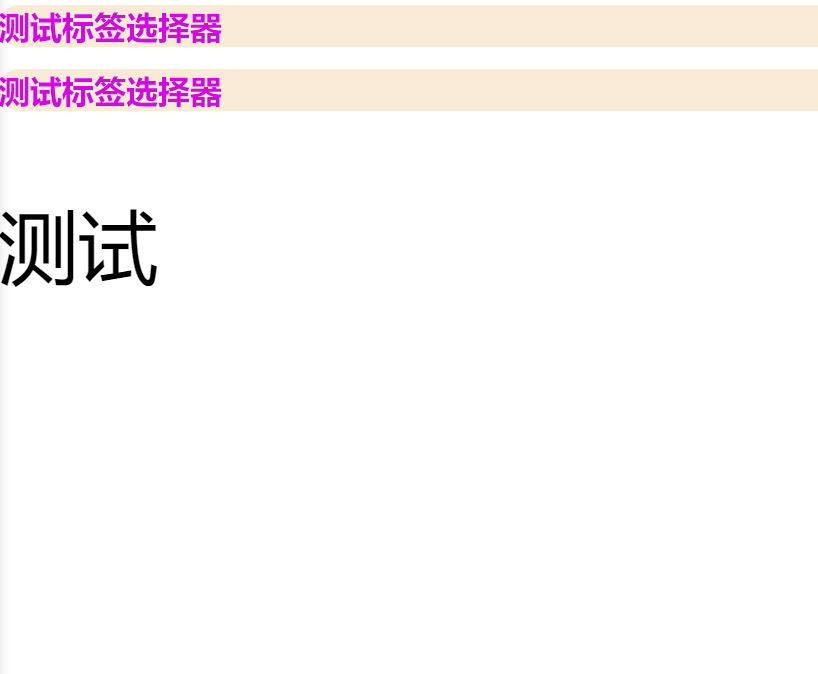
-
类选择器
<!DOCTYPE html>
<html lang="en">
<head>
    <meta charset="UTF-8">
    <title>Title</title>

<!--    类选择的格式
.class的名称{}
好处,可以多个标签归类,是同一个class
-->
    <style>
        .sir{
            color: #d209e0;
        }
        .sir2{
            color: aqua;
        }
    </style>
</head>
<body>
<h1 class="sir">标题1</h1>
<h1 class="sir2">标题2</h1>
<h1 class="sir">标题3</h1>

<p class="sir">P标签</p>
</body>
</html>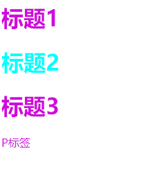
-
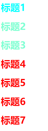
ID选择器
<!DOCTYPE html>
<html lang="en">
<head>
    <meta charset="UTF-8">
    <title>Title</title>
    <!--
    id选择器:id必须为唯一
    #id名称{}
          -->
    <style>
        #sir{
            color: aqua;
        }
        .sir{
            color: aquamarine;
        }
        h1{
            color: red;
        }
    </style>
</head>
<body>
<h1 id = "sir">标题1</h1>
<h1  class="sir">标题2</h1>
<h1 class="sir">标题3</h1>
<h1>标题4</h1>
<h1>标题5</h1>
<h1>标题6</h1>
<h1>标题7</h1>
</body>
</html>
2.2层次选择器
-
后代选择器:在某个元素的后面
/*    后代选择器*/
    body   p{
        background: green;
    }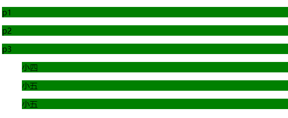
-
子选择器:一代
/*    子选择器*/
    body>p{
        background: red;
    }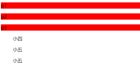
-
相邻兄弟选择器:只有一个 向下
/*相邻兄弟选择器*/
    .active +p{
        background: bisque;
    }
<p class="active">p1</p> <p>p2</p>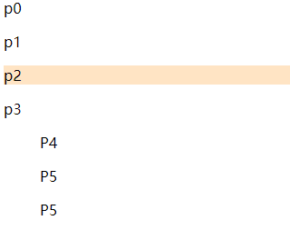
-
通用选择器:当前选择元素向下的所有兄弟元素
/* 通用选择器 */ .active~p{ background: burlywood; }<p class="active">p1</p>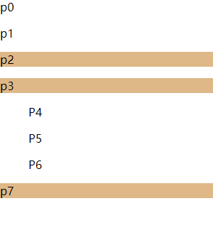
<!DOCTYPE html>
<html lang="en">
<head>
<meta charset="UTF-8">
<title>Title</title>
<style>
/*p{*/
/* background: green;*/
/*}*/
/* 后代选择器*/
/* body p{*/
/* background: green;*/
/* }*/
/* 子选择器*/
/* body>p{*/
/* background: saddlebrown;*/
/* }*/
/*相邻兄弟选择器*/
/* .active +p{*/
/* background: bisque;*/
/* }*/
/* 通用选择器 */
.active~p{
background: burlywood;
}
</style>
</head>
<body>
<p>p0</p>
<p class="active">p1</p>
<p>p2</p>
<p>p3</p>
<ul>
<ll>
<p>P4</p>
</ll>
<ll>
<p>P5</p>
</ll>
<ll>
<p>P6</p>
</ll>
</ul>
<p>p7</p>
</body>
</html>
2.3结构伪类选择器
伪类:条件
<!DOCTYPE html>
<html lang="en">
<head>
<meta charset="UTF-8">
<title>Title</title>
<style>
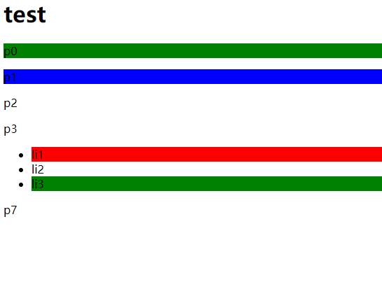
/*ul的第一个子元素*/
ul li:first-child{
background: red;
}
/*ul的最后一个子元素*/
ul li:last-child{
background: green;
}
/* 定位到父元素,选择当前的第二个,当前元素才生效*/
p:nth-child(2){
background: green;
}
/* 定位到父元素,选择P元素的第二个,生效*/
p:nth-of-type(2){
background: blue;
}
</style>
</head>
<body>
<h1>test</h1>
<p>p0</p>
<p>p1</p>
<p>p2</p>
<p>p3</p>
<ul>
<li>li1</li>
<li>li2</li>
<li>li3</li>
</ul>
<p>p7</p>
</body>
</html>
2.5属性选择器
= 绝对
*=包含
^=以什么什么开头
$=以什么什么结尾
<!DOCTYPE html>
<html lang="en">
<head>
    <meta charset="UTF-8">
    <title>Title</title>
    <style>
        .demo a{
            float:left;
            display:block;
            height: 50px;
            width: 50px;
            border-radius: 30px;
            background: blue;
            text-align: center;
            font:bold 20px/50px Arial;
            text-decoration: none;
            color: gray;
            margin-right: 5px;
        }
    /*
    = 绝对
    *=包含
    ^=以什么什么开头
    $=以什么什么结尾
    */
    /*    存在id=first属性的元素  a[]{}*/
        a[id=first]{
            background: red;
        }
    /*    class存在links的元素*/
        a[class*="links"]{
            background: green;
        }
    /*   选中href以http开头的元素 */
        a[href^=http]{
            background: bisque;
        }
    /*    选中href种以pdf结尾的元素*/
        a[href$=pdf]{
            background: brown;
        }
    </style>
</head>
<body>
<p class="demo">
    <a href="https://cn.bing.com" class="links itme first" id="first">1</a>
    <a href="" class="links time active" target="_blank" title="test">2</a>
    <a href="images/123.html"class="links itme ">3</a>
    <a href="images/123.png"class="links itme">4</a>
    <a href="images/123.jpg"class="links itme">5</a>
    <a href="abc">6</a>
    <a href="/abc.pdf">7</a>
    <a href="/abc.pdf">8</a>
    <a href="abc.doc">9</a>
    <a href="abcd.doc"class="links itme last">10</a>
</p>
</body>
</html>
三、美化网页元素
3.1为什么要美化网页
-
有效的传递页面信息
-
美化网页,页面漂亮,才能吸引用户
-
凸显页面的主体
-
提高用户体验
span标签:重点要突出的字,使用span标签套起来
<!DOCTYPE html>
<html lang="en">
<head>
    <meta charset="UTF-8">
    <title>Title</title>
    <style>
        #title1{
            color: brown;
            font-size: 50px;
        }
    </style>
</head>
<body>
1+1=<span id = "title1">2</span>
</body>
</html>
3.2字体样式
<!--
font-family:字体
font-size:字体大小
font-weight:字体的粗细
color:字体颜色
-->
    <style>
        body{
            font-family: "Arial",宋体;
        }
        h1{

            font-size: 50px;
        }
        p:nth-of-type(1){
            font-weight:bold;
        }
        p:nth-child(3){
            color: red;
        }
    </style>
3.3文本样式
-
颜色
单词 RGB 0~F RBGA color: rgb(,,,,) -
文本对齐方式
text-align:center,left........位置(左对齐,居中..) img,span{vertical-align: middle;} 水平对齐 -
首行缩进
text-indent: 2em;(首行缩进) -
行高
height: 300px;段高 line-height:行高 -
装饰
text-decoration:underline下划线 line-through中划线 overline上划线
<!DOCTYPE html>
<html lang="en">
<head>
<meta charset="UTF-8">
<title>Title</title>
</head>
<!--
颜色:
单词
RGB 0~F
RBGA color: rgb(,,,,)
排版:
text-align:center,left........位置(左对齐,居中..)
text-indent: 2em;(首行缩进)
height: 300px;段高
line-height:行高
text-decoration:underline下划线 line-through中划线 overline上划线
img,span{vertical-align: middle;} 水平对齐
-->
<style>
h1{
color: rgba(255,0,0,90%);
text-align: center;
}
img,span{
vertical-align: middle;
}
p:nth-of-type(1){
text-indent: 2em;
}
p:nth-of-type(3){
background: green;
height: 300px;
line-height: 2em;
}
.l1{
text-decoration:underline;
}
.l2{
text-decoration: line-through;
}
.l3{
text-decoration: overline;
}
</style>
<body>
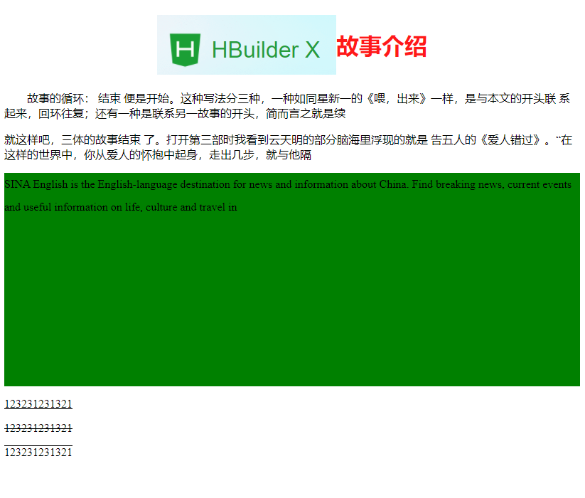
<h1><img src="images/img.png" alt=""><span>故事介绍</span></h1>
<p class = "p1">故事的循环: 结束 便是开始。这种写法分三种,一种如同星新一的《喂,出来》一样,是与本文的开头联
系起来,回环往复;还有一种是联系另一故事的开头,简而言之就是续</p>
<p>就这样吧,三体的故事结束 了。打开第三部时我看到云天明的部分脑海里浮现的就是
告五人的《爱人错过》。“在这样的世界中,你从爱人的怀抱中起身,走出几步,就与他隔</p>
<p>SINA English is the English-language destination for news and information about China. Find breaking news, current
events and useful information on life, culture and travel in</p>
<p class="l1"> 123231231321</p>
<p class="l2"> 123231231321</p>
<p class="l3"> 123231231321</p>
</body>
</html>
3.4阴影
text-shadow:red 10px 10px 1px;(颜色,右偏移,下偏移,阴影半径)
3.5超链接伪类
正常情况下,a与a:hover
/*默认的颜色*/
a{
    text-decoration: none;
    color: black;
}
/*鼠标悬浮的状态*/
a:hover{
    color: orange;
    font-size: 50px;
}
/*鼠标按住未释放的状态*/
a:active{
    color: red;
}
/*点击之后*/
a:visited{
    color: green;
}
3.6列表
<!DOCTYPE html>
<html lang="en">
<head>
<meta charset="UTF-8">
<title>Title</title>
<link rel="stylesheet" href="css/style.css">
</head>
<body>
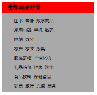
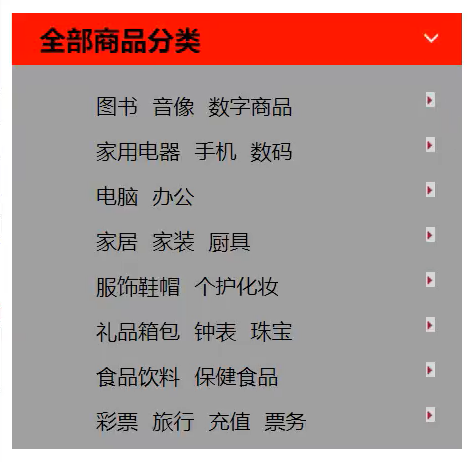
<div id="nav">
<h2 class="title">全部商品分类</h2>
<ul>
<li>
<a href="#">图书</a>
<a href="#">音像</a>
<a href="#">数字商品</a>
</li>
<li>
<a href="#">家用电器</a>
<a href="#">手机</a>
<a href="#">数码</a>
</li>
<li>
<a href="#">电脑</a>
<a href="#">办公</a>
</li>
<li>
<a href="#">家居</a>
<a href="#">家装</a>
<a href="#">厨具</a>
</li>
<li>
<a href="#">服饰鞋帽</a>
<a href="#">个性化妆</a>
</li>
<li>
<a href="#">礼品箱包</a>
<a href="#">钟表</a>
<a href="#">珠宝</a>
</li>
<li>
<a href="#">食品饮料</a>
<a href="#">保健食品</a>
</li>
<li>
<a href="#">彩票</a>
<a href="#">旅行</a>
<a href="#">充值</a>
<a href="#">票务</a>
</li>
</ul>
</div>
</body>
</html>
#nav{
    width: 300px;
    background: darkgray;
}
.title{
    font-size: 18px;
    font-weight: bold;
    text-indent: 1em;
    line-height: 35px;
    background: red;
}
/*ul li*/
/*
list-style
    none去掉圆点
    circle空心元
    decimal 数字
    square 正方形
*/

ul li{
    height: 30px;
    list-style: none;
}
a{
    text-decoration: none;
    font-size: 14px;
    color: #000;
}
a:hover{
    color: orange;
}
3.7背景图像
<style>
    div{
        width: 1000px;
        height: 700px;
        /*边框:粗细,实线,线条颜色*/
        border:1px solid red;
        background-image:url("images/img.jpg") ;
    /*    默认是全部平铺的*/
    }
    .div1{
        /*垂直平铺*/
        background-repeat:repeat-x ;
    }
    .div2{
        /*水平平铺*/
        background-repeat: repeat-y;
    }
    /*不平铺*/
    .div3{
        background-repeat:no-repeat;
    }
</style>
background:red url("../images/img.png")270px 10px no-repeat(颜色,图像,位置,位置,不全部平铺)
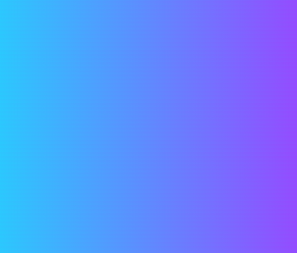
3.8渐变
<!--径向渐变,圆形渐变-->
<style>
    body{
        background-image: linear-gradient(19deg,#21D4FD,#B721FF 100%);
    }
</style>
四、盒子模型
4.1什么是盒子模型
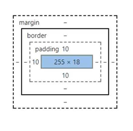
margin:外边距
padding:内边距
border:边框
4.2边框
- 边框的粗细
- 边框的样式 dashed虚线 solid实线
- 边框的颜色
<!DOCTYPE html>
<html lang="en">
<head>
<meta charset="UTF-8">
<title>Title</title>
<style >
body{
/*body总有一个默认的外边框 margin:0*/
margin: 0;
}
/*border:*/
/* 1. 边框的粗细*/
/* 2. 边框的样式*/
/* 3. 边框的颜色*/
h2{
font-size: 16px;
background-color: #21D4FD;
line-height: 30px;
margin: 0;
color: white;
}
#app{
width:300px;
border: 1px solid red;
line-height: 30px;
}
form{
background: #21D4FD;
}
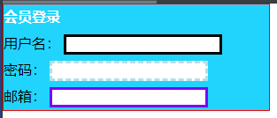
div:nth-of-type(1)> input{
border: 3px solid black;
}
div:nth-of-type(2)> input{
border: 3px dashed powderblue;
}
div:nth-of-type(3)> input{
border: 3px solid #740af5;
}
</style>
</head>
<body>
<div id="app">
<h2>会员登录</h2>
<form action="#">
<div>
<span>用户名:</span>
<input type="text">
</div>
<div>
<span>密码:</span>
<input type="password">
</div>
<div>
<span>邮箱:</span>
<input type="text">
</div>
</form>
</div>
</body>
</html>
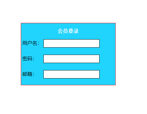
4.3内外边距
外边距:顺时针  margin:0
		margin :0 1px
		margin :0 1px 2px 3px
内边距  左右padding: 10px 2px;
<!DOCTYPE html>
<html lang="en">
<head>
<meta charset="UTF-8">
<title>Title</title>
<style >
body{
/*body总有一个默认的外边框 margin:0*/
margin: 0;
}
/*顺时针 margin:0
margin :0 1px
margin :0 1px 2px 3px
*/
h2{
font-size: 16px;
background-color: #21D4FD;
line-height: 30px;
margin: 0;
color: white;
font-family: 宋体;
text-align: center;
}
#app{
width:300px;
border: 1px solid red;
line-height: 30px;
margin: 300px auto;
background: #21D4FD;
}
input{
border: 1px solid black;
margin: auto;
padding: 5px ;
}
div:nth-of-type(1){
padding: 10px 2px;
}
div:nth-of-type(2){
padding: 10px 2px;
}
div:nth-of-type(3){
padding: 10px 2px;
}
</style>
</head>
<body>
<div id="app">
<h2>会员登录</h2>
<form action="#">
<div>
<span>用户名:</span>
<input type="text">
</div>
<div>
<span>密码: </span>
<input type="password">
</div>
<div>
<span>邮箱: </span>
<input type="text">
</div>
</form>
</div>
</body>
</html>
盒子的计算方式:
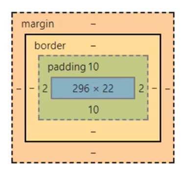
margin+border+padding+内容宽度
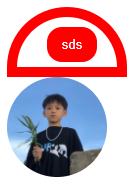
4.4圆角边框
顺时针- 左上 右上 右下 左下 ->
   div{
            width: 100px;
            height: 100px;
            border: 10px solid red;
            border-radius: 100px 50px 10px;
        }
<!DOCTYPE html>
<html lang="en">
<head>
    <meta charset="UTF-8">
    <title>Title</title>
    <style>
        div{
            width: 100px;
            height: 50px;
            border: 10px solid red;
            border-radius: 100px 100px 0px 0px ;
        }
        button{
            width: 50px;
            margin:10px 30px;
            border-radius: 15px;
            border:  10px solid red;
            background-color: red;
            color: white;
            padding: 0px;
        }
        img{
            width: 100px;
            border-radius: 50px;
        }
    </style>
</head>
<body>
    <div>
        <button>sds</button>
    </div>
    <img src="images/img.jpg" alt="">
</body>
</html>
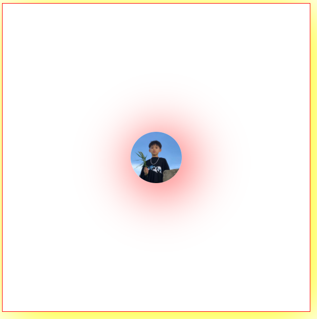
4.5阴影
<!DOCTYPE html>
<html lang="en">
<head>
    <meta charset="UTF-8">
    <title>Title</title>
    <style>
        .div1{
            width: 600px;
            height: 600px;
            border: 1px solid red;
            box-shadow: 10px 10px 100px yellow;
        }
        .div{
        }
        .img{
            display: block;
            width: 100px;
            height: 100px;
            margin: 250px auto;
            border-radius: 50px;
            box-shadow: 10px 10px 100px red;
        }
    </style>
</head>
<body>
<div class="div1">

   <img class="img" src="images/img.jpg" alt="" >
</div>
</body>
</html>
五、浮动
5.1标准文档流
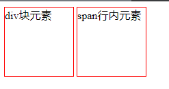
块级元素:独占一行
h1~h5 p div 列表……
行内元素:不独占一行
span a img strong……
行内元素可以包含在块级元素中,反之,则不可以
5.2display
display: block:块元素
                 nline:行内元素
                 inline-block:是块元素但是可以内联
                 none:消失
5.3浮动
float:right(左右)
clear:both(清除浮动)
clear: right:右侧不允许有浮动
          left:左侧不允许有浮动
          both:两侧不允许有浮动*/
<!DOCTYPE html>
<html lang="en">
<head>
<meta charset="UTF-8">
<title>Title</title>
<link rel="stylesheet" href=" css/css.css"type="text/css">
</head>
<body>
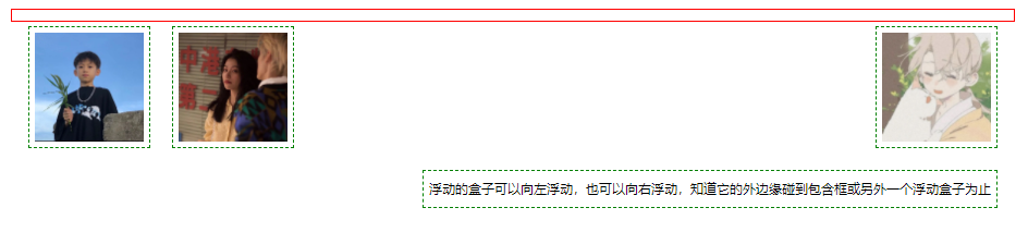
<div id = "father">
<div class="layer01"><img src="images/img1.jpg" alt=""> </div>
<div class="layer02"><img src="images/img2.jpg" alt=""> </div>
<div class="layer03"><img src="images/img3.jpg" alt=""> </div>
<div class="layer04">浮动的盒子可以向左浮动,也可以向右浮动,知道它的外边缘碰到包含框或另外一个浮动盒子为止</div>
</div>
</body>
</html>
div{
    margin: 10px;
    padding: 5px;
}
#father{
    border: 1px solid red;
}
img{
    height: 100px;
    width: 100px;
}
.layer01{
    height: 100px;
    width: 100px;
    display: inline-block;
    border: 1px dashed green;
    float: left;
}
.layer02{
    height: 100px;
    width: 100px;
    display: inline-block;
    border: 1px dashed green;
    float: left;
}
.layer03{
    height: 100px;
    width: 100px;
    display: inline-block;
    border: 1px dashed green;
    float: right;
}
/* clear: right:右侧不允许有浮动
          left:左侧不允许有浮动
          both:两侧不允许有浮动*/
.layer04{
    display: inline-block;
    border: 1px dashed green;
    font-size: 12px;
    line-height: 23px;
    float: right;
    clear: both;
}
5.4父级边框塌陷问题
clear: right:右侧不允许有浮动
left:左侧不允许有浮动
both:两侧不允许有浮动*/
解决方案:
-
增加父级元素的高度
#father{ border: 1px solid red; height:800px } -
增加一个空的div标签。然后清除浮动
<div class="clear"></div>.clear{ clear: both; margin: 0px; padding: 0px; }
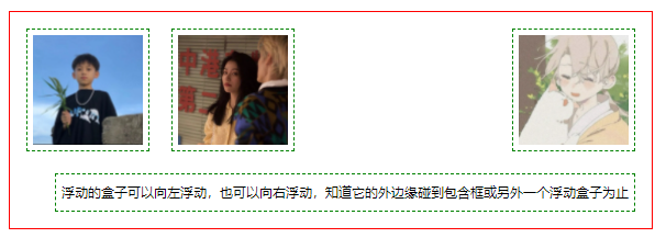
3.overflow
在父级元素中增加一个overflow:hidden(当元素内的内容溢出的时候使它隐藏溢出的部分,即超出部分隐藏)
#father{
    border: 1px solid red;
    overflow: hidden;
}
4.父类添加一个伪类:after
#father:after{
    content:'';
    display:block;
    clear:both
}
小结:
-
浮动元素后面增加空的div
简单,代码中尽量避免空div
- 设置父元素的高度
简单,元素假设有了固定的高度,就会被限制
- overflow
简单,下拉的一些场景避免使用
- 父类添加一个伪类:after(推荐)
写法稍微复杂一些,但是没有副作用,推荐使用
5.5对比
-
dosplay
方向不可以控制
-
float
浮动起来的话会同里标准文档流,所有要解决父级边框塌陷问题
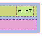
六、定位
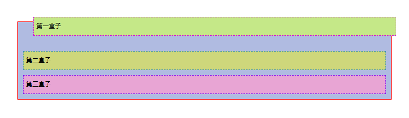
默认情况:
<!DOCTYPE html>
<html lang="en">
<head>
    <meta charset="UTF-8">
    <title>Title</title>
    <style>
        div{
            margin: 10px;
            padding: 5px;
            font-size: 12px;
            line-height: 25px;
        }
        #father{
            background-color: #b0bbe1;
            border: 1px solid red;
            padding: 0px;
        }
        #first{
            border: 1px dashed #d209e0;
            background-color: #c5e888;
        }
        #second{
            border: 1px dashed #378ac1;
            background-color: #ced77b;
        }
        #third{
            border: 1px dashed #740af5;
            background-color: #e8a5d4;
        }
    </style>
</head>
<body>
<div id="father">
    <div id="first">第一盒子</div>
    <div id="second">第二盒子</div>
    <div id="third">第三盒子</div>
</div>
</body>
</html>
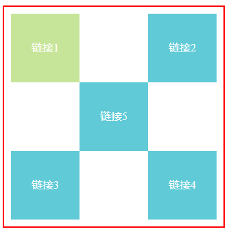
6.1相对定位
相对定位:position: relative;
相对于原来的位置,进行指定的偏移。仍然在标准文档流中!原来位置会保留
/*相对定位:上下左右*/
position: relative;
top:-20px;/*距离上面偏移负二十*/
left: 20px;
buttom:10/*距离上面偏移十*/
练习
<!DOCTYPE html>
<html lang="en">
<head>
    <meta charset="UTF-8">
    <title>Title</title>
    <style>
        #box{
            height: 300px;
            width:300px;
            padding: 10px;
            border: 2px solid red;
        }
        a{
            height: 100px;
            width:100px;
            text-decoration: none;
            color: #ffffff;
            background-color: #60cad7;
            line-height: 100px;
            text-align: center;
            display: block;
        }
        a:hover{
            background-color: #c7e598;
        }
        .a2{
            position: relative;
            top: -100px;
            left: 200px;
        }
        .a4{
            position: relative;
            top: -100px;
            left: 200px;
        }
        .a5{
            position: relative;
            top: -300px;
            left: 100px;
        }
    </style>
</head>
<body>
<div id="box">
    <a class="a1" href="#">链接1</a>
    <a class="a2" href="#">链接2</a>
    <a class="a3" href="#">链接3</a>
    <a class="a4" href="#">链接4</a>
    <a class="a5" href="#">链接5</a>
</div>
</body>
</html>
6.2绝对定位
定位:基于xxx定位
- 没有父级元素定位的前提下,相对与浏览器定位
position: absolute;
right: 30px;
- 假设父级元素存在定位,我们通常会相对于父级元素进行偏移
#father{
    background-color: #b0bbe1;
    border: 1px solid red;
    padding: 0px;
    position: relative;
}
#first{
    border: 1px dashed #d209e0;
    background-color: #c5e888;
    position: absolute;
    right: 30px;
}
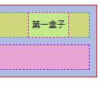
-
在父级元素范围内移动
相对于父级或浏览器的位置,进行指定的偏移,绝对定位的话,它不在标准文档流中,原来的位置不会被保留
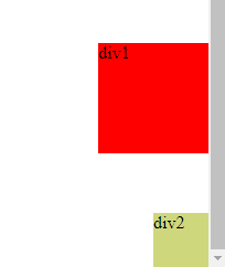
6.3固定定位fixed
position:fixed;
<!DOCTYPE html>
<html lang="en">
<head>
    <meta charset="UTF-8">
    <title>Title</title>
    <style>
        body{
            height: 1000px;
        }
        div:nth-of-type(1){
            /*绝对定位,相对于浏览器*/
            width: 100px;
            height: 100px;
            background: red;
            position: absolute;
            right: 0;
            bottom: 0;
        }
        div:nth-of-type(2){
            /*固定定位*/
            width: 50px;
            height: 50px;
            background: #ced77b;
            position:fixed;
            right: 0;
            bottom: 0;
        }
    </style>
</head>
<body>
<div>div1</div>
<div>div2</div>
</body>
</html>
6.4 z-index
z-index: 999;/*第999层,越大越前*/
6.5透明度
opacity: 50%;/*透明度50%*/or ilter:Alpha(opacity=50)
<!DOCTYPE html>
<html lang="en">
<head>
<meta charset="UTF-8">
<title>Title</title>
<link rel="stylesheet" href="css/css.css">
</head>
<body>
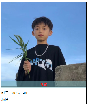
<div id = content>
<ul>
<li>
<img src="images/img.jpg" alt="">
</li>
<li class="touxiang"> 头像</li>
<li class="bj"></li>
<li>时间:2020-01-01</li>
<li>微博</li>
</ul>
</div>
</body>
</html>
img{
    width: 300px;
    height: 300px;
}
#content{
    width: 300px;
    padding: 0px;
    margin: 0px;
    overflow: hidden;
    font-size: 12px;
    line-height: 25px;
    border: 1px solid black;
}
ul,lu{
    padding: 0px;
    margin: 0px;
    list-style: none;
}
/*父级元素相对定位*/
#content ul{
    position: relative;
}
.touxiang,.bj{
    position: absolute;
    width: 300px;
    top:280px;
    height: 25px;
    text-align: center;
}
.touxiang{
    color: red;
    z-index: 999;

}
.bj{
    background: #7db6be;
    opacity: 50%;
}
七、动画
网上复制源码

 浙公网安备 33010602011771号