
qml基础组件概述
QML组件概述
1基础视觉组件
1.Item
Item : 所有可视 QML 组件的基类,提供基本的定位和尺寸属性。
Item {
    width: 100
    height: 100
}
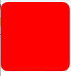
2.Rectangle
Rectangle : 矩形组件,可以设置颜色、边框和圆角
Rectangle {
    width: 100
    height: 100
    color: "red"
    radius: 10
}
效果图:
3.image组件
显示图像的组件
/*
记得图片没有被添加到Qt资源系统(.qrc文件),直接使用绝对路径虽然理论上可行,但建议将图片添加到资源文件中:
右键项目 → "Add New..." → Qt → Qt Resource File"
在资源文件中添加图片,然后通过qrc:/路径引用:
*/
Image {
        source: "/image/test.png"
        fillMode: Image.PreserveAspectFit
}
效果图:
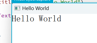
4.Text
显示文本的组件
Text {
        text: "Hello World"
        font.pixelSize: 30
    }
效果图:
2.布局组件
1.Row :
水平排列子项
Row {
        spacing: 10
        Text { text: "第一项" }
        Text { text: "第二项" }
        Text { text: "第三项" }
        Text { text: "第四项" }
    }
效果图: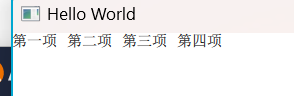
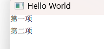
2.Column
垂直排列子项
Column {
        spacing: 10
        Text { text: "第一项" }
        Text { text: "第二项" }
    }
效果图:
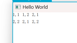
3.Grid
网格布局
Grid {
        columns: 3
        spacing: 10
        Text { text: "1,1" }
        Text { text: "1,2" }
        Text { text: "2,1" }
        Text { text: "2,2" }
        Text { text: "2,1" }
        Text { text: "2,2" }
    }
效果图:
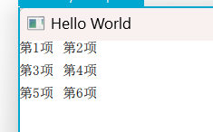
4. Flow
流式布局
Flow {
        width: 100
        spacing: 10
        Text { text: "第1项" }
        Text { text: "第2项" }
        Text { text: "第3项" }
        Text { text: "第4项" }
        Text { text: "第5项" }
        Text { text: "第6项" }
        // 当宽度不足时会自动换行
    }
效果图:
Qt高级布局
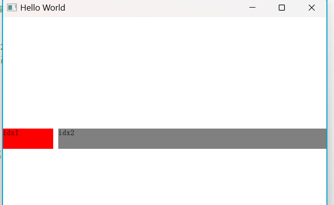
1.RowLayout
高级水平布局
RowLayout {
        anchors.fill: parent  // 关键1:让布局填满父窗口
        spacing: 10
        Rectangle{
            Layout.preferredWidth: 100  // 关键2:明确宽度
            Layout.preferredHeight: 40  // 明确高度
            color: "red"
            Text {
                id: t1
                text: qsTr("idx1")
            }
        }
        Rectangle{
            Layout.fillWidth: true  // 关键3:填充剩余空间
            Layout.preferredHeight: 40
            color: "grey"
            Text {
                id: t2
                text: qsTr("idx2")
            }
        }
    }
效果图:
2.ColumnLayout
高级垂直布局
和上面的RowLayout 类似,只是RowLayout 水平,而ColumnLayout 是垂直布局。
3输入组件
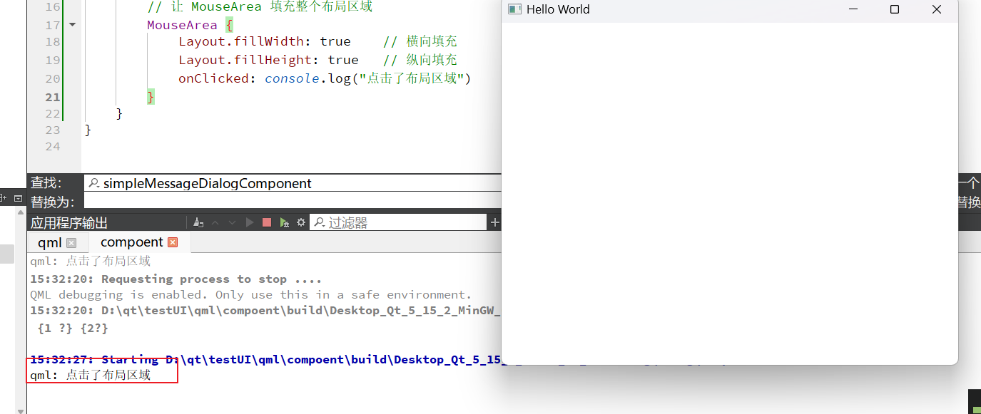
1.MouseArea
捕获鼠标事件
RowLayout {
        anchors.fill: parent
        spacing: 10

        // 让 MouseArea 填充整个布局区域
        MouseArea {
            Layout.fillWidth: true    // 横向填充
            Layout.fillHeight: true   // 纵向填充
            onClicked: console.log("点击了布局区域")
        }
    }
效果图:
2.TextField : 文本输入框
3. Button : 按钮
4模型视图组件
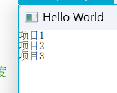
1.ListView
列表组件
ListView {
        anchors.fill: parent  // 关键点:填充窗口以获高度
        model: ["项目1", "项目2", "项目3"]	//数据
        delegate: Text { text: modelData }	//每一个元素
    }
效果图:
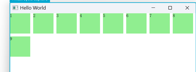
2.GridView : 网格视图
GridView {
        anchors.fill: parent
        cellWidth: 80; cellHeight: 80
        model: 9
        delegate: Rectangle {
            width: 70; height: 70
            color: "lightgreen"
            Text { text: index + 1 }
        }
    }
效果图:
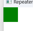
3.Repeater
重复器,根据模型创建多个项
// 横向排列 + 居中
    Row {
        anchors.centerIn: parent
        spacing: 20
		//Repeater本身不会处理布局
        Repeater {
            model: 3
            Rectangle {
                width: 100
                height: 30
                color: "lightblue"
                radius: 4  // 圆角
                Text {
                    text: "项目 " + (index + 1)
                    anchors.centerIn: parent
                }
            }
        }
    }
效果图: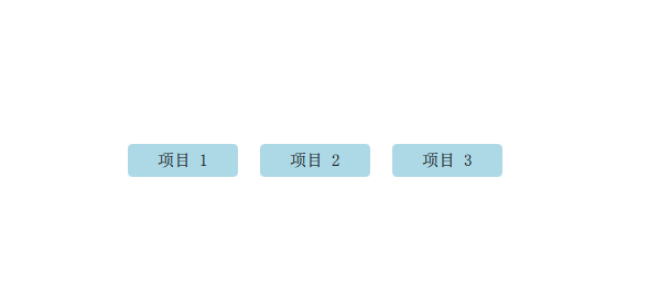
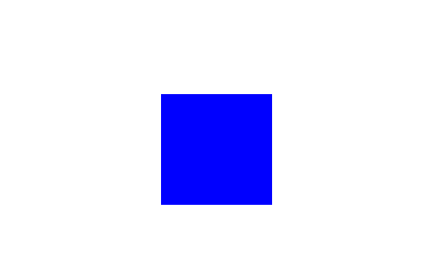
5.动态加载组件
1.loader组件
Row {
        anchors.centerIn: parent
        spacing: 20

        Loader {
            sourceComponent: Rectangle {
                width: 100; height: 100
                color: "blue"
            }
        }
    }
效果图:
2.Component
定义可重用的qml组件
Component {
        id: myComponent
        Rectangle { color: "green"; width: 50; height: 50 }
    }

    Loader { sourceComponent: myComponent }
效果图:

 浙公网安备 33010602011771号