
CSS3
HTML+CSS+JavaScript
结构 + 表现 + 交互
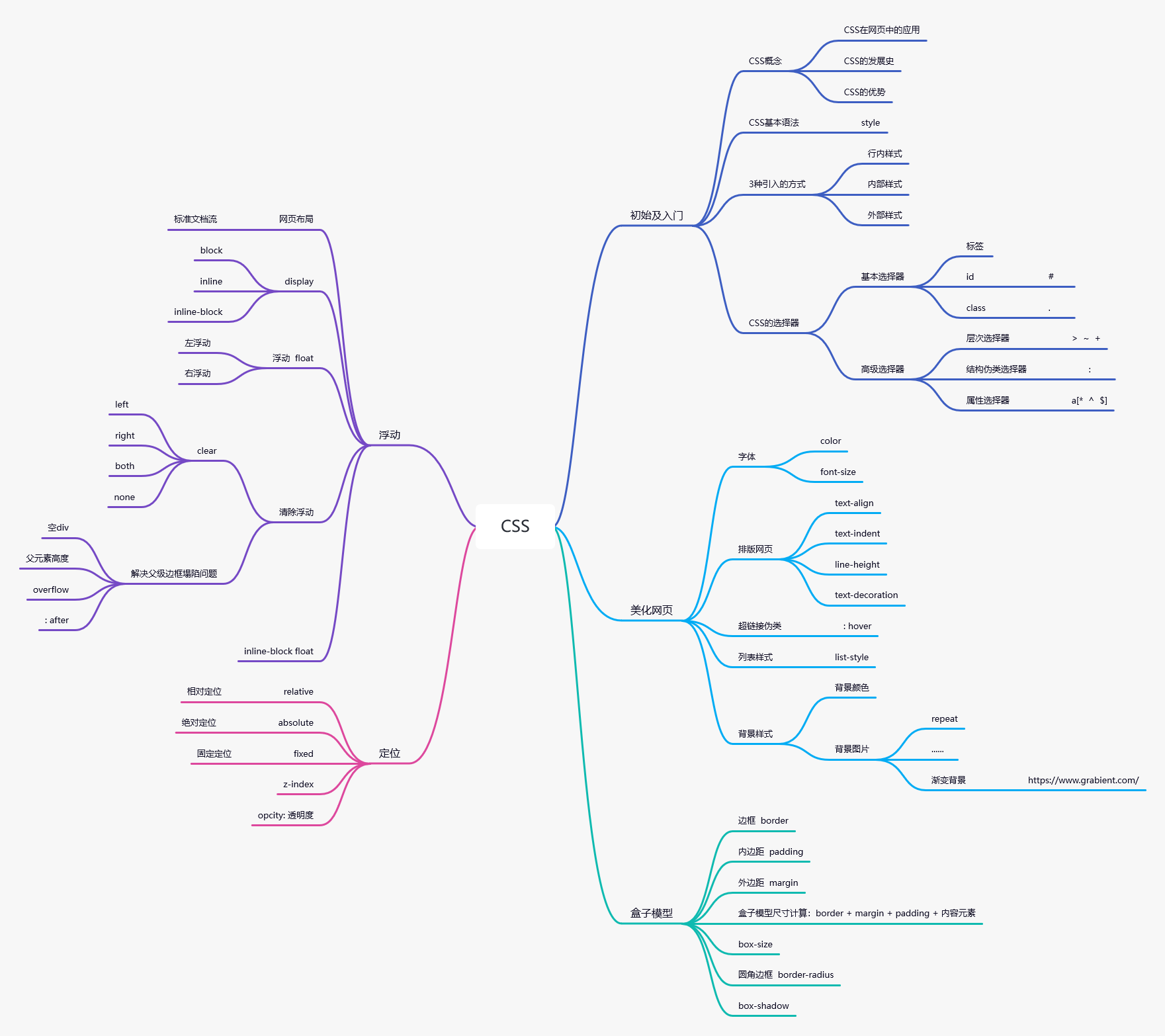
什么是CSS
如何学习
- CSS是什么
- CSS怎么样(快速入门)
- CSS选择器(重点 + 难点)
- 美化网页(文字,阴影,超链接,列表,渐变...)
- 盒子模型
- 浮动
- 定位
- 网页动画(特效效果)
什么是CSS
Cascading Style Sheet层叠级联样式表
CSS:表现(美化网页)
字体,颜色,边距,高度,宽度,背景图片,网页定位,网页浮动...
发展史
CSS1.0
CSS2.0 DIV () + CSS,HTML与CSS分离的思想,网页变得简单,SEO
CSS2.1 浮动,定位
CSS3.0 圆角,阴影,动画... 浏览器兼容性...
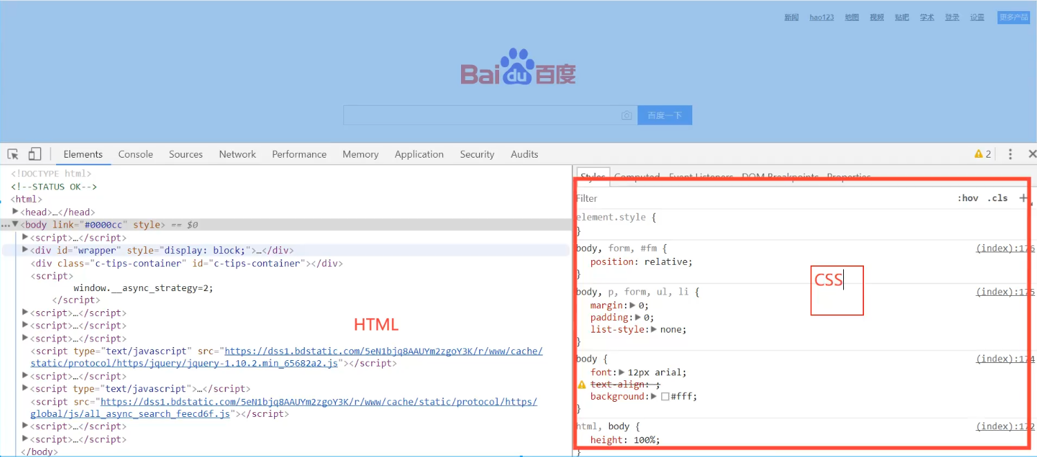
快速入门
style
基本入门
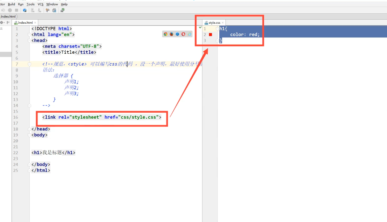
<!DOCTYPE html>
<html lang="en">
<head>
    <meta charset="UTF-8">
    <title>Title</title>

    <!-- 规范,<style> 可以编写css的代码,每一个声明,最好使用分号结尾
    语法:
        选择器{
            声明1;
            声明2;
            声明3;
        }
    -->
    <style>
        h1{
            color: red;
        }
    </style>

</head>
<body>

<h1>我是标题</h1>

</body>
</html>
建议使用这种规范
CSS的优势:
- 内容和表现分离
- 网页结构表现统一,可以实现复用
- 样式十分的丰富
- 建议使用独立于html的css文件
- 利于SEO,容易被搜索引擎收录!
CSS的三种导入方式
<!DOCTYPE html>
<html lang="en">
<head>
    <meta charset="UTF-8">
    <title>Title</title>

    <!-- 内部样式 -->
    <style>
        h1{
            color: green;
        }
    </style>

    <link rel="stylesheet" href="css/style.css">

</head>
<body>

<!-- 优先级:就近原则 -->

<!-- 行内样式,在标签元素中,编写一个style属性,编写样式即可 -->
<h1 style="color: red">我是标题</h1>

</body>
</html>
==================================
/* 外部样式 */
h1{
    color: yellow;
}
拓展:外部样式两种写法
-
链接式
<!-- 外部样式 --> <link rel="stylesheet" href="css/style.css"> -
导入式
@import是CSS2.1特有的
<!-- 导入式 -->
    <style>
        @import url("css/style.css");
    </style>
选择器
作用:选择页面上的某一个或者某一类元素
基本选择器
1、标签选择器:选择一类标签
<!DOCTYPE html>
<html lang="en">
<head>
    <meta charset="UTF-8">
    <title>Title</title>

    <style>
        /*标签选择器,会选择到页面上所有的这个标签的元素*/
        h1{
            color: red;
            background: #3cbda6;
            border-radius: 15px;
        }
        p{
            font-size: 80px;
        }
    </style>

</head>
<body>

<h1>学Java</h1>
<h1>学Java</h1>
<p>听狂神说</p>

</body>
</html>
2、类 选择器 class:选择所有class属性一致的标签,跨标签 .类名()
<!DOCTYPE html>
<html lang="en">
<head>
    <meta charset="UTF-8">
    <title>Title</title>

    <style>
        /*类选择器的格式   .class的名称{}
        好处,可以多个标签归类,是同一个class,可以复用
        */
        .qinjiang{
            color: blue;
        }
        .kuangshen{
            color: #9022d0;
        }
    </style>

</head>
<body>

<h1 class="qinjiang">标题1</h1>
<h1 class="kuangshen">标题2</h1>
<h1 class="qinjiang">标题3</h1>

<p class="qinjiang">P标签</p>

</body>
</html>
3、id 选择器:全局唯一! #id名{}
<!DOCTYPE html>
<html lang="en">
<head>
    <meta charset="UTF-8">
    <title>Title</title>

    <style>
        /* id选择器    : id必须保证全局唯一
           #id名称{}
           优先级:
           不遵循就近原则,固定的
           id 选择器 > class 选择器 > 标签选择器
        */
        #qinjiang{
            color: #fc07ca;
        }
        .style1{
            color: green;
        }
        h1{
            color: blue;
        }
    </style>

</head>
<body>

<h1 id="qinjiang" class="style1">标题1</h1>
<h1 class="style1">标题2</h1>
<h1 class="style1">标题3</h1>
<h1>标题4</h1>
<h1>标题5</h1>

</body>
</html>
优先级:id > class > 标签
层次选择器
1、后代选择器:在某个元素的后面 祖爷爷 爷爷 爸爸 你
/* 后代选择器 */
body p{
	background: red;
}
2、子选择器,一代,儿子 shift+tab(多行缩进)
/* 子选择器 */
body>p{
	background: #3cbda6;
}
3、相邻兄弟选择器 同辈
/* 相邻兄弟选择器,只有一个,相邻(向下) */
.active + p{
    background: #a13d30;
}
4、通用选择器
/* 通用兄弟选择器,当前选中元素的向下的所有兄弟元素 */
.active~p{
    background: #02ff00;
}
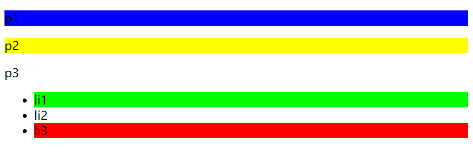
结构伪类选择器
伪类: 条件
/*ul的第一个子元素*/
ul li:first-child{
    background: #02ff00;
}

/*ul的第一个子元素*/
ul li:last-child{
    background: red;
}
/* 选中 p1 : 定位到父元素,选择当前的第一个元素
选择当前p元素的父级元素,选中父级元素的第一个,并且是当前元素才生效!
*/
p:nth-child(1){
    background: blue;
}

/*选中父元素,下的p元素的第二个,类型*/
p:nth-of-type(2){
    background: yellow;
}
<!DOCTYPE html>
<html lang="en">
<head>
    <meta charset="UTF-8">
    <title>Title</title>

    <!-- 避免使用,class,id选择器 -->
    <style>
        /*ul的第一个子元素*/
        ul li:first-child{
            background: #02ff00;
        }

        /*ul的第一个子元素*/
        ul li:last-child{
            background: red;
        }

        /* 选中 p1 : 定位到父元素,选择当前的第一个元素
        选择当前p元素的父级元素,选中父级元素的第一个,并且是当前元素才生效!
        */
        p:nth-child(1){
            background: blue;
        }

        /*选中父元素,下的p元素的第二个,类型*/
        p:nth-of-type(2){
            background: yellow;
        }

        /*a:hover{*/
        /*    background: black;*/
        /*}*/


    </style>

</head>
<body>

    <!--<a href="">31231</a>-->
    <!--<h1>h1</h1>-->
    <p>p1</p>
    <p>p2</p>
    <p>p3</p>
    <ul>
        <li>li1</li>
        <li>li2</li>
        <li>li3</li>
    </ul>

</body>
</html>
属性选择器(常用)
id + class 结合~
<!DOCTYPE html>
<html lang="en">
<head>
    <meta charset="UTF-8">
    <title>Title</title>

    <style>
        .demo a{
            float:left;
            display: block;
            height: 50px;
            width: 50px;
            border-radius: 10px;
            background: blue;
            text-align: center;
            color: grey;
            text-decoration: none;
            margin-right: 5px;
            font:bold 20px/50px Arial;
        }

        /* 属性名, 属性名 = 属性值(正则)
        = 绝对等于
        *= 包含这个元素
        ^= 以这个开头
        $= 以这个结尾        */
        /* 存在id属性的元素 a[]{} */
        /*a[id]{*/
        /*    background: yellow;*/
        /*}*/
        /* id=first的元素 */
        /*a[id=first]{*/
        /*    background: yellow;*/
        /*}*/

        /* class中有links的元素 */
        /*a[class *= "links"]{*/
        /*    background: yellow;*/
        /*}*/

        /*选中href中以http开头的元素*/
        /*a[href^=http]{*/
        /*    background: yellow;*/
        /*}*/

        a[href$=pdf]{
            background: yellow;
        }

    </style>

</head>
<body>

<p class="demo">

  <a href="http://www.baidu.com" class="links item firs" id="first">1</a>
  <a href="http://blog.kuangstudy.com" class="links item active" target="_blank" title="test">2</a>
  <a href="images/123.html" class="links item">3</a>
  <a href="images/123.png" class="links item">4</a>
  <a href="images/123.jpg" class="links item">5</a>
  <a href="abc" class="links item">6</a>
  <a href="/a.pdf" class="links item">7</a>
  <a href="/abc.pdf" class="links item">8</a>
  <a href="abc.doc" class="links item">9</a>
  <a href="abcd.doc" class="links item last">10</a>

</p>

</body>
</html>
=
*=
^=
$=
CSS,JS,JQuery,Vue常用
美化网页元素
为什么要美化网页
1、有效的传递页面信息
2、美化网页,页面漂亮才能吸引用户
3、凸显页面的主题
4、提高用户的体验
span标签:重点要突出的字,使用span标签套起来
<!DOCTYPE html>
<html lang="en">
<head>
    <meta charset="UTF-8">
    <title>Title</title>

    <style>
        #title1{
            font-size: 50px;
        }
    </style>

</head>
<body>

欢迎学习 <span id="title1">Java</span>

</body>
</html>
字体样式
<!--
font-family: 字体
font-size: 字体大小
font-weight: 字体粗细
color: 字体颜色

-->

<style>
    body{
        font-family: "Arial Black",楷体;
        color: #a13d30;
    }
    h1{
        font-size: 50px;
    }
    .p1{
        font-weight: lighter;
    }
</style>
文本样式
1、颜色 color rgb rgba
2、文本对齐的方式 text-align = center
3、首行缩进 text-indent: 2em
4、行高 line-height: 单行文字上下居中! line-height = height
5、装饰 text-decoration
6、文本图片水平对齐: vertical-align: middle
<!DOCTYPE html>
<html lang="en">
<head>
    <meta charset="UTF-8">
    <title>Title</title>

    <!--
    颜色:
        单词
        RGB  0~F
        RGBA  A: 0~1

    text-align : 排版,居中
    text-indent : 2em;  段落首行缩进
    height : 300px
    line-height : 300px
    行高,和 块的高度一致,就可以上下居中
    -->

    <style>
        h1{
            color: rgba(0,255,255,0.9);
            text-align: center;
        }
        .p1{
            text-indent: 2em;
        }
        .p3{
            background: blue;
            height: 300px;
            line-height: 300px;
        }
        /*下划线*/
        .l1{
            text-decoration: underline;
        }
        /*中划线*/
        .l2{
            text-decoration: line-through;
        }
        /*上划线*/
        .l3{
            text-decoration: overline;
        }
        /*超链接去下划线*/
        a{
            text-decoration: none;
        }

        /*
        水平对齐~ 参照物  a,b
        */
         img,span{
             vertical-align: middle;
         }
    </style>

</head>
<body>

<a href="">123</a>

<p class="l1">1231231</p>
<p class="l2">1231231</p>
<p class="l3">1231231</p>

<h1>故事介绍</h1>

<p class="p1">
    这个世界名为元泱境界,脉(本质为振动)是构成万物的基础。每隔333年,会有一个神秘而强大的异常生物重生,它就是魁拔!魁拔的每一次出现,都会给元泱境界带来巨大的灾难!即便是天界的神族,也在劫难逃。在天地两界各种力量的全力打击下,魁拔一次次被消灭,但又总是按333年的周期重新出现。魁拔纪元1664年,天神经过精确测算后,在魁拔苏醒前一刻对其进行毁灭性打击。但谁都没有想到,由于一个差错导致新一代魁拔成功地逃脱了致命一击。很快,天界魁拔司和地界神圣联盟均探测到了魁拔依然生还的迹象。因此,找到魁拔,彻底消灭魁拔,再一次成了各地热血勇士的终极目标。
</p>

<p>
    在偏远的兽国窝窝乡,蛮大人和蛮吉每天为取得象征成功和光荣的妖侠纹耀而刻苦修炼,却把他们生活的村庄搅得鸡犬不宁。村民们绞尽脑汁把他们赶走。一天,消灭魁拔的征兵令突然传到窝窝乡,村长趁机怂恿蛮大人和蛮吉从军参战。然而,在这个一切都凭纹耀说话的世界,仅凭蛮大人现有的一块冒牌纹耀,不要说参军,就连住店的资格都没有。受尽歧视的蛮吉和蛮大人决定,混上那艘即将启程去消灭魁拔的巨型战舰,直接挑战魁拔,用热血换取至高的荣誉。
</p>

<p class="p3">
    Since there’s no help, come let us kiss and part;Nay, I have done, you get no more of me,And I am glad, yea glad with all my heartThat thus so cleanly I myself can free;Shake hands forever, cancel all our vows,And when we meet at any time again,Be it not seen in either of our browsThat we one jot of former love retain.Now at the last gasp of Love’s latest breath,When, his pulse failing, Passion speechless lies,When Faith is kneeling by his bed of death,And Innocence is closing up his eyes,Now if thou wouldst, when all have given him over,From death to life thou mightst him yet recover.
</p>

<p>
    <img src="images/a.png" alt="">
    <span>dsjlfajdlsahgs</span>

</p>

</body>
</html>
阴影
/*text-shadow:阴影颜色,水平偏移,垂直偏移,阴影半径*/
#price{
    text-shadow: #00eaff 10px 10px 2px;

}
超链接伪类
正常情况下,a,a: hover
/*默认的颜色*/
a{
    text-decoration: none;
    color: black;
}
/*鼠标悬浮的颜色 (只需要记住:hover)*/
a:hover{
    color: orange;
    font-size: 50px;
}
列表
#nav{
    width: 300px;
}
h2{
    font-size: 18px;
    font-weight:bold;
    text-indent: 1em;
    line-height: 30px;
    background: red;
}
/*ul li*/
/*
list-style:
none  去掉圆点
circle  空心圆
decimal  数字
square  正方形
*/
ul{
    background: grey;
}
ul li{
    height: 30px;
    list-style: none;
    text-indent: 1em;
}
a{
    text-decoration: none;
    font-size: 14px;
    color: black;
}
a:hover{
    color: orange;
    text-decoration: underline;
}
<!DOCTYPE html>
<html>
<head lang="en">
<meta charset="UTF-8">
<title>列表样式</title>
<link rel="stylesheet" href="css/style.css" type="text/css"/>
</head>
<body>
<div id="nav">
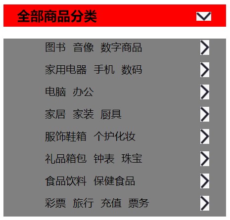
<h2 class="title">全部商品分类</h2>
<ul>
<li><a href="#">图书</a> <a href="#">音像</a> <a href="#">数字商品</a></li>
<li><a href="#">家用电器</a> <a href="#">手机</a> <a href="#">数码</a></li>
<li><a href="#">电脑</a> <a href="#">办公</a></li>
<li><a href="#">家居</a> <a href="#">家装</a> <a href="#">厨具</a></li>
<li><a href="#">服饰鞋箱</a> <a href="#">个护化妆</a></li>
<li><a href="#">礼品箱包</a> <a href="#">钟表</a> <a href="#">珠宝</a></li>
<li><a href="#">食品饮料</a> <a href="#">保健食品</a></li>
<li><a href="#">彩票</a> <a href="#">旅行</a> <a href="#">充值</a> <a href="#">票务</a></li>
</ul>
</div>
</body>
</html>
背景
背景颜色
背景图片
<style>
        div{
            width: 1000px;
            height: 700px;
            border: 1px solid red;
            background-image: url("images/tx.jpg");
            /*默认是全部平铺的 repeat*/
        }
        .div1{
            background-repeat: repeat-x;
        }
        .div2{
            background-repeat: repeat-y;
        }
        .div3{
            background-repeat: no-repeat;
        }
    </style>
练习:
#nav{
    width: 300px;
}
h2{
    font-size: 18px;
    font-weight:bold;
    text-indent: 1em;
    line-height: 30px;
    /* 颜色,图片,图片位置,平铺方式 */
    background: red url("../images/d.jpg") 260px 10px no-repeat;
}
/*ul li*/
/*
list-style:
none  去掉圆点
circle  空心圆
decimal  数字
square  正方形
*/
ul{
    background: grey;
}
ul li{
    height: 30px;
    list-style: none;
    text-indent: 1em;
    background-image: url("../images/r.jpg");
    background-repeat: no-repeat;
    background-position: 225px 2px;
}
a{
    text-decoration: none;
    font-size: 14px;
    color: black;
}
a:hover{
    color: orange;
    text-decoration: underline;
}
渐变
background-color: #4158D0;
background-image: linear-gradient(43deg, #4158D0 0%, #C850C0 46%, #FFCC70 100%);
盒子模型
什么是盒子模型

margin:外边距
padding:内边距
border:边框
边框
1、边框的粗细
2、边框的样式
3、边框的颜色
<!DOCTYPE html>
<html lang="en">
<head>
    <meta charset="UTF-8">
    <title>Title</title>

    <style>
        /*body总有一个默认的外边距margin:0,常见操作*/
        /*h1,ul,li,a,body{*/
        /*    margin: 0;*/
        /*    padding: 0;*/
        /*}*/
        /*border: 粗细,样式,颜色*/
        #box{
            width: 300px;
            border: 1px solid red;  /*边框*/
        }
        h2{
            font-size: 16px;
            background-color: #3cbda6;
            line-height: 30px;
            color: white;
        }

        form{
            background: #3cbda6;
        }

        div:nth-of-type(1)>input{
            border: 3px solid black;  /*边框*/
        }
        div:nth-of-type(2) input{
            border: 3px dashed powderblue;  /*边框*/
        }
        div:nth-of-type(3) input{
            border: 2px dashed darkgreen;  /*边框*/
        }

    </style>

</head>
<body>

<div id="box">
    <h2>会员登录</h2>
    <form action="#">
        <div>
            <span>用户名:</span>
            <input type="text">
        </div>
        <div>
            <span>密码:</span>
            <input type="text">
        </div>
        <div>
            <span>邮箱:</span>
            <input type="text">
        </div>
    </form>
</div>

</body>
</html>
内外边距
<!DOCTYPE html>
<html lang="en">
<head>
  <meta charset="UTF-8">
  <title>Title</title>

  <!-- 外边距的妙用:居中元素
  margin: 0 auto;
  -->
  <style>

    #box{
      width: 300px;
      border: 1px solid red;  /*边框*/
      margin: 0 auto;
    }
    /*
    顺时针旋转
    margin:0  上下左右
    margin:0 1px  上下  左右
    margin:0 1px 2px 3px  上 左 下 右*/
    h2{
      font-size: 16px;
      background-color: #3cbda6;
      line-height: 30px;
      color: white;
      margin: 0 1px;
    }

    form{
      background: #3cbda6;
    }
    input{
      border: 1px solid black;
    }
    div:nth-of-type(1){
      padding: 10px 2px;
    }
  </style>

</head>
<body>

<div id="box">
  <h2>会员登录</h2>
  <form action="#">
    <div>
      <span>用户名:</span>
      <input type="text">
    </div>
    <div>
      <span>密码:</span>
      <input type="text">
    </div>
    <div>
      <span>邮箱:</span>
      <input type="text">
    </div>
  </form>
</div>

</body>
</html>
盒子的计算方式:你这个元素到底多大?
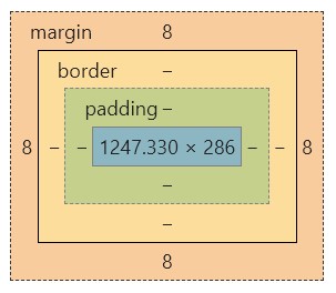
margin + border + padding + 内容宽度
圆角边框
4个角
<style>
div{
    width: 100px;
    height: 100px;
    border: 10px solid red;
    border-radius: 50px;
}
</style>
阴影
<!DOCTYPE html>
<html lang="en">
<head>
    <meta charset="UTF-8">
    <title>Title</title>

<!--margin: 0 auto;  居中-->
<!--要求:  块元素,块元素有固定的宽度-->

    <style>
        img{
            margin: 0 auto;
            border-radius: 10px;
            box-shadow: 10px 10px 1px yellow;
        }
    </style>

</head>
<body>

<div style="width: 500px;text-align: center;">
    <img src="images/a.png" alt="">
</div>

</body>
</html>
浮动
标准文档流
快级元素:独占一行
h1~h6 p div 列表...
行内元素:不独占一行
span a img strong...
行内元素 可以被包含在块级元素中,反之,则不可以~
display
<!--
block 块元素
inline  行内元素
inline-block  行内块元素
none
-->

<style>
    div{
        width: 100px;
        height: 100px;
        border: 1px solid red;
        display: inline;
    }
    span{
        width: 100px;
        height: 100px;
        border: 1px solid red;
        display: inline-block;
    }
</style>
1、这个也是一种实现行内元素排列的方式,但是我们很多情况都是用float
float
1、左右浮动 float
div {
    margin: 10px;
    padding: 5px;
}
#father {
    border:1px #000 solid;
}
.layer01 {
    border:1px #F00 dashed;
    display: inline-block;
    float: right;
}
.layer02 {
    border:1px #00F dashed;
    display: inline-block;
    float: right;
}
.layer03 {
    border:1px #060 dashed;
    display: inline-block;
    float: right;
}
.layer04 {
    border:1px #666 dashed;
    font-size: 12px;
    line-height: 23px;
    display: inline-block;
    float: right;
}
父级边框塌陷的问题
clear
/*
clear: right; 右侧不允许有浮动元素
clear: left; 左侧不允许有浮动元素
clear: both; 两侧不允许有浮动元素
clear: none;
*/
解决方案:
1、增加父级元素的高度~
#father {
    border:1px #000 solid;
    height: 800px;
}
2、增加一个空的div标签,清除浮动
<div class="clear"></div>

.clear{
    clear: both;
    margin: 0;
    padding: 0;
}
3、overflow hidden、scroll
在父级元素中增加一个 overflow: hidden;
4、父类添加一个伪类:after
#father:after{
	content: '';
	display: block;
	clear: both;
}
小结:
-
浮动元素后面增加空的div
简单,代码中尽量避免空div
-
设置父元素的高度
简单,元素假设有了固定的高度,就会被限制
-
overflow
简单,下拉的一些场景避免使用
-
父类添加一个伪类:after(推荐)
写法稍微复杂一点,但是没有副作用,推荐使用!
对比
-
display
方向不可以控制
-
float
浮动起来的话会脱离标准文档流,所以要解决父级边框塌陷的问题~
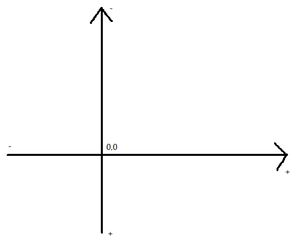
定位
相对定位
<!DOCTYPE html>
<html lang="en">
<head>
  <meta charset="UTF-8">
  <title>Title</title>

  <!-- 相对定位 -->
  <!-- 相对于自己原来的位置进行偏移 -->
  <style>
    body{
      padding: 20px;
    }
    div{
      margin: 10px;
      padding: 5px;
      font-size: 12px;
      line-height: 25px;
    }
    #father{
      border: 1px solid #666666;
      padding: 0;
    }
    #first{
      background-color: #03bb26;
      border: 1px dashed darkgreen;
      position: relative; /*相对定位:上下左右*/
      top: -20px;
      left: 20px;
    }
    #second{
      background-color: #9022d0;
      border: 1px dashed rebeccapurple;
    }
    #third{
      background-color: #ff6d0a;
      border: 1px dashed peru;
      position: relative;
      bottom: -10px;
      right: 20px;
    }
  </style>

</head>
<body>

<div id="father">
  <div id="first">第一个盒子</div>
  <div id="second">第二个盒子</div>
  <div id="third">第三个盒子</div>
</div>

</body>
</html>
相对定位:position:relative;
相对于原来的位置,进行指定的偏移,相对定位的话,它仍然在标准文档流中,原来的位置会被保留
top: -20px;
left: 20px;
bottom: -10px;
right: 20px;
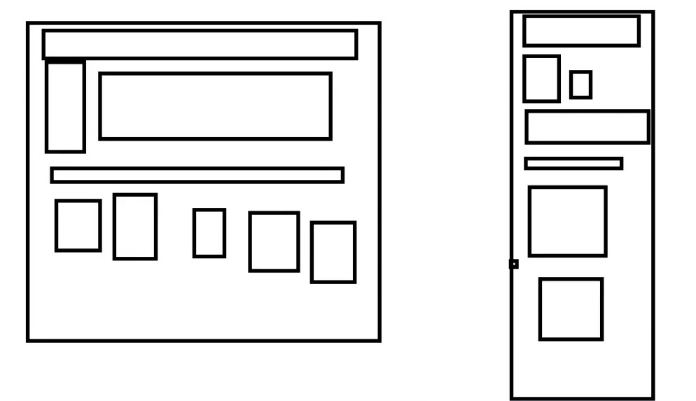
练习
使用CSS绘制如下图形
<!DOCTYPE html>
<html lang="en">
<head>
    <meta charset="UTF-8">
    <title>Title</title>

    <style>
        #father{
            height: 300px;
            width: 300px;
            padding: 10px;
            border: 5px solid red;
        }
        a{
            display: block;
            background-color: #fc07ca;
            height: 100px;
            width: 100px;
            line-height: 100px;
            text-align: center;
            text-decoration: none;
        }
        .a2,.a4{
            position: relative;
            top: -100px;
            left: 200px;
        }
        .a5{
            position: relative;
            left: 100px;
            top: -300px;
        }
        a:hover{
            background-color: #0e82ff;
        }
    </style>

</head>
<body>

<div id="father">
    <a class="a1" href="#">链接一</a>
    <a class="a2" href="#">链接二</a>
    <a class="a3" href="#">链接三</a>
    <a class="a4" href="#">链接四</a>
    <a class="a5" href="#">链接五</a>
</div>

</body>
</html>
绝对定位
定位:基于xxx定位,上下左右
1、没有父级元素定位的前提下,相对于浏览器定位
2、假设父级元素存在定位,我们通常会相对于父级元素进行偏移~
3、在父级元素范围内移动
相对于父级或者浏览器的位置,进行指定的偏移,绝对定位的话,它不在标准文档流中,原来的位置不会被保留
<!DOCTYPE html>
<html lang="en">
<head>
  <meta charset="UTF-8">
  <title>Title</title>

  <style>
    div{
      margin: 10px;
      padding: 5px;
      font-size: 12px;
      line-height: 25px;
    }
    #father{
      border: 1px solid #666666;
      padding: 0;
      position: relative;
    }
    #first{
      background-color: #03bb26;
      border: 1px dashed darkgreen;
    }
    #second{
      background-color: #9022d0;
      border: 1px dashed rebeccapurple;
      position: absolute;
      right: 30px;
      top: -10px;
    }
    #third{
      background-color: #ff6d0a;
      border: 1px dashed peru;
    }
  </style>

</head>
<body>

<div id="father">
  <div id="first">第一个盒子</div>
  <div id="second">第二个盒子</div>
  <div id="third">第三个盒子</div>
</div>

</body>
</html>
固定定位 fixed
<!DOCTYPE html>
<html lang="en">
<head>
    <meta charset="UTF-8">
    <title>Title</title>

    <style>
        body{
            height: 1000px;
        }
        div:nth-of-type(1){ /*绝对定位:相对于浏览器*/
            width: 100px;
            height: 100px;
            background-color: red;
            position: absolute;
            right: 0;
            bottom: 0;
        }
        div:nth-of-type(2){ /*fixed,固定定位*/
            width: 50px;
            height: 50px;
            background-color: yellow;
            position: fixed;
            right: 0;
            bottom: 0;
        }
    </style>

</head>
<body>

<div>div1</div>
<div>div2</div>

</body>
</html>
z-index
图层~
z-index:默认是0,最高无限~ 999
值越大,越靠前
<!DOCTYPE html>
<html lang="en">
<head>
    <meta charset="UTF-8">
    <title>Title</title>

    <link rel="stylesheet" href="css/style.css">

</head>
<body>

<div id="content">
    <ul>
        <li><img src="images/bg.jpg" alt=""></li>
        <li class="tipText">学习微服务,找狂神</li>
        <li class="tipBg"></li>
        <li>时间:2099-01-01</li>
        <li>地点:月球一号基地</li>
    </ul>
</div>

</body>
</html>
opacity:0.5;/背景透明度/
#content{
    width: 640px;
    padding: 0;
    margin: 0;
    overflow: hidden;
    font-size: 12px;
    line-height: 25px;
    border: 1px #000000 solid;
}
ul,li{
    padding: 0px;
    margin: 0px;
    list-style: none;
}
/*父级元素相对定位*/
#content ul{
    position: relative;
}
.tipText,.tipBg{
    position: absolute;
    width: 640px;
    height: 25px;
    top: 375px;
}
.tipText{
    color: white;
    z-index: 0;
}
.tipBg{
    background-color: black;
    opacity: 0.5; /*背景透明度*/
    /*filter: alpha(opacity=50); IE8之前使用*/
}
总结

 浙公网安备 33010602011771号