

css如何实现气泡框上的箭头
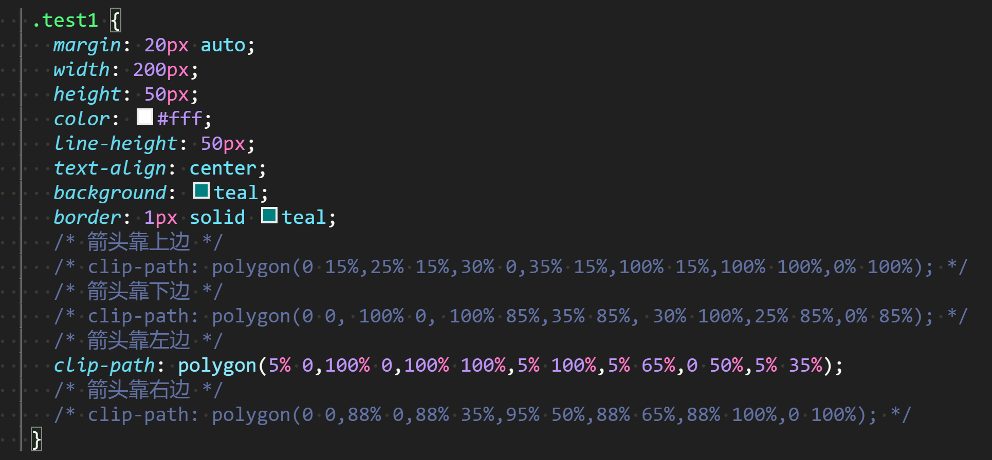
1:clip-path: polygon(...);

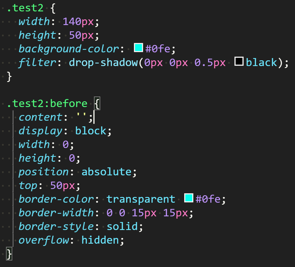
2:filter: drop-shadow(...);
点击查看全部代码
<!DOCTYPE html>
<html lang="en">
<head>
<meta charset="UTF-8" />
<meta http-equiv="X-UA-Compatible" content="IE=edge" />
<meta name="viewport" content="width=device-width, initial-scale=1.0" />
<title>Document</title>
<style>
.test1 {
margin: 20px auto;
width: 200px;
height: 50px;
color: #fff;
line-height: 50px;
text-align: center;
background: teal;
border: 1px solid teal;
/* 箭头靠上边 */
/* clip-path: polygon(0 15%,25% 15%,30% 0,35% 15%,100% 15%,100% 100%,0% 100%); */
/* 箭头靠下边 */
/* clip-path: polygon(0 0, 100% 0, 100% 85%,35% 85%, 30% 100%,25% 85%,0% 85%); */
/* 箭头靠左边 */
clip-path: polygon(
5% 0,
100% 0,
100% 100%,
5% 100%,
5% 65%,
0 50%,
5% 35%
);
/* 箭头靠右边 */
/* clip-path: polygon(0 0,88% 0,88% 35%,95% 50%,88% 65%,88% 100%,0 100%); */
}
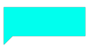
.test2 {
width: 140px;
height: 50px;
background-color: #0fe;
filter: drop-shadow(0px 0px 0.5px black);
}
.test2:before {
content: '';
display: block;
width: 0;
height: 0;
position: absolute;
top: 50px;
border-color: transparent #0fe;
border-width: 0 0 15px 15px;
border-style: solid;
overflow: hidden;
}
/* */
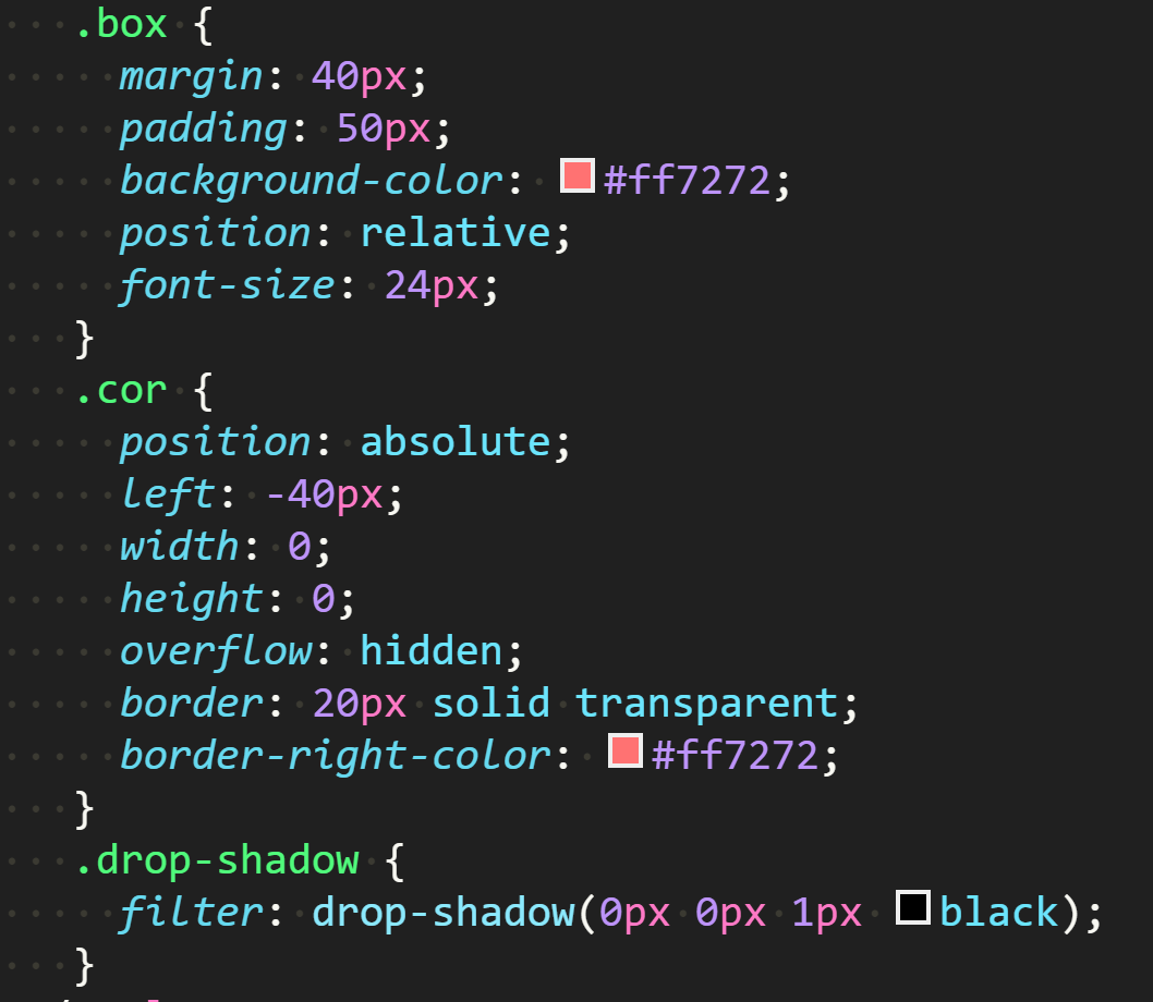
.box {
margin: 40px;
padding: 50px;
background-color: #ff7272;
position: relative;
font-size: 24px;
}
.cor {
position: absolute;
left: -40px;
width: 0;
height: 0;
overflow: hidden;
border: 20px solid transparent;
border-right-color: #ff7272;
}
.drop-shadow {
filter: drop-shadow(0px 0px 1px black);
}
</style>
</head>
<body>
<div class="test1"></div>
<div class="test2"></div>
<div class="box drop-shadow">
<i class="cor"></i>
filter: drop-shadow
</div>
</body>
</html>

 浙公网安备 33010602011771号