Matplotlib.pyplot 二维绘图
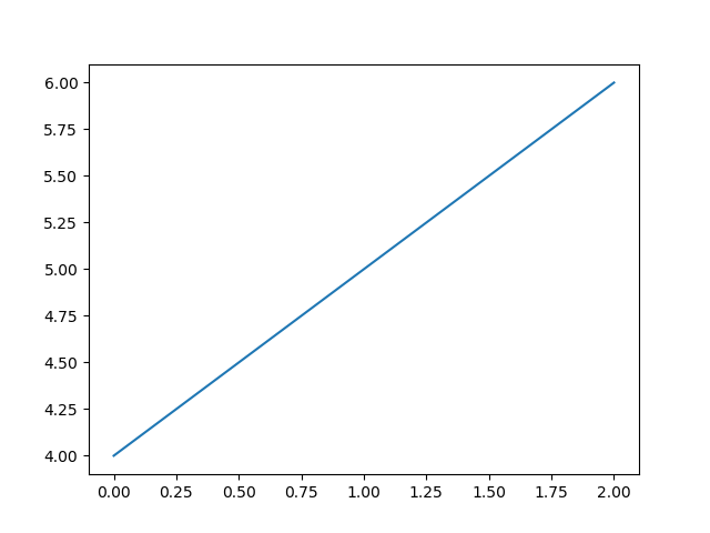
例1:缺参补全
import matplotlib.pyplot as plt

plt.plot([5, 6, 8, 10])
plt.ylabel('some numbers')
plt.show()
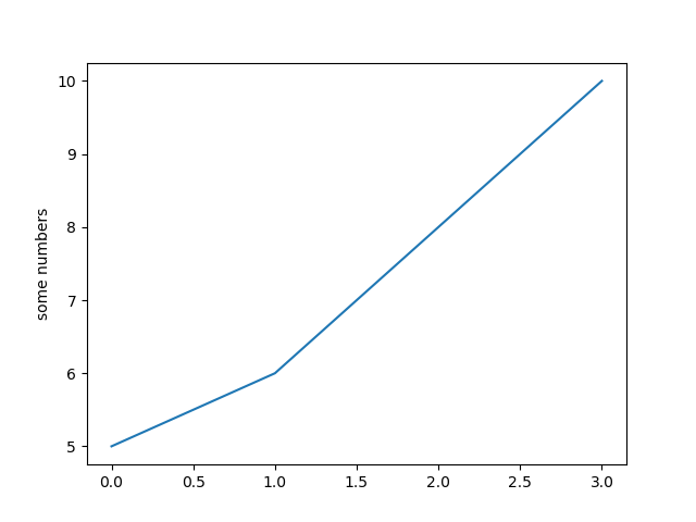
你会很好奇,为什么x轴范围在0-3而y轴的范围在5-10。因为如果你仅仅只提供一个列表给plot()命令,matplotlib
会默认这是y值,再按照len(y)=4,即y的长度给x从0开始分配相应长度的列表[0,1,2,3]。
例2.给定坐标轴范围
import matplotlib.pyplot as plt

plt.plot([1, 2, 3, 4], [1, 4, 9, 16], 'ro')
plt.axis([0, 6, 0, 20])
plt.show()
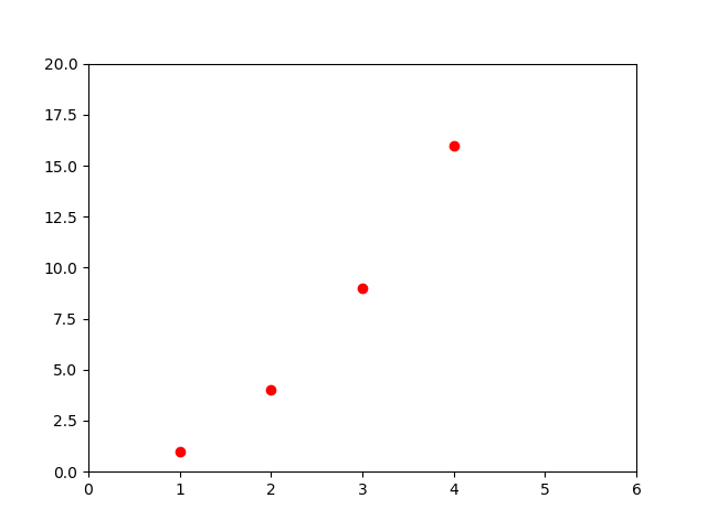
plot()命令中参数'ro'表示红色的实心圆点
axis()命令即给定x,y轴的范围
例3.与numpy中array的配合
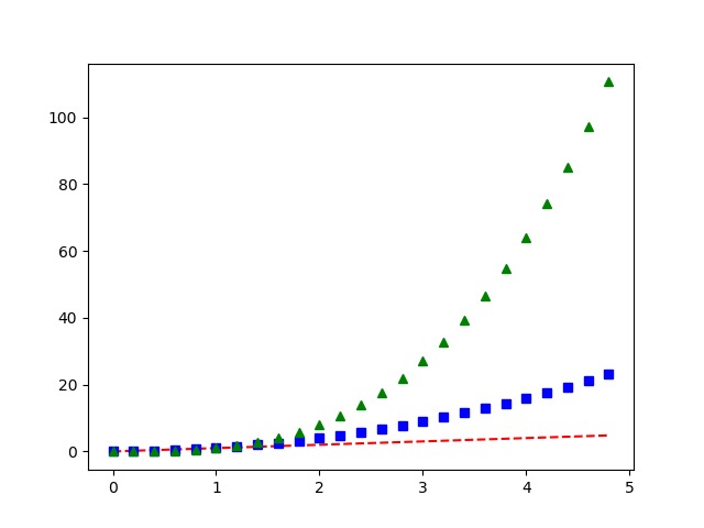
import numpy as np
import matplotlib.pyplot as plt

t = np.arange(0., 5., 0.2)
# [0.  0.2 0.4 0.6 0.8 1.  1.2 1.4 1.6 1.8 2.  2.2 2.4 2.6 2.8 3.  3.2 3.4 3.6 3.8 4.  4.2 4.4 4.6 4.8]

# red的--, blue的方框 and green的尖尖
plt.plot(t, t, 'r--', t, t ** 2, 'bs', t, t ** 3, 'g^')
plt.show()
例4:控制线的属性
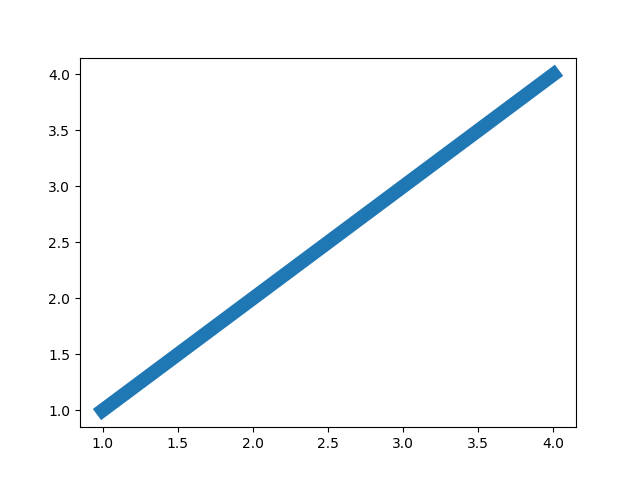
1.线的粗细
import matplotlib.pyplot as plt

plt.plot([1, 2, 3, 4], [1, 2, 3, 4], linewidth=10)
plt.show()
2.抗锯齿
import matplotlib.pyplot as plt

line, = plt.plot([1, 2, 3, 4], [1, 2, 3, 4], '-')
line.set_antialiased(False)  # 关闭抗锯齿
plt.show()
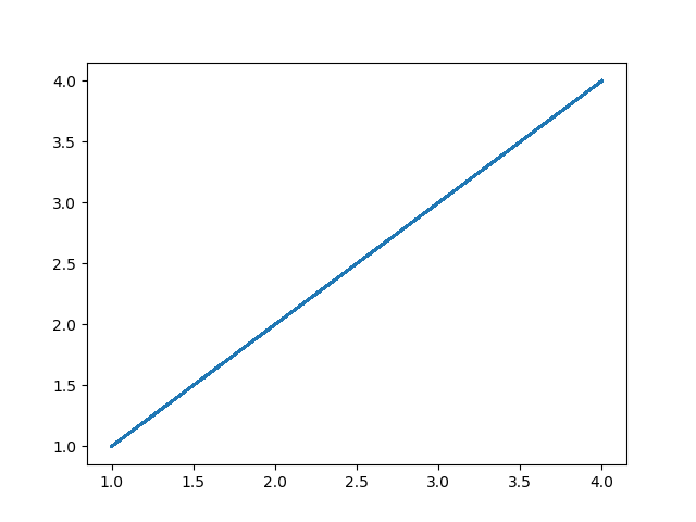
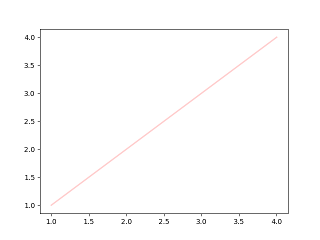
3.设置多属性
import matplotlib.pyplot as plt

lines = plt.plot([1, 2, 3, 4], [1, 2, 3, 4])
# 同时设置线的多个属性
plt.setp(lines, color='r', linewidth=2.0, alpha=0.2)

plt.show()
属性大全:
| Property | Value Type |
|---|---|
| alpha | float |
| animated | [True | False] |
| antialiased or aa | [True | False] |
| clip_box | a matplotlib.transform.Bbox instance |
| clip_on | [True | False] |
| clip_path | a Path instance and a Transform instance, a Patch |
| color or c | any matplotlib color |
| contains | the hit testing function |
| dash_capstyle | ['butt' | 'round' | 'projecting'] |
| dash_joinstyle | ['miter' | 'round' | 'bevel'] |
| dashes | sequence of on/off ink in points |
| data | (np.array xdata, np.array ydata) |
| figure | a matplotlib.figure.Figure instance |
| label | any string |
| linestyle or ls | [ '-' | '--' | '-.' | ':' | 'steps' | ...] |
| linewidth or lw | float value in points |
| lod | [True | False] |
| marker | [ '+' | ',' | '.' | '1' | '2' | '3' | '4' ] |
| markeredgecolor or mec | any matplotlib color |
| markeredgewidth or mew | float value in points |
| markerfacecolor or mfc | any matplotlib color |
| markersize or ms | float |
| markevery | [ None | integer | (startind, stride) ] |
| picker | used in interactive line selection |
| pickradius | the line pick selection radius |
| solid_capstyle | ['butt' | 'round' | 'projecting'] |
| solid_joinstyle | ['miter' | 'round' | 'bevel'] |
| transform | a matplotlib.transforms.Transform instance |
| visible | [True | False] |
| xdata | np.array |
| ydata | np.array |
| zorder | any number |
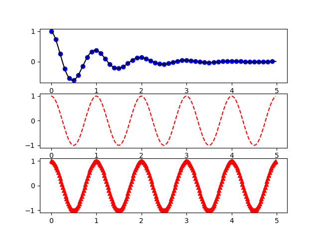
例5:多图
1.图中多图
import numpy as np
import matplotlib.pyplot as plt


def f(t):
    return np.exp(-t) * np.cos(2 * np.pi * t)


t1 = np.arange(0.0, 5.0, 0.1)
t2 = np.arange(0.0, 5.0, 0.02)

plt.figure(1)
plt.subplot(311)
plt.plot(t1, f(t1), 'bo', t2, f(t2), 'k')

plt.subplot(312)
plt.plot(t2, np.cos(2 * np.pi * t2), 'r--')

plt.subplot(313)
plt.plot(t2, np.cos(2 * np.pi * t2), 'r^')
plt.show()
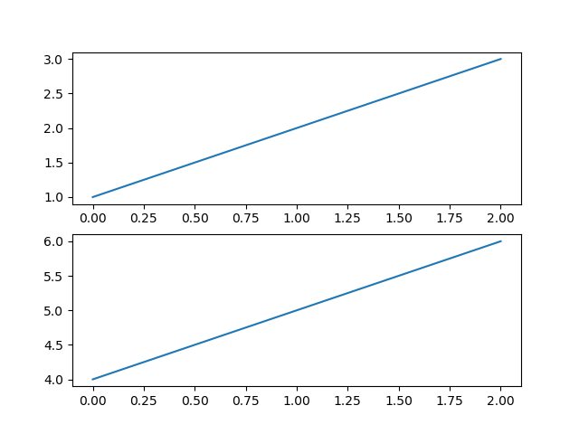
2.多图齐出
import matplotlib.pyplot as plt

plt.figure(1)  # the first figure
plt.subplot(211)  # the first subplot in the first figure
plt.plot([1, 2, 3])
plt.subplot(212)  # the second subplot in the first figure
plt.plot([4, 5, 6])

plt.figure(2)  # a second figure
plt.plot([4, 5, 6])  # creates a subplot(111) by default

plt.show()
例6:图中插字
import numpy as np
import matplotlib.pyplot as plt

# Fixing random state for reproducibility
np.random.seed(19680801)

mu, sigma = 100, 15
x = mu + sigma * np.random.randn(10000)

# the histogram of the data
n, bins, patches = plt.hist(x, 50, normed=1, facecolor='g', alpha=0.75)

t = plt.xlabel('my data', fontsize=14, color='red')
plt.ylabel('Probability')
plt.title('Histogram of IQ')
plt.text(60, .025, r'$\mu=100,\ \sigma=15$')
plt.axis([40, 160, 0, 0.03])
plt.grid(True)
plt.show()
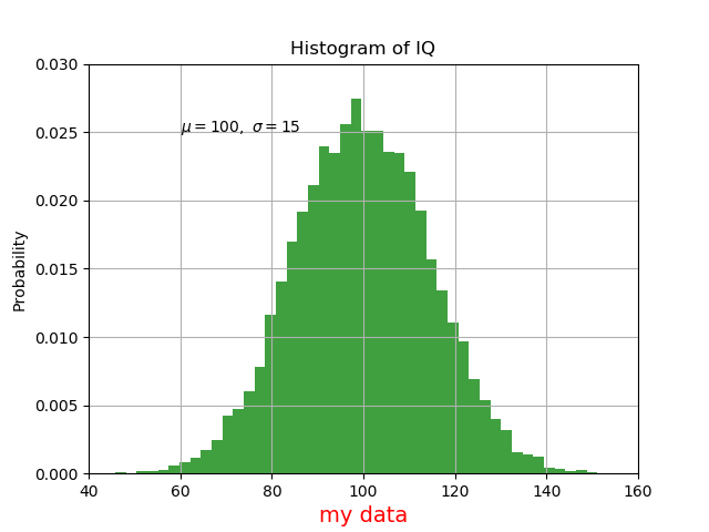
1.使用数学表达式
plt.title(r'$\sigma_i=15$')
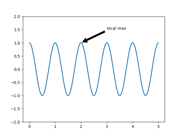
2.注释语
import numpy as np
import matplotlib.pyplot as plt

ax = plt.subplot(111)

t = np.arange(0.0, 5.0, 0.01)
s = np.cos(2 * np.pi * t)
line, = plt.plot(t, s, lw=2)

plt.annotate('local max', xy=(2, 1), xytext=(3, 1.5),
             arrowprops=dict(facecolor='black', shrink=0.05),
             )

plt.ylim(-2, 2)
plt.show()

 浙公网安备 33010602011771号