

分步骤详解圣杯布局和双飞翼布局【主要通过float实现】
目前,圣杯布局和双飞翼布局使用flex布局都很容易实现,但是用float来实现还是比较难的事情。我之前为了学习这两个布局也看了很多篇博文,但是这些博文都是直接给出实现代码,自己只能通过复制粘贴来完成。我写这篇博文主要通过分步骤实现圣杯布局和双飞翼布局,来进一步加深自己对于float、margin负值的理解。
接下来将分步骤详细讲解圣杯布局和双飞翼布局。
分步骤详解圣杯布局
首先,我们先在编辑器内写入简单的圣杯布局的结构代码,如下:
<body>
  <div id="header">this is header</div>
  <div id="container">
    <div id="center">center</div>
	<div id="left">left</div>
	<div id="right">right</div>
  </div>
  <div id="footer">this is footer</div>
</body>
同时为div设置简单的样式,让其有明显的演示效果
<style type="text/css">
	body{
		min-width: 550px;
	}
	#header{
		width: 100%;
		background-color: aliceblue;
	}
	#footer{
		width: 100%;
		background-color: aliceblue;
	}
	#container{
	}
	#center{
		width: 100%;
		background-color: aqua;
	}
	#left{
		width: 150px;
		background-color: bisque;
	}
	#right{
		width: 200px;
		background-color: beige;
	}
</style>
之后我们通过网页打开该项目,可以看到中间的三栏分成了三行:
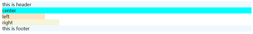
显然这不是我们想要的结果,这时我们需要对其进行样式修改,主要分为了5个步骤:
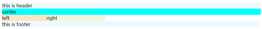
步骤一:为container内的每个子元素添加float:left的属性
<style>
	#container .column{
		float: left;
	}
</style>
<body>
  <div id="header">this is header</div>
  <div id="container">
    <div id="center" class="column">center</div>
	<div id="left" class="column">left</div>
	<div id="right" class="column">right</div>
  </div>
  <div id="footer">this is footer</div>
</body>
其结果如下:

但在这时我们发现 footer 也浮动到了上面,因此我们需要对其进行清除浮动操作;
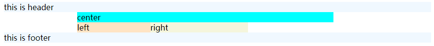
步骤二:为#footer添加clear: both
其结果如下:
可以看到footer到了下面;
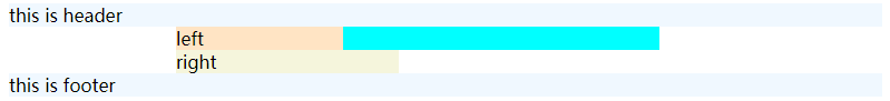
步骤三:将container设置padding/margin,为left和right腾出位置
#container{
	padding-left: 150px;
	padding-right: 200px;
}
其结果如下:
步骤四:将left移动到center左侧的空位上
- 为
#left添加margin-left: -100%;样式,其结果如下:
![image]()
此时,left移动到了与center左侧重合的位置,但这里仍不是我们期望的位置; - 再 为
#left添加position: relative; right: 150px;样式,其结果如下:
![image]()
这时,left就移动到了想要的位置。这一步的意思是,left相对于自身与右侧撑开150px【自身的长度】;
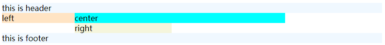
步骤五:将right移动到center右侧的空位上
为right添加margin-right: -200px;样式,其结果如下:

分步骤详解双飞翼布局
首先,我们先在编辑器内写入简单的双飞翼布局的结构代码,如下:
<body>
  <div id="main">
	<div id="main-wrapper">
		this is main
	</div>
  </div>
  <div id="left">
  	this is left
  </div>
  <div id="right">
  	this is right
  </div>
</body>
同时为div设置简单的样式,让其有明显的演示效果
<style type="text/css">
	body{
		min-width: 550px;
	}
	#main{
		width: 100%;
		height: 200px;
		background-color: aqua;
	}
	#left{
		width: 150px;
		height: 200px;
		background-color: bisque;
	}
	#right{
		width: 200px;
		height: 200px;
		background-color: beige;
	}
</style>
之后我们通过网页打开该项目,可以看到:
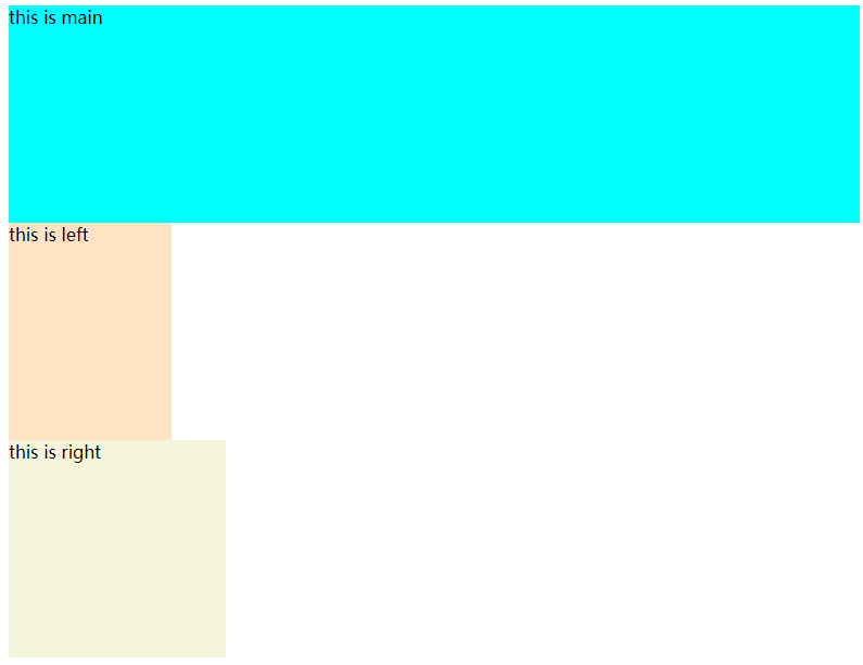
显然这不是我们想要的结果,这时我们需要对其进行样式修改,主要分为了4个步骤:
步骤一:为每个子元素添加float:left的属性
.column {
		float: left;
	}

<body>
  <div id="main" class="column">
	<div id="main-wrapper">
		this is main
	</div>
  </div>
  <div id="left" class="column">
  	this is left
  </div>
  <div id="right" class="column">
  	this is right
  </div>
</body>
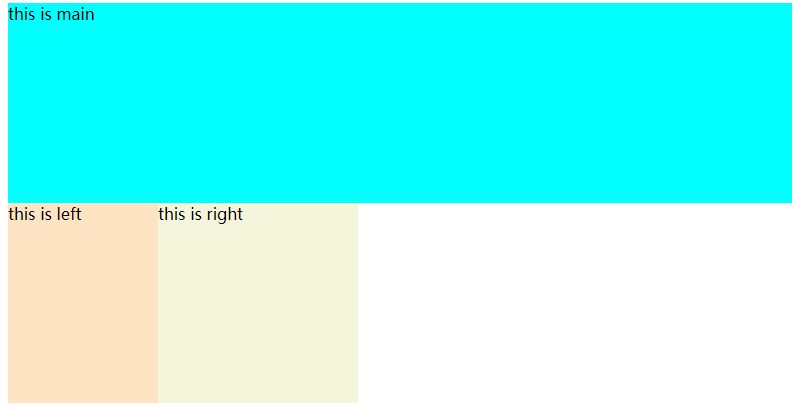
步骤二:为main设置margin/padding,为left和right腾出位置
#main-wrapper{
	margin-left: 150px;
	margin-right: 200px;
}
其结果如下,可以看到this is main左右向中间移动
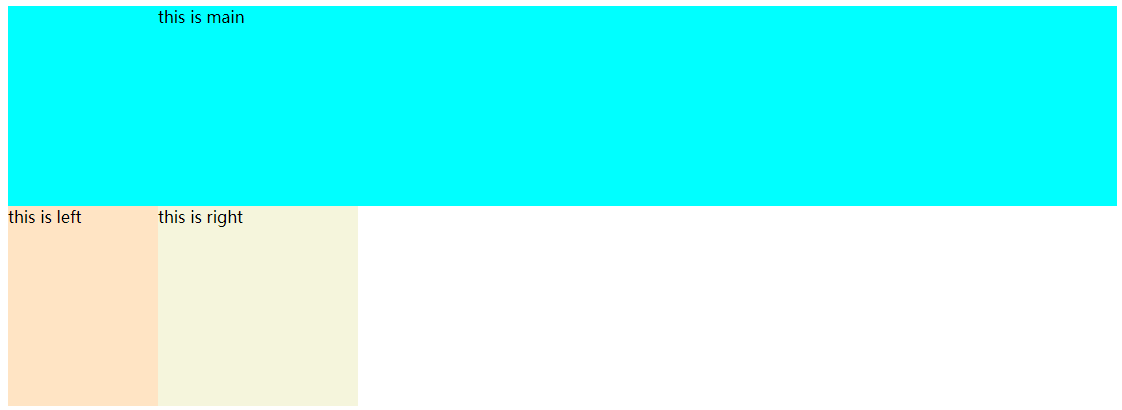
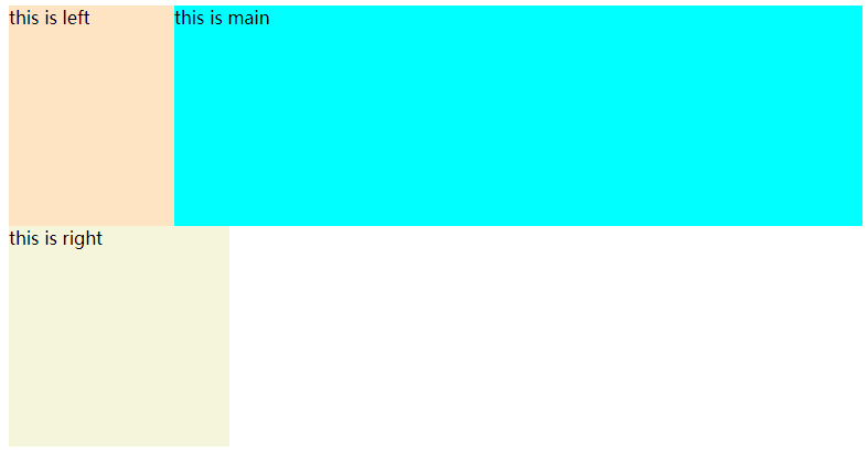
步骤三:将left移动到main左侧的空位上
为#left添加margin-left: -100%;样式,其结果如下:
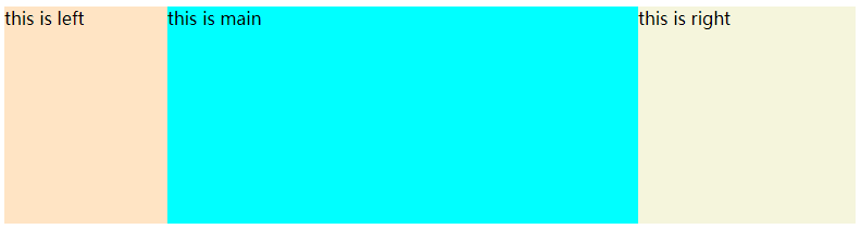
步骤四:将right移动到main右侧的空位上
注意:这一步,如果和圣杯布局的步骤五一样为#right添加margin-right: -200px;样式,其结果如下:
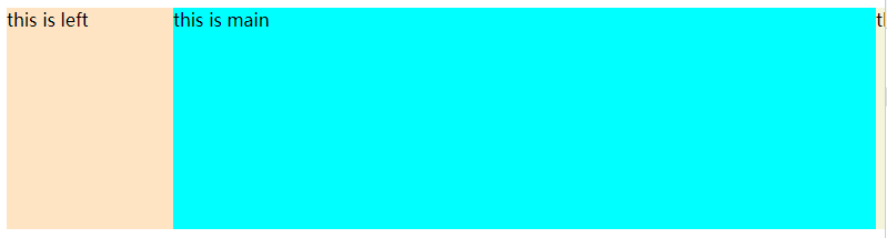
会发现right被挤在main的右边,这样可以是不对的。我们需要将margin-right: -200px;改成margin-left: -200px;。
原因是main设置的是width: 100%,这样宽度就失去了响应式。

 浙公网安备 33010602011771号