

前端HTML CSS面试题
写在前面:本文内容主要根据慕课网双越老师的付费课程“一天时间迅速准备前端面试 快速构建初级前端知识体系 ”进行编写,主要是为了自己在面试前总结学习,欢迎留言指教。
本文包括如下内容
- HTML面试题
- CSS面试题
HTML面试题
1. 如何理解HTML语义化
自己的理解:标签内容可读,易懂;爬虫分析标签可以很容易分析出网页的主次关系
1.让人更容易读懂(增加代码可读性)
2.让搜索引擎更容易读懂(SEO)
2. 默认情况下,哪些HTML标签是块级元素,哪些是内联元素?
- 首先需要解释块级元素、内联元素的概念定义:
块级元素:display: block/ table不管多小,都在独占一行
内联元素:display: inline/ inline-block不会独占一行,会和其他元素挤在一行 - 再举例:
块级元素有:div h1 h2 table ul ol p
内联元素有:span img input button
CSS面试题
- 布局
- 定位
- 图文样式
- 响应式
- CSS3 flex 动画(本篇不涉及)
布局
- 盒子模型的宽度如何计算
- margin纵向重叠的问题
- margin负值的问题
- BFC理解和应用
- float布局的问题,以及clearfix
- flex布局的问题(画骰子)
1. 盒子模型的宽度如何计算
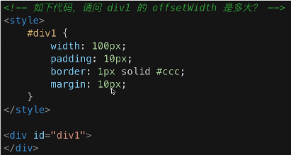
我先给出自己的答案(是错的):100px + 20px + 2px + 20px
首先我们需要了解offsetWidth
offsetWidth = 内容宽度(width) + 内边距(padding) + 边框(border), 无外边距(margin)
正确答案:100 + 20 + 2 = 122
补充:如何让offsetWidth 等于100px,该如何做
box-sizing: border-box 这样是让整个盒子的宽度为width设的值
2. margin纵向重叠的问题
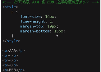
- 相邻元素的margin-top和margin-bottom会发生重叠,取较大值
- 空白内容的
<p></p>也会重叠,也就是说空白内容的<p></p>不占空间
正确答案: 15px
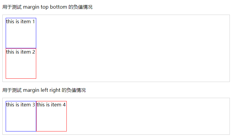
3. margin负值的问题
- margin-top和margin-left负值,元素向上、向左移动
- margin-right负值,右侧元素左移,自身不受影响
- margin-bottom负值,下侧元素上移,自身不受影响
首先是没有进行margin负值的情况下的代码和结果展示:
<style type="text/css">
	body{
		margin: 20px;
	}
	.float-left{
		float: left;
	}
	.clearfix::after{
		content: '';
		display: table;
		clear: both;
	}
	.contanier{
		border: 1px solid #ccc;
		padding: 10px;
	}
	.contanier .item{
		width: 100px;
		height: 100px;
	}
	.contanier .border-blue {
		border: 1px solid blue;
	}
	.contanier .border-red {
		border: 1px solid red;
	}
</style>

<body>
	<p>用于测试 margin top bottom 的负值情况</p>
	<div class="contanier">
		<div class="item border-blue">
			this is item 1
		</div>
		<div class="item border-red">
			this is item 2
		</div>
	</div>
	<p>用于测试 margin left right 的负值情况</p>
	<div class="contanier clearfix">
		<div class="item border-blue float-left">
			this is item 3
		</div>
		<div class="item border-red float-left">
			this is item 4
		</div>
	</div>
</body>
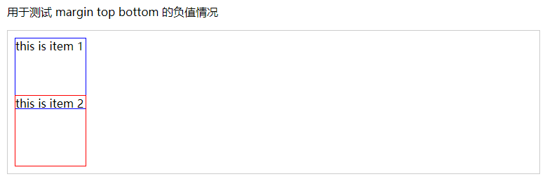
接下来,在我们为item1添加style="margin-top: -20px;"之后,其结果演示如下:
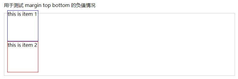
发现item1向上移动;
为item3添加style="margin-left: -20px;"之后,其结果演示如下:
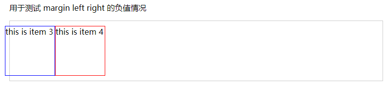
发现item3向左移动。
之后,我们再将item1的样式修改为style="margin-bottom: -20px;"之后,其结果演示如下:
发现,其自身不受影响,下方元素上移;
我们将item3的样式修改为style="margin-right: -20px;"之后,其结果演示如下:
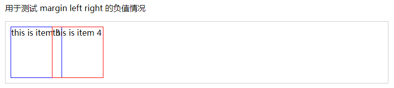
发现,其自身不受影响,右方元素左移。
4. BFC理解和应用
什么是BFC,如何应用
- BFC 全称 block format context,块级格式化上下文
- 指一块独立渲染区域,内部元素的渲染不会影响边界以外的元素
- 形成BFC的常见条件
- float不是none
- position是absolute或fixed
- overflow不是visible
- display是flex inline-block等
- BFC的常见应用
- 清除浮动
- 脱离文档流
一般,不应用BFC,其结果及代码如下:
<style type="text/css">
.container {
background-color: #f1f1f1;
}
.left {
float: left;
}
</style>
<body>
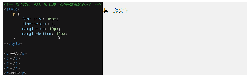
<div class="container">
<img src="H:\谷歌浏览器下载\image (2).png" class="left"/>
<p>某一段文字······</p>
</div>
</body>
我们想要图片把container撑开,但是却到了外面。为了解决这一问题,需要为元素添加上述4种方法的某一种即可。
.bfc{
	overflow: hidden; /*触发元素 BFC*/
}

为container 和 p 添加上述样式
5. float布局的问题,以及clearfix
如何实现圣杯布局和双飞翼布局/手写clearfix如何实现圣杯布局和双飞翼布局/手写clearfix
- 圣杯布局和双飞翼布局的要求
- 三栏布局,中间一栏最先加载和渲染
- 两侧内容固定,中间内容随着宽度自适应
- 一般用于PC网页
- 圣杯布局和双飞翼布局的技术总结
- 使用float布局(每一个子div)
- 两侧使用margin负值(子div),以便和中间内容横向重叠
- 防止中间内容被两侧覆盖(父div),一个用padding【圣杯】 一个用margin【双飞翼】
首先是圣杯布局的结果展示及代码:

/*圣杯布局*/
<style type="text/css">
	body{
		min-width: 550px;
	}
	#header{
		width: 100%;
		background-color: aliceblue;
	}
	/*为每个子元素设置float*/
	#container .column{
		float: left;
	}
	#footer{
		width: 100%;
		background-color: aliceblue;
	}
	/*为left子元素和right子元素预留位置*/
	#container{
		padding-left: 150px;
		padding-right: 200px;
	}
	#center{
		width: 100%;
		background-color: aqua;
	}
	#left{
		position: relative;
		width: 150px;
		background-color: bisque;
		margin-left: -100%; //将left移动到与center左侧重叠
		right: 150px; //再将left向左移动,推到最左侧
	}
	#right{
		width: 200px;
		background-color: beige;
		margin-right: -200px; //将right向左移动,会移动到最右侧
	}
	/*手写 clearfix*/
	.clearfix::after {
		content: '';
		display: table;
		clear: both;
	}
</style>

<body>
  <div id="header">this is header</div>
  <div id="container" class="clearfix">
    <div id="center" class="column">center</div>
	<div id="left" class="column">left</div>
	<div id="right" class="column">right</div>
  </div>
  <div id="footer">this is footer</div>
</body>
接下来是双飞翼布局的结果展示及代码:
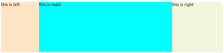
//双飞翼布局相较于圣杯布局实现更为简单
<style type="text/css">
	body{
		min-width: 550px;
	}
	//还是先为每个子元素设置float
	.column{
		float: left;
	}
	#main{
		width: 100%;
		height: 200px;
		background-color: aqua;
	}
	//为left,right预留位置
	#main-wrapper{
		margin-left: 150px;
		margin-right: 200px;
	}
	#left{
		width: 150px;
		height: 200px;
		background-color: bisque;
		margin-left: -100%; //直接向左拖拽
	}
	#right{
		width: 200px;
		height: 200px;
		background-color: beige;
		margin-left: -200px; //直接向右拖拽
	}
</style>
<body>
  <div id="main" class="column">
	<div id="main-wrapper">
		this is main
	</div>
  </div>
  <div id="left" class="column">
  	this is left
  </div>
  <div id="right" class="column">
  	this is right
  </div>
</body>
6. flex布局的问题(画骰子)
常用语法回顾
- flex-direction 主轴方向 row|row-reverse|column|column-reverse
- justify-content 主轴对齐方式 flex-start|flex-end|center|space-between|space-around
- align-items 交叉轴对齐方式 flex-start|flex-end|center|baseline|stretch
- flex-warp 换行 nowrap|wrap|wrap-reverse
- align-self 子元素在交叉轴对齐方式 auto|flex-start|flex-end|center|baseline|stretch
我的理解:前4个主要在父元素内进行设置子元素的属性【容器属性】,第5个在子元素内设置其本身的属性【项目属性】
设置为display: flex的元素将会成为flex容器,其内部结构如下:
![image]()
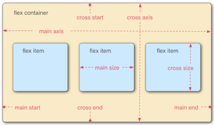
关于flex更为详细的教程,请参考Flex 布局教程:语法篇
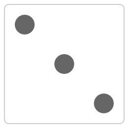
flex实现一个三点的色子,代码如下
<style type="text/css">
	.box{
		width: 200px;
		height: 200px;
		border: 2px solid #ccc;
		border-radius: 10px;
		padding: 20px;
		display: flex;  //设置该部分的子元素为flex布局
		justify-content: space-between; //该部分的子元素两侧对齐
	}
	//为每个圆点设置格式
	.item{
		width: 40px;
		height: 40px;
		border-radius: 50%;
		background-color: #666;
	}
	//第二个圆点本身 纵向居中
	.item:nth-child(2){
		align-self: center;
	}
	//第三个圆点本身 靠下对齐
	.item:nth-child(3){
		align-self: flex-end;
	}
</style>

<body>
	<div class="box">
		<span class="item"></span>
		<span class="item"></span>
		<span class="item"></span>
	</div>
</body>
结果展示如下:
定位
- absolute和relative分别依据什么定位
- 居中对齐有哪些实现方式
1. absolute和relative分别依据什么定位
- relative依据自身定位
- absolute依据最近一层的定位元素定位
定位元素有
- absolute relative fixed
- body
2. 居中对齐有哪些实现方式
- 水平居中
- inline元素:text-align: center
- block元素:margin: auto
- absolute元素:left: 50% + margin-left 负值
- 垂直居中
- inline元素:line-align的值等于height的值
- absolute元素
- top: 50% + margin-top 负值 必须知道子元素的尺寸
- transform(-50%, -50%) CSS3 可以不知道子元素的尺寸 兼容性不好
- top, left, bottom, right: 0 + margin: auto 让外边距自动填充 好处:既可以保证浏览器兼容性,又可以不用知道子元素尺寸
图文样式
- ling-height如何继承
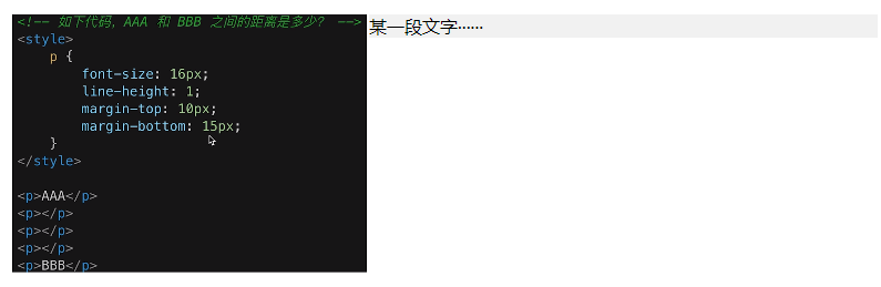
1. ling-height如何继承
//如下代码,p 标签的行高将会是多少?
<style>
body {
	font-size: 20px;
	line-height: 200%;
}
p {
	font-size: 16px;
}
</style>
<body>
	<p>AAA</p>
</body>
20px 乘 200% = 40px
- 写具体数值,如30px,则继承该值(比较好理解)
- 写比例,如2 / 1.5,则继承该比例(比较好理解)
- 写百分比,如200%,则继承计算出来的值(考点)
响应式
- rem是什么
- 响应式布局的常用方案
- rem的弊端
- 网页视口尺寸
- vw / vh
1. rem是什么
rem是一个长度单位
- px,绝对长度单位,最常用
- em,相对长度单位,相对于父元素,不常用
- rem,相对长度单位,相对于根元素,常用于响应式布局
2. 响应式布局的常用方案
- media-query,根据不同的屏幕宽度设置根元素font-size
- rem,基于根元素的相对单位
3. rem的弊端
- 阶梯型
4. 网页视口尺寸
- window.screen.height //屏幕高度
- window.innerHeight //网页视口高度
- document.body.clientHeight //body高度
5. vw / vh
- vh网页视口高度的1/100
- vw网页视口宽度的1/100
- vmax取两者最大值;vmin取两者最小值

 浙公网安备 33010602011771号