

使用媒介查询设置字体尺寸
<!DOCTYPE html>
<html>
<head>
<meta charset="UTF-8">
<title>rem and media queries</title>
<meta name="viewport" content="user-scalable=no, initial-scale=1.0, maximum-scale=1.0, minimum-scale=1.0">
<style>
html {
height: 100%;
width: 100%;
font-size: 20px;
}
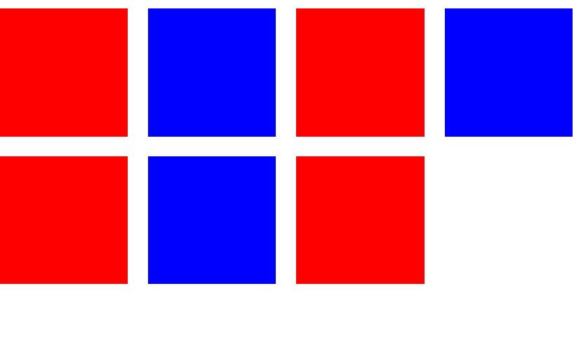
.box {
width: 5rem;
height: 5rem;
display: inline-block;
margin-right: .5rem;
margin-bottom: .5rem;
}
.blue-box {
background-color: red;
}
.org-box {
background-color: blue;
}
@media only screen and (max-width:300px) {
html {
font-size: 10px;
}
}
@media only screen and (min-width:300px) and (max-width:650px) {
html {
font-size: 20px;
}
}
@media only screen and (min-width:650px) and (max-width:900px) {
html {
font-size: 30px;
}
}
@media only screen and (min-width:900px) {
html {
font-size: 40px;
}
}
</style>
</head>
<body>
<div class="bd">
<div class="box blue-box"></div>
<div class="box org-box"></div>
<div class="box blue-box"></div>
<div class="box org-box"></div>
<div class="box blue-box"></div>
<div class="box org-box"></div>
<div class="box blue-box"></div>
<div class="box org-box"></div>
<div class="box blue-box"></div>
</div>
</body>
</html>
rem and media queries

 浙公网安备 33010602011771号