
animation实现卡片翻转动效
使用animation实现卡片翻转动效,效果如下(iPhone转的gif有卡顿,实际效果流畅):
先上全部代码,再在最后给出代码解析,分步说明实现原理。
html
<div class="visual-card">
  <div class="contain">
    <div class="section-box">
      <div class="card-box">
        <img src="../../assets/images/1.png" />
      </div>
      <div class="card-box">
        <img src="../../assets/images/2.png" />
      </div>
      <div class="card-box">
        <img src="../../assets/images/3.png" />
      </div>
      <div class="card-box">
        <img src="../../assets/images/4.png" />
      </div>
      <div class="card-box">
        <img src="../../assets/images/5.png" />
      </div>
      <div class="card-box">
        <img src="../../assets/images/6.png" />
      </div>
    </div>
  </div>
</div>
less(此代码less版本为4.*,其他版本less自行替换语法,防止报错[Unrecognised input]):
body {
  background-color: rgb(16, 14, 14);
}

/* ------------------------------------
 * 注释一:设置父级div显示在屏幕正中间
 * ------------------------------------
 */
.visual-card {
  position: absolute;
  bottom: 375px;
  width: 100%;
  left: 50%;
  transform: translateX(-50%);
}

.contain {
  margin: 0;
  padding: 0;
  /* 设置flex布局 */
  display: flex;
  /* 在主轴上居中 */
  justify-content: center;
  /* 在测轴上居中 */
  align-items: center;
  height: 100%;
  width: 100%;
  /* ------------------------------------
   * 注释五a:透视
   * ------------------------------------
   */
  perspective: 900px;
}

.section-box {
  width: 300px;
  height: 400px;
  position: relative;
  /* ------------------------------------
   * 注释五b:所有子元素在3D空间中呈现
   * ------------------------------------
   */
  transform-style: preserve-3d;

  /* ------------------------------------
   * 注释二:设置图片位置及样式
   * ------------------------------------
   */
  .card-box {
    position: absolute !important;
    left: 0;
    top: 0;
    width: 100%;
    height: 100%;
    display: flex;
    vertical-align: middle;
    /* 图片居中 */
    text-align: center;

    /* ------------------------------------
     * 注释三:设置图片倒影
     * ------------------------------------
     */
    -webkit-box-reflect: below 15px linear-gradient(transparent 10%, rgba(255, 255, 255, 0.3));

    /* ------------------------------------
     * 注释六:添加除animation-name外的animation属性
     * ------------------------------------
     */
    animation-duration: 15s;
    animation-timing-function: linear;
    animation-iteration-count: infinite;
    animation-delay: 3s;

    img {
      width: 300px;
      height: 400px;
    }
  }
}

/* 以下为animation的关键代码 */
@transforms: rotateY(45deg) translateZ(-800px),
             rotateY(45deg) translateZ(-600px),
             rotateY(45deg) translateZ(-400px),
             rotateY(-45deg) translateZ(-400px),
             rotateY(-45deg) translateZ(-600px),
             rotateY(-45deg) translateZ(-800px);

/* ------------------------------------
 * 注释七:设置每个图片的关键动画帧
 * ------------------------------------
 */
// 1. 循环生成@keyframes的核心函数(Less 4.x 兼容版)
.generate-keyframes(@index) when (@index <= 6) {
  @keyframe-name: ~"dh@{index}";
  // 计算六个阶段transform的索引(核心:超出长度自动回绕到1)
  @len: length(@transforms);
  // 0% 阶段索引 = 当前循环索引
  @start-index: @index;
  // 16.66% 阶段索引:当前+1,若等于长度+1则回绕到1
  @second-index: if(@index + 1 > @len, 1, @index + 1);
  // 33.32% 阶段索引:当前+2,若超出长度则取模回绕
  @third-index: if(@index + 2 > @len, @index + 2 - @len, @index + 2);
  // 49.98% 阶段索引:当前+3,若超出长度则取模回绕
  @fourth-index: if(@index + 3 > @len, @index + 3 - @len, @index + 3);
  // 66.64% 阶段索引:当前+4,若超出长度则取模回绕
  @fifth-index: if(@index + 4 > @len, @index + 4 - @len, @index + 4);
  // 83.3% 阶段索引:当前+5,若超出长度则取模回绕
  @end-index: if(@index + 5 > @len, @index + 5 - @len, @index + 5);

  // 通过变量引用生成@keyframes(Less 4.x 识别此写法)
  @keyframes @keyframe-name {
    // 自定义动画逻辑
    0% {
      transform: extract(@transforms, @start-index);
    }

    8.33% {
      transform: extract(@transforms, @start-index);
    }

    16.66% {
      transform: extract(@transforms, @second-index);
    }

    24.99% {
      transform: extract(@transforms, @second-index);
    }

    33.32% {
      transform: extract(@transforms, @third-index);
    }

    41.65% {
      transform: extract(@transforms, @third-index);
    }

    49.98% {
      transform: extract(@transforms, @fourth-index);
    }

    58.31% {
      transform: extract(@transforms, @fourth-index);
    }

    66.64% {
      transform: extract(@transforms, @fifth-index);
    }

    74.97% {
      transform: extract(@transforms, @fifth-index);
    }

    83.3% {
      transform: extract(@transforms, @end-index);
    }

    91.63% {
      transform: extract(@transforms, @end-index);
    }

    100% {
      transform: extract(@transforms, @start-index);
    }
  }

  // 递归自增,完成6次循环
  .generate-keyframes(@index + 1);
}
.generate-keyframes(1);

.card-box-loop(@index) when (@index <= 6) {
  // 生成:nth-child选择器(插值语法兼容所有版本)
  .card-box:nth-child(@{index}) {
    /* ------------------------------------
     * 注释四:设置每个图片的transform属性值
     * ------------------------------------
     */
    transform: extract(@transforms, @index);

    /* ------------------------------------
     * 注释八:赋值动画名
     * ------------------------------------
     */
    animation-name: ~"dh@{index}"
  }
  // 递归自增(循环核心)
  .card-box-loop(@index + 1);
}

// 3. 启动循环(从第1个开始)
.card-box-loop(1);
接下来一步步解析如何实现:
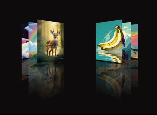
1、设置父级div显示在屏幕正中间(注释一代码),效果如图:
2、设置图片位置及样式,全部居于正中间重叠(注释二代码),效果如图:
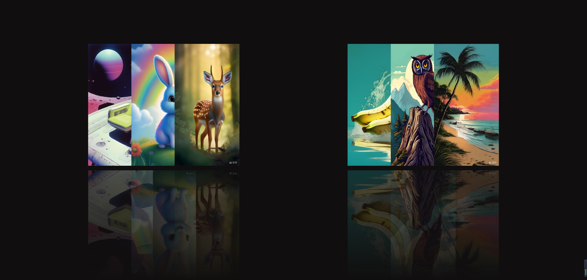
3、给图片设置倒影(注释三代码),丰富画面,效果如图:
4、设置每个图片的transform属性值,让图片在动画执行的第一帧位置(注释四代码),效果如图
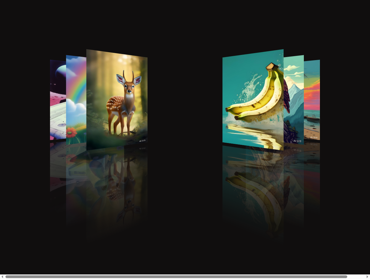
5、此时所有的图片都在一个2D的空间上展示,效果不明显,若要在3D空间展示,需要在父元素上添加样式属性
perspective(注释五.a代码),子元素添加样式属性transform-style(注释五.b代码),添加后即可看见在Y、Z轴上的旋转,效果如下:
6、给每个需要旋转动画的元素添加上除动画名外的动画属性(注释六代码);
7、设置animation-name(注释七代码)。
8、将animation-name赋值给对应的元素(注释八代码)。
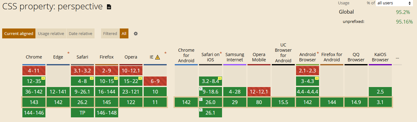
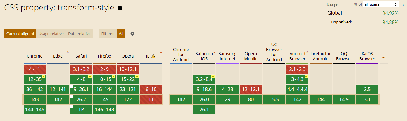
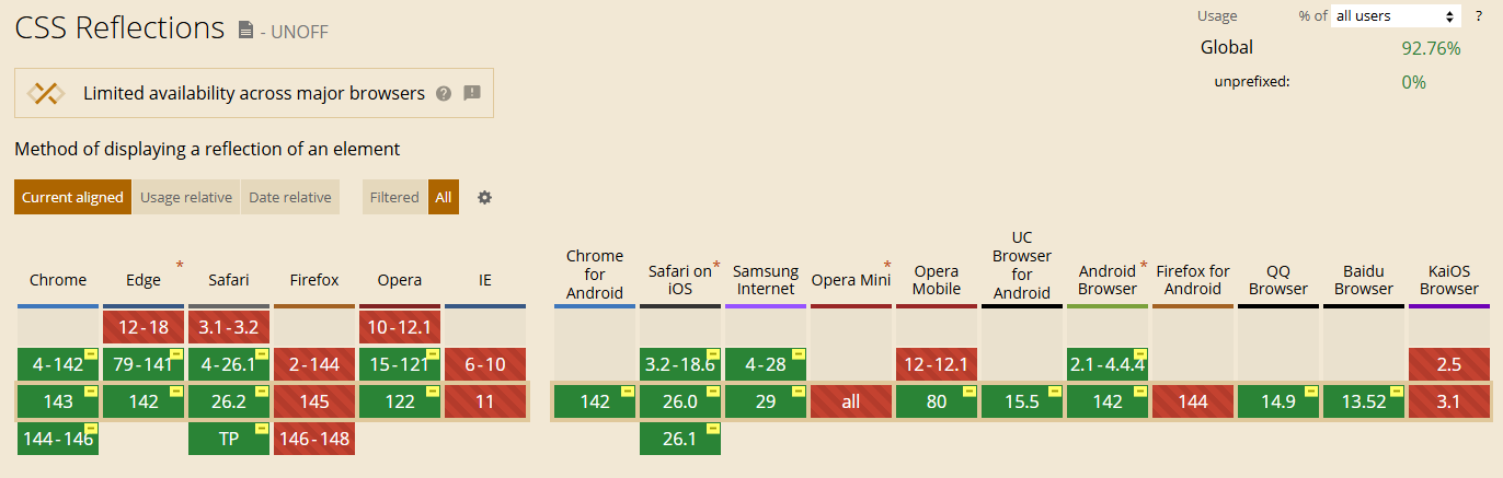
此效果关键是需要使用perspective配合transform-style: preserve-3d实现旋转交互,其兼容性以及设置倒影box-reflect兼容性如下:
简述box-reflect语法:
box-reflect:direction(方向)、offset(偏移量)和mask-box-image(遮罩图像)
direction:定义倒影的方向,决定了倒影相对于原元素的位置。
            可选值:above(上方)、below(下方)、left(左侧)和right(右侧)。
offset:定义倒影与原元素之间的偏移距离。
            可以是数值,百分比,百分比是根据原元素的尺寸来计算的。
            偏移量可以为负值,表示倒影会向相反方向偏移。
mask-box-image:定义遮罩图像,用于覆盖在倒影上,创造出不同的视觉效果。
            可以是绝对或相对地址指定的图像,线性渐变或径向渐变创建的图像。
            如果不设置该值,则倒影将没有遮罩。
以上。

 浙公网安备 33010602011771号