
渐变线段流动效果CSS+SVG
第二次出现的线段还有些问题没有完善好,先上传代码作为备份吧!
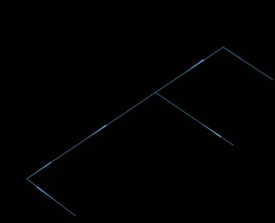
技术呈现:CSS实现线段的动画,SVG画出蓝色线段,
offset-path:线段的路径;
offset-distance:动画;
<template>
  <div class="left">
    <div class="login-mark">
      <img src="../assets/img/loginmark.png" />
    </div>
    <div class="line"></div>
    <div class="line01"></div>
    <div class="line02"></div>
    <div class="line03"></div>
    <div class="line04"></div>
    <div class="line05"></div>
    <svg width="100%" height="100%" version="1.1" xmlns="http://www.w3.org/2000/svg">
      <path class="svgline" d="M175 595 L79 522 L470 260 L569 325" />
      <path class="svgline" d="M335 350 L490 455 " />
    </svg>
    <div class="logo">
      <router-link class="blue" to="/login">
        <img src="../assets/img/logo.png" />
      </router-link>
    </div>
  </div>
</template>
<style scoped>
.svgline {
  fill-opacity: 0;
  stroke-linecap: round;
  stroke-width: 2;
  stroke: rgba(94, 213, 254, 0.4);
}
.line {
  background: linear-gradient(
    to left,
    rgba(94, 214, 255, 1),
    rgba(94, 214, 255, 0)
  );
  height: 2px;
  width: 50px;
  border-radius: 5px;
  overflow: hidden;
  position: absolute;
  offset-path: path("M175 595 L98 537");
  animation: myfirst 4s;
  animation-timing-function: linear;
  offset-distance: 100%;
  animation-iteration-count: infinite;
  opacity: 0;
}
@keyframes myfirst {
  0% {
    offset-distance: 0%;
    opacity: 1;
  }
  80% {
    offset-distance: 100%;
    opacity: 1;
  }
  100% {
    opacity: 0;
  }
}
.line04 {
  background: linear-gradient(
    to left,
    rgba(94, 214, 255, 1),
    rgba(94, 214, 255, 0)
  );
  height: 2px;
  width: 50px;
  border-radius: 5px;
  overflow: hidden;
  position: absolute;
  offset-path: path("M79 522 L449 273");
  animation: myfirst01 15s;
  animation-timing-function: linear;
  offset-distance: 100%;
  animation-delay: 7.2s;
  opacity: 0;
  animation-iteration-count: infinite;
}
.line05 {
  background: linear-gradient(
    to left,
    rgba(94, 214, 255, 1),
    rgba(94, 214, 255, 0)
  );
  height: 2px;
  width: 50px;
  border-radius: 5px;
  overflow: hidden;
  position: absolute;
  offset-path: path("M79 522 L449 273");
  animation: myfirst01 15s;
  animation-timing-function: linear;
  offset-distance: 100%;
  animation-delay: 11.2s;
  opacity: 0;
  animation-iteration-count: infinite;
}
.line01 {
  background: linear-gradient(
    to left,
    rgba(94, 214, 255, 1),
    rgba(94, 214, 255, 0)
  );
  height: 2px;
  width: 50px;
  border-radius: 5px;
  overflow: hidden;
  position: absolute;
  offset-path: path("M79 522 L449 273");
  animation: myfirst01 15s;
  animation-timing-function: linear;
  offset-distance: 100%;
  animation-delay: 3.2s;
  opacity: 0;
  animation-iteration-count: infinite;
}
@keyframes myfirst01 {
  0% {
    offset-distance: 0%;
    opacity: 0;
  }
  10% {
    opacity: 1;
    offset-distance: 10%;
  }
  90% {
    opacity: 1;
    offset-distance: 100%;
  }
  100% {
    opacity: 0;
    offset-distance: 100%;
  }
}
.line02 {
  background: linear-gradient(
    to left,
    rgba(94, 214, 255, 1),
    rgba(94, 214, 255, 0)
  );
  height: 2px;
  width: 50px;
  border-radius: 5px;
  overflow: hidden;
  position: absolute;
  offset-path: path("M470 260 L549 312");
  animation: myfirst02 4s;
  animation-timing-function: linear;
  offset-distance: 100%;
  animation-delay: 17.4s;
  opacity: 0;
  animation-iteration-count: infinite;
}
@keyframes myfirst02 {
  0% {
    offset-distance: 0%;
    opacity: 0;
  }
  5% {
    opacity: 0;
    offset-distance: 3%;
  }
  10% {
    opacity: 0;
    offset-distance: 5%;
  }
  90% {
    opacity: 1;
    offset-distance: 100%;
  }
  100% {
    opacity: 0;
    offset-distance: 100%;
  }
}
.line03 {
  background: linear-gradient(
    to left,
    rgba(94, 214, 255, 1),
    rgba(94, 214, 255, 0)
  );
  height: 2px;
  width: 50px;
  border-radius: 5px;
  overflow: hidden;
  position: absolute;
  offset-path: path("M335 350 L469 441");
  animation: myfirst03 4s;
  animation-timing-function: linear;
  offset-distance: 100%;
  animation-delay: 11.4s;
  opacity: 0;
  animation-iteration-count: infinite;
}
@keyframes myfirst03 {
  0% {
    offset-distance: 0%;
    opacity: 0;
  }
  10% {
    opacity: 1;
    offset-distance: 15%;
  }
  90% {
    opacity: 1;
    offset-distance: 100%;
  }
  100% {
    opacity: 0;
    offset-distance: 100%;
  }
}
</style>
posted on 2022-04-12 15:09 caicai2015 阅读(1775) 评论(0) 收藏 举报


 浙公网安备 33010602011771号