

Sharepoint学习笔记—Ribbon系列-- 2. 在Ribbon中添加新Tab
有了上面的基础,我们来看看如何向Sharepoint网站的Ribbon中添加我们定义的Tab。
直接进入操作步骤
一、创建 SharePoint 项目
要添加新选项卡,应首先创建一个空白 SharePoint 项目。如下:
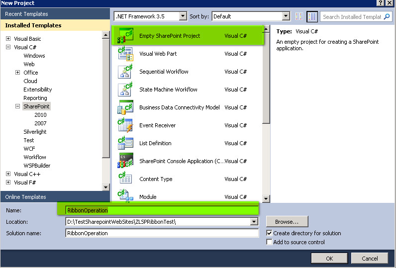
把此方案设置成Farm解决方案
然后在此项目中分别加入新的Feature与新的空白Element如下图
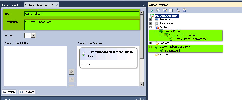
二、使用自定义操作中的功能区 XML 定义功能区自定义项
方法是 打开 Elements.xml 文件,其内容如下:
 View Code

<Elements xmlns="http://schemas.microsoft.com/sharepoint/">
<CustomAction
Id="MyCustomRibbonTab"
Location="CommandUI.Ribbon.ListView"
RegistrationId="101"
RegistrationType="List">
<CommandUIExtension>
<CommandUIDefinitions>
<CommandUIDefinition
Location="Ribbon.Tabs._children">
<Tab
Id="Ribbon.CustomTabExample"
Title="My Custom Tab"
Description="This holds my custom commands!"
Sequence="501">
<Scaling
Id="Ribbon.CustomTabExample.Scaling">
<MaxSize
Id="Ribbon.CustomTabExample.MaxSize"
GroupId="Ribbon.CustomTabExample.CustomGroupExample"
Size="OneLargeTwoMedium"/>
<Scale
Id="Ribbon.CustomTabExample.Scaling.CustomTabScaling"
GroupId="Ribbon.CustomTabExample.CustomGroupExample"
Size="OneLargeTwoMedium" />
</Scaling>
<Groups Id="Ribbon.CustomTabExample.Groups">
<Group
Id="Ribbon.CustomTabExample.CustomGroupExample"
Description="This is a custom group!"
Title="Custom Group"
Sequence="52"
Template="Ribbon.Templates.CustomTemplateExample">
<Controls Id="Ribbon.CustomTabExample.CustomGroupExample.Controls">
<Button
Id="Ribbon.CustomTabExample.CustomGroupExample.HelloWorld"
Command="CustomTabExample.HelloWorldCommand"
Sequence="15"
Description="Says hello to the World!"
LabelText="Hello, World!"
TemplateAlias="cust1"/>
<Button
Id="Ribbon.CustomTabExample.CustomGroupExample.GoodbyeWorld"
Command="CustomTabExample.GoodbyeWorldCommand"
Sequence="17"
Description="Says good-bye to the World!"
LabelText="Good-bye, World!"
TemplateAlias="cust2"/>
<Button
Id="Ribbon.CustomTabExample.CustomGroupExample.LoveWorld"
Command="CustomTabExample.LoveWorldCommand"
Sequence="19"
Description="Says I love the World!"
LabelText="I love you, World!"
TemplateAlias="cust3"/>
</Controls>
</Group>
</Groups>
</Tab>
</CommandUIDefinition>
<CommandUIDefinition Location="Ribbon.Templates._children">
<GroupTemplate Id="Ribbon.Templates.CustomTemplateExample">
<Layout
Title="OneLargeTwoMedium"
LayoutTitle="OneLargeTwoMedium">
<Section Alignment="Top" Type="OneRow">
<Row>
<ControlRef DisplayMode="Large" TemplateAlias="cust1" />
</Row>
</Section>
<Section Alignment="Top" Type="TwoRow">
<Row>
<ControlRef DisplayMode="Medium" TemplateAlias="cust2" />
</Row>
<Row>
<ControlRef DisplayMode="Medium" TemplateAlias="cust3" />
</Row>
</Section>
</Layout>
</GroupTemplate>
</CommandUIDefinition>
</CommandUIDefinitions>
<CommandUIHandlers>
<CommandUIHandler
Command="CustomTabExample.HelloWorldCommand"
CommandAction="javascript:alert('Hello, world!');" />
<CommandUIHandler
Command="CustomTabExample.GoodbyeWorldCommand"
CommandAction="javascript:alert('Good-bye, world!');" />
<CommandUIHandler
Command="CustomTabExample.LoveWorldCommand"
CommandAction="javascript:alert('I love you, world!');" />
</CommandUIHandlers>
</CommandUIExtension>
</CustomAction>
</Elements>
下面对其内容作如下说明:
<Elements xmlns="http://schemas.microsoft.com/sharepoint/">
<CustomAction
Id="MyCustomRibbonTab"
Location="CommandUI.Ribbon.ListView"
RegistrationId="101"
RegistrationType="List">
<CommandUIExtension>
<CommandUIDefinitions>
<CommandUIDefinition
Location="Ribbon.Tabs._children">
在对Ribbon进行自定义时,你需要把CustomAction 元素与Ribbon的XML 一起使用。CustomAction元素的Location 属性告知 CustomAction 在何处应用自定义项(即此元素内的所有自定义内容)。
下表对这些Location可能的值进行了说明。本例我们把Location值设置为CommandUI.Ribbon.ListView 也即我们此处定义的自定义项(Tab)将在我们显示列表视图的WebPart时出现在Ribbon区域,而基其它时候我们是看不见它的。
|
值 |
说明 |
|
CommandUI.Ribbon |
对于指定的 RegistrationId,自定义项出现在任何地方。 |
|
CommandUI.Ribbon.ListView |
当存在列表视图 Web 部件时出现自定义项。 |
|
CommandUI.Ribbon.EditForm |
自定义项出现在编辑表单上。 |
|
CommandUI.Ribbon.NewForm |
自定义项出现在新建表单上。 |
|
CommandUI.Ribbon.DisplayForm |
自定义项出现在显示表单上。 |
关于RegistrationId属性:用于指定与此操作(CustomAction )关联的列表或项内容类型的标识符,或文件类型或编程标识符 (ProgID)。 关于它们的含义请参见
Sharepoint学习笔记—Ribbon系列-- Reference :List definitions Type and BaseType ,此处我们设置为101也即我们自定义的CustomAction与
Document library //文档库 进行关联。也就是说当我们选择Sharepoint网站的某个DocumentLibrary List时,就会出现我们自下定义的CustomAction选项卡(Tab),也就是说,
在CustomAction的相关属性设置中,我们解决了它显示的“时机”问题。
RegistrationType属性: 用于给每项操作指定注册附件。可能的值包括:ContentType,FileType,List,ProgId
<CommandUIDefinitions>
<CommandUIDefinition
Location="Ribbon.Tabs._children">
<Tab
Id="Ribbon.CustomTabExample"
Title="My Custom Tab"
Description="This holds my custom commands!"
Sequence="501">
CommandUIDefinition 元素上的 Location 定义其内部控件呈现的位置。在本示例中,您将引用服务器功能区(Ribbon)的 Tabs 集合(Ribbon.Tabs._childern)。_children 约定告知功能区将以下 XML 插入到输出中以便呈现功能区。在本例中,您将插入 Tab 元素 XML。
Tab元素中的Sequence 属性将定义Tab相对于其他Tabs所呈现的位置。Sharepoint系统默认的Tab使用 100 的整倍数作为它们的Sequence值,因此用户自定义的Tab的Sequence 属性不应是 100 的整倍数以防止与系统的默认Sequence值出现冲突。应避免冲突,以确保对功能区 XML 进行适当处理。
由此可见,CustomAction影响了显示的“时机”,此处CommandUIDefinition与Tab中的相关属性设置影响了显示的"位置"。
Id="Ribbon.CustomTabExample.Scaling">
<MaxSize
Id="Ribbon.CustomTabExample.MaxSize"
GroupId="Ribbon.CustomTabExample.CustomGroupExample"
Size="OneLargeTwoMedium"/>
<Scale
Id="Ribbon.CustomTabExample.Scaling.CustomTabScaling"
GroupId="Ribbon.CustomTabExample.CustomGroupExample"
Size="OneLargeTwoMedium" />
</Scaling>
在创建自定义Tab时,您必须定义在添加控件时如何对Tab进行缩放。通过将 Scaling 元素与 GroupTemplate 一起使用可对此进行处理。
MaxSize 元素对组(Group)中控件的最大大小进行定义。而 Scale 元素定义组(Group)如何在不同的情况下进行缩放。
GroupId 属性将一个组与缩放大小相关联。
Size 属性由稍后在GroupTemplate 中定义的 Layout 元素定义。
<Group
Id="Ribbon.CustomTabExample.CustomGroupExample"
Description="This is a custom group!"
Title="Custom Group"
Sequence="52"
Template="Ribbon.Templates.CustomTemplateExample">
<Controls Id="Ribbon.CustomTabExample.CustomGroupExample.Controls">
<Button
Id="Ribbon.CustomTabExample.CustomGroupExample.HelloWorld"
Command="CustomTabExample.HelloWorldCommand"
Sequence="15"
Description="Says hello to the World!"
LabelText="Hello, World!"
TemplateAlias="cust1"/>
Groups 元素对将在选项卡上出现的组进行定义。Group 元素自身具有与其他控件相似的属性以及一个 Template 属性。
Template 属性引用我们后面将要定义的 GroupTemplate,Sharepoin要求每一个Group都必须与某个特定的GroupTemplate项进行绑定,并推荐用户尽量使用用户自已定义的GroupTemplate.
Controls 元素包含将在组中出现的控件。组内部的控件必须定义 TemplateAlias 和 Command 属性。与Tab类似,每个控件具有一个 Sequence 属性,用于定义这些控件将在组中出现的位置。默认控件基于 10 的整倍数,所以任何自定义控件不应使用 10 的整倍数以避免发生冲突。Command 属性由 CommandUIHandler 元素使用,并且即使在未指定 CommandUIHandler 时也要求使用此属性。TemplateAlias 属性定义控件相对于 GroupTemplate 出现的位置。
<GroupTemplate Id="Ribbon.Templates.CustomTemplateExample">
<Layout
Title="OneLargeTwoMedium"
LayoutTitle="OneLargeTwoMedium">
<Section Alignment="Top" Type="OneRow">
<Row>
<ControlRef DisplayMode="Large" TemplateAlias="cust1" />
</Row>
</Section>
<Section Alignment="Top" Type="TwoRow">
<Row>
<ControlRef DisplayMode="Medium" TemplateAlias="cust2" />
</Row>
<Row>
<ControlRef DisplayMode="Medium" TemplateAlias="cust3" />
</Row>
</Section>
</Layout>
</GroupTemplate>
</CommandUIDefinition>
</CommandUIDefinitions>
定义组模板(GroupTemplate)时,您必须将其定义为另一个 CommandUIDefinition。CommandUIDefinition 具有 Ribbon.Templates._children 位置。这与用于组和选项卡的模式相同。
GroupTemplate 元素包含一个 Layout 元素,后者又包含 Section 或 OverflowSection 元素。Layout 元素具有一个 Title 属性,可用于 MaxSize 和 Scale 元素上的 Size 属性。
Section 元素具有两个属性。Alignment 属性对以下 Row 元素中的控件所处的位置进行定义。Type 属性定义将在对应的部分显示的行数。一个 Section 最多具有三个 Row 元素。
Row 元素包含一个或多个 ControlRef 元素。每个 ControlRef 元素定义一个控件在功能区的显示方式。DisplayMode 属性包含以下值(注:并非所有的控件都提供所有的 DisplayMode 值)。
|
值 |
说明 |
|
Small |
显示为无标签文本的小图标。 |
|
Medium |
显示为带有标签文本的 16 x 16 的图标。 |
|
Large |
显示为带有标签文本的 32 x 32 的图标。 |
|
Text |
仅显示为文本。 |
还可以有一个 OverflowSection 元素而不是 Section 元素。此元素定义一个区域,在此区域中,不必使用 Row 元素即可显示多个控件。所有的控件都将显示为由 DisplayMode 属性定义的相同大小。DividerAfter 和 DividerBefore 属性定义在显示溢出部分时分隔线将出现的位置。
向默认功能区位置添加控件时,您应该考虑组模板和缩放。向默认位置添加控件可改变组的显示。大多数默认组模板包含将随自定义控件一起增长的溢出部分。在更高级的方案中,您可以重写缩放来根据设计需要显示控件。
<CommandUIHandler
Command="CustomTabExample.HelloWorldCommand"
CommandAction="javascript:alert('Hello, world!');" />
<CommandUIHandler
Command="CustomTabExample.GoodbyeWorldCommand"
CommandAction="javascript:alert('Good-bye, world!');" />
<CommandUIHandler
Command="CustomTabExample.LoveWorldCommand"
CommandAction="javascript:alert('I love you, world!');" />
</CommandUIHandlers>
CommandUIHandlers 元素包含所有 CommandUIHandler 元素。CommandUIHandler 元素定义功能区上的控件如何响应某个操作。Command 属性是与随控件定义的 Command 属性一起使用的命令的唯一名称。CommandAction 属性包含可对控件执行的操作。此操作可以是 ECMAScript(JavaScript、JScript)、URL 或 UrlAction 元素中以前包含的任意内容。
三、部署自定义项
按 F5。Visual Studio 2010 中的 SharePoint 开发工具将自动构建和部署功能。
转到网站或子网站中的文档库。
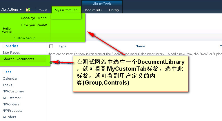
单击“My Custom Tab”选项卡,查看“自定义组”,然后单击“Hello, World”、“Good-bye, World”或“I Love You, World”按钮。

 浙公网安备 33010602011771号