css
1、CSS 入门
A、为什么学习 CSS(CSS 的作用)
【1】HTML 虽然可以在一定程度上修饰页面,但是页面的
整体还是不够美观。
【2】HTML 进行网页的书写重复的代码比较多,后期的维
护性不好。
B、什么是 CSS(CSS 的概念)
英文全称:Cascading Style Sheets
层叠样式表(级联样式表)
CSS 的引入方式
CSS 的引入的三种方式
在标签的内部直接使用(不推荐使用)
-
<!--1、行内式 style=“key:value; ”
style="font-size:30px;color: yellow;" -->
-
<!--2、内嵌样式
- 这个style标签写建议写到head里面,因为这个中的内容需要展现到用户面前的-->
<style>
/*选择器 */
span{
/*字体的大小*/
font-size: 30px;
/*字体的颜色*/
color: red;
/*字体的样式*/
font-family: 宋体;
}
</style>
这个 (.css)文件是在外部定义好的文件直接建立csss
文件就可以了
-
<!--3、链接式 rel:当前的文档和引入的文档的关系 href:是指引入文档的关系-->
<link rel="stylesheet" href="css/css.css"/>
-
<!--*4*导入式 了解:这种方式也可以引入CSS的样式,作为了解-->
<style>
@import url("css/css.css");
</style>
CSS 中三种引入方式遵循的就近原则 :
- 不相同的样式会进行样式的叠加,
- 相同的样式会采用就近的原则。
- 样式跟随距离自己近的风格


<!DOCTYPE html>
<html>
    <head>
        <meta charset="utf-8">
        <title></title>


        <style>
             /*【2】内嵌样式*/
            /*p代表标签的名称*/
            p{
            /*字体颜色*/
             color: yellow;
             /*字体的大小*/
             font-size: 25px;

             /*字体加粗*/
             font-weight: bold;

            }

        </style>


        <!--【3】外部式(连接式)  rel:引入文件和当前文件的关系  href:引入文件的路径-->
        <link rel="stylesheet" type="text/css" href="css/css1.css"/>

        <!--<style>
            /*[4]导入样式(了解即可)*/
            @import url("css/css1.css");

        </style>-->


    </head>
    <body>
        <p>我们不一样</p>
        <!--【1】行内样式   键:值-->
        <!--<p style="color: red;">我们不一样</p>-->

        <!--<p >我们不一样</p>


        <p>我们不一样</p>-->


    </body>
</html>
<!--
    CSS中的引入方式的顺序 :就近原则


-->
CSS 中的常用选择器
常用四种选择器
- 标签选择器
p{
color: red;
}
- id选择器
id:(唯一性)
id命名:数字、字母、下划线、中划线(-),不
能用数字开头
#p_1{
font-size: 30px;
color: yellowgreen;
}
- class选择器
.p_2{
font-weight: bold;
color: yellow;
}
- 通用选择器:
*{
}
四种选择器的优先级:
id 选择器>class 选择器>标签选择器>通用选择器
权重 100 10 1
<!DOCTYPE html>
<html>
    <head>
        <meta charset="utf-8">
        <title></title>

        <style>
            /*通用选择器  *代表该页面中的所有的元素 */
            *{
                color: red;

                background-color: black;
            }
            /*元素选择器*/
            div{

                width: 200px;

                height: 200px;
                /*背景颜色*/
                background-color: blue;

                /*边框的粗细   边框的风格  边框的颜色 */
                border: 1px solid red;

            }
            /*ID选择器 #id的名称 id的名称保证唯一

             * ID的命名: 数字、字母、下划线、中划线组成,不能用数字开头
             * */
            #div1{

                background-color: green;

            }

            /*class类选择器*/

            .div_1{

                background-color: pink;

            }

        </style>

    </head>
    <body>


        <!--<div class="div_1">1</div>-->

        <div>2</div>

        <!--<div class="div_1">3</div>-->


        <p>你好</p>
    </body>
</html>

<!--

    选择器的优先级:


    ID>类选择器>元素选择器>通用选择器

权重 100    10      1


-->
CSS 中其他选择器
- 后代选择器 只要包含该标签对象即可
div span{
font-size: 27px;
font-family: 宋体;
color: red;
}
- 子选择器 直系子标签
div>span{
color: red;
}
- 兄弟选择器 只会改变下面相邻的元素对象
#p_1+p{
color: green;
}
- 兄弟选择器 后面所有的兄弟对象都会改变
#p_1~p{
color: red;
font-size: 30px;
}
- 伪类选择器
a:hover{
color: red;
}
<!DOCTYPE html>
<html>
    <head>
        <meta charset="utf-8">
        <title></title>
        <style>
            /*后代选择器   只要包含该标签对象即可  */
            /*div span{

                font-size: 27px;

                font-family: 宋体;

                color: red;
            }*/

            /*子选择器 直系子标签*/

           /* div>span{

            color: red;
           }
           */
          /*兄弟选择器  只会改变下面相邻的元素对象*/

          /*#p_1+p{

              color: green;

          }*/

         /*兄弟选择器  后面所有的兄弟对象都会改变*/
         /*#p_1~p{

             color: red;

             font-size: 30px;

         }*/

        /*伪类选择器*/

            a:hover{

                color: red;

            }


        </style>

    </head>
    <body>


        <div>

            <span>北京尚学堂</span>

            <p>

                <span>北京尚学堂123</span>

            </p>

        </div>

        <span>北京尚学堂</span>

        <hr />

        <p id="p_1">我们不一样</p>


        <p>我们不一样</p>


        <p>我们不一样</p>

        <hr />

        <a href="">京东网址</a>
    </body>
</html>
CSS 中常用样式总结 1
- 字体:(font)
/*字体的颜色*/
- color: gray;
/*字体的大小*/
- font-size: 12px;
/*字体的加粗*/
- /*font-weight: bold;*/
/*字体的风格*/
- /*font-family: 宋体;*/
/*字体倾斜*/
- /*font-style: italic;*
文本(text)
/*下划线展示*/
- text-decoration: underline;
/*去除下划线*/
- text-decoration: none;
/*文本居中*/
- text-align: center;
- border 属性有三个修饰属性
border-color
border-color:red;
border-top-color:blue;
border-width
border-width: 1px;
border-left-width: 3px;
border-style
border-style: solid
border-bottom-style: solid;
可以使用border统一设置
border: 1px solid red;
border-right: 5px dotted blue;
<!DOCTYPE html>
<html>
    <head>
        <meta charset="utf-8">
        <title></title>
        <style>

            .top{

                width: 100%;

                height: 100px;

                border: 1px solid  red;

            }

            .top_a{
                /*字体的颜色*/
                color: gray;

                /*字体的大小*/

                font-size: 12px;
                /*
                /*字体的加粗*/
                /*font-weight: bold;*/
                /*字体的风格*/
                /*font-family: 宋体;*/
                /*字体倾斜*/
                /*font-style: italic;*/


                /*去除下划线*/
                text-decoration: none;
            }

            a:hover{

                color: red;
                /*下划线展示*/
                text-decoration: underline;

            }

            .tips{

                width: 100%;

                height: 40px;

                border:  1px dotted indianred;
                /*背景颜色*/
                background-color: pink;

                /*文本居中*/
                text-align: center;

                /*行高  行高的高度和div外面的高度一致这时候里面的内容就会垂直居中*/
                line-height: 40px;

            }

            .center{

                width: 100%;

                height: 500px;

                border: 1px  solid  red;
               /*设置背景图片*/
                background-image: url("http://img30.360buyimg.com/da/jfs/t22399/154/765213112/96035/f94f9605/5b17512dN2de9d722.jpg");

                /*设置背景图片不重复*/

                background-repeat: no-repeat;

                /*调整背景图片的位置   X   Y*/
                background-position: center;

                /*调整背景图片的大小   宽  高  */
                /*background-size: 300px  500px;*/
                /*背景颜色    red   #f0000  rgb(255,0,0)  rgba(255,0,0,.5){包含透明度} */
                background-color: rgba(255,0,0,.5);


            }

        </style>

    </head>
    <body>
        <!--顶部的位置-->
        <div class="top">

          <a href="" class="top_a">登录页面,调查问卷</a>
        </div>

        <!--中间的提示操作-->

        <div class="tips">

            <span>依据《网络安全法》,为保障您的账户安全和正常使用,请尽快完成手机号验证! 新版《京东隐私政策》已上线,将更有利于保护您的个人隐私。</span>

        </div>

        <div class="center">


        </div>

    </body>
</html>
<!--

    字体:

                /*字体的颜色*/
                color: gray;
                /*字体的大小*/
                font-size: 12px;
                /*
                /*字体的加粗*/
                /*font-weight: bold;*/
                /*字体的风格*/
                /*font-family: 宋体;*/
                /*字体倾斜*/
                /*font-style: italic;*/


    text
                /*下划线展示*/
                text-decoration: underline;
               /*去除下划线*/
                text-decoration: none;
               /*文本居中*/
                text-align: center;

    行高
                line-height: 40px;


    背景
                /*设置背景图片*/
                background-image: url("http://img30.360buyimg.com/da/jfs/t22399/154/765213112/96035/f94f9605/5b17512dN2de9d722.jpg");

                /*设置背景图片不重复*/

                background-repeat: no-repeat;

                /*调整背景图片的位置   X   Y*/
                background-position: center;

                /*调整背景图片的大小   宽  高  */
                /*background-size: 300px  500px;*/
                /*背景颜色    red   #f0000  rgb(255,0,0)  rgba(255,0,0,.5){包含透明度} */
                background-color: rgba(255,0,0,.5);

-->
CSS 常用样式总结 2
行高
line-height: 40px;
背景
/*设置背景图片*/
background-image:
url("http://img30.360buyimg.com/da/jfs/t22399/154/765213112/96035/f94f9605/5b17512dN2de9d722.jpg");
/*设置背景图片不重复*/
background-repeat: no-repeat;
/*调整背景图片的位置 X Y*/
background-position: center;
/*调整背景图片的大小 宽 高 */
/*background-size: 300px 500px;*/
/*背景颜色 red #f0000 rgb(255,0,0)
rgba(255,0,0,.5){包含透明度} */
background-color: rgba(255,0,0,.5);
<!DOCTYPE html>
<html>
    <head>
        <meta charset="utf-8">
        <title></title>
        <style>

            .top{

                width: 100%;

                height: 100px;

                border: 1px solid  red;

            }

            .top_a{
                /*字体的颜色*/
                color: gray;

                /*字体的大小*/

                font-size: 12px;
                /*
                /*字体的加粗*/
                /*font-weight: bold;*/
                /*字体的风格*/
                /*font-family: 宋体;*/
                /*字体倾斜*/
                /*font-style: italic;*/


                /*去除下划线*/
                text-decoration: none;
            }

            a:hover{

                color: red;
                /*下划线展示*/
                text-decoration: underline;

            }

            .tips{

                width: 100%;

                height: 40px;

                border:  1px dotted indianred;
                /*背景颜色*/
                background-color: pink;

                /*文本居中*/
                text-align: center;

                /*行高  行高的高度和div外面的高度一致这时候里面的内容就会垂直居中*/
                line-height: 40px;

            }

            .center{

                width: 100%;

                height: 500px;

                border: 1px  solid  red;
               /*设置背景图片*/
                background-image: url("http://img30.360buyimg.com/da/jfs/t22399/154/765213112/96035/f94f9605/5b17512dN2de9d722.jpg");

                /*设置背景图片不重复*/

                background-repeat: no-repeat;

                /*调整背景图片的位置   X   Y*/
                background-position: center;

                /*调整背景图片的大小   宽  高  */
                /*background-size: 300px  500px;*/
                /*背景颜色    red   #f0000  rgb(255,0,0)  rgba(255,0,0,.5){包含透明度} */
                background-color: rgba(255,0,0,.5);


            }

        </style>

    </head>
    <body>
        <!--顶部的位置-->
        <div class="top">

          <a href="" class="top_a">登录页面,调查问卷</a>
        </div>

        <!--中间的提示操作-->

        <div class="tips">

            <span>依据《网络安全法》,为保障您的账户安全和正常使用,请尽快完成手机号验证! 新版《京东隐私政策》已上线,将更有利于保护您的个人隐私。</span>

        </div>

        <div class="center">


        </div>

    </body>
</html>
<!--

    字体:

                /*字体的颜色*/
                color: gray;
                /*字体的大小*/
                font-size: 12px;
                /*
                /*字体的加粗*/
                /*font-weight: bold;*/
                /*字体的风格*/
                /*font-family: 宋体;*/
                /*字体倾斜*/
                /*font-style: italic;*/


    text
                /*下划线展示*/
                text-decoration: underline;
               /*去除下划线*/
                text-decoration: none;
               /*文本居中*/
                text-align: center;

    行高
                line-height: 40px;


    背景
                /*设置背景图片*/
                background-image: url("http://img30.360buyimg.com/da/jfs/t22399/154/765213112/96035/f94f9605/5b17512dN2de9d722.jpg");

                /*设置背景图片不重复*/

                background-repeat: no-repeat;

                /*调整背景图片的位置   X   Y*/
                background-position: center;

                /*调整背景图片的大小   宽  高  */
                /*background-size: 300px  500px;*/
                /*背景颜色    red   #f0000  rgb(255,0,0)  rgba(255,0,0,.5){包含透明度} */
                background-color: rgba(255,0,0,.5);

-->
CSS 中常用样式总结 3
行元素和块元素
行内元素:(多个标签位于同一行)
span font 小标签 img a 等
块元素:(标签可以自动换行的元素是块元素)
div h1-h6 ul p 等
其他样式
/*调整透明度的属性 0-1*/
opacity: 0.4;
/*超出隐藏 hidden*/
overflow: hidden;
/*行内元素转块级元素 inline block none(隐藏)*/
display: block;
<!DOCTYPE html>
<html>
    <head>
        <meta charset="utf-8">
        <title></title>
        <style>
            .div_1{

                width: 200px;

                height: 200px;

                background-color: rgba(255,0,0);

                color: rgba(0,0,255);

                /*调整透明度的属性  0-1*/
                opacity: 0.4;

                /*超出隐藏  hidden*/
                overflow: hidden;


            }

            #span_1{

                width: 100px;

                height: 100px;

                border: 1px solid red;
                /*行内元素转块级元素   inline   block  none(隐藏)*/
                display: block;

            }

            ul{

                float: right;

            }

            li{
                /*列表的风格去除*/
                list-style: none;

                float:left;
                /*内边距*/
                padding-left: 15px;
            }

        </style>

    </head>
    <body>


        <ul>
            <li><a href="">新闻</a></li>
            <li><a href="">hao123</a></li>
            <li><a href="">地图</a></li>
            <li><a href="">视频</a></li>
            <li><a href="">贴吧</a></li>
            <li><a href="">学术</a></li>
        </ul>

        <!--<hr />


        <div class="div_1">

            我们都是div我们都是div我们都是div我们都是div我们都是div
            我们都是div我们都是div我们都是div我们都是div我们都是div
            我们都是div我们都是div我们都是div我们都是div我们都是div
            我们都是div我们都是div我们都是div我们都是div我们都是div
            我们都是div我们都是div我们都是div我们都是div我们都是div

        </div>

        <hr />

        <span id="span_1">1234</span>

        <hr />
        -->


    </body>
</html>

<!--
    行内元素:(多个标签位于同一行)

     span  font  小标签   img  a  等

    块元素:(标签可以自动换行的元素是块元素)

       div   h1-h6  ul    p    等


-->
CSS 中的定位
绝对定位:
absolute :定位离开之后释放的之前的位置 基于外
层父级标签来说。 (释放掉之前的位置,后面的元素顶上去)
相对定位:
relative: 定位离开之后之前的位置没有释放 基于之
前的位置来说 (之前的位置没有释放掉)
固定定位:
fixed :始终是基于浏览器的左上角定位 适合
做广告
position :fixed
top: 150px;
left:150px;
默认定位:
static :初始的定位的操作
<!DOCTYPE html>
<html>
    <head>
        <meta charset="utf-8">
        <title></title>
        <style>

            .div_1{

                width: 200px;

                height: 200px;

                background-color: red;

                /*绝对定位*/
                /*position: absolute;*/

                /*固定定位*/
                position: absolute;

                top: 150px;

                left: 150px;

                /*置于底层位置*/
                z-index: -1;


            }

            .div_2{

                width: 200px;

                height: 200px;

                background-color: green;


                /*相对定位*/
                /*position: relative;

                top: 300px;

                left: 300px;*/


            }
        </style>

    </head>
    <body>

        <div class="div_1"></div>

        <div class="div_2"></div>

        <br />
        <br />
        <br />
        <br />
        <br />
        <br />
        <br />
        <br />
        <br />
        <br />
        <br />
        <br />
        <br />
        <br />
        <br />
        <br />
        <br />
        <br />
        <br />
        <br />
        <br />
        <br />
        <br />
        <br />
        <br />
        <br />
        <br />
        <br />
        <br />
        <br />
        <br />
        <br />
        <br />
        <br />
        <br />
        <br />
        <br />
        <br />
        <br />
        <br />
        <br />
        <br />
        <br />
        <br />
        <br />
        <br />

    </body>
</html>
<!--
    绝对定位:
    absolute  :定位离开之后释放的之前的位置   基于外层父级标签来说


    相对定位:

     relative: 定位离开之后之前的位置没有释放  基于之前的位置来说

    固定定位:

     fixed   :始终是基于浏览器的左上角定位    适合做广告

    默认定位:

     static   :初始的定位的操作


-->
<!DOCTYPE html>
<html>
<head>
<meta charset="UTF-8">
<title>Insert title here</title>
<style type="text/css">
    *.{
     margin: 0px;
     padding:0px;

    }
    #id{
        height:120px;
        width:300px;
        background-color:pink;


     }
     #id2{
         height: 120px;
         width: 300px;
         background-color: red;

         position:relative;
         left:50px;
         top:300px;
     }
     .class{
          position: absolute;
         left:200px;
         top:200px;
      }
      li{
              list-style:none;
              padding-left:50px;
              float:right;
      }
</style>
</head>
<body>
<div id="s">
<ul >
            <li>Coffee</li>
            <li>Milk</li>
        </ul>
</div>

    <div id="id" class="class" ></div>
    <div id="id2"></div>


</body>
</html>
盒模型
盒子模型的介绍示意图
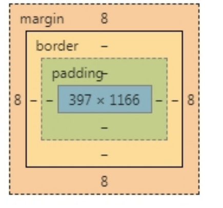
3 个属性都可以同时或者分别设置 4 个方向属性值
margin:1px,2px,3px,4px;(顺时针放向:上右下左4个方向)
margin:1px,2px;
margin:1px;
margin:0px auto ;//块元素会自动居中
margin-left:1px;
<!DOCTYPE html>
<html>
    <head>
        <meta charset="utf-8">
        <title></title>
        <style>
            /*清除浏览器的留白*/
            body,html{margin: 0px;padding: 0px;}

            .div_1{

                width: 200px;

                height: 200px;

                background-color: red;

                /*内边距  真是div和border之间的距离*/
                /*padding: 50px;*/
                /*   上下的距离    左右的距离*/
                /*padding: 30px  50px;*/
                /* 上 右 下 左*/
                /*padding: 10px  20px  30px  40px;*/

                /*padding-top: 30px;*/

                /*外边距  给盒子进行定位*/
                /*margin: 50px;*/

                /*margin-left: 80px;

                margin-top: 70px;*/

                /*外边距 垂直的方向回去较大的值*/
                margin-bottom: 40px;
                /*外边距  水平方向会合并*/
                margin-right: 40px;

            }

            .div_2{
                width: 200px;

                height: 200px;

                background-color: green;

                /*margin-top: 70px;*/

                margin-left: 50px;


            }


            div{

                float: left;

            }

        </style>

    </head>
    <body>

        <div class="div_1"></div>


        <div class="div_2"></div>


    </body>
</html>
CSS3 中新增选择器
- /*获得class名称是div1下面的第一个子元素*/
- .div1>p:first-child{
- color: red;
- }
- div1>p:last-child{
- color: green;
- }
- /*获得具体的某一个子元素*/
- .div1>p:nth-child(2){
- background-color: palegreen;
- }
- .div1>p:nth-child(even){
- background-color: red;
- }
- div1>p:nth-child(odd){
- background-color: green;
- }
- /*获得空的元素对象*/
- .div1>p:empty{
- height: 50px;
- background-color: darkmagenta;
- }
- /*获得焦点执行的样式*/
- input:focus{
- width: 300px;
- height:100px;
- }
- input:checked{
- width: 20px;
- height: 20px;
- }
- 伪对象选择器是在指定的对象之前(或者之后)插入内容
- .div1:before{
- /*content: "我们的祖国是花园";*/
- content: url(img/1.jpg);
- }
- .div1:after{}
<!DOCTYPE html>
<html>
    <head>
        <meta charset="utf-8">
        <title></title>

        <style>
            /*获得class名称是div1下面的第一个子元素*/
            .div1>p:first-child{

                color: red;

            }

          .div1>p:last-child{

            color: green;

          }
          /*获得具体的某一个子元素*/

          /*.div1>p:nth-child(2){

              background-color: palegreen;

          }*/

         /* .div1>p:nth-child(even){

              background-color: red;

          }

          .div1>p:nth-child(odd){

               background-color: green;

          }*/
           /*获得空的元素对象*/

          .div1>p:empty{

                height: 50px;

                background-color: darkmagenta;

          }

          /*获得焦点执行的样式*/
        /*  input:focus{

              width: 300px;

              height:100px;
          }*/

         input:checked{

             width: 20px;

             height: 20px;

         }


        </style>

    </head>
    <body>


        <div class="div1">

            <p>1</p>
            <p>2</p>
            <p>3</p>
            <p></p>
            <p>4</p>
            <p>5</p>


        </div>

        <hr />

        <input type="text" name="" id="" value="" />
        <hr />

       男:<input type="radio"  name="sex"/>

       女:<input type="radio"  name="sex"/>

    </body>
</html>
<!DOCTYPE html>
<html>
    <head>
        <meta charset="utf-8">
        <title></title>

        <style>
            /*

             *  伪对象选择器是在指定的对象之前(或者之后)插入内容
             * */
            .div1:before{

                /*content: "我们的祖国是花园";*/

                content: url(img/1.jpg);

            }

            .div1:after{


            }

        </style>
    </head>
    <body>


        <div class="div1">你好</div>

    </body>
</html>
CSS3 中新增选择器 2
- 选择器学习
- /*属性选择器*/
- input[type='text']{
- width: 300px;
- height: 40px;
- }
- /*属性 ^用fom开头的对象 $*/
- input[name^='fom']{
- width: 300px;
- height: 40px;
- }
- 选择器的种类总结:
- 【1】基础选择器
- * id class 标签
- 【2】关系选择器
- > + ~
- 【3】伪类选择器
- hover
- 【4】伪对象选择器
- before \after
- 【5】属性选择器
- input[type='text']
<!DOCTYPE html>
<html>
    <head>
        <meta charset="utf-8">
        <title></title>

        <style>

             /*属性选择器*/

            /*input[type='text']{

                width: 300px;

                height: 40px;

            }*/

            /*属性 ^用fom开头的对象   $*/

            input[name^='fom']{


                width: 300px;

                height: 40px;
            }

        </style>


    </head>
    <body>

        <p>

          账号:    <input type="text" name="fom_zh" id="" value="" />

        </p>


        <p>
        密码:    <input type="password" name="fom_pwd" id="" value="" />

        </p>


        <p>
        邮箱:    <input type="email" name="fom_email" id="" value="" />

        </p>

        <p>
         年龄:    <input type="number" name="age" />


        </p>
    </body>
</html>
<!--
     选择器的种类:


       【1】基础选择器

           *   id   class   标签

       【2】关系选择器

            >   +   ~

       【3】伪类选择器

           hover

       【4】伪对象选择器

          before  \after


       【5】属性选择器

         input[type='text']


-->
CSS3 中常用的样式
CSS3 中常用样式
- /*倒圆角指令*/
- border-radius: 100px;
- /* 左上右下 右上左下 */
- border-radius:10px 60px;
- border-radius:10px 20px 30px 40px;
- /*旋转角度*/
- transform: rotate(45deg);
- /*放大的倍数*/
- transform: scale(1.3);
- /* X:水平的位移 Y :垂直的位移 负数:上*/
- transform: translate(0px,-5px);
- /*2D角度的旋转 X Y*/
- transform: skew(40deg,45deg);
- /*阴影 水平方向的偏移 垂直方向的偏移 模糊度 阴
- 影的颜色*/
- box-shadow: 0px 0px 70px #D5093C;
- CSS3 中的动画标签
- @-ms-keyframes name{
- from{}
- to{}
- }
- @-ms-keyframes name{
- 0%{}
- 50%{}
- 100%{}
- }
<!DOCTYPE html>
<html>
    <head>
        <meta charset="utf-8">
        <title></title>

        <style>

            body{

                background-color: #ffa5a5;

            }


            .cen{

                width: 200px;

                height: 200px;

                background-color: #d5093c;

                /*阴影   水平方向的偏移  垂直方向的偏移  模糊度 阴影的颜色*/
                 box-shadow: 0px 0px 70px #D5093C;
                 /*执行动画的调用*/
                 animation: 1s aj infinite;


            }

            .lef{


                /*倒圆角指令*/
                border-radius: 100px;
                /* 左上右下   右上左下 */
                /*border-radius:10px  60px;*/

                /*border-radius:10px 20px 30px 40px;*/

                position: absolute;

                top: 200px;

                left: 200px;


            }

            .rig{

                border-radius: 100px;

                position: absolute;

                top: 200px;

                left: 341px;
            }

            .c{
                /*旋转角度*/
                transform: rotate(45deg);

                position: absolute;

                top: 269px;

                left: 271px;


            }

            /*CSS3中的动画*/

            @keyframes aj{

                 0%{transform: scale(1)rotate(45deg);}

                 50%{transform: scale(1.1)rotate(45deg);}

                 100%{transform: scale(1)rotate(45deg);}

            }

            @-moz-keyframes name{
                from{}
                to{}
            }


            @-ms-keyframes name{
                from{}
                to{}
            }
            @-webkit-keyframes name{
                from{}
                to{}
            }
        </style>


    </head>
    <body>


        <div class="cen lef" ></div>

        <div class="cen c"></div>

        <div class="cen rig"></div>
    </body>
</html>
<!--

    CSS3中常用的属性

                 /*倒圆角指令*/
                border-radius: 100px;
                /* 左上右下   右上左下 */
                /*border-radius:10px  60px;*/

                /*border-radius:10px 20px 30px 40px;*/


               /*旋转角度*/
                transform: rotate(45deg);
                /*放大的倍数*/
                /*transform: scale(1.3);*/
                /* X:水平的位移   Y  :垂直的位移  负数:上*/
                /*transform: translate(0px,-5px);*/
                /*2D角度的旋转  X  Y*/
                 transform: skew(40deg,45deg);

               /*阴影   水平方向的偏移  垂直方向的偏移  模糊度 阴影的颜色*/
                 box-shadow: 0px 0px 70px #D5093C;


                CSS3中的动画标签
                 @-ms-keyframes name{
                from{}
                to{}
            }

            @-ms-keyframes name{
                0%{}

                50%{}


                100%{}
            }

-->
下载小图标: https://www.iconfont.cn/

 浙公网安备 33010602011771号