css包含块
什么是包含块?
对于元素的尺寸和位置,会受它的包含块所影响。对于一些属性,例如:width,height,padding,margin,绝对定位元素的偏移值(position被设置成absolute或者fixed),当我们对其赋予百分比值,这些值得计算值,就是通过元素的包含快计算得来。
案例一
<body>
  <div class="container">
    <div class="item"></div>
  </div>
</body>
.container{
  width: 500px;
  height: 300px;
  background-color: skyblue;
}
.item{
  width: 50%;
  height: 50%;
  background-color: red;
}
此时div.item的宽高分别为250px和150px,这是通过div.item的包含块来计算的,而这里包含块的大小,就是次元色最近的祖先块元素的内容区。
包含块分为两种,一种是根元素(HTML元素)所在的包含块,被称之为初始包含块(initial containing block)。对于浏览器而言,初始包含块的大小等于视口viewport的大小,基点在画布的原点(视口左上角)。他作为元素绝对定位和固定定位的参照物。
另外一种是对于非根元素,对于非根元素的包含块判定由几种不同的情况。大致分为如下几种:
- 如果元素的position是relative或static,那么包含块由离它最近的块容器(block container)的内容区域的边缘建立。
- 如果pisition的属性是fixed,那么包含块由视口建立。
- 如果元素使用了absolute定位,则包含块由它最近的pisition的值不是static(就是为fixed、absolute、relative或sticky)的祖先元素的内边距区的边缘组成。
对于第三点可以看以下案例:
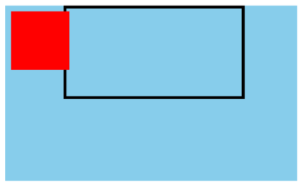
案例二
<body>
    <div class="container">
      <div class="item">
        <div class="item2"></div>
      </div>
    </div>
  </body>
.container {
  width: 500px;
  height: 300px;
  background-color: skyblue;
  position: relative;
}
.item {
  width: 300px;
  height: 150px;
  border: 5px solid;
  margin-left: 100px;
}
.item2 {
  width: 100px;
  height: 100px;
  background-color: red;
  position: absolute;
  left: 10px;
  top: 10px;
}
根据上面第三条规则,对于div.item2来讲,它的包含块应该是div.container,而非div.item,所以该布局的大致画面如下:
实际上对于非根元素来讲,包含快还有一种可能,那就是如果position的属性是absolute或fixed,包含块也可能是由满足以下条件的最近父级元素的内边距区的边缘组成:
- transform或perspective的值不是none
- will-change的值是transform或perspective
- filter的值不是none或will-change的值是filter(只在Firefox下生效)
- contain的值是paint(contain:paint)
再来看一个案例
案例三
<body>
  <div class="container">
    <div class="item">
      <div class="item2"></div>
    </div>
  </div>
</body>
.container {
  width: 500px;
  height: 300px;
  background-color: skyblue;
  position: relative;
}
.item {
  width: 300px;
  height: 150px;
  border: 5px solid;
  margin-left: 100px;
  transform: rotate(0deg); /* 新增代码 */
}
.item2 {
  width: 100px;
  height: 100px;
  background-color: red;
  position: absolute;
  left: 10px;
  top: 10px;
}
我们对于上面的代码只新增了一条声明,就是transform:rorate(0deg),此时的渲染效果如下图所示:
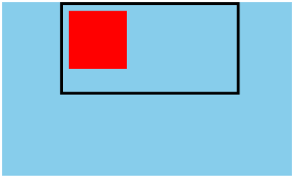
可以看到,此时对于div.item2来讲,包含块就变成了div.item

 浙公网安备 33010602011771号