
Taro自定义Tabbar
在项目中遇到需要自定义底部的tabbar,首先需要了解底部tabbar最少2个最多5个,项目中可能会遇到自定义时底部的tabbar总个数超过5个的情况,
比如:在商家端小程序底部需要显示3个tabbar,客户端小程序也需要显示3个tabbar,此时商家端和客户端的tabbar都不相同,此时自定义就可以用到。
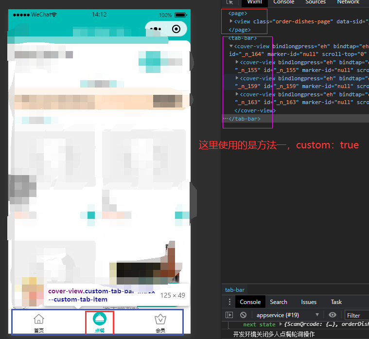
方法一:使用CoverView/CoverImage 微信小程序原生的覆盖层组件, 好处避免导航被原生组件遮挡,切换底部导航页面时,导航栏不会有闪烁的问题
-
在
app.config中按正常填写 tabBar 项的相关配置(为了向下兼容),并把 tabBar 项的custom字段设置为true。 -
所有作为 TabBar 页面的
config里需要声明usingComponents项,也可以在app.config设置全局开启。 -
原生 custom tabBar 限制:
- 仅支持小程序端,H5/APP 端无法使用
- 必须放在
pages/custom-tab-bar目录下,不能放在 components 或 src 根目录 - 组件内只能使用
CoverView/CoverImage,不能使用普通View/Image(否则会被原生组件遮挡)
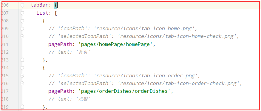
步骤一:在app.config.js中增加自定义tabbar开关custom:true
  tabBar: {
    custom: true,
    list: [
      {
        pagePath: 'pages/storeManagePage/storeManagePage',
        text: '库存',
      }, {
        pagePath: 'pages/my/my',
        text: '我的',
      }
    ]
  }
步骤二: 在添加导航栏显示的页面增加usingComponents配置,以库存页面(pages/storeManagePage/storeManagePage)为例,
这里 custom-tab-bar 组件是创建在src目录下,所以这个路径要写正确
export default {
  navigationBarTitleText: '供应链',
  enablePullDownRefresh: true,  //使能微信小程序的下拉刷新
  backgroundTextStyle: 'dark', //顶部显示颜色为深色的三个点
  usingComponents: {
    'custom-tab-bar': '../custom-tab-bar'
  }
}
在页面中引入组件
render () { return (
      <View className='app-page store-manage-page'>
         ...
      </* 这里引入底部导航栏组件 */>
        <custom-tab-bar></custom-tab-bar>
      </View>
    )
  }
步骤三: 在 src 目录 pages 下添加 custom-tab-bar 目录,在里面书写组件, 大部分的内容,不可直接复制粘贴使用,代码进行了简单的替换,如果项目使用了redux,建议将TabList数据放在redux中

/**
 * author: wang.p  2022-10-17
 * description: 自定义组件
 * */

import Taro from '@tarojs/taro'
import React, {Component} from 'react';
import { CoverView, CoverImage } from '@tarojs/components'
import classnames from 'classnames';
import PropsType from 'prop-types';
import {connect} from "react-redux";
import {onChangeGlobalData} from "@/reducers/globalReducer";
import './index.scss'

// 底部导航栏数组,可以放到后端数据库中,前端获取后缓存
const TabListData = [
  {
    pagePath: '/pages/storeManagePage/storeManagePage',
    text: '供应链',
    iconPath: '未选中图片路径.png',
    selectedIconPath: '已选中图片路径.png',
  }, {
    pagePath: '/pages/my/my',
    text: '我的',
    iconPath: '未选中图片路径.png',
    selectedIconPath: '已选中图片路径.png' ,
  }
]

class CustomTabBar extends Component {

  static propTypes = {
    SelectedTabBar: PropsType.string,  // 激活的tabbar路径
    onChangeGlobalData: PropsType.func,  // 修改tabbar
  }

  state = {
    selected: 0,  // 当前激活的tab下标
    color: '#000',  // 字体颜色
    selectedColor: '#00bab4',  // 激活的字体颜色
    backgroundColor: '#ffffff',  // 背景色
    borderStyle: 'black',   // 边框颜色
  }

  componentDidMount() {
  }


  render() {
    const {SelectedTabBar} = this.props;
    return (
      <CoverView className={classnames('custom-tab')}>
        {
          TabListData.map((item, index) => {
            return <CoverView className='custom-tab-item' onClick={this.switchTab.bind(this, item)}
                              data-path={item.pagePath} key={index}>
              <CoverImage className='custom-tab-item-img'
                          src={SelectedTabBar === item.pagePath ? item.selectedIconPath : item.iconPath}/>
              <CoverView className='custom-tab-item-text'
                         style={{color: SelectedTabBar === item.pagePath ? this.state.selectedColor : this.state.color}}>
                {item.text}
              </CoverView>
            </CoverView>
          })
        }
      </CoverView>
    )
  }

  /**
   * 切换Tab
   * */
  switchTab = (tabData) => {
    let that = this;
    const {pagePath, navigateTo} = tabData;
    if (navigateTo) {
      Taro.navigateTo({
        url: pagePath
      })
    } else {
      Taro.switchTab({
        url: pagePath,
        success: () => {
      // 页面切换时,修改缓存的导航栏
          that.props.onChangeGlobalData({SelectedTabBar: pagePath});
        }
      })
    }
  }
}

const mapStateToProps = (state) => {
  const {SelectedTabBar} = state[StoreKeys.GlobalData];
  return {
    SelectedTabBar: SelectedTabBar
  };
};

const mapDispatchToProps = {
  onChangeGlobalData   // 这个是修改激活的tabbar信息,本人将其缓存在redux中
};

export default connect(mapStateToProps, mapDispatchToProps)(CustomTabBar)
.custom-tab {
  display: flex;
  flex-direction: row;
  justify-content: space-around;
  position: fixed;
  bottom: 0;
  width: 100vw;
  height: 50Px;
  border-radius: 0;
  box-sizing: border-box;
  border-top: 1Px solid #f1f1f1;
  background-color: #FFFFFF;

  &-item {
    flex: 1;
    display: flex;
    flex-direction: column;
    justify-content: center;
    align-items: center;
    position: relative;

    &-img {
      margin: 0 auto;
      width: 28PX;
      height: 28Px;
    }

    &-text {
      margin-top: 4Px;
      font-size: 10Px;
    }
  }
}
方法二:在页面中使用Taro.hideTabBar() 隐藏底部Tabbar,并创建自定义Tarbar组件,在页面中引入,Tabbar组件就直接使用上面方法一组件CustomTabBar,文件名要大写
同时在app.config.js的tabBar的list配置中,只配置pagePath的路由,否则页面在显示时会先看到配置中的tabbar,然后又显示自定义的,只配置pagePath,底部只会看到一个空白的,
组件的样式要记得添加z-index,否则有可能因为position属性被页面其他组件遮挡
使用方法二,还是要创建方法一种的custom-tab-bar,不然编译时会提示需要解决这个custom-tab-bar/index.js不存在的问题

方法一可以避免遮挡问题以及切换导航栏页面是底部导航栏闪烁问题,方法二是组件可以完全自己定义
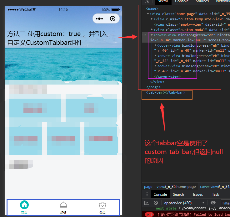
追加一个思路:app.config.js配置中 tabBar增加了custom:true的配置,就会使底部tabbar消失,需要添加自定义,
那可以直接使用方法二组件,这样就不会出现方法二中需要先隐藏原来的Tabbar的操作

下面的文档先不要参考,因为是几年前的一个文档,目前可能存在一些问题。
说明一点,方法一和方法二在页面上显示会有不同,方法一在页面html中是显示在page标签外的,而方法二是显示在page标签里面的

 浙公网安备 33010602011771号