TabLayoutBottomDemo【TabLayout实现底部选项卡】
版权声明:本文为HaiyuKing原创文章,转载请注明出处!
前言
使用TabLayout实现底部选项卡切换功能。
效果图

代码分析
1、演示固定模式的展现
2、演示自定义布局的实现
使用步骤
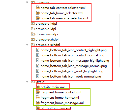
一、项目组织结构图


注意事项:
1、 导入类文件后需要change包名以及重新import R文件路径
2、 Values目录下的文件(strings.xml、dimens.xml、colors.xml等),如果项目中存在,则复制里面的内容,不要整个覆盖
二、导入步骤
引入依赖库
在APP的build.gradle文件中添加以下代码【注意:版本号和com.android.support:appcompat-v7保持一致】
apply plugin: 'com.android.application'

android {
    compileSdkVersion 25
    buildToolsVersion "25.0.3"
    defaultConfig {
        applicationId "com.why.project.tablayoutbottomdemo"
        minSdkVersion 15
        targetSdkVersion 25
        versionCode 1
        versionName "1.0"
        testInstrumentationRunner "android.support.test.runner.AndroidJUnitRunner"
    }
    buildTypes {
        release {
            minifyEnabled false
            proguardFiles getDefaultProguardFile('proguard-android.txt'), 'proguard-rules.pro'
        }
    }
}

dependencies {
    compile fileTree(dir: 'libs', include: ['*.jar'])
    androidTestCompile('com.android.support.test.espresso:espresso-core:2.2.2', {
        exclude group: 'com.android.support', module: 'support-annotations'
    })
    compile 'com.android.support:appcompat-v7:25.3.1'
    testCompile 'junit:junit:4.12'
    //TabLayout
    compile 'com.android.support:design:25.3.1'
}
将选项卡子项布局文件tab_bottom_item.xml文件复制到项目中


<?xml version="1.0" encoding="utf-8"?>
<!-- 底部选项卡区域的子选项卡布局文件 -->
<RelativeLayout xmlns:android="http://schemas.android.com/apk/res/android"
    android:layout_width="match_parent"
    android:layout_height="wrap_content"
    android:background="@color/tab_bg_normal"
    android:gravity="center" >

    <!-- android:checkMark="?android:attr/listChoiceIndicatorMultiple"代表多选
         android:checkMark="?android:attr/listChoiceIndicatorSingle" 代表单选
         该属性不添加的话,不会显示方框或者圆点
       -->

       <!-- android:drawableTop的属性值使用drawable目录下的selector选择器 -->
       <!-- android:tag="tag1"用于checkedTextview的索引 -->

       <!-- 选项卡的内容(图片+文字)类似RadioButton -->
    <!--android:textAlignment="center" 文本居中-->
    <CheckedTextView
        android:id="@+id/bottomtab_checkedTextView"
        android:tag="tag1"
        android:layout_width="wrap_content"
        android:layout_height="wrap_content"
        android:gravity="center"
        android:text=""
        android:textSize="@dimen/tab_text_size"
        android:textColor="@color/tab_text_normal"
        android:textAlignment="center"
        />
</RelativeLayout>
将图片资源和selector文件复制到项目中【后续可根据实际情况更换图片】


在colors.xml文件中添加以下代码:【后续可根据实际情况更改背景颜色、文字颜色值】
<?xml version="1.0" encoding="utf-8"?>
<resources>
    <color name="colorPrimary">#3F51B5</color>
    <color name="colorPrimaryDark">#303F9F</color>
    <color name="colorAccent">#FF4081</color>

    <!-- *********************************底部选项卡区域********************************* -->
    <!-- 底部选项卡底部背景色 -->
    <color name="tab_bg_normal">#00000000</color>
    <color name="tab_bg_selected">#00000000</color>
    <!-- 底部选项卡文本颜色 -->
    <color name="tab_text_normal">#8a8a8a</color>
    <color name="tab_text_selected">#38ADFF</color>
</resources>
在dimens.xml文件中添加以下代码:【后续可根据实际情况更改底部选项卡区域的高度值、文字大小值】
<resources>
    <!-- Default screen margins, per the Android Design guidelines. -->
    <dimen name="activity_horizontal_margin">16dp</dimen>
    <dimen name="activity_vertical_margin">16dp</dimen>

    <!-- *********************************底部选项卡区域********************************* -->
    <!--底部选项卡高度值-->
    <dimen name="tab_bottom_background_height">56dp</dimen>
    <!-- 底部选项卡文本大小 -->
    <dimen name="tab_text_size">14sp</dimen>
    <dimen name="tab_medium_text_size">16sp</dimen>
    <dimen name="tab_larger_text_size">18sp</dimen>
    <dimen name="tab_larger_small_text_size">20sp</dimen>

</resources>
在strings.xml文件中添加以下代码:【后续可根据实际情况更改底部选项卡的文字内容】
<resources>
    <string name="app_name">TabLayoutBottomDemo</string>

    <!-- *********************************底部选项卡区域********************************* -->
    <string name="home_function_home">首页</string>
    <string name="home_function_message">消息</string>
    <string name="home_function_contact">我的</string>

</resources>
至此,选项卡子项的布局所需的文件已集成到项目中了。
三、使用方法
在Activity布局文件中引用TabLayout
<?xml version="1.0" encoding="utf-8"?>
<LinearLayout
    xmlns:android="http://schemas.android.com/apk/res/android"
    xmlns:tools="http://schemas.android.com/tools"
    xmlns:app="http://schemas.android.com/apk/res-auto"
    android:id="@+id/activity_main"
    android:layout_width="match_parent"
    android:layout_height="match_parent"
    android:orientation="vertical"
    tools:context="com.why.project.tablayoutbottomdemo.MainActivity">

    <!-- viewpager区域 -->
    <android.support.v4.view.ViewPager
        android:id="@+id/vp_tab"
        android:layout_width="match_parent"
        android:layout_height="0.0dp"
        android:layout_weight="1"/>

    <View
        android:layout_width="match_parent"
        android:layout_height="1dp"
        android:background="#cfcfcf">
    </View>

    <!-- 选项卡区域 -->
    <!--设置TabLayout的模式 app:tabMode 默认是fixed:固定的,标签很多时候会被挤压,不能滑动。-->
    <!--设置整个TabLayout的颜色 app:tabBackground-->
    <!--设置选中字体的颜色 app:tabSelectedTextColor-->
    <!--设置未选中字体的颜色 app:tabTextColor-->
    <!--设置指示器下标的颜色 app:tabIndicatorColor-->
    <!--设置指示器下标的高度 app:tabIndicatorHeight,如果设置的是0.0dp,则代表没有下划线-->
    <!--设置内容的显示模式 app:tabGravity,center : 居中,如果是fill,则是充满-->
    <android.support.design.widget.TabLayout
        android:id="@+id/tl_top"
        android:layout_width="match_parent"
        android:layout_height="@dimen/tab_bottom_background_height"
        app:tabBackground="@android:color/transparent"
        app:tabMode="fixed"
        app:tabIndicatorHeight="0dp"
        app:tabGravity="fill"
        />
</LinearLayout>
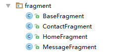
创建需要用到的fragment类和布局文件【后续可根据实际情况更改命名,并且需要重新import R文件】

创建选项卡子项model类TabItemModel
package com.why.project.tablayoutbottomdemo.model;

/**
 * Created by HaiyuKing
 * Used
 */

public class TabItemModel {
    private String tabTitle;
    private int tabImgResd;

    public TabItemModel(String tabTitle, int tabImgResd){
        this.tabTitle = tabTitle;
        this.tabImgResd = tabImgResd;
    }

    public String getTabTitle() {
        return tabTitle;
    }

    public void setTabTitle(String tabTitle) {
        this.tabTitle = tabTitle;
    }

    public int getTabImgResd() {
        return tabImgResd;
    }

    public void setTabImgResd(int tabImgResd) {
        this.tabImgResd = tabImgResd;
    }
}
创建viewpager的适配器
package com.why.project.tablayoutbottomdemo.adapter;

import android.support.v4.app.Fragment;
import android.support.v4.app.FragmentManager;
import android.support.v4.app.FragmentPagerAdapter;

import com.why.project.tablayoutbottomdemo.model.TabItemModel;

import java.util.List;

/**
 * Created by HaiyuKing
 * Used
 */

public class ContentPagerAdapter extends FragmentPagerAdapter {

    private List<TabItemModel> tabIndicators;
    private List<Fragment> tabItemList;

    public ContentPagerAdapter(FragmentManager fm, List<TabItemModel> tabIndicators, List<Fragment> tabItemList) {
        super(fm);
        this.tabIndicators = tabIndicators;
        this.tabItemList = tabItemList;
    }

    @Override
    public Fragment getItem(int position) {
        return tabItemList.get(position);
    }

    @Override
    public int getCount() {
        return tabItemList.size();
    }

    @Override
    public CharSequence getPageTitle(int position) {
        return tabIndicators.get(position).getTabTitle();
    }
}
在Activity中使用如下【继承FragmentActivity或者其子类】
package com.why.project.tablayoutbottomdemo;

import android.graphics.drawable.Drawable;
import android.os.Bundle;
import android.support.design.widget.TabLayout;
import android.support.v4.app.Fragment;
import android.support.v4.content.ContextCompat;
import android.support.v4.view.ViewPager;
import android.support.v7.app.AppCompatActivity;
import android.view.View;
import android.widget.CheckedTextView;

import com.why.project.tablayoutbottomdemo.adapter.ContentPagerAdapter;
import com.why.project.tablayoutbottomdemo.fragment.ContactFragment;
import com.why.project.tablayoutbottomdemo.fragment.HomeFragment;
import com.why.project.tablayoutbottomdemo.fragment.MessageFragment;
import com.why.project.tablayoutbottomdemo.model.TabItemModel;

import java.util.ArrayList;
import java.util.List;

public class MainActivity extends AppCompatActivity {

    private TabLayout mTabLayout;
    private ViewPager mTabViewPager;

    /**碎片声明*/
    private HomeFragment homeFragment;//首页
    private MessageFragment messageFragment;//消息
    private ContactFragment contactFragment;//我的

    private List<TabItemModel> tabIndicators;
    private List<Fragment> tabFragments;
    private ContentPagerAdapter contentAdapter;

    //选项卡的各个选项的CheckedTextView的集合:用于切换时改变图标和文字颜色
    private List<CheckedTextView> bottomTab_checkeds = new ArrayList<CheckedTextView>();

    @Override
    protected void onCreate(Bundle savedInstanceState) {
        super.onCreate(savedInstanceState);
        setContentView(R.layout.activity_main);

        initViews();
        initDatas();
        initEvents();
    }

    private void initViews() {
        mTabLayout = (TabLayout) findViewById(R.id.tl_top);
        mTabViewPager = (ViewPager) findViewById(R.id.vp_tab);
    }

    private void initDatas() {
        //初始化选项卡子项的文本、图标model集合
        tabIndicators = new ArrayList<TabItemModel>();
        tabIndicators.add(new TabItemModel(getResources().getString(R.string.home_function_home),
                R.drawable.home_tab_home_selector));
        tabIndicators.add(new TabItemModel(getResources().getString(R.string.home_function_message),
                R.drawable.home_tab_message_selector));
        tabIndicators.add(new TabItemModel(getResources().getString(R.string.home_function_contact),
                R.drawable.home_tab_contact_selector));
        //初始化碎片集合
        tabFragments = new ArrayList<>();
        homeFragment = HomeFragment.getInstance(HomeFragment.class,null);
        messageFragment = MessageFragment.getInstance(MessageFragment.class,null);
        contactFragment = ContactFragment.getInstance(ContactFragment.class,null);
        tabFragments.add(homeFragment);
        tabFragments.add(messageFragment);
        tabFragments.add(contactFragment);
        //实例化Adapter
        contentAdapter = new ContentPagerAdapter(getSupportFragmentManager(),tabIndicators,tabFragments);
        mTabViewPager.setAdapter(contentAdapter);
        //TabLayout和ViewPager相关联
        mTabLayout.setupWithViewPager(mTabViewPager);

        //自定义布局的话,必须放到setupWithViewPager后面
        for (int i = 0; i < tabIndicators.size(); i++) {
            TabLayout.Tab itemTab = mTabLayout.getTabAt(i);
            if (itemTab!=null){
                itemTab.setCustomView(R.layout.tab_bottom_item);
                View bottomtabitemView = itemTab.getCustomView();
                //===========设置CheckedTextView控件的图片和文字==========
                final CheckedTextView bottomtab_checkedTextView = (CheckedTextView) bottomtabitemView.findViewById(R.id.bottomtab_checkedTextView);

                //设置CheckedTextView控件的android:drawableTop属性值
                Drawable drawable = ContextCompat.getDrawable(this,tabIndicators.get(i).getTabImgResd());
                //setCompoundDrawables 画的drawable的宽高是按drawable.setBound()设置的宽高
                //而setCompoundDrawablesWithIntrinsicBounds是画的drawable的宽高是按drawable固定的宽高,即通过getIntrinsicWidth()与getIntrinsicHeight()自动获得
                drawable.setBounds(0, 0, drawable.getMinimumWidth(), drawable.getMinimumHeight());
                bottomtab_checkedTextView.setCompoundDrawables(null, drawable, null, null);
                //bottomtab_checkedTextView.setCompoundDrawablesWithIntrinsicBounds(null, drawable, null, null);

                //设置CheckedTextView的文字
                bottomtab_checkedTextView.setText(tabIndicators.get(i).getTabTitle());

                bottomTab_checkeds.add(bottomtab_checkedTextView);
            }
        }

        //设置第一选项卡为选中状态
        mTabLayout.getTabAt(0).getCustomView().setSelected(true);
        bottomTab_checkeds.get(0).setTextColor(getResources().getColor(R.color.tab_text_selected));
    }

    private void initEvents() {
        mTabLayout.addOnTabSelectedListener(new TabLayout.OnTabSelectedListener() {
            @Override
            public void onTabSelected(TabLayout.Tab tab) {
                //选中了tab的逻辑
                bottomTab_checkeds.get(tab.getPosition()).setTextColor(getResources().getColor(R.color.tab_text_selected));
            }

            @Override
            public void onTabUnselected(TabLayout.Tab tab) {
                //未选中了tab的逻辑
                bottomTab_checkeds.get(tab.getPosition()).setTextColor(getResources().getColor(R.color.tab_text_normal));
            }

            @Override
            public void onTabReselected(TabLayout.Tab tab) {
                //再次选中了tab的逻辑
            }
        });
    }
}
混淆配置
无
参考资料
Android TabLayout 分分钟打造一个滑动标签页

 浙公网安备 33010602011771号