原生CSS、HTML 和 JavaScript 实现酷炫表单
一直使用 Vue/React ,习惯了用组件,偶尔想用原生三剑客写点 Demo 发现样式丑的不忍直视。最近看 掘金小册《玩转CSS的艺术之美》看到 CSS 相关的内容,发现原生 CSS 也可以把表单处理的很好看。
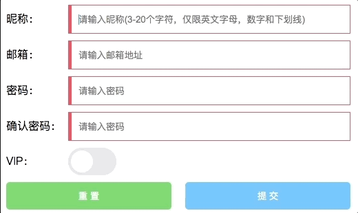
效果:
完整代码:
<!DOCTYPE html>
<html lang="en">

<head>
    <meta charset="UTF-8">
    <meta name="viewport" content="width=device-width, initial-scale=1.0">
    <title>Document</title>
    <style>
        .form-box {
            width: 500px;
        }

        .form-item {
            display: flex;
            align-items: center;
            margin-bottom: 10px;
        }

        label {
            display: block;
            font-size: 16px;
            flex: 90px 0 0;
        }

        label::after {
            content: ":";
            margin-right: 6px;
            display: inline-block;
            vertical-align: middle;
        }

        input.text-input {
            display: block;
            padding: 0 10px;
            border: 1px solid #ccc;
            width: 100%;
            height: 40px;
            outline: none;
            caret-color: #09f;
            /*光标颜色*/
            transition: all 300ms;
            border-left-width: 5px;
        }

        input.text-input:valid {
            border-color: #3c9;
        }

        input.text-input:invalid {
            border-color: #f66;
        }
        input[type=checkbox] {
            position: relative;
            appearance: none;/*去除系统默认appearance的样式引发的问题*/
            cursor: pointer;
            transition: all 100ms;
            border-radius: 31px;
            width: 70px;
            height: 40px;
            background-color: #e9e9eb;
            outline: none;
            margin: 0;
            display: inline-block;
        }
        input[type=checkbox]::before {
            position: absolute;
            content: "";
            transition: all 300ms cubic-bezier(.45, 1, .4, 1);
            border-radius: 31px;
            width: 70px;
            height: 40px;
            background-color: #e9e9eb;
        }
        input[type=checkbox]::after {
            position: absolute;
            left: 4px;
            top: 4px;
            border-radius: 27px;
            width: 32px;
            height: 32px;
            background-color: #fff;
            box-shadow: 1px 1px 5px rgba(#000, .3);
            content: "";
            transition: all 300ms cubic-bezier(.4, .4, .25, 1.35);
        }
        input[type=checkbox]:checked {
            background-color: #3c9;
        }
        input[type=checkbox]:checked::before {
            transform: scale(0);
        }
        input[type=checkbox]:checked::after {
            transform: translateX(30px);
        }
        button {
            width: 48%;
            height: 40px;
            padding: 0;
            margin: 0;
            border: none;
            outline: none;
            cursor: pointer;
            border-radius: 5px;
            overflow: hidden;
            position: relative;
            background: #63c3ff;
            color: #fff;
        }
        button::before {
            --size: 0;
            position: absolute;
            left: var(--x);
            top: var(--y);
            width: var(--size);
            height: var(--size);
            background-image: radial-gradient(circle closest-side, #09f, transparent);
            content: "";
            transform: translate3d(-50%, -50%, 0);
            transition: width 200ms ease, height 200ms ease;
        }
        button[type=reset] {
            background: #6fcc6f;
        }
        button[type=reset]::before {
            background-image: radial-gradient(circle closest-side, #4abf4a, transparent);
        }
        button:hover::before {
            --size: 400px;
        }
        button:first-child {
            margin-right: 4%;
        }
        span {
            position: relative;
            pointer-events: none;
        }
    </style>
</head>

<body>
    <form class="form-box" id="form" onsubmit=onSubmit(event)>
        <div class="form-item">
            <label>昵称</label>
            <input type="text"
                name="name"
                class="text-input"
                placeholder="请输入昵称(3-20个字符,仅限英文字母,数字和下划线)"
                pattern="^[\w]{3,20}$"
                oninput="setCustomValidity('')"
                oninvalid="setCustomValidity('请输入合法的昵称>_<')"
                required>
        </div>
        <div class="form-item">
            <label>邮箱</label>
            <input type="email"
                class="text-input"
                placeholder="请输入邮箱地址"
                required>
        </div>
        <div class="form-item">
            <label>密码</label>
            <input type="password"
                name="password"
                class="text-input"
                placeholder="请输入密码"
                oninput="onPwdInput(event)"
                required>
        </div>
        <div class="form-item">
            <label>确认密码</label>
            <input type="password"
                name="password"
                id="confirmPwd"
                class="text-input"
                placeholder="请输入密码"
                required>
        </div>
        <div class="form-item">
            <label>VIP</label>
            <input name="isAdult" type="checkbox" />
        </div>
        <div class="form-item">
            <button type="reset" onmousemove="move(event)">
                <span>重 置</span>
            </button>
            <button type="submit" value="提 交" onmousemove="move(event)">
                <span>提 交</span>
            </button>
        </div>
    </form>

    <script>
        function move(e) {
            const x = e.pageX - e.target.offsetLeft;
            const y = e.pageY - e.target.offsetTop;
            e.target.style.setProperty("--x", `${x}px`);
            e.target.style.setProperty("--y", `${y}px`);
        }
        function onSubmit(e) {
            e.preventDefault(); // 阻止表单提交
            const form = e.target;
            console.log(params);
        }
        function onPwdInput(e) {
            confirmPwd.pattern = e.target.value;
        }
    </script>
</body>

</html>
顺便说一下代码里涉及的知识点
1、属性选择器
一般用的较多 CSS 选择器的是ID、类、和标签选择器。属性选择器也有各种灵活的使用方式。语法是中括号。
[attr] 表示带有以 attr 命名的属性的元素。
[attr=value] 表示带有以 attr 命名的属性,且属性值为 value 的元素。
还有其他限制开头、结尾、包含等规则,可以自己查找。
2、表单状态选择器
表单元素和不合法的表单元素。appearance 主要有两种用途,要将平台特定的样式应用于默认情况下不包含该样式的元素,删除默认情况下具有特定于平台的样式的元素。
上面代码中的 appearance: none 就是删除 checkbox 原有的样式。
<div style="appearance: button;">button</div> 可以让你一个 div 显示原生按钮样式。(不过兼容性不大好,我试了下Chrome并没有生效, -webkit-appearance 在Safari中生效了)
4、pointer-events: none
指定 pointer-events: none; 的元素永远不会成为鼠标事件的 target。禁用其鼠标事件和鼠标相关样式。
但是,当其后代元素的pointer-events属性指定其他值时,鼠标事件可以指向后代元素,在这种情况下,鼠标事件将在捕获或冒泡阶段触发父元素的事件侦听器。
5、表单验证
required:任何带有 required 属性的字段都必须有值,否则无法提交表单。
input type: HTML5 为 <input> 元素增加了几个新的 type 值。这些类型属性不仅表明了字段期待的数据类型,而且也提供了一些默认验证,其中两个新的输入类型是已经得到广泛支持的 "email" 和 "url"。
pattern:文本字段 pattern 属性,用于指定一个正则表达式,用户输入的文本必须与之匹配。在重复输入密码的时候,把第一次的密码作为重复密码的 pattern 以保证两次输入密码一致性验证。
setCustomValidity: 自定义表单不合法时的提示信息。
6、CSS 变量
在 JavaScript 接受鼠标事件参数并将鼠标位置赋值给 CSS 变量,就可以根据设置跟随鼠标移动的样式了。

 浙公网安备 33010602011771号