
神奇的css3(1)新增属性、选择器
Css3简介
1、什么是css3?
CSS3是CSS2的升级版本,3只是版本号,它在CSS2.1的基础上增加了很多强大的新功能。 目前主流浏览器chrome、safari、firefox、opera、甚至360都已经支持了CSS3大部分功能了,IE10以后也开始全面支持CSS3了。
2、css3前缀
在编写CSS3样式时,不同的浏览器可能需要不同的前缀。它表示该CSS属性或规则尚未成为W3C标准的一部分,是浏览器的私有属性,虽然目前较新版本的浏览器都是不需要前缀的,但为了更好的向前兼容前缀还是少不了的。
标准写法如表顺序,再在后面添加无前缀的。

例如:
border-radius: 20px;

             /* chrome和safari */

            -webkit-border-radius:20px;

            /* IE */

            -ms-border-radius:20px;

            /* firefox */

            -moz-border-radius:20px;

            /* opera */

            -o-border-radius:20px;
3、css3功能
Css3提供了更加强大且精准的选择器,提供多种背景填充方案,可以实现渐变颜色,可以改变元素的形状、角度等,可以加阴影效果,报纸布局,弹性盒子,ie6混杂模式的盒模型,新的计量单位,动画效果等等等..
但是CSS3的兼容性问题同样也显得格外重要,并不是所有CSS3属性都通过了W3C标准,所以我们需要全面的兼容性查阅手册
http://www.runoob.com/cssref/css3-browsersupport.html兼容性参考手册
https://caniuse.com/兼容性查阅手册,更方便
二、css3功能介绍
1、CSS3 圆角border-radius
border-radius: 20px; /* 四个角设置统一值可以只写一次 */
border-radius: 50%;/* 除了用固定值还可以用百分比 */
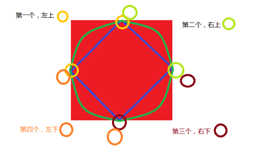
border-radius:20px 20px 20px 20px; /* 顺序是 左上-右上-右下-左下 */
相当于:
border-top-left-radius: 20px; //设置左上角
border-top-right-radius: 20px; //设置右上角
border-bottom-left-radius: 20px; //设置左下角
border-bottom-right-radius: 20px; //设置左下角
相当于:
border-top-left-radius:20px 20px;
border-top-right-radius:20px 20px;
border-bottom-right-radius:20px 20px;
border-bottom-left-radius:20px 20px;
* boreder-radius:1em 2em 1em 2em / 2em 1em 2em 1em,这种写法相当于设置4个点的x轴/4个点的y周
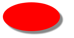
实例:整园
div {

            width: 200px;

            height: 200px;

            background: red;

            border-radius: 50%;

        }
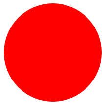
原理:
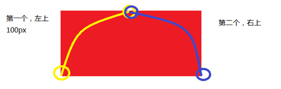
实例:半圆
div {

            width: 200px;

            height: 100px;

            background: red;

            border-radius: 100px 100px 0 0;

            /* 或者 */

            /* border-top-right-radius: 100px;

            border-top-left-radius: 100px; */

        }
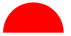
原理:
2、边框背景 border-image
border-image: source slice width outset repeat;
默认值:none 100% 1 0 stretch
|
用于指定要用于绘制边框的图像的位置 |
|
|
图像边界向内偏移 |
|
|
图像边界的宽度 |
|
|
用于指定在边框外部绘制 border-image-area 的量 |
|
|
这个例子演示了如何创建一个border-image 属性的按钮。 |
border-image-slice: number|%|fill;
|
值 |
说明 |
|
number |
数字表示图像的像素(位图图像)或向量的坐标(如果图像是矢量图像) |
|
% |
百分比图像的大小是相对的:水平偏移图像的宽度,垂直偏移图像的高度 |
|
fill |
保留图像的中间部分 |
border-image-width: number|%|auto;
|
值 |
说明 |
|
number |
表示相应的border-width 的倍数 |
|
% |
边界图像区域的大小:横向偏移的宽度的面积,垂直偏移的高度的面积 |
|
auto |
如果指定了,宽度是相应的image slice的内在宽度或高度 |
border-image-repeat:
|
值 |
描述 |
|
stretch |
默认值。拉伸图像来填充区域 |
|
repeat |
平铺(repeated)图像来填充区域。 |
|
round |
类似 repeat 值。如果无法完整平铺所有图像,则对图像进行缩放以适应区域。 |
|
space |
类似 repeat 值。如果无法完整平铺所有图像,扩展空间会分布在图像周围 |
|
initial |
将此属性设置为默认值。 |
|
inherit |
从父元素中继承该属性。 |
3、css3颜色值 rgba()
RGB是一种色彩标准,是由红(R)、绿(G)、蓝(B)的变化以及相互叠加来得到各式各样的颜色。RGBA是在RGB的基础上增加了控制alpha透明度的参数。
语法:color:rgba(R,G,B,A)
以上R、G、B三个参数,正整数值的取值范围为:0 - 255。百分数值的取值范围为:0.0% - 100.0%。超出范围的数值将被截至其最接近的取值极限。并非所有浏览器都支持使用百分数值。A为透明度参数,取值在0~1之间,不可为负值。
代码示例:background-color:rgba(100,120,60,0.5);
4、CSS3盒阴影 box-shadow
box-shadow: X轴偏移量 Y轴偏移量 [阴影模糊半径] [阴影扩展半径] [阴影颜色] [投影方式];
box-shadow:4px 2px 6px 7px #333333 inset;(默认ouset)
实例:
div {

            width: 200px;

            height: 100px;

            background: red;

            border-radius:50%;

            box-shadow: 10px 10px 5px #888888;

        }
结果:
同一盒子,可以同时加多个阴影,阴影之间用“,”隔开
box-shadow:4px 2px 6px #f00, -4px -2px 6px #000, 0px 0px 12px 5px #33CC00 inset;
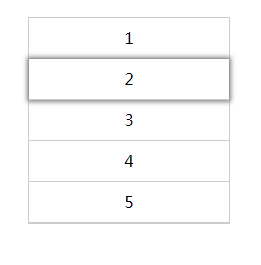
实例:3D感选中li
<!DOCTYPE html>

<html lang="en">


<head>

    <meta charset="UTF-8">

    <meta name="viewport" content="width=device-width, initial-scale=1.0">

    <meta http-equiv="X-UA-Compatible" content="ie=edge">

    <title>Document</title>

    <style>

        * {

            margin: 0;

            padding: 0;

            list-style: none;

        }

        ul{

            margin: 100px;

            width: 200px;

            border: 1px solid #ccc;

        }

        ul li{

            width: 100%;

            height: 40px;

            line-height: 40px;

            text-align: center;

            border-bottom: 1px solid #ccc;

        }

        ul li:hover{

            box-shadow: 0 0 6px 2px #888;

        }

    </style>

</head>


<body>

    <ul>

        <li>1</li>

        <li>2</li>

        <li>3</li>

        <li>4</li>

        <li>5</li>

    </ul>

</body>


</html>
结果:
5、渐变背景颜色
CSS3的渐变分为两种
1)线性渐变(linear - to)
语法: linear-gradient([direction], color [percent], color [percent], …)[] 内为选填
direction角度的单位为 “deg” 也可以用to bottom, to left, to top left等的方式来表达
实例:
div {

            width:300px;

            height: 40px;

            background: linear-gradient(to right,red 0%, blue 40% ,green 80%,pink 100% );

        }
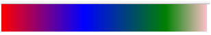
实例:
div {

            width:300px;

            height: 40px;

            background: linear-gradient(40deg,red 0%, blue 40% ,green 80%,pink 100% );

        }

2)径向渐变(radial - at)
语法:radial-gradient(shape at position, color [percent] , color, …)
shape:放射的形状,可以为原型circle,可以为椭圆ellipse
position: 圆心位置,可以两个值,也可以一个,如果为一个时,第二个值默认center 即 50%。值类型可以为百分数,距离像素,也可以是方位值(left,top...); /*x 轴主半径 y轴次半径*/
实例:
div {

            width:300px;

            height: 300px;

            background:radial-gradient(circle at 100px 100px,red 0,blue 40%,yellow 100%);

        }

实例:
div {

            width:300px;

            height: 300px;

            background:radial-gradient(circle at center,red 0,blue 40%,yellow 100%);

        }

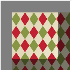
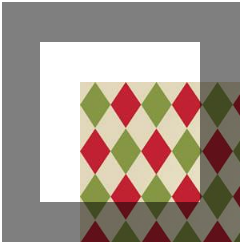
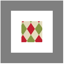
6、背景图片起始位置background-origin
语法:background-origin : border-box | padding-box | content-box;
参数分别表示背景图片是从边框,还是内边距(默认值),或者是内容区域开始显示。默认border区
实例:
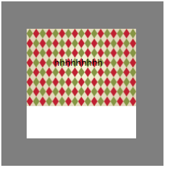
div {

            width:100px;

            height: 100px;

            padding: 50px;

            border: 50px solid rgba(0,0,0,0.5);

            background-image: url('timg.jpg');

            background-repeat: no-repeat;

            background-origin: padding-box;

        }
实例:
div {

            width:100px;

            height: 100px;

            padding: 50px;

            border: 50px solid rgba(0,0,0,0.5);

            background-image: url('timg.jpg');

            background-repeat: no-repeat;

            background-origin: content-box;

        }
7、裁剪背景background-clip
语法:background-clip : border-box | padding-box | content-box | no-clip
参数分别表示从边框、或内填充,或者内容区域向外裁剪背景。no-clip表示不裁切,和参数border-box显示同样的效果。background-clip默认值为border-box。
background-clip : text ;从前景内容的形状(比如文字)作为裁剪区域向外裁剪,如此即可实现使用背景作为填充色之类的遮罩效果
注意:webkit独有属性,且必须配合text-fill-color属性
-webkit-background-clip:text;
-webkit-text-fill-color:transparent;
text-fill-color:-webkit-background-clip;
-webkit-background-clip: text;
实例:
div {

            width:100px;

            height: 100px;

            padding: 50px;

            border: 50px solid rgba(0,0,0,0.5);

            background-image: url('timg.jpg');

            background-repeat: no-repeat;

           background-clip: content-box;

        }
实例:
div {

            width:100px;

            height: 100px;

            padding: 50px;

            border: 50px solid rgba(0,0,0,0.5);

            background-image: url('timg.jpg');

            background-repeat: no-repeat;

           background-clip: padding-box;

        }
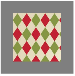
8、背景图片尺寸background-size
设置背景图片的大小,以长度值或百分比显示,还可以通过cover和contain来对图片进行伸缩。
语法:background-size: auto | <长度值> | <百分比> | cover | contain
取值说明:
1)auto:默认值,不改变背景图片的原始高度和宽度;
2)<长度值>:成对出现如200px 50px,将背景图片宽高依次设置为前面两个值,当设置一个值时,将其作为图片宽度值来等比缩放;
3)<百分比>:0%~100%之间的任何值,将背景图片宽高依次设置为所在元素宽高乘以前面百分比得出的数值,当设置一个值时同上;
4)cover:用一张图片铺满整个背景,如果比例不符,则截断图片
5)contain:尽量让背景内,存在一整张图片
实例:
div {

            width:100px;

            height: 100px;

            padding: 50px;

            border: 50px solid rgba(0,0,0,0.5);

            background-image: url('timg.jpg');

            background-repeat: no-repeat;

            background-size: cover;

        }
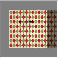
实例:
div {

            width:100px;

            height: 100px;

            padding: 50px;

            border: 50px solid rgba(0,0,0,0.5);

            background-image: url('timg.jpg');

            background-repeat: no-repeat;

            background-size: contain;

        }
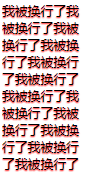
9、文本阴影text-shadow
text-shadow:X-Offset Y-Offset blur color;
X-Offset:表示阴影的水平偏移距离,其值为正值时阴影向右偏移,反之向左偏移;
Y-Offset:是指阴影的垂直偏移距离,如果其值是正值时,阴影向下偏移,反之向上偏移;
Blur:是指阴影的模糊程度,其值不能是负值,如果值越大,阴影越模糊,反之阴影越清晰,如果不需要阴影模糊可以将Blur值设置为0;
Color:是指阴影的颜色,其可以使用rgba色。
比如,我们可以用下面代码实现设置阴影效果;text-shadow: 0 1px 1px #fff
实例:
text-shadow: 0 1px 1px red;

10、文字边界换行
word-wrap:normal或者break-word
实例:
div{

            width: 100px;

            height: 300px;

        }

        p{

            text-shadow: 0 1px 1px red;

            word-wrap: break-word;

        }
11、引入字体font-face
@font-face{

font-family:”myFirstFont”;

src:url('Sansation_Light.ttf'),

url(‘Sansation_Light.eot') format(‘eot’);

}

p{

font-family:”myFristFont”;

}
format: 此值指的是你自定义的字体的格式,主要用来帮助浏览器识别浏览器对@font-face的兼容问题,这里涉及到一个字体format的问题,因为不同的浏览器对字体格式支持是不一致的,浏览器自身也无法通过路径后缀来判断字体。font-family名字自定义。
@font-face {

      font-family: 'diyfont';

      src: url('diyfont.eot'); /* IE9+ */

      src: url('diyfont.eot?#iefix') format('embedded-opentype'), /* IE6-IE8 */

            url('diyfont.woff') format('woff'), /* chrome、firefox */

             url('diyfont.ttf') format('truetype'), /* chrome、firefox、opera、Safari, Android, iOS 4.2+*/

            url('diyfont.svg#fontname') format('svg'); /* iOS 4.1- */

}
Css3字体地址:http://www.w3cplus.com/content/css3-font-face
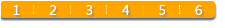
综合练习:制作导航菜单
<!DOCTYPE html>

<html lang="en">

<head>

    <meta charset="UTF-8">

    <meta name="viewport" content="width=device-width, initial-scale=1.0">

    <meta http-equiv="X-UA-Compatible" content="ie=edge">

    <title>Document</title>

    <style>

        * {

            margin: 0;

            padding: 0;

            list-style: none;

        }


        ul {

            display: inline-block;

            background: rgba(255, 165, 0, 1);

            border-radius: 10px;

            box-shadow: 0 5px 5px #666;

        }


        ul li {

            display: inline-block;

            border-right: 1px dashed #fff;

            color: #fff;

            font-size: 30px;

            padding: 0 30px;

            margin: 10px 0;

            line-height: 20px;

            text-shadow: 4px 4px 4px #888;

        }


        ul li:last-child {

            border-right: none;

        }

    </style>

</head>


<body>

    <ul>

        <li>1</li>

        <li>2</li>

        <li>3</li>

        <li>4</li>

        <li>5</li>

        <li>6</li>

    </ul>

</body>


</html>
三、css3选择器介绍
1、属性选择器
E[att^=“val”] {…} 选择匹配元素E, 且E元素定义了属性att, 其属性值以val开头的任何字符串
E[att$=“val”]{…}选择匹配元素E, 且E元素定义了属性att, 其属性值以val结尾的任何字符串
E[att*=“val”]{…}选择匹配元素E, 且E元素定义了属性att, 其属性值任意位置出现了“val”。即属性值包含了“val”,位置不限。
2、伪类选择器
伪类用于向某些选择器添加特殊的效果。
伪类的效果可以通过添加一个实际的类来达到。伪元素的效果则需要通过添加一个实际的元素才能达到。这也是为什么他们一个称为伪类,一个称为伪元素的原因。
1)root 根标签选择器
“:root”选择器等同于<html>元素,简单点说:
:root{background:orange}和html{background:orange}得到的效果等同,建议使用:root(xml等)
:root{

            background: rgba(255,4,4,1);

        }
2):not 否定选择器
用法和jQuery 中的not类似,可以排除某些特定条件的元素
div:not([class=“demo”]){
background-color:red;
}意思为除了class为demo的div以外,所有的div的背景颜色都变红
实例:
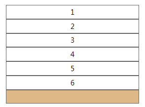
<!DOCTYPE html>

<html lang="en">


<head>

    <meta charset="UTF-8">

    <meta name="viewport" content="width=device-width, initial-scale=1.0">

    <meta http-equiv="X-UA-Compatible" content="ie=edge">

    <title>Document</title>

    <style>

        * {

            margin: 0;

            padding: 0;

            list-style: none;

        }

        ul{

            margin: 100px;

            width: 300px;

        }

        ul li{

            height: 30px;

            line-height: 30px;

            border: 1px solid #666;

            text-align: center;

        }

        li:not([class = 'li1']){

            color: red;

        }

    </style>

</head>


<body>

    <ul>

        <li class="li1">1</li>

        <li class="li1">2</li>

        <li class="li1">3</li>

        <li>4</li>

        <li>5</li>

        <li>6</li>

    </ul>

</body>


</html>

3)empty 空标签选择器
用来选择没有内容的元素、不在文档树中的元素,这里的没有内容指的是一点内容都没有,哪怕是一个空格。
实例:
<!DOCTYPE html>

<html lang="en">


<head>

    <meta charset="UTF-8">

    <meta name="viewport" content="width=device-width, initial-scale=1.0">

    <meta http-equiv="X-UA-Compatible" content="ie=edge">

    <title>Document</title>

    <style>

        * {

            margin: 0;

            padding: 0;

            list-style: none;

        }

        ul{

            margin: 100px;

            width: 300px;

        }

        ul li{

            height: 30px;

            line-height: 30px;

            border: 1px solid #666;

            text-align: center;

        }

        li:empty{

            background: burlywood;

        }

    </style>

</head>


<body>

    <ul>

        <li class="li1">1</li>

        <li class="li1">2</li>

        <li class="li1">3</li>

        <li>4</li>

        <li>5</li>

        <li>6</li>

        <li></li>

    </ul>

</body>


</html>
4)target 目标元素选择器
用来匹配被location.hash 选中的元素(即锚点元素)
选择器可用于选取当前活动的目标元素
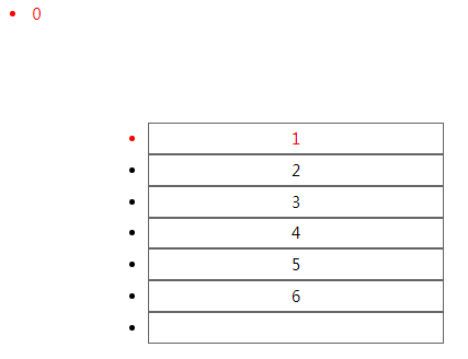
5):first-child 第一个子元素
实例:
<!DOCTYPE html>

<html lang="en">


<head>

    <meta charset="UTF-8">

    <meta name="viewport" content="width=device-width, initial-scale=1.0">

    <meta http-equiv="X-UA-Compatible" content="ie=edge">

    <title>Document</title>

    <style>


        ul{

            margin: 100px;

            width: 300px;

        }

        ul li{

            height: 30px;

            line-height: 30px;

            border: 1px solid #666;

            text-align: center;

        }

        li:first-child{

            color: red;

        }

    </style>

</head>


<body>

    <li>0</li>

    <ul>

        <li>1</li>

        <li>2</li>

        <li>3</li>

        <li>4</li>

        <li>5</li>

        <li>6</li>

        <li></li>

    </ul>

</body>


</html>
body中,第一个li 0被选定
ul中,第一个li 1被选定
:last-child 最后一个子元素
:nth-child(){} 第xxx个子元素,n代表变量自然数
实例:
<!DOCTYPE html>

<html lang="en">


<head>

    <meta charset="UTF-8">

    <meta name="viewport" content="width=device-width, initial-scale=1.0">

    <meta http-equiv="X-UA-Compatible" content="ie=edge">

    <title>Document</title>

    <style>


        ul{

            margin: 100px;

            width: 300px;

        }

        ul li{

            height: 30px;

            line-height: 30px;

            border: 1px solid #666;

            text-align: center;

        }

        li:nth-child(3){

            color: red;

            background: yellow;

        }

    </style>

</head>


<body>

    <li>0</li>

    <ul>

        <li>1</li>

        <li>2</li>

        <li>3</li>

        <li>4</li>

        <li>5</li>

        <li>6</li>

        <li></li>

    </ul>

</body>


</html>
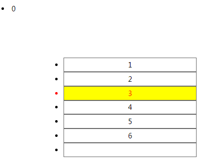
:nth-last-child(){} 从后往前数
以上四个选择器均有弊端,即如果当前位置元素不是前面所修饰的元素,那么无效
注:其父元素的第 N 个子元素,不论元素的类型。
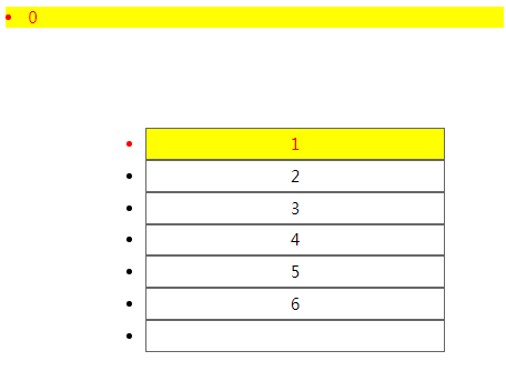
6):first-of-type 第一个子元素
实例:
<!DOCTYPE html>

<html lang="en">


<head>

    <meta charset="UTF-8">

    <meta name="viewport" content="width=device-width, initial-scale=1.0">

    <meta http-equiv="X-UA-Compatible" content="ie=edge">

    <title>Document</title>

    <style>


        ul{

            margin: 100px;

            width: 300px;

        }

        ul li{

            height: 30px;

            line-height: 30px;

            border: 1px solid #666;

            text-align: center;

        }

        li:first-of-type{

            color: red;

            background: yellow;

        }

    </style>

</head>


<body>

    <li>0</li>

    <ul>

        <li>1</li>

        <li>2</li>

        <li>3</li>

        <li>4</li>

        <li>5</li>

        <li>6</li>

        <li></li>

    </ul>

</body>


</html>
:last-of-type 最后一个子元素
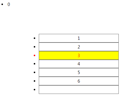
:nth-of-type(){} 第xxx个子元素,n代表变量自然数
实例:
<!DOCTYPE html>

<html lang="en">


<head>

    <meta charset="UTF-8">

    <meta name="viewport" content="width=device-width, initial-scale=1.0">

    <meta http-equiv="X-UA-Compatible" content="ie=edge">

    <title>Document</title>

    <style>


        ul{

            margin: 100px;

            width: 300px;

        }

        ul li{

            height: 30px;

            line-height: 30px;

            border: 1px solid #666;

            text-align: center;

        }

        li:nth-of-type(3){

            color: red;

            background: yellow;

        }

    </style>

</head>


<body>

    <li>0</li>

    <ul>

        <li>1</li>

        <li>2</li>

        <li>3</li>

        <li>4</li>

        <li>5</li>

        <li>6</li>

        <li></li>

    </ul>

</body>


</html>
实例:
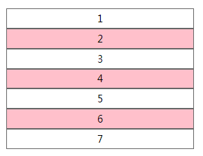
li:nth-of-type(2n) {

            background: pink;

        }
实例:
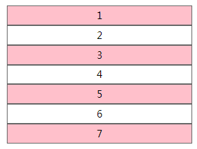
ul li:nth-of-type(2n-1) {

            background: pink;

        }
:nth-last-of-type(){} 从后往前数
此种选择器,限制了类型,即在所修饰元素的类型下选择特定位置的元素。
7)only-child 唯一子元素选择器
选择是独生子的子元素,即该子元素不能有兄弟元素,它的父元素只有他一个直接子元素。
实例:
<!DOCTYPE html>

<html lang="en">


<head>

    <meta charset="UTF-8">

    <meta name="viewport" content="width=device-width, initial-scale=1.0">

    <meta http-equiv="X-UA-Compatible" content="ie=edge">

    <title>Document</title>

    <style>

        ul {

            margin: 100px;

            width: 300px;

        }


        ul li {

            height: 30px;

            line-height: 30px;

            border: 1px solid #666;

            text-align: center;

        }

        span:only-child {

            color: red;

        }

    </style>

</head>


<body>

    <li>0</li>

    <ul>

        <li>1</li>

        <li>2</li>

        <li>3</li>

        <li>4</li>

        <li>5</li>

        <li>6</li>

        <li></li>

    </ul>

    <p>

        <span>123</span>

    </p>

</body>


</html>
Span是p下面的唯一直接子元素,123变红色
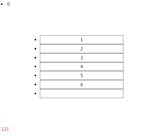
注意:选择的元素是独生子子元素,而非有唯一子元素的父元素。
8):only-of-type
如果要选择第某类特定的子元素(p) 在兄弟节点中是此类元素唯一个的话,就需要用到这个属性了
实例:
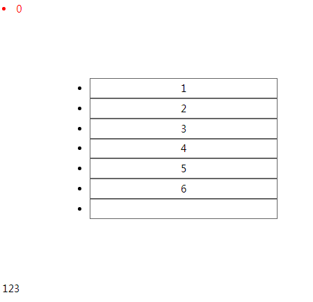
<!DOCTYPE html>

<html lang="en">


<head>

    <meta charset="UTF-8">

    <meta name="viewport" content="width=device-width, initial-scale=1.0">

    <meta http-equiv="X-UA-Compatible" content="ie=edge">

    <title>Document</title>

    <style>

        ul {

            margin: 100px;

            width: 300px;

        }


        ul li {

            height: 30px;

            line-height: 30px;

            border: 1px solid #666;

            text-align: center;

        }

        li:only-of-type {

            color: red;

        }

    </style>

</head>


<body>

    <li>0</li>

    <ul>

        <li>1</li>

        <li>2</li>

        <li>3</li>

        <li>4</li>

        <li>5</li>

        <li>6</li>

        <li></li>

    </ul>

    <p>

        <span>123</span>

    </p>

</body>


</html>
Body直接子元素中,有且只有一个li,0被选中
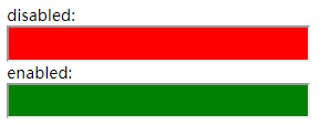
9):enabled 可用的元素
:disabled 不可用的元素
在web的表单中,有些表单元素有可用(“enabled”)和不可用(“disabled”)状态,比如输入框,密码框,复选框等。在默认情况下,这些表单元素都处在可用状态。那么我们可以通过伪类选择器 enabled 进行选择,disabled则相反。
实例:
<!DOCTYPE html>

<html lang="en">


<head>

    <meta charset="UTF-8">

    <meta name="viewport" content="width=device-width, initial-scale=1.0">

    <meta http-equiv="X-UA-Compatible" content="ie=edge">

    <title>Document</title>

    <style>

       input{

           width: 300px;

           height: 30px;

       }

       input:enabled{

           background: green;

       }

       input:disabled{

           background: red;

       }

    </style>

</head>


<body>

    <input type="text" disabled>

    <input type="text">

</body>

</html>
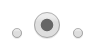
10):checked
选择框的被选中状态
注:checkbox, radio 的一些默认状态不可用属性进行改变,如边框颜色。
实例:
<!DOCTYPE html>

<html lang="en">


<head>

    <meta charset="UTF-8">

    <meta name="viewport" content="width=device-width, initial-scale=1.0">

    <meta http-equiv="X-UA-Compatible" content="ie=edge">

    <title>Document</title>

    <style>

       input:checked{

          width: 30px;

          height: 30px;

       }

    </style>

</head>


<body>

<input type="checkbox">

<input type="checkbox">

<input type="checkbox">

</body>

</html>

实例:
<!DOCTYPE html>

<html lang="en">


<head>

    <meta charset="UTF-8">

    <meta name="viewport" content="width=device-width, initial-scale=1.0">

    <meta http-equiv="X-UA-Compatible" content="ie=edge">

    <title>Document</title>

    <style>

       input:checked{

          width: 30px;

          height: 30px;

       }

    </style>

</head>


<body>

<input type="radio" name="aa">

<input type="radio" name="aa">

<input type="radio" name="aa">

</body>

</html>
11):read-only 选中只读的元素
eg:<input type=“text” readonly=“readonly”/>
:read-write 选中非只读的元素
eg:<input type=“text”/>
实例:
<!DOCTYPE html>

<html lang="en">


<head>

    <meta charset="UTF-8">

    <meta name="viewport" content="width=device-width, initial-scale=1.0">

    <meta http-equiv="X-UA-Compatible" content="ie=edge">

    <title>Document</title>

    <style>

        /* 只读 */

        input:read-only {

           background: gray;

        }

        /* 非只读 */

        input:read-write{

            width: 300px;

            height: 40px;

        }

    </style>

</head>


<body>

    非只读<input type="text" name="aa">

    非只读<input type="text" name="aa">

    read-only<input type="text" name="aa" readonly="readonly">

</body>


</html>

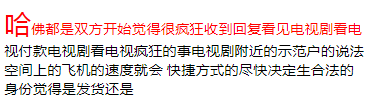
3、伪元素选择器
伪元素的效果是需要通过添加一个实际的元素才能达到的。
CSS3对伪元素进行了一定的调整,在以前的基础上增加了一个:也就是现在变成了::first-letter,::first-line,::before,::after
实例:
<!DOCTYPE html>

<html lang="en">


<head>

    <meta charset="UTF-8">

    <meta name="viewport" content="width=device-width, initial-scale=1.0">

    <meta http-equiv="X-UA-Compatible" content="ie=edge">

    <title>Document</title>

    <style>

        div{

            width: 400px;

        }

        p::first-letter{

           font-size: 30px;

        }

        p::first-line{

           color: red;

        }

    </style>

</head>


<body>

    <div>

        <p>哈佛都是双方开始觉得很疯狂收到回复看见电视剧看电视付款电视剧看电视疯狂的事电视剧附近的示范户的说法 空间上的飞机的速度就会 快捷方式的尽快决定生合法的身份觉得是发货还是</p>

    </div>

</body>


</html>
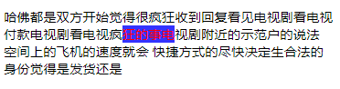
另外还增加了一个::selection
“::selection” 选择器是用来匹配突出显示的文本(用鼠标选择文本的时候)。浏览器默认情况下,用鼠标选择网页文本是以“蓝色的北京,白色的字体”显示的。
注:火狐下必须加-moz- :-moz-::selection
实例:
<!DOCTYPE html>

<html lang="en">


<head>

    <meta charset="UTF-8">

    <meta name="viewport" content="width=device-width, initial-scale=1.0">

    <meta http-equiv="X-UA-Compatible" content="ie=edge">

    <title>Document</title>

    <style>

        div{

            width: 400px;

        }

        p::selection{

            background: blue;

            color: red;

            word-wrap: break-word;

        }

    </style>

</head>


<body>

    <div>

        <p>哈佛都是双方开始觉得很疯狂收到回复看见电视剧看电视付款电视剧看电视疯狂的事电视剧附近的示范户的说法 空间上的飞机的速度就会 快捷方式的尽快决定生合法的身份觉得是发货还是</p>

    </div>

</body>


</html>
属性:user-select: none;
实例:
p::selection{

            user-select: none;

        }
此段代码实现无法用光标选择文本
4、条件选择器
1)直接子元素 E > F an F element child of an E element
实例:
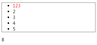
<!DOCTYPE html>

<html lang="en">


<head>

    <meta charset="UTF-8">

    <meta name="viewport" content="width=device-width, initial-scale=1.0">

    <meta http-equiv="X-UA-Compatible" content="ie=edge">

    <title>Document</title>

    <style>

        ul{

            width: 300px;

            border: 1px solid #666;

        }

        li > span{

            color: red;

        }

    </style>

</head>


<body>

    <ul>

        <li>

            <span>123</span>

        </li>

        <li>2</li>

        <li>3</li>

        <li>4</li>

        <li>5</li>

    </ul>

    <span>8</span>

</body>


</html>
2)后面的紧挨着的兄弟节点 E + F an F element immediately preceded by an E element
实例:
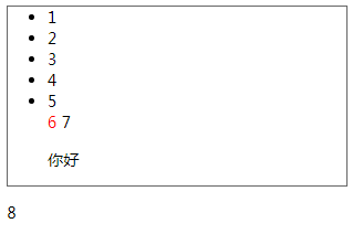
<!DOCTYPE html>

<html lang="en">


<head>

    <meta charset="UTF-8">

    <meta name="viewport" content="width=device-width, initial-scale=1.0">

    <meta http-equiv="X-UA-Compatible" content="ie=edge">

    <title>Document</title>

    <style>

        ul{

            width: 300px;

            border: 1px solid #666;

        }

        li + span{

            color: red;

        }

    </style>

</head>


<body>

    <ul>

        <li>1</li>

        <li>2</li>

        <li>3</li>

        <li>4</li>

        <li>5</li>

        <span>6</span>

        <span>7</span>

        <p>你好</p>

    </ul>

    <span>8</span>

</body>


</html>
3)后面的兄弟节点 E ~ F an F element preceded by an E element
实例:
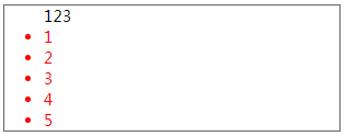
<!DOCTYPE html>

<html lang="en">


<head>

    <meta charset="UTF-8">

    <meta name="viewport" content="width=device-width, initial-scale=1.0">

    <meta http-equiv="X-UA-Compatible" content="ie=edge">

    <title>Document</title>

    <style>

        ul {

            width: 300px;

            border: 1px solid #666;

        }


        span~li {

            color: red;

        }

    </style>

</head>


<body>

    <ul>

        <span>123</span>

        <li>1</li>

        <li>2</li>

        <li>3</li>

        <li>4</li>

        <li>5</li>

    </ul>

</body>


</html>
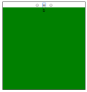
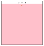
实例:点击小图表,切换指定区域的背景图片,要求不能用js(切换tab选项)
<!DOCTYPE html>

<html lang="en">

<head>

    <meta charset="UTF-8">

    <meta name="viewport" content="width=device-width, initial-scale=1.0">

    <meta http-equiv="X-UA-Compatible" content="ie=edge">

    <title>Document</title>

    <style>

        .wrapper {

            position: relative;

            width: 300px;

            height: 320px;

            margin: 10px auto;

            border: 1px solid black;

            text-align: center;

        }

        .wrapper input{

            height: 20px;

        }

        .wrapper div{

            position: absolute;

            top: 20px;

            width: 300px;

            height: 300px;

        }

        .wrapper div:nth-of-type(1){

            display: none;

            background: red;

        }

        .wrapper div:nth-of-type(2){

            display: none;

            background: green;

        }

        .wrapper div:nth-of-type(3){

            display: none;

            background: pink;

        }

        .wrapper input:checked + div{

            display: block;

        }

    </style>

</head>

<body>

    <div class="wrapper">

        <input type="radio" name="aa" checked>

        <div>a</div>

        <input type="radio" name="aa">

        <div>b</div>

        <input type="radio" name="aa">

        <div>c</div>

    </div>

</body>


</html>
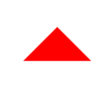
5、透明色颜色值 transparent
transparent 是颜色中的透明色。
实例:利用transparent画三角
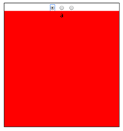
<!DOCTYPE html>

<html lang="en">

<head>

    <meta charset="UTF-8">

    <meta name="viewport" content="width=device-width, initial-scale=1.0">

    <meta http-equiv="X-UA-Compatible" content="ie=edge">

    <title>Document</title>

    <style>

        *{

            margin: 0;

            padding: 0;

        }

        .wrapper{

            position: absolute;

            top: 50%;

            left: 50%;

            transform: translate(-50%,-50%);

            width: 0;

            height: 0;

            border: 100px solid transparent;

            border-bottom-color: red;

        }

    </style>

</head>

<body>

    <div class="wrapper">

    </div>

</body>

</html>

 浙公网安备 33010602011771号