

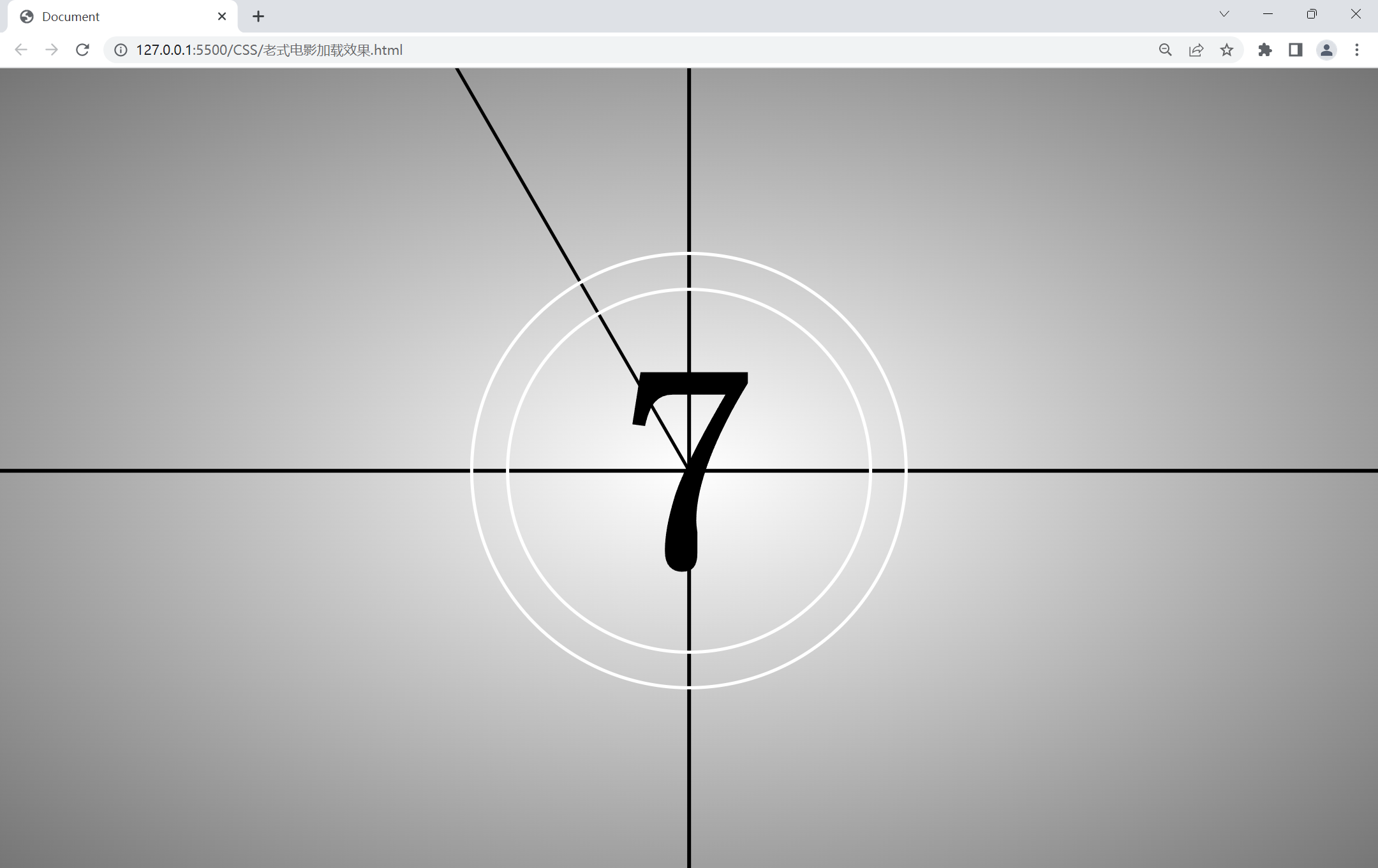
简单的css动画---老式电影加载效果
<!DOCTYPE html>
<html lang="en">
<head>
<meta charset="UTF-8">
<meta http-equiv="X-UA-Compatible" content="IE=edge">
<meta name="viewport" content="width=device-width, initial-scale=1.0">
<title>Document</title>
<style>
body
{
margin: 0;
padding: 0;
height: 100vh;
font-family: '宋体';
}
.box{
position: absolute;
width: 100%;
height: 100%;
background: radial-gradient(#fff,#757575);
overflow: hidden;
}
.box::before{
content: '';
position: absolute;
top: 50%;
left: 0;
transform: translateY(-50%);
width: 100%;
height: 5px;
background: #000;
}
.box::after{
content: '';
position: absolute;
top: 0;
left: 50%;
transform: translateX(-50%);
width: 5px;
height: 100%;
background: #000;
}
.cicrle{
position: absolute;
top: 50%;
left: 50%;
transform: translate(-50%,-50%);
width: 500px;
height: 500px;
border: 5px solid #fff;
border-radius: 50%;
z-index: 1;
}
.cicrle.cicrle1{
width: 600px;
height: 600px;
}
.niddle{
position: absolute;
top: calc(50% - 2px);
left: 50%;
height: 4px;
width: 1200px;
background: #000;
animation: animate 1s linear infinite;
transform-origin: left;
}
@keyframes animate{
0%{
transform: rotate(0deg);
}
100%{
transform: rotate(360deg);
}
}
.number{
position: absolute;
width: 100%;
height: 100%;
}
.number div{
position: absolute;
top: 0;
left: 0;
width: 100%;
height: 100%;
font-size: 25em;
font-weight: bold;
display: flex;
justify-content: center;
align-items: center;
opacity: 0;
animation: animateNumber 11s linear infinite;
}
@keyframes animateNumber{
0%,10%{
opacity: 1;
}
10.1%,100%{
opacity: 0;
}
}
.number div:nth-child(1){
animation-delay: 0s;
}
.number div:nth-child(2){
animation-delay: 1s;
}
.number div:nth-child(3){
animation-delay: 2s;
}
.number div:nth-child(4){
animation-delay: 3s;
}
.number div:nth-child(5){
animation-delay: 4s;
}
.number div:nth-child(6){
animation-delay: 5s;
}
.number div:nth-child(7){
animation-delay: 6s;
}
.number div:nth-child(8){
animation-delay: 7s;
}
.number div:nth-child(9){
animation-delay: 8s;
}
.number div:nth-child(10){
animation-delay: 9s;
}
.number div:nth-child(11){
animation-delay: 10s;
}
</style>
</head>
<body>
<div class="box">
<div class="cicrle cicrle1" ></div>
<div class="cicrle cicrle2" ></div>
<div class="niddle"></div>
<div class="number">
<div>10</div>
<div>9</div>
<div>8</div>
<div>7</div>
<div>6</div>
<div>5</div>
<div>4</div>
<div>3</div>
<div>2</div>
<div>1</div>
<div>0</div>
</div>
</div>
</body>
</html>
结果

 浙公网安备 33010602011771号