

简单的Css动画---移动方块效果
<!DOCTYPE html>
<html lang="en">
<head>
<meta charset="UTF-8">
<meta http-equiv="X-UA-Compatible" content="IE=edge">
<meta name="viewport" content="width=device-width, initial-scale=1.0">
<title>移动块效果</title>
<style>
body{
margin: 0;
padding: 0;
background: #222430;
}
.loader{
position: absolute;
top: 50%;
left: 50%;
transform: translate(-50%,-50%);
width: 150px;
height: 150px;
/* background: #0c1025; */
}
.loader span{
position: absolute;
width: 50px;
height: 50px;
background: #fff;
border-radius: 4px;
animation: animate 2s linear infinite;
}
.loader span:nth-child(1){
animation-delay: 0s;
background: #fd3f39;
}
.loader span:nth-child(2){
animation-delay: -0.667s;
background: rgb(75, 9, 101);
}
.loader span:nth-child(3){
animation-delay: 0.667s;
background: #278007;
}
@keyframes animate{
0%{
top: 0;
left: 0;
}
12.5%{
top: 0;
left: 50%;
}
25%{
top: 0;
left: 50%;
}
37.5{
top: 50%;
left: 50%;
}
50%{
top: 50%;
left: 50%;
}
62.5{
top: 50%;
left: 0;
}
75%{
top: 50%;
left: 0;
}
87.5%{
top: 0;
left: 0;
}
100%{
top: 0;
left: 0;
}
}
</style>
</head>
<body>
<div class="loader">
<span></span>
<span></span>
<span></span>
</div>
</body>
</html>
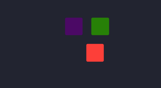
结果:

 浙公网安备 33010602011771号