

简单的Css动画---攀爬效果
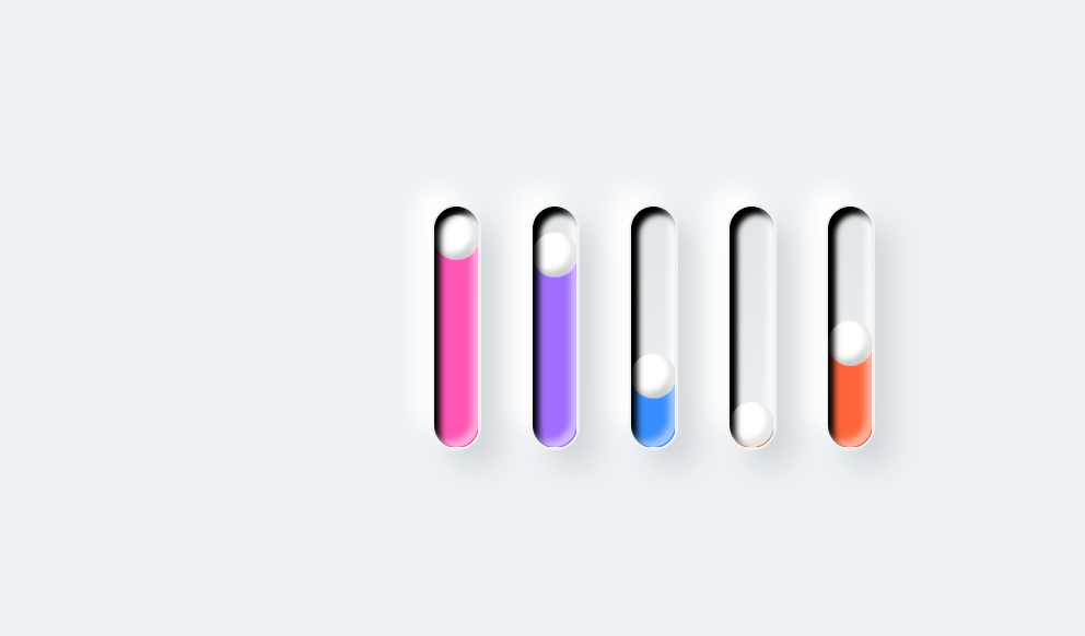
<!DOCTYPE html>
<html lang="en">
<head>
<meta charset="UTF-8">
<meta http-equiv="X-UA-Compatible" content="IE=edge">
<meta name="viewport" content="width=device-width, initial-scale=1.0">
<title>攀爬效果2</title>
<style>
*{
margin: 0;
padding: 0;
box-sizing: border-box;
}
body{
display: flex;
justify-content: center;
align-items: center;
background: #edf1f4;
min-height: 100vh;
}
.loader{
display: flex;
flex-direction: row;
}
.loader div{
position: relative;
width: 40px;
height: 200px;
margin: 20px;
overflow: hidden;
border-radius: 40px;
background: linear-gradient(to bottom, rgba(0,0,0,0.05),#edf1f4);
border: 2px solid #edf1f4;
box-shadow: 15px 15px 20px rgba(0, 0, 0, 0.1),
-15px -15px 20px#fff,
inset -5px -5px 5px rgba(255,255,255,0.5),
inset 5px 5px 5px rgba(0, 0, 0.05);
}
.loader div::before{
content: '';
position: absolute;
top: 0;
left: 0;
width: 100%;
height: 100%;
z-index: 10;
border-radius: 40px;
box-shadow: 15px 15px 20px rgba(0, 0, 0, 0.1),
-15px -15px 20px#fff,
inset -5px -5px 5px rgba(255,255,255,0.5),
inset 5px 5px 5px rgba(0, 0, 0.05);
}
.loader div::after{
content: '';
position: absolute;
top: 0;
left: 0;
width: 36px;
height: 36px;
background: #fff;
border-radius: 50%;
box-shadow: inset -5px -5px 5px rgba(0, 0, 0, 0.2),
0 420px 0 400px #2196f3;
animation: animate 2.5s ease-in-out infinite;
transform: translateY(160px);
animation-delay: calc(-0.5s * var(--i));
}
@keyframes animate{
0%{
transform: translateY(160px);
filter: hue-rotate(180deg);
}
50%{
transform: translateY(0px);
}
100%{
transform: translateY(160px);
filter: hue-rotate(0deg);
}
}
</style>
</head>
<body>
<div class="loader">
<div style="--i:0"></div>
<div style="--i:1"></div>
<div style="--i:2"></div>
<div style="--i:3"></div>
<div style="--i:4"></div>
</div>
</body>
</html>
结果:

 浙公网安备 33010602011771号