

简单的Css动画--文字填充效果
<!DOCTYPE html>
<html lang="en">
<head>
<meta charset="UTF-8">
<meta http-equiv="X-UA-Compatible" content="IE=edge">
<meta name="viewport" content="width=device-width, initial-scale=1.0">
<title>文字填充效果</title>
<style>
*{
margin: 0;
padding: 0;
font-family: 'Popins', sans-serif;
box-sizing: border-box;
}
body{
display: flex;
justify-content: center;
align-items: center;
min-height: 100vh;
background: #252839;
}
h2{
position: relative;
font-size: 14vw;
color:#252839;
-webkit-text-stroke: 0.5vw #383d52;
text-transform: uppercase;
}
h2::before{
content: attr(data-text);
position: absolute;
top: 0;
left: 0;
width: 0;
height: 100%;
color: #673971;
-webkit-text-stroke: 0vw #383d52;
border-right: 2px solid #673971;
overflow: hidden;
animation: animate 6s linear infinite;
}
@keyframes animate{
0%,10%,100%{
width: 0;
}
70%,90%{
width: 100%;
}
}
</style>
</head>
<body>
<h2 data-text="Creative...">Creative...</h2>
</body>
</html>
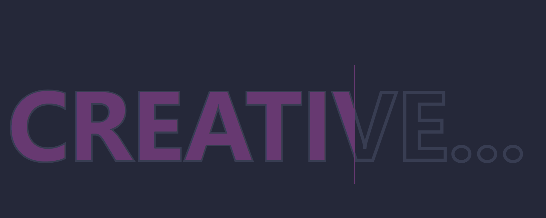
结果:

 浙公网安备 33010602011771号