

简单的Css动画---边框线条动画
<!DOCTYPE html>
<html lang="en">
<head>
<meta charset="UTF-8">
<meta http-equiv="X-UA-Compatible" content="IE=edge">
<meta name="viewport" content="width=device-width, initial-scale=1.0">
<title>边框线条动画</title>
<style>
body{
margin: 0;
padding: 0;
background: #ff005c;
}
.loader{
position: absolute;
top: 50%;
left: 50%;
transform: translate(-50%,-50%);
width: 400px;
height: 100px;
line-height: 85px;
text-align: center;
color: #fff;
font-size: 50px;
letter-spacing: 25px;
font-family: '宋体';
overflow: hidden;
}
.loader span{
position: absolute;
background: #fff;
}
.loader span:nth-child(1){
width: 100%;
height: 4px;
top: 0;
left: -100%;
animation: animate1 2s linear infinite;
}
.loader span:nth-child(2){
width: 100%;
height: 4px;
bottom: 0;
right: -100%;
animation: animate2 2s linear infinite;
}
.loader span:nth-child(3){
width: 4px;
height: 100%;
top: -100%;
right: 0;
animation: animate3 2s linear infinite;
}
.loader span:nth-child(4){
width: 4px;
height: 100%;
bottom: -100%;
left: 0;
animation: animate4 2s linear infinite;
}
@keyframes animate1{
0%{
left: -100%;
}
20%{
left: 0;
}
40%{
left: 100%;
}
60%{
left: 100%;
}
80%{
left: 100%;
}
100%{
left: 100%;
}
}
@keyframes animate2{
0%{
right: -100%;
}
20%{
right: -100%;
}
40%{
right: -100%;
}
60%{
right: 0%;
}
80%{
right: 100%;
}
100%{
right: 100%;
}
}
@keyframes animate3{
0%{
top:-100%;
}
20%{
top: 0;
}
40%{
top: 0;
}
60%{
top: 100%;
}
80%{
top: 100%;
}
100%{
top: 100%;
}
}
@keyframes animate4{
0%{
bottom: -100%;
}
20%{
bottom: -100%;
}
40%{
bottom: -100%;
}
60%{
bottom: -100%;
}
80%{
bottom: 0%;
}
100%{
bottom: 100%;
}
}
</style>
</head>
<body>
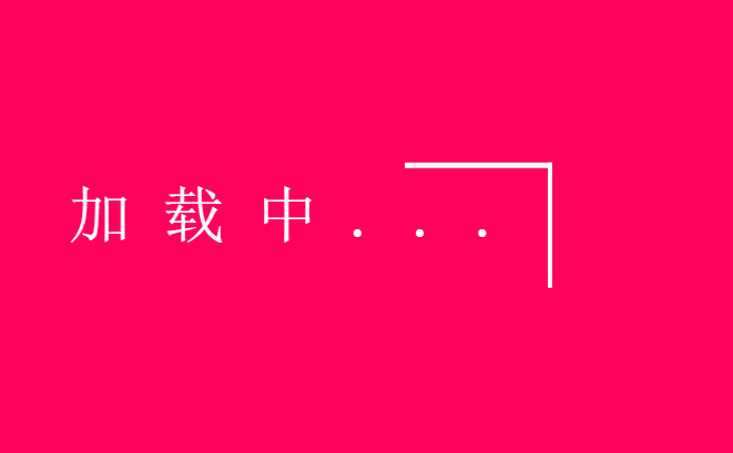
<div class="loader">
加载中...
<span></span>
<span></span>
<span></span>
<span></span>
</div>
</body>
</html>
结果:

 浙公网安备 33010602011771号