

简单的Css动画--闪烁的文字效果
<!DOCTYPE html>
<html lang="en">
<head>
<meta charset="UTF-8">
<meta http-equiv="X-UA-Compatible" content="IE=edge">
<meta name="viewport" content="width=device-width, initial-scale=1.0">
<title>闪烁文字效果</title>
<style>
body{
margin: 0;
padding: 0;
background: #262626;
}
ul{
position: absolute;
top: 50%;
left: 50%;
transform: translate(-50%,-50%);
margin: 0;
padding: 0;
display: flex;
}
ul li{
list-style: none;
color: #484848;
font-family: Arial;
font-size: 5em;
letter-spacing: 15px;
animation: animate 1.4s linear infinite;
}
@keyframes animate{
0%{
color:#484848;
text-shadow: none;
}
90%{
color:#484848;
text-shadow: none;
}
100%{
color:#fff000;
text-shadow: 0 0 7px #fff900, 0 0 50px #ff6c00;
}
}
/* 延迟时间 */
ul li:nth-child(1){
animation-delay: 0.2s;
}
ul li:nth-child(2){
animation-delay: 0.4s;
}
ul li:nth-child(3){
animation-delay: 0.6s;
}
ul li:nth-child(4){
animation-delay: 0.8s;
}
ul li:nth-child(5){
animation-delay: 1s;
}
ul li:nth-child(6){
animation-delay: 1.2s;
}
ul li:nth-child(7){
animation-delay: 1.4s;
}
</style>
</head>
<body>
<ul>
<li>天</li>
<li>街</li>
<li>踏</li>
<li>尽</li>
<li>公</li>
<li>卿</li>
<li>骨</li>
</ul>
</body>
</html>
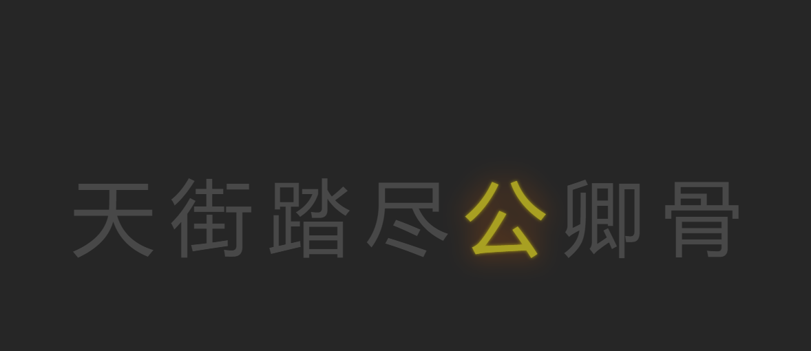
如图:

 浙公网安备 33010602011771号