
简单的css动画---跳动的文字
<!DOCTYPE html>
<html lang="en">
<head>
<meta charset="UTF-8">
<meta http-equiv="X-UA-Compatible" content="IE=edge">
<meta name="viewport" content="width=device-width, initial-scale=1.0">
<title>3D文字跳动</title>
<style>
body{
margin: 0;
padding: 0;
background: #ff5757;
}
h1{
margin: 0;
padding: 0;
position: absolute;
top: 50%;
left: 50%;
transform: translate(-50%,-50%);
}
h1 span{
color:#262626;
background: #fff;
padding: 10px 20px;
font-family: '宋体';
display: table-cell;
box-shadow: inset 0 0 5px rgba(0,0,0,0.3),0 5px 0 #ccc;
animation: animate 0.5s infinite;
}
@keyframes animate{
0%{
transform: translateY(0px);
box-shadow: inset 0 0 5px rgba(0,0,0,0.3),0 5px 0 #ccc, 0 5px #ccc,0 15px 5px rgba(0,0,0,0.5s);
}
50%{
transform: translateY(-20px);
box-shadow: inset 0 0 5px rgba(0,0,0,0.3),0 5px 0 #ccc, 0 5px #ccc,0 15px 5px rgba(0,0,0,0.5s);
}
100%{
transform: translateY(0px);
box-shadow: inset 0 0 5px rgba(0,0,0,0.3),0 5px 0 #ccc, 0 5px #ccc,0 15px 5px rgba(0,0,0,0.5s);
}
}
h1 span:nth-child(1){
animation-delay: 0.2s;
}
h1 span:nth-child(2){
animation-delay: 0.4s;
}
h1 span:nth-child(3){
animation-delay: 0.6s;
}
h1 span:nth-child(4){
animation-delay: 0.8s;
}
</style>
</head>
<body>
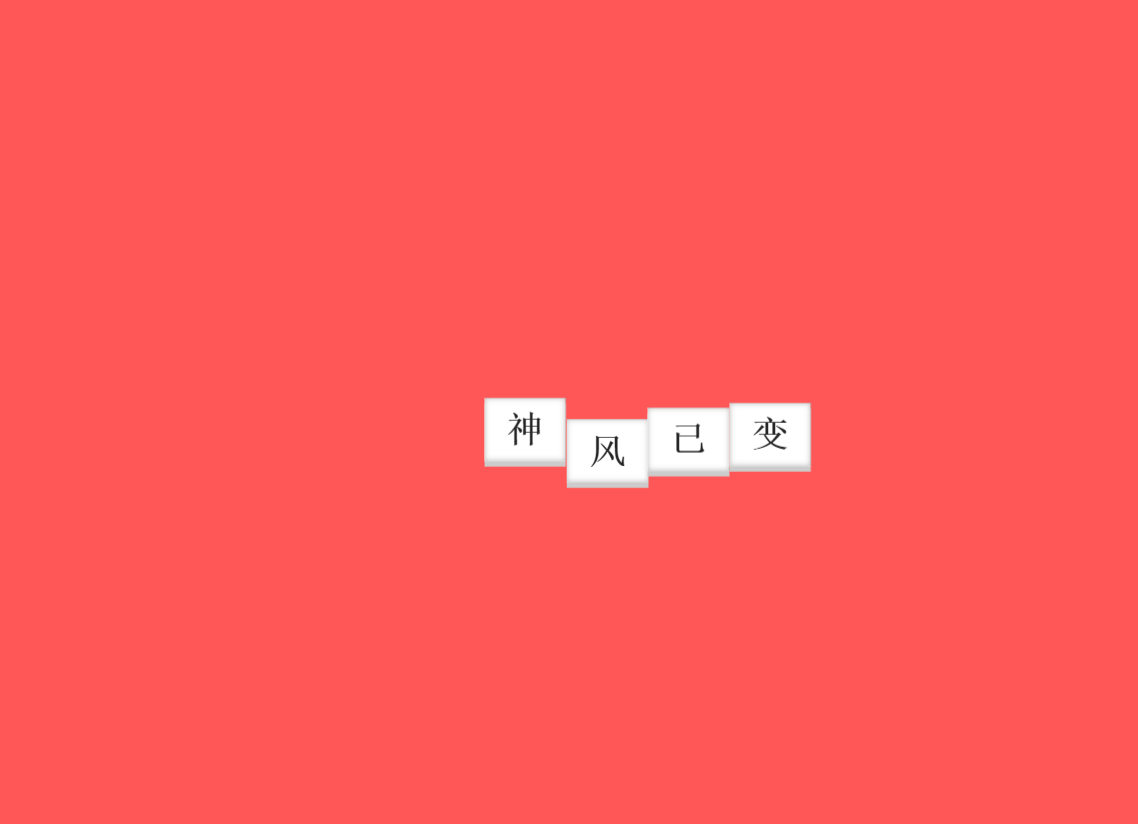
<h1>
<span>神</span>
<span>风</span>
<span>已</span>
<span>变</span>
</h1>
</body>
</html>
结果:

 浙公网安备 33010602011771号