

逆战班学习之弹性布局
弹性布局的语法分为两部分。一部分是加在父容器上的语法,用来规定总体布局,给一行或多行添加样式;一部分的加在子项上的语法,用来给某一个子项添加样式。
一、添加在父容器上的语法
display:flex
flex-direction
flex-wrap
flex-flow
justify-content
align-items
align-content
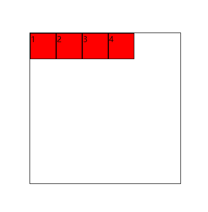
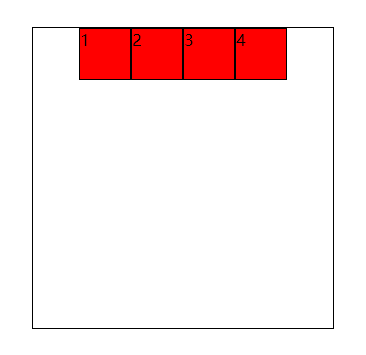
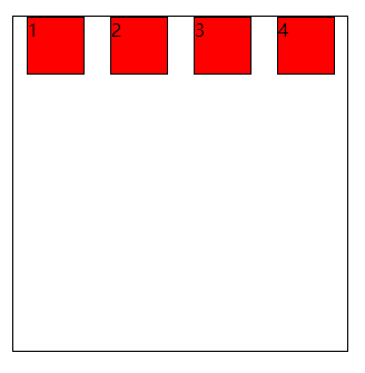
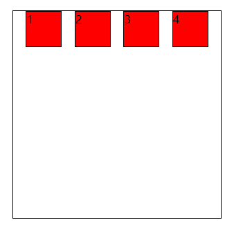
1.display:flex指定该容器是弹性布局
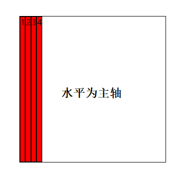
弹性布局下,子项默认水平排列。
 1 <!DOCTYPE html>
 2 <html lang="en">
 3 <head>
 4     <meta charset="UTF-8">
 5     <meta name="viewport" content="width=device-width, initial-scale=1.0">
 6     <title>Document</title>
 7     <style>
 8         .box{width: 300px;height: 300px;margin: 100px auto;border: 1px solid black; display: flex;}
 9         .box div{width: 50px;height: 50px; background: red;border: 1px solid black;}
10    </style>
11 </head>
12 <body>
13     <div class="box">
14         <div>1</div>
15         <div>2</div>
16         <div>3</div>
17         <div>4</div>
18     </div>
19 </body>
20 </html>
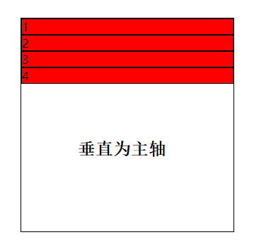
2.布局的排列方向(主轴的排列方向)
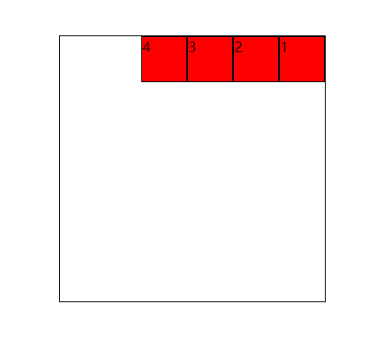
flex-direction: row (默认值)行为主轴,从左往右排列
row-reverse 行为主轴,与row相反,从右往左排列
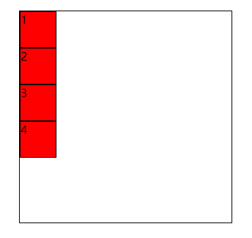
column 列为主轴,从上往下排列
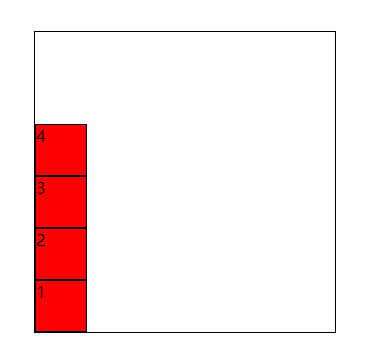
column-reverse 列为主轴,从下往上排列
- 设置row-revers
<style>
        .box{width: 300px;height: 300px;margin: 100px auto;border: 1px solid black; display: flex;flex-direction: row-reverse;}
        .box div{width: 50px;height: 50px; background: red;border: 1px solid black;}
</style>
- 设置column
<style>
        .box{width: 300px;height: 300px;margin: 100px auto;border: 1px solid black; display: flex;flex-direction:column;}
        .box div{width: 50px;height: 50px; background: red;border: 1px solid black;}
</style>
- 设置column-reverse
<style>
        .box{width: 300px;height: 300px;margin: 100px auto;border: 1px solid black; display: flex;flex-direction:column-reverse;}
        .box div{width: 50px;height: 50px; background: red;border: 1px solid black;}
</style>
注:当子元素不设置宽高时,默认情况下,水平为主轴时,宽度由内容决定,高度由父容器决定;垂直为主轴时,宽度由父容器决定,高低由内容决定。
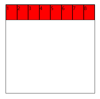
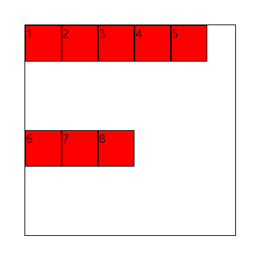
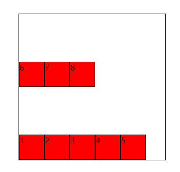
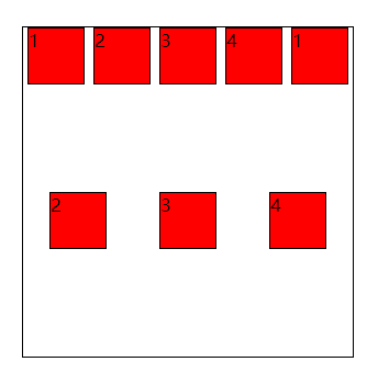
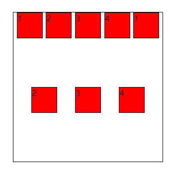
3.换行处理
flex-wrap:nowrap (默认)不换行
wrap 换行
wrap-reverse 反向换行
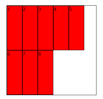
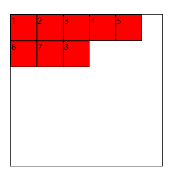
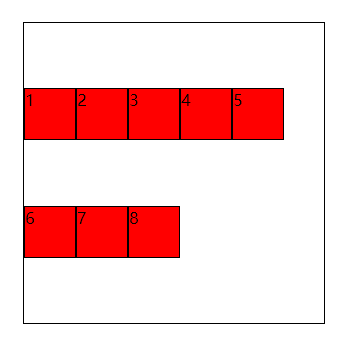
- nowrap默认情况下,子元素自动收缩
<style>
        .box{width: 300px;height: 300px;margin: 100px auto;border: 1px solid black; display: flex;flex-wrap: wrap;}
        .box div{ width:50px;height:50px;background: red;border: 1px solid black;}
    </style>
</head>
<body>
    <div class="box">
        <div>1</div>
        <div>2</div>
        <div>3</div>
        <div>4</div>
        <div>5</div>
        <div>6</div>
        <div>7</div>
        <div>8</div>
    </div>
</body>
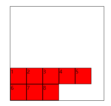
- 设置wrap
<style>
        .box{width: 300px;height: 300px;margin: 100px auto;border: 1px solid black; display: flex;flex-wrap: wrap;}
        .box div{ width:50px;height:50px;background: red;border: 1px solid black;}
</style>
-
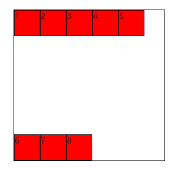
设置wrap-reverse
<style>
        .box{width: 300px;height: 300px;margin: 100px auto;border: 1px solid black; display: flex;flex-wrap: wrap-reverse;}
        .box div{ width:50px;height:50px;background: red;border: 1px solid black;}
</style>
4.felx-flow 复合写法
flex-direction与flex-wrap的复合写法,第一个值规定主轴方向,第二个值规定是否换行,用空格隔开。
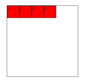
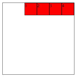
5.主轴方向上子项的对齐和分布方式
justify-content:flex-start 起始位置对齐
flex-end 结束位置对齐
center 中心位置对齐
space-between 两端对齐,多余空白间距在元素中间区域分配
space-around 环绕,两侧空白是中间空白的一半
space-evenly 匀称分配空隙,子项两侧空白间距完全相等
- 设置flex-start
<style>
        .box{width: 300px;height: 300px;margin: 100px auto;border: 1px solid black; display: flex; justify-content: flex-start;}
        .box div{ width:50px;height:50px;background: red;border: 1px solid black;}
</style>


<body>
    <div class="box">
        <div>1</div>
        <div>2</div>
        <div>3</div>
        <div>4</div>
    </div>
- 设置flex-end
<style>
        .box{width: 300px;height: 300px;margin: 100px auto;border: 1px solid black; display: flex; justify-content: flex-end;}
        .box div{ width:50px;height:50px;background: red;border: 1px solid black;}
</style>
- 设置center
<style>
        .box{width: 300px;height: 300px;margin: 100px auto;border: 1px solid black; display: flex; justify-content: center;}
        .box div{ width:50px;height:50px;background: red;border: 1px solid black;}
</style>
- 设置space-between
<style>
        .box{width: 300px;height: 300px;margin: 100px auto;border: 1px solid black; display: flex; justify-content: space-between;flex-wrap:wrap;}
        .box div{ width:50px;height:50px;background: red;border: 1px solid black;}
</style>


- 设置space-around
<style>
        .box{width: 300px;height: 300px;margin: 100px auto;border: 1px solid black; display: flex; justify-content: space-around;flex-wrap: wrap;}
        .box div{ width:50px;height:50px;background: red;border: 1px solid black;}
</style>
- 设置space-evenly
<style>
        .box{width: 300px;height: 300px;margin: 100px auto;border: 1px solid black; display: flex; justify-content: space-evenly;flex-wrap: wrap;}
        .box div{ width:50px;height:50px;background: red;border: 1px solid black;}
</style>
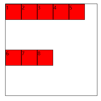
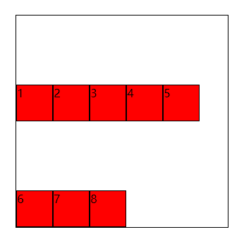
6.一行中子元素的(侧轴)对齐方式
align-items: stretch(默认)拉伸
flex-start 起始对齐
flex-end 结束对齐
center 中心对齐
- 默认情况下,在未设置子元素高时,子元素拉伸。
- 设置flex-start
<style>
        .box{width: 300px;height: 300px;margin: 100px auto;border: 1px solid black; display: flex; flex-wrap: wrap;align-items: flex-start;}
        .box div{ width:50px;height:50px;background: red;border: 1px solid black;}
</style>
- 设置flex-end
<style>
        .box{width: 300px;height: 300px;margin: 100px auto;border: 1px solid black; display: flex; flex-wrap: wrap;align-items: flex-end;}
        .box div{ width:50px;height:50px;background: red;border: 1px solid black;}
</style>
- 设置center
<style>
        .box{width: 300px;height: 300px;margin: 100px auto;border: 1px solid black; display: flex; flex-wrap: wrap;align-items: center;}
        .box div{ width:50px;height:50px;background: red;border: 1px solid black;}
</style>
7.多行侧轴,行于行之间的对齐方式
(只有一行元素时该属性不起作用)
于justify-content取值相同:
align-content:flex-start 起始位置对齐
flex-end 结束位置对齐
center 中心位置对齐
space-between 两端对齐,多余空白间距在行中间区域分配
space-around 环绕,两侧空白是中间空白的一半
space-evenly 匀称分配空隙,行两侧空白间距完全相等
- 设置flex-start
<style>
        .box{width: 300px;height: 300px;margin: 100px auto;border: 1px solid black; display: flex; flex-wrap: wrap;align-content: flex-start;}
        .box div{ width:50px;height:50px;background: red;border: 1px solid black;}
</style>
- 设置flex-end
<style>
        .box{width: 300px;height: 300px;margin: 100px auto;border: 1px solid black; display: flex; flex-wrap: wrap;align-content: flex-end;}
        .box div{ width:50px;height:50px;background: red;border: 1px solid black;}
</style>
- 设置center
<style>
        .box{width: 300px;height: 300px;margin: 100px auto;border: 1px solid black; display: flex; flex-wrap: wrap;align-content: center;}
        .box div{ width:50px;height:50px;background: red;border: 1px solid black;}
</style>
- 设置space-between
<style>
        .box{width: 300px;height: 300px;margin: 100px auto;border: 1px solid black; display: flex; flex-wrap: wrap;align-content: space-between;}
        .box div{ width:50px;height:50px;background: red;border: 1px solid black;}
</style>
- 设置space-around
<style>
        .box{width: 300px;height: 300px;margin: 100px auto;border: 1px solid black; display: flex; flex-wrap: wrap;align-content: space-around;}
        .box div{ width:50px;height:50px;background: red;border: 1px solid black;}
</style>

- 设置space-evenly
<style>
        .box{width: 300px;height: 300px;margin: 100px auto;border: 1px solid black; display: flex; flex-wrap: wrap;align-content: space-evenly;}
        .box div{ width:50px;height:50px;background: red;border: 1px solid black;}
</style>
二、添加到子容器上的语法
order 排序
flex-grow 扩展
flex-shrink 收缩
flex-basis
align-self
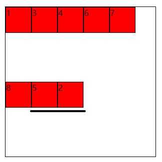
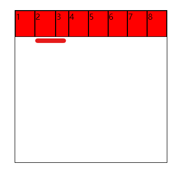
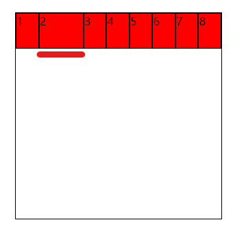
1.order排序
默认值是0,设置数字,越大越靠后。
<style>
        .box{width: 300px;height: 300px;margin: 100px auto;border: 1px solid black; display: flex; flex-wrap: wrap;}
        .box div{ width:50px;height:50px;background: red;border: 1px solid black;}
        .box div:nth-of-type(2){order: 2;}
        .box div:nth-of-type(5){order: 1;}
</style>
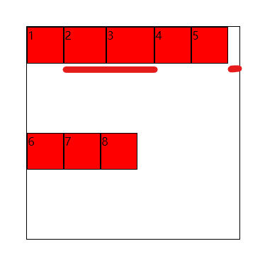
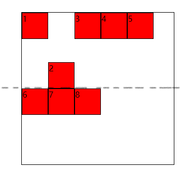
2.flex-grow扩展
- 0 (默认值)不扩展
- 按比例扩展,子元素总和小于1,还会有空隙剩余。
<style>
        .box{width: 300px;height: 300px;margin: 100px auto;border: 1px solid black; display: flex; flex-wrap: wrap;}
        .box div{ width:50px;height:50px;background: red;border: 1px solid black;}
        .box div:nth-of-type(2){flex-grow: .2;}
        .box div:nth-of-type(3){flex-grow: .4;}
</style>
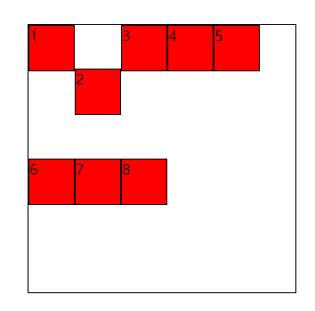
- 比例值大于等于1时,不会剩余空隙。
<style>
        .box{width: 300px;height: 300px;margin: 100px auto;border: 1px solid black; display: flex; flex-wrap: wrap;}
        .box div{ width:50px;height:50px;background: red;border: 1px solid black;}
        .box div:nth-of-type(2){flex-grow: 1;}
        .box div:nth-of-type(3){flex-grow: 2;}
</style>
3.flex-shrink收缩
默认值是1,收缩
0 不收缩
收缩值与1进行比较,小于1是值收缩的小些,大于1的值收缩的大些
<style>
        .box{width: 300px;height: 300px;margin: 100px auto;border: 1px solid black; display: flex;}
        .box div{ width:50px;height:50px;background: red;border: 1px solid black;}
        .box div:nth-of-type(2){flex-shrink: 0.8;}
        .box div:nth-of-type(3){flex-shrink: 2;}
</style>
4.flex-basis 定义了分配剩余空间之前的默认大小
<style>
        .box{width: 300px;height: 300px;margin: 100px auto;border: 1px solid black; display: flex;}
        .box div{ width:50px;height:50px;background: red;border: 1px solid black;}
        .box div:nth-of-type(2){flex-basis: 100px;}
</style>
5.flex:
flex-grow、flex-shrink与flex-basis的复合写法
6.align-self 针对某一个子项的侧轴上(默认下,垂直)对齐方式
align-self:stretch(默认,拉伸)
flex-start
flex-end
center
- 设置flex-end
<style>
        .box{width: 300px;height: 300px;margin: 100px auto;border: 1px solid black; display: flex;flex-wrap: wrap;}
        .box div{ width:50px;height:50px;background: red;border: 1px solid black;}
</style>
- 设置center
<style>
        .box{width: 300px;height: 300px;margin: 100px auto;border: 1px solid black; display: flex;flex-wrap: wrap;}
        .box div{ width:50px;height:50px;background: red;border: 1px solid black;}
        .box div:nth-of-type(2){align-self: center;}
</style>

 浙公网安备 33010602011771号