改变checkbox的默认样式总共有两种方法,大体思路都是一样的,先将checkbox隐藏,然后用一个样式元素来伪装成checkbox,主要的不同之处在于如何设置选中后的样式。
第一种方法是使用图片,将不同状态下的样式集合到一张图片上,根据改变background-positon来改变样式,类似于css sprite,之前随笔中的icheck就是这个原理bootstrap中的icheck.js插件,这种方法的兼容性比较好,但是不够灵活。
第二种方法是使用transform绘制选中后的样式,这样就可以根据自己的喜好随意修改样式了,但是兼容性不太强。
下图代码是第二种方法,其中红色方框部分为transform的绘制过程。
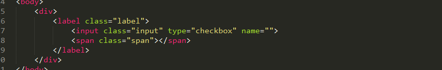
1.html结构是这样的:
label将样式元素span和checkbox绑定起来
2.css是这样的:
.input:checked+.span:after实现样式切换

3.源码:


 1 <!doctype html>
 2 <html>
 3 <head>
 4      <meta charset="utf-8">
 5      <title>demo</title>
 6      <style>
 7      .label{position: relative;}
 8      .input{display:none}
 9      .span{display: inline-block;width: 16px;height: 16px;border: 1px solid #fd8845;}
10      .input:checked+.span:after{
11          content: "";
12          position: absolute;
13          width: 9px;
14          height: 4px;
15          border: 2px solid #fd8845;
16          border-top-color: transparent;
17          border-right-color: transparent;
18          -ms-transform: rotate(-60deg);
19          -moz-transform: rotate(-60deg);
20          -webkit-transform: rotate(-60deg);
21          transform: rotate(-45deg);}
22      </style>
23 </head>
24 <body>
25      <div>
26          <label class="label">
27              <input class="input" type="checkbox" name="">
28              <span class="span"></span>
29          </label>
30      </div>
31 </body>
32 </html>
4.补充一段radio的css源码(HTML结构和checkbox是一样的):
 1 .radioLabel{position: relative;}
 2 .radioInput{display: none;}
 3 .radioSpan{display: inline-block;width: 1em;height: 1em;border:1px solid red;border-radius: 50%;}
 4 .radioInput:checked+.radioSpan:after{
 5     content: "";
 6     position: absolute;
 7     top: 47%;
 8     left: 29%;
 9     width: .4em;
10     height: .4em;
11     border-radius: 50%;
12     background-color: red;
13 }
5.补充二者的效果图:
checkbox: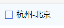
radio: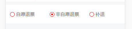

 浙公网安备 33010602011771号