


前端 ECharts -数据可视化适配方案
flexible.js 把屏幕分为24等份
PC端的效果图是1920px
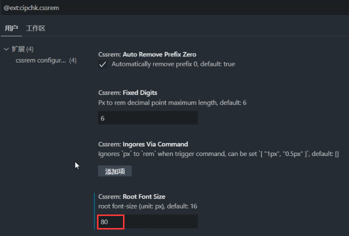
下载cssrem 插件设置它的基准值为80px
flexible.js内容如下:
 1 (function flexible (window, document) {
 2   var docEl = document.documentElement
 3   var dpr = window.devicePixelRatio || 1
 4
 5   // adjust body font size
 6   function setBodyFontSize () {
 7     if (document.body) {
 8       document.body.style.fontSize = (12 * dpr) + 'px'
 9     }
10     else {
11       document.addEventListener('DOMContentLoaded', setBodyFontSize)
12     }
13   }
14   setBodyFontSize();
15
16   // set 1rem = viewWidth / 10   pc端修改为24   移动端默认为10
17   function setRemUnit () {
18     var rem = docEl.clientWidth / 24
19     docEl.style.fontSize = rem + 'px'
20   }
21
22   setRemUnit()
23
24   // reset rem unit on page resize
25   window.addEventListener('resize', setRemUnit)
26   window.addEventListener('pageshow', function (e) {
27     if (e.persisted) {
28       setRemUnit()
29     }
30   })
31
32   // detect 0.5px supports
33   if (dpr >= 2) {
34     var fakeBody = document.createElement('body')
35     var testElement = document.createElement('div')
36     testElement.style.border = '.5px solid transparent'
37     fakeBody.appendChild(testElement)
38     docEl.appendChild(fakeBody)
39     if (testElement.offsetHeight === 1) {
40       docEl.classList.add('hairlines')
41     }
42     docEl.removeChild(fakeBody)
43   }
44 }(window, document))
在vscode中下载cssrem插件,管理->配置管理:

代码内容:
引入修改后的 flexible.js
然后书写媒体查询,最小宽度为1920px 超过1920时 html基准值font-size为80px,最大1024px 小于1024px html基准值font-size为42.66px
 1 <!DOCTYPE html>
 2 <html lang="en">
 3
 4 <head>
 5     <meta charset="UTF-8">
 6     <meta name="viewport" content="width=device-width, initial-scale=1.0">
 7     <meta http-equiv="X-UA-Compatible" content="ie=edge">
 8     <title>项目适配方案</title>
 9     <script src="js/flexible.js"></script>
10     <style>
11         @media screen and (max-width: 1024px) {
12             html {
13                 font-size: 42.66px !important;
14             }
15         }
16         @media screen and (min-width: 1920px) {
17             html {
18                 font-size: 80px !important;
19             }
20         }
21         div {
22             width: 2.5rem;
23             height: 2.5rem;
24             background-color: pink;
25         }
26     </style>
27 </head>
28 <body>
29     <div></div>
30 </body>
31 </html>

 浙公网安备 33010602011771号