Matplotlib基础学习
Matplotlib基础学习
Matplotlib简介
Matplotlib是一个python2D的绘图库,它能使绘图变得非常简单,只要短短几行代码即可生成,直方图,功率图,条行图,散点图等等.
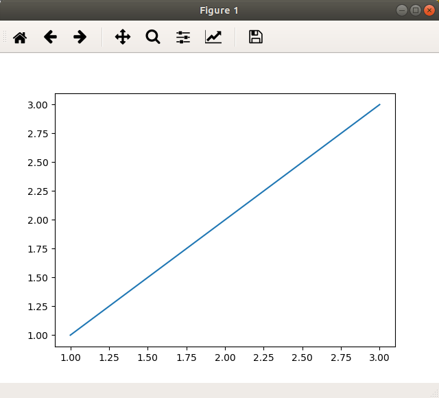
一个简单的例子
import numpy as np
import matplotlib.pyplot as plt
x = np.array([1,2,3])
y = np.array([1,2,3])
plt.plot(x,y)
plt.show()
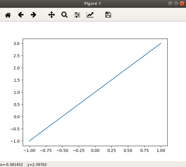
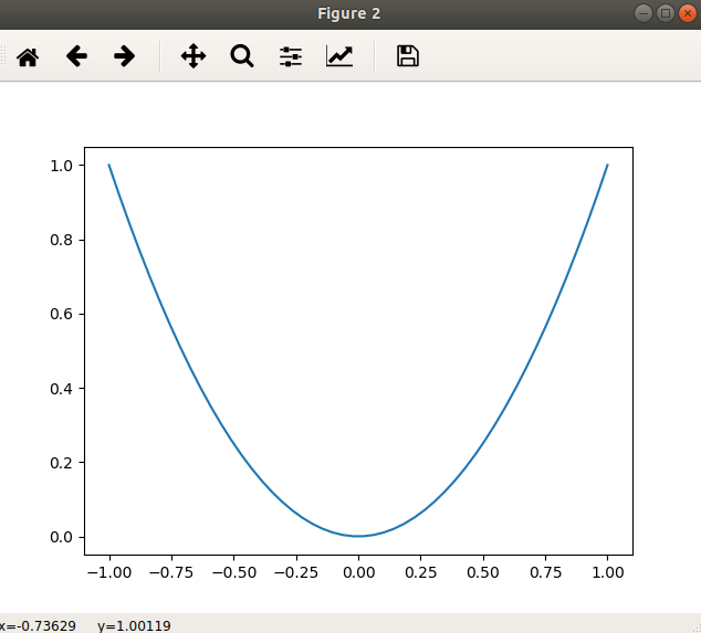
figure简单使用
figure用来分别作出多张图像,而非在一张图片上作多条线
import matplotlib.pyplot as plt
import numpy as np

x = np.linspace(-1,1,50)
y = 2 * x + 1
plt.figure()
plt.plot(x,y)

x1 = x
y1 = x**2
plt.figure()
plt.plot(x1,y1)

plt.show()
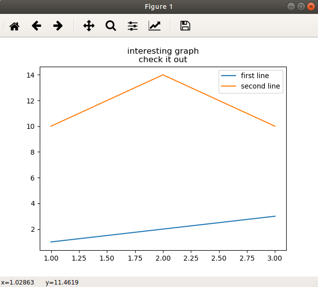
图例,标题和标签
很多时候我们要的不仅仅是一张图片那么简单,它的标题,轴域上的标签和图例,对其的解释也是非常重要的.
import matplotlib.pyplot as plt
import numpy as np
x1 = np.array([1,2,3])
y1 = np.array([1,2,3])

x2 = np.array([1,2,3])
y2 = np.array([10,14,10])

#这里添加的第三个参数label是线条指定名称,之后在图例中显示它
plt.plot(x1,y1,label='first line')
plt.plot(x2,y2,label='second line')
#这的xlabel,ylabel可以用来为轴创建标签
plt.xlabel = ('plot number')
plt.ylabel = ('important var')
#title是用来创建图的标题的
plt.title('interesting graph\ncheck it out')
#legend在这是用来生成默认图例的
plt.legend()
plt.show()
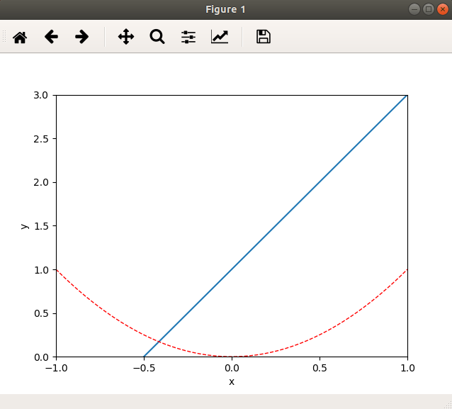
设置坐标轴
import matplotlib.pyplot as plt
import numpy as np

x1 = np.linspace(-1,1,50)
y1 = 2 * x1 + 1
x2 = x1
y2 = x2**2

plt.figure()
plt.plot(x1,y1)
plt.plot(x2,y2,color = 'red', linewidth = 1.0, linestyle = '--')

#设置坐标轴取值范围
plt.xlim((-1,1))
plt.ylim((0,3))

#设置坐标轴的label,之前已经提及了
plt.xlabel('x')
plt.ylabel('y')

#设置x坐标轴刻度,原本和y轴一样6个点,现在变成5个点了
plt.xticks(np.linspace(-1,1,5))
plt.show()
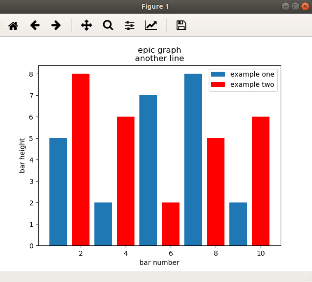
基本图
条行图
import matplotlib.pyplot as plt
import numpy as np

x1 = np.array([1,3,5,7,9])
y1 = np.array([5,2,7,8,2])
x2 = np.array([2,4,6,8,10])
y2 = np.array([8,6,2,5,6])

plt.bar(x1,y1, label='example one')
plt.bar(x2,y2, label='example two', color = 'r')
plt.xlabel('bar number')
plt.ylabel('bar height')

plt.legend()
plt.title('epic graph\nanother line')

plt.show()
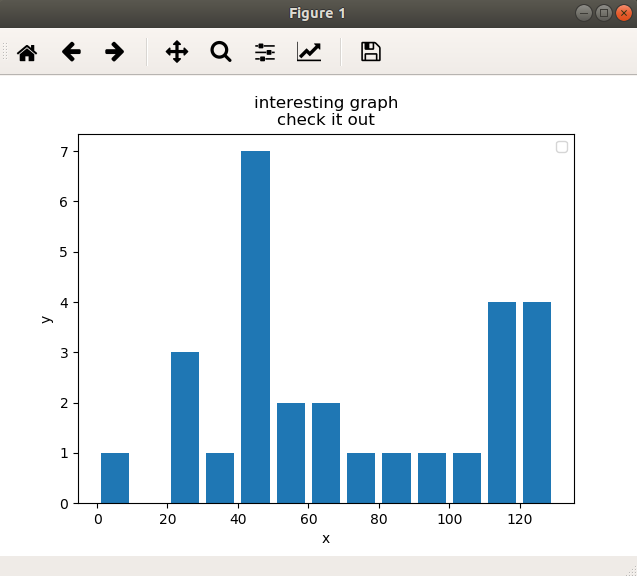
接下来就是直方图,直方图和条行图非常类似,但更倾向于将区段组合在一起来显示分布.
import numpy as np
import matplotlib.pyplot as plt

population_ages = np.array([22,55,62,45,21,22,34,42,42,4,99,102,110,120,121,122,130,111,115,112,80,75,65,54,44,43,42,48])
bins = np.array([0,10,20,30,40,50,60,70,80,90,100,110,120,130])

plt.hist(population_ages, bins, histtype='bar', rwidth=0.8)
plt.xlabel('x')
plt.ylabel('y')
plt.title('interesting graph\ncheck it out')
plt.legend()
plt.show()
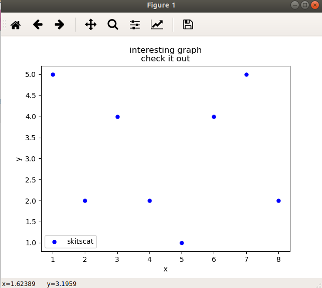
散点图
接下来要说的是散点图,散点图通常是用于比较两个变量来寻找相关性或者进行分组.
import numpy as np
import matplotlib.pyplot as plt

x = np.array([1,2,3,4,5,6,7,8])
y = np.array([5,2,4,2,1,4,5,2])

plt.scatter(x,y, label='skitscat', color='b', s=25, marker='o')
plt.xlabel('x')
plt.ylabel('y')
plt.title('interesting graph\ncheck it out')
plt.legend()
plt.show()
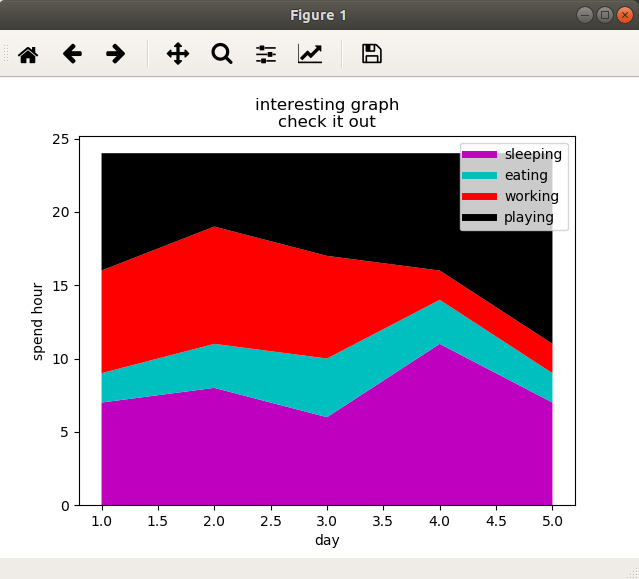
堆叠图
这里将介绍的是堆叠图.堆叠图一般用于显示'部分对整体'随时间的关系.堆叠图相当于饼图随时间而变化所形成的.
接下来这个例子以花费时间为例,来看每天花在吃饭,睡觉,工作,玩耍随天数增加的变化.
import numpy as np
import matplotlib.pyplot as plt

days = np.array([1,2,3,4,5])
sleeping = np.array([7,8,6,11,7])
eating = np.array([2,3,4,3,2])
working = np.array([7,8,7,2,2])
playing = np.array([8,5,7,8,13])

plt.plot([],[],color='m',label='sleeping', linewidth=5)
plt.plot([],[],color='c',label='eating', linewidth=5)
plt.plot([],[],color='r',label='working', linewidth=5)
plt.plot([],[],color='k',label='playing', linewidth=5)


plt.stackplot(days, sleeping,eating,working,playing, colors=['m','c','r','k'])
plt.xlabel('day')
plt.ylabel('spend hour')
plt.title('interesting graph\ncheck it out')
plt.legend()
plt.show()
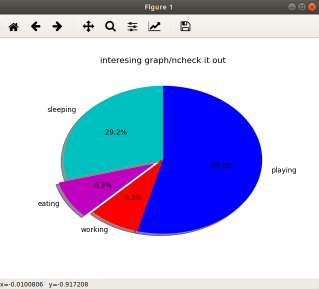
饼图
通常,饼图用于显示部分对于整体的情况,通常以%为单位,而对于matplotlib而言,它会处理这些东西,我们所要做的仅仅是提供数值
接下来这个例子是某一天的时间花费.
import numpy as np
import matplotlib.pyplot as plt

slices = np.array([7,2,2,13])
activities = np.array(['sleeping', 'eating', 'working', 'playing'])
cols = np.array(['c','m','r','b'])

plt.pie(slices,
        labels=activities,
        colors=cols,
        startangle=90,
        shadow=True,
        explode=(0,0.1,0,0),#这里是拉出第二个切片0.1的距离
        autopct='%1.1f%%')#选择将百分比放置到图标上面

plt.title('interesing graph/ncheck it out')
plt.show()
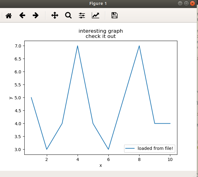
从文件中加载数据
很多情况下,我们绘制图片所需的数据是存在文件中的,而文件类型却是多种多样.这里,先介绍内置的csv模块加载csv文件,然后介绍用Numpy加载文件.
csv
先创建一个example.txt文件
内容为:
1,5
2,3
3,4
4,7
5,4
6,3
7,5
8,7
9,4
10,4
import matplotlib.pyplot as plt
import csv

x = []
y = []
#csv读取的文件不一定要以.csv为拓展名,它可以是任何具有分隔数据的文本文件
with open('example.txt', 'r') as csvfile:#csv模块打开文件
    plots = csv.reader(csvfile, delimiter=',')#csv读取器自动按行分割文件,这里以','为分隔符
    for row in plots:
        x.append(int(row[0]))
        y.append(int(row[1]))

plt.plot(x,y,label='loaded from file!')
plt.xlabel('x')
plt.ylabel('y')
plt.title('interesting graph\ncheck it out')
plt.legend()
plt.show()
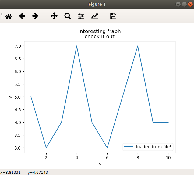
Numpy加载文件
import matplotlib.pyplot as plt
import numpy as np

x, y = np.loadtxt('example.txt', delimiter=',', unpack = True)
plt.plot(x,y,label='loaded from file!')

plt.xlabel('x')
plt.ylabel('y')
plt.title('interesting fraph\ncheck it out')
plt.legend()
plt.show()
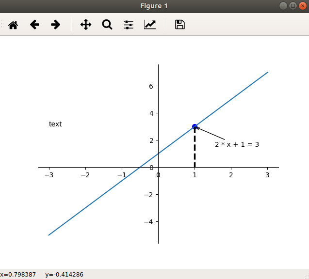
添加注解和绘制点,
import matplotlib.pyplot as plt
import numpy as np

x = np.linspace(-3,3,50)
y = 2 * x + 1

plt.figure()
plt.plot(x,y)

#获取当前的坐标轴,get current axis
ax = plt.gca()
#去掉上右边框
ax.spines['right'].set_color('none')
ax.spines['top'].set_color('none')

#设置x坐标轴为下边框
ax.xaxis.set_ticks_position('bottom')
#设置x轴在(0,0)的位置
ax.spines['bottom'].set_position(('data',0))

ax.yaxis.set_ticks_position('left')
ax.spines['left'].set_position(('data',0))

x0 = 1
y0 = 2*x0 + 1
#绘制点
plt.scatter(x0, y0, s = 50, color = 'blue')
#绘制虚线
plt.plot([x0,x0], [y0,0], 'k--', lw = 2.5)
#注解方法一
plt.annotate('2 * x + 1 = 3', xy=(x0,y0), xycoords='data', xytext=(+30,-30),textcoords='offset points', arrowprops=dict(arrowstyle='->'))
#注解方法二
plt.text(-3, 3, 'text')

plt.show()
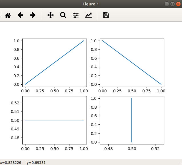
subplot绘制多图
import matplotlib.pyplot as plt

plt.figure()

plt.subplot(2,2,1)
plt.plot([0,1],[0,1])

plt.subplot(2,2,2)
plt.plot([0,1],[1,0])

plt.subplot(2,2,3)
plt.plot([0,1],[0.5,0.5])

plt.subplot(2,2,4)
plt.plot([0.5,0.5],[0,1])

plt.show()
写的不是很详细,也不算很全,因为我觉得即使现在学的很仔细,用不到很快就会忘记的,所以到要用的时候在将他补全,会更好.所以现在大概有个框架就够了.

 浙公网安备 33010602011771号