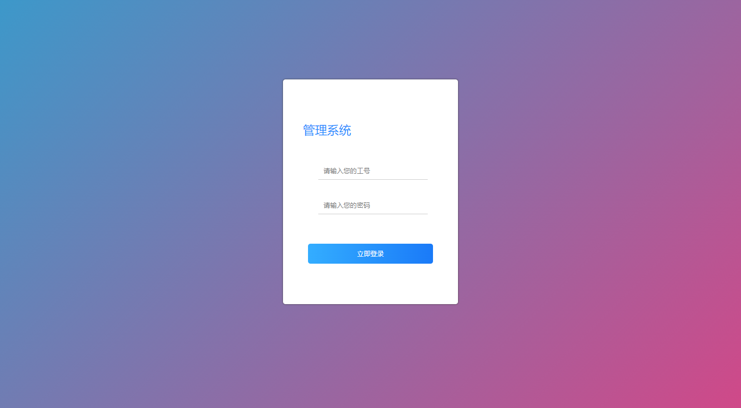
CSS 遮罩层,背景渐变
CSS 遮罩层,背景渐变
html
<!DOCTYPE html>
<html>
<head>
 <link rel="stylesheet" href="basic.css">
</head>
<body>
<div class="masked-element">
    <div class="content">这里是需要遮罩的内容</div>
</div>
<div class="container">
  <div class="content">正常内容</div>
</div>
</body>

</html>
basic.css
.masked-element {
    position: absolute;
    width: 100%;
    height: 100%;
    z-index: 1000;
    /*background: url('http://www.vipsoft.com.cn/vipsoft/img/logo/classic/light.png') no-repeat center center;*/
    /*background-size: cover;*/
    background: linear-gradient(-45deg, #ee7752, #e73c7e, #23a6d5, #23d5ab);
    background-size: 400% 400%;
    animation: gradientBG 15s ease infinite; /*背景渐变*/
}

.masked-element::after {
    content: '';
    position: absolute;
    top: 0;
    left: 0;
    right: 0;
    bottom: 0;
    /*background: rgba(0, 0, 0, 0.6); !* 遮罩颜色和透明度 */
}

.content {
    position: relative; /* 确保内容在遮罩之上 */
    z-index: 1;
    color: white; /* 遮罩下的文字颜色 */
}
本文来自博客园,作者:VipSoft 转载请注明原文链接:https://www.cnblogs.com/vipsoft/p/18243808

 浙公网安备 33010602011771号