
echarts实现左右柱状图
需求遇到两种左右柱状图,1用的是一个柱状图实现的,2用的是两个柱状图实现的,先记录一下解决方法
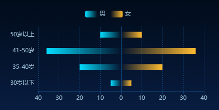
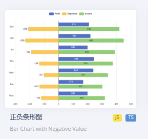
1. 首先进入echarts官网 https://echarts.apache.org/examples/zh/index.html#chart-type-bar 发现示例中有个正负条形图,和需求需要展示的图差不多
只需要将x轴的负轴展示的值变成正数,塞值的时候还是塞负数,柱子弄成渐变色就差不多了,需要注意的是左右柱的“stack”要相同,不然就会在不同的行导致左右不对称
{
    "legend": {
        "data": [
            "男",
            "女"
        ],
        "top": "10%",
        "left": "center",
        "textStyle": {
            "color": "#99BCD0"
        }
    },
    "tooltip": {
        "trigger": "axis",
        "axisPointer": {
            "type": "shadow"
        }
    },
    "grid": {
        "left": "3%",
        "right": "4%",
        "bottom": "3%",
        "containLabel": true
    },
    "xAxis": {
        "type": "value",
        "axisLabel": {
            "color": "#99BCD0",
            "inside": false
        },
        "axisLine": {
            "show": true,
            "lineStyle": {
                "color": "#1e88e54d"
            }
        },
        "splitLine": {
            "show": true,
            "lineStyle": {
                "color": "#1e88e54d",
                "type": "#1e88e54d"
            }
        }
    },
    "yAxis": {
        "axisLabel": {
            "show": true,
            "color": "#99BCD0"
        },
        "axisTick": {
            "show": false
        },
        "type": "category",
        "data": [
            "30岁以下",
            "35-40岁",
            "41-50岁",
            "50岁以上"
        ],
        "axisLine": {
            "show": true,
            "lineStyle": {
                "color": "#1e88e54d"
            }
        }
    },
    "series": [
        {
            "name": "男",
            "type": "bar",
            "data": [
                -5,
                -20,
                -36,
                -10
            ],
            "stack": "Total",
            "barWidth": "12px",
            "itemStyle": {
                "color": {
                    "x": 0,
                    "y": 0,
                    "x2": 1,
                    "y2": 0,
                    "type": "linear",
                    "global": false,
                    "colorStops": [
                        {
                            "offset": 0,
                            "color": "#03DCFF"
                        },
                        {
                            "offset": 1,
                            "color": "rgba(3,220,255,0)"
                        }
                    ]
                }
            }
        },
        {
            "name": "女",
            "type": "bar",
            "barWidth": "12px",
            "data": [
                5,
                20,
                36,
                10
            ],
            "stack": "Total",
            "itemStyle": {
                "color": {
                    "x": 1,
                    "y": 1,
                    "x2": 0,
                    "y2": 1,
                    "type": "linear",
                    "global": false,
                    "colorStops": [
                        {
                            "offset": 0,
                            "color": "#FFBB30"
                        },
                        {
                            "offset": 1,
                            "color": "rgba(255,187,48,0)"
                        }
                    ]
                }
            }
        }
    ]
}
相关方法
function getMyOption() {
    var lineColor = myProperty.leftBarColor;
    var option = {
       legend: {
         data: myProperty.title,
           // 设置图例的位置为底部,并留出一定的间距
        top: myProperty.legendTop, // 可以是百分比或具体像素值(px)
        left: 'center', // 居中显示图例
        // 如果需要更精确地控制左右间距,可以使用如下属性:
        // right: '5%' 或者具体的像素值如 right: 50
            textStyle: {
                color:  myProperty.legendNameColor ? myProperty.legendNameColor  :"#FFFFFF"
                },
       },
      tooltip: {
        trigger: 'axis',
        axisPointer: {
          type: 'shadow' // 默认为直线,可选为:'line' | 'shadow'
        },
       formatter: function (params) {
            //  console.log(params)
            var result = '<div style="color:#333;">';
            params.forEach(function (item, index) {
                var valueTemp = item.value
                var value = Math.abs(Number(valueTemp))
                var color = myProperty.leftBarColor
                if (index == 1) {
                    color = myProperty.rightBarColor
                }
               result += ` <div><span style="color:white">${item.axisValue}<span></div>\n`
               result += `<p style="color:white"><span class="dot" style="background-color: ${color};"></span><strong>${item.seriesName}</strong>:<span style="color:white">${value}</span></p>`;
            });
            result += '</div>';
            return result;
          }
      },
      grid: {
            left: '3%',
            right: '4%',
            bottom: '3%',
            containLabel: true
          },
      xAxis: {
        type: 'value', // 更改为数值轴
        axisLabel: {
          formatter: function (value) {
              return Math.abs(value); // 自定义正负数轴标签
          },
          color: myProperty.leftXAxisColor,
          inside: false
        },
        axisLine: {
            show: true,
            lineStyle: {
              color: myProperty.leftSplitLineColor, // 设置X轴线颜色为红色
             // width: 2,         // 设置X轴线宽度
            //  type: 'solid'    // 设置X轴线类型为实线
            }
       },
        splitLine: {
            show: true,
            lineStyle: {
              color: myProperty.leftSplitLineColor, // 设置分割线颜色
              type: myProperty.leftSplitLineColor // 设置分割线为虚线
            }
          }
      },
      yAxis: {
        axisLabel: {
          show: true, // y轴标签
          color: myProperty.leftYAxisColor
        },
        axisTick: {   // 隐藏Y轴刻度线(小横线)
          show: false
        },
        //offset: myProperty.leftYAxisOffset, // 增加偏移量以模拟Y轴标签的空间
        type: 'category', // 更改为类目轴
        data: myData.yData,
        axisLine: {
            show: true,
            lineStyle: {
              color: myProperty.leftSplitLineColor, // 设置X轴线颜色为红色
             // width: 2,         // 设置X轴线宽度
            //  type: 'solid'    // 设置X轴线类型为实线
            }
       },
      },
      series: getSeries()
    };
    console.log('option', option)
    return option;
}

function getSeries() {
    var dataTemp = myData.xData[0];
    var rightdata =  myData.xData[1];
    var leftdata = []
    if (dataTemp) {
        for (var i = 0; i < dataTemp.length; i++) {
            leftdata.push(-dataTemp[i])
        }
    }
    var lineColorLeft = myProperty.leftBarColor;
    var lineColorRight = myProperty.rightBarColor;
    var series =[
        {
          name: myProperty.title[0],
          type: 'bar', // 柱状图类型不变
          data: leftdata,
          stack: 'Total', // 通过为需要对齐的两个系列设置相同的stack值,可以让它们在同一位置堆叠起来
          barWidth: myProperty.barWidth,
          itemStyle: {
            color: new echarts4.graphic.LinearGradient(0, 0, 1, 0, [
                    {
                            offset: 0, color: lineColorLeft,// 0% 处的颜色
                        },  {
                            offset: 1, color: HEX2RGB(lineColorLeft, 0), // 100% 处的颜色
                        }
            ])
          }
        },
        {
          name: myProperty.title[1],
          type: 'bar', // 柱状图类型不变
          barWidth: myProperty.barWidth,
          data: rightdata,
          stack: 'Total',
          itemStyle: {
            color: new echarts4.graphic.LinearGradient(1, 1, 0, 1, [
                    {
                            offset: 0, color: lineColorRight,// 0% 处的颜色
                        },  {
                            offset: 1, color: HEX2RGB(lineColorRight, 0), // 100% 处的颜色
                        }
            ])
          }
        }
    ]
    return series
}
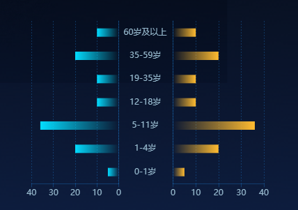
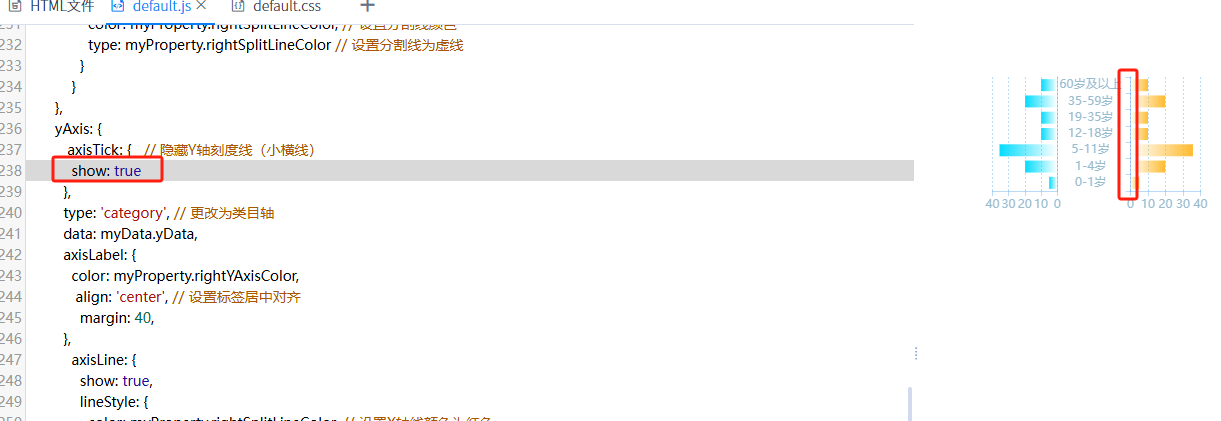
2. 尝试用1中的方式做这个图没有做的出来,最后想着还是用两个柱状图实现吧,主要难在中间的那个y轴标签
html
<div style='background-color:rgba(0,0,0,0);width: 370px;height: 200px' class="left-right-zzt">
    <div class="chartLeft"></div>
    <div class="chartRight"></div>
</div>
css
 .chartRight {
        width: 50%;
        height: 100%;
        float: left;
 /*   animation: spin 5s  linear infinite;*/
}
.chartLeft {
        width: calc(50% - 40px);
        height: 100%;
        float: left;
   		margin-right: -40px;
 /*   animation: spin 5s  linear infinite;*/
}
.dot {
    width: 10px;
    height: 10px;
    background-color: red; /* 圆点颜色 */
    border-radius: 50%; /* 将其变为圆形 */
    display: inline-block; /* 让它可以在文本中内联显示 */
    margin-right: 5px;
  }
示例:
left:
{
    "tooltip": {
        "trigger": "axis",
        "axisPointer": {
            "type": "shadow"
        }
    },
    "grid": {
        "left": "3%",
        "right": "4%",
        "bottom": "3%",
        "containLabel": true
    },
    "xAxis": {
        "type": "value",
        "axisLabel": {
            "color": "#99BCD0",
            "inside": false
        },
        "axisLine": {
            "show": true,
            "lineStyle": {
                "color": "#1e88e54d"
            }
        },
        "splitLine": {
            "show": true,
            "lineStyle": {
                "color": "#1e88e54d",
                "type": "#1e88e54d"
            }
        }
    },
    "yAxis": {
        "axisLabel": {
            "show": true
        },
        "axisTick": {
            "show": false
        },
        "offset": 100,
        "type": "category",
        "data": [
            "0-1岁",
            "1-4岁",
            "5-11岁",
            "12-18岁",
            "19-35岁",
            "35-59岁",
            "60岁及以上"
        ],
        "axisLine": {
            "show": true,
            "lineStyle": {
                "color": "#1e88e54d"
            }
        }
    },
    "series": [
        {
            "name": "男性",
            "type": "bar",
            "data": [
                -5,
                -20,
                -36,
                -10,
                -10,
                -20,
                -10
            ],
            "barWidth": "12px",
            "itemStyle": {
                "color": {
                    "x": 0,
                    "y": 0,
                    "x2": 1,
                    "y2": 0,
                    "type": "linear",
                    "global": false,
                    "colorStops": [
                        {
                            "offset": 0,
                            "color": "#03DCFF"
                        },
                        {
                            "offset": 1,
                            "color": "rgba(3,220,255,0)"
                        }
                    ]
                }
            }
        }
    ]
}
right:
{
    "tooltip": {
        "trigger": "axis",
        "axisPointer": {
            "type": "shadow"
        }
    },
    "grid": {
        "left": "3%",
        "right": "4%",
        "bottom": "3%",
        "containLabel": true
    },
    "xAxis": {
        "type": "value",
        "axisLabel": {
            "color": "#99BCD0",
            "inside": false
        },
        "axisLine": {
            "show": true,
            "lineStyle": {
                "color": "#1e88e54d"
            }
        },
        "splitLine": {
            "show": true,
            "lineStyle": {
                "color": "#1e88e54d",
                "type": "#1e88e54d"
            }
        }
    },
    "yAxis": {
        "axisTick": {
            "show": false
        },
        "type": "category",
        "data": [
            "0-1岁",
            "1-4岁",
            "5-11岁",
            "12-18岁",
            "19-35岁",
            "35-59岁",
            "60岁及以上"
        ],
        "axisLabel": {
            "color": "#99BCD0",
            "align": "center",
            "margin": 40
        },
        "axisLine": {
            "show": true,
            "lineStyle": {
                "color": "#1e88e54d"
            }
        }
    },
    "series": [
        {
            "name": "女性",
            "type": "bar",
            "barWidth": "12px",
            "data": [
                5,
                20,
                36,
                10,
                10,
                20,
                10
            ],
            "itemStyle": {
                "color": {
                    "x": 1,
                    "y": 1,
                    "x2": 0,
                    "y2": 1,
                    "type": "linear",
                    "global": false,
                    "colorStops": [
                        {
                            "offset": 0,
                            "color": "#FFBB30"
                        },
                        {
                            "offset": 1,
                            "color": "rgba(255,187,48,0)"
                        }
                    ]
                }
            }
        }
    ]
}
注意点:
js相关方法
function initMyChart(basedom) {
    if (!window["echarts4"]) {
        EUI.include(EUI.getContextPath() + "vfs/root/products/ebi/sys/coolrpt/coolresource/js/echarts.js");
    }
    if (!myChartRight) {
        myChartRight = echarts4.init($(basedom).find(".chartRight")[0]);
        var optionRight = getMyOptionRight();
        myChartRight.setOption(optionRight);
    }
    if (!myChartLeft) {
        myChartLeft = echarts4.init($(basedom).find(".chartLeft")[0]);
        var optionLeft = getMyOptionLeft();
        myChartLeft.setOption(optionLeft);
    }
    console.log('optionLeft', optionLeft)
    console.log('optionRight', optionRight)
}
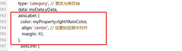
function getMyOptionLeft() {
    var dataTemp = myData.xData[0];
    var data = []
    if (dataTemp) {
        for (var i = 0; i < dataTemp.length; i++) {
            data.push(-dataTemp[i])
        }
    }
    var lineColor = myProperty.leftBarColor;
    var optionLeft = {
      tooltip: {
        trigger: 'axis',
        axisPointer: {
          type: 'shadow' // 默认为直线,可选为:'line' | 'shadow'
        },
       formatter: function (params) {
               console.log(params)
            var result = '<div style="color:#333;">';
            params.forEach(function (item) {
                var valueTemp = item.value
                var value = -(Number(valueTemp))
               result += ` <div><span style="color:white">${item.axisValue}<span></div>\n`
               result += `<p style="color:white"><span class="dot" style="background-color: ${myProperty.leftBarColor};"></span><strong>${item.seriesName}</strong>:<span style="color:white">${value}</span></p>`;
            });
            result += '</div>';
            return result;
          }
      },
      grid: {
            left: '3%',
            right: '4%',
            bottom: '3%',
            containLabel: true
          },
      xAxis: {
        type: 'value', // 更改为数值轴
        axisLabel: {
          formatter: function (value) {
              return Math.abs(value); // 自定义正负数轴标签
           // if (value === 0) {
           //   return ''; // 中间点不显示数值
           // } else {
            //  return Math.abs(value); // 自定义正负数轴标签
            //}
          },
          color: myProperty.leftXAxisColor,
          inside: false
        },
        axisLine: {
            show: true,
            lineStyle: {
              color: myProperty.leftSplitLineColor, // 设置X轴线颜色为红色
             // width: 2,         // 设置X轴线宽度
            //  type: 'solid'    // 设置X轴线类型为实线
            }
       },
        splitLine: {
            show: true,
            lineStyle: {
              color: myProperty.leftSplitLineColor, // 设置分割线颜色
              type: myProperty.leftSplitLineColor // 设置分割线为虚线
            }
          }
      },
      yAxis: {
        axisLabel: {
          show: true // y轴标签
        },
        axisTick: {   // 隐藏Y轴刻度线(小横线)
          show: false
        },
        offset: myProperty.leftYAxisOffset, // 增加偏移量以模拟Y轴标签的空间
        type: 'category', // 更改为类目轴
        data: myData.yData,
        axisLine: {
            show: true,
            lineStyle: {
              color: myProperty.leftSplitLineColor, // 设置X轴线颜色为红色
             // width: 2,         // 设置X轴线宽度
            //  type: 'solid'    // 设置X轴线类型为实线
            }
       },
      },
      series: [
        {
          name: myProperty.title[0],
          type: 'bar', // 柱状图类型不变
          data: data,
          barWidth: myProperty.barWidth,
          itemStyle: {
            color: new echarts4.graphic.LinearGradient(0, 0, 1, 0, [
                    {
                            offset: 0, color: lineColor,// 0% 处的颜色
                        },  {
                            offset: 1, color: HEX2RGB(lineColor, 0), // 100% 处的颜色
                        }
            ])
          }
        }
      ]
    };
    return optionLeft;
}
越努力越幸运~ 加油ヾ(◍°∇°◍)ノ゙

 浙公网安备 33010602011771号