【转】div盒子水平垂直居中
/*PC端,方式一:margin+position(不兼容IE6)*/
<!DOCTYPE html>
<html lang="en">
<head>
<meta charset="UTF-8">
<title>子DIV居中</title>
<style type="text/css">
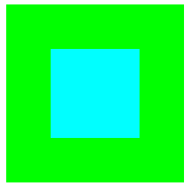
.wrap {
width: 200px;
height: 200px;
background: #00FF00;
position: relative;
}
.wrap .center {
width: 100px;
height: 100px;
background: #00FFFF;
/*关键点如下*/
margin: auto;
position: absolute;
left: 0;
right: 0;
top: 0;
bottom: 0;
}
</style>
</head>
<body>
<div class="wrap">
<div class="center"></div>
</div>
</body>
</html>
/*PC端,方式二:position+margin(兼容所有浏览器)*/
<!DOCTYPE html>
<html lang="en">
	<head>
	    <meta charset="UTF-8">
	    <title>子DIV居中</title>
	    <style type="text/css">
		    .wrap {
			    width: 200px;
			    height: 200px;
			    background: #00FF00;
			    position: relative;
			}

			.wrap .center {
			    background: #00FFFF;
			    position: absolute;
			    width: 100px;
			    height: 100px;
			    /*关键点如下*/
			    left: 50%;
			    top: 50%;
			    margin-left:-50px;/*对应中间盒子宽度的一半*/
			    margin-top:-50px;/*对应中间盒子高度的一半*/
			}

	    </style>
	</head>

	<body>
		<div class="wrap">
    		<div class="center"></div>
		</div>
	</body>
</html>
方案一:
div绝对定位水平垂直居中【margin:auto实现绝对定位元素的居中】,
兼容性:,IE7及之前版本不支持

    div{
            width: 200px;
            height: 200px;
            background: green;
            position:absolute;
            left:0;
            top: 0;
            bottom: 0;
            right: 0;
            margin: auto;
        }
方案二:
div绝对定位水平垂直居中【margin 负间距】 这或许是当前最流行的使用方法。
         div{
            width:200px;
            height: 200px;
            background:green;
            position: absolute;
            left:50%;
            top:50%;
            margin-left:-100px;
            margin-top:-100px;
        }
方案三:
div绝对定位水平垂直居中【Transforms 变形】
兼容性:IE8不支持;
        div{
            width: 200px;
            height: 200px;
            background: green;
            position:absolute;
            left:50%;    /* 定位父级的50% */
            top:50%;
            transform: translate(-50%,-50%); /*自己的50% */
        }
方案四:
css不定宽高水平垂直居中
     .box{

             height:600px;
             display:flex;
             justify-content:center;
             align-items:center;
               /* aa只要三句话就可以实现不定宽高水平垂直居中。 */
        }
        .box>div{
            background: green;
            width: 200px;
            height: 200px;
        }
方案五:
将父盒子设置为table-cell元素,可以使用text-align:center和vertical-align:middle实现水平、垂直居中。比较完美的解决方案是利用三层结构模拟父子结构
|
1
2
3
4
5
6
7
8
9
10
11
12
13
14
15
16
17
18
19
20
21
22
23
24
|
<p class="outerBox tableCell"> </p><p class="ok"> </p><p class="innerBox">tableCell</p> <p></p><p></p>/*table-cell实现居中将父盒子设置为table-cell元素,设置text-align:center,vertical-align: middle;子盒子设置为inline-block元素*/.tableCell{ display: table;}.tableCell .ok{ display: table-cell; text-align: center; vertical-align: middle;}.tableCell .innerBox{ display: inline-block;} |
方案六:
对子盒子实现绝对定位,利用calc计算位置
<p class="outerBox calc">
    </p><p class="innerBox">calc</p>
<p></p>


/*绝对定位,clac计算位置*/
.calc{
  position: relative;
}
.calc .innerBox{
  position: absolute;
  left:-webkit-calc((500px - 200px)/2);
  top:-webkit-calc((120px - 50px)/2);
  left:-moz-calc((500px - 200px)/2);
  top:-moz-calc((120px - 50px)/2);
  left:calc((500px - 200px)/2);
  top:calc((120px - 50px)/2);
}
转:https://www.cnblogs.com/Julia-Yuan/p/6648816.html
__EOF__

本文作者:持之以恒(韧)
关于博主:擅长性能、全链路、自动化、企业级自动化持续集成(DevTestOps)、测开等
面试必备:项目实战(性能、自动化)、简历笔试,https://www.cnblogs.com/uncleyong/p/15777706.html
测试提升:从测试小白到高级测试修炼之路,https://www.cnblogs.com/uncleyong/p/10530261.html
欢迎分享:如果您觉得文章对您有帮助,欢迎转载、分享,也可以点击文章右下角【推荐】一下!
关于博主:擅长性能、全链路、自动化、企业级自动化持续集成(DevTestOps)、测开等
面试必备:项目实战(性能、自动化)、简历笔试,https://www.cnblogs.com/uncleyong/p/15777706.html
测试提升:从测试小白到高级测试修炼之路,https://www.cnblogs.com/uncleyong/p/10530261.html
欢迎分享:如果您觉得文章对您有帮助,欢迎转载、分享,也可以点击文章右下角【推荐】一下!

 浙公网安备 33010602011771号