Flex弹性布局精讲
一、Flex布局的基本概念
采用Flex布局的元素,称为Flex容器(flex container)。它的所有子元素自动成为容器成员,称为Flex项目(flex item)。
二、flex container的属性
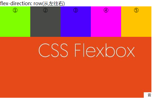
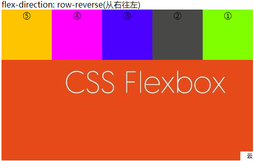
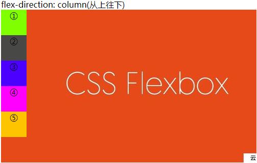
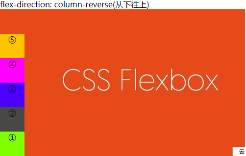
1、flex-direction(①row(默认值) ②row-reverse ③column ④column-reverse)
direction顾名思义是items的排列方向。
flex-direction的属性值有如下四种:
row(默认值):主轴为水平方向,起点在左端。row-reverse:主轴为水平方向,起点在右端。column:主轴为垂直方向,起点在上沿。column-reverse:主轴为垂直方向,起点在下沿。
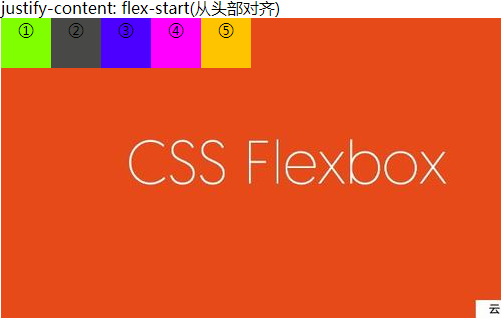
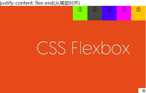
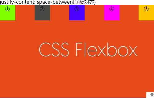
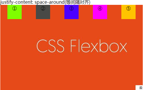
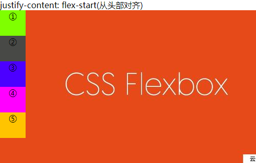
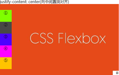
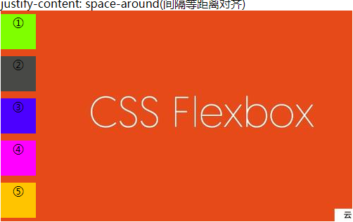
2、 justify-content(①flex-start(默认值) ②flex-end ③center ④space-between ⑤space-around)
justify-content决定了items从哪里开始对齐。
例1:flex-direction: row的情况

例2:flex-direction: column的情况


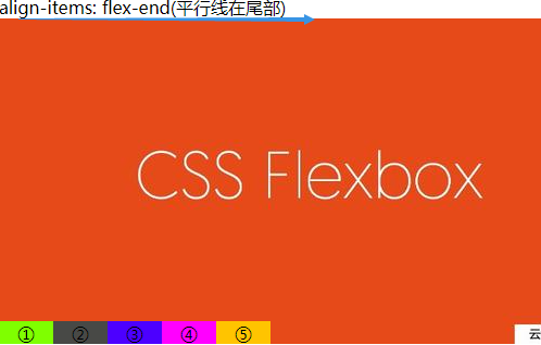
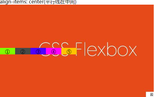
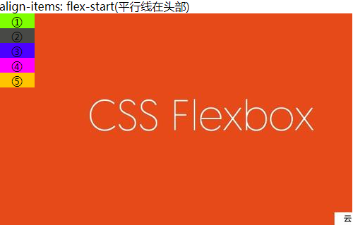
3、align-items(①flex-start ②flex-end ③center ④baseline ⑤stretch(默认值))
align-items实际上是选择了平行于多个元素的一个平行线,而这个平行线所在的位置即为要对齐的基准线。注:以下items都没有设置高度。
例1:flex-direction: row情况


例1:flex-direction:column情况


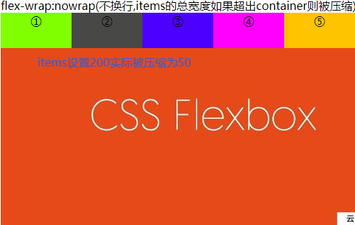
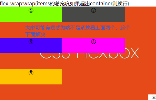
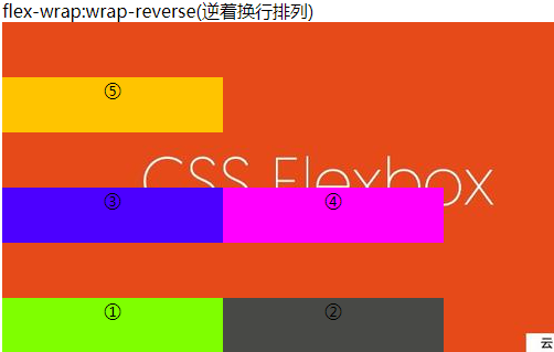
4、flex-wrap(①nowrap(默认值) ②wrap ③wrap-reverse) 注:以下items宽度200,container宽度500。
flex-direction: row情况
5、flex-flow属性是flex-direction属性和flex-wrap属性的简写形式,默认值为row nowrap
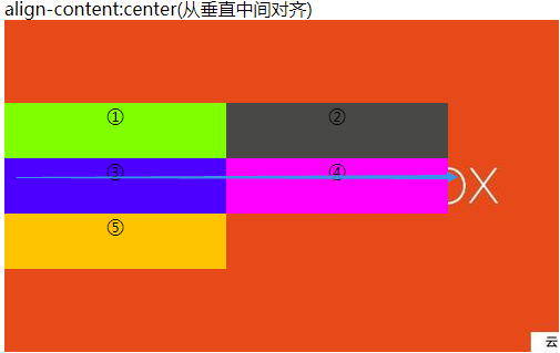
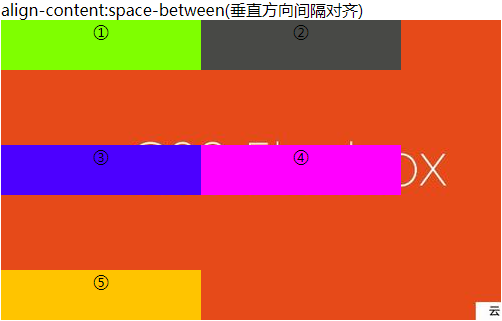
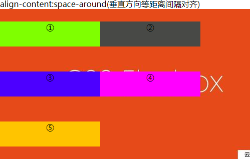
6、align-content: flex-start | flex-end | center | space-between | space-around | stretch(默认值);
align-content决定了多行元素在垂直方向的对齐方式。
例:以flex-wrap: wrap;为例


三、flex items项目的属性
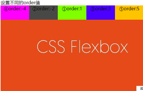
1、order:一个numnber值数字越小越靠前,默认为0
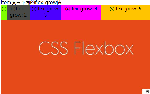
2、flex-grow:一个number值,定义项目放大比例
3、align-self:auto | flex-start | flex-end | center | baseline | stretch
四、使用上述属性使元素水平、垂直居中
justify-content: center;/* 水平居中 */
/* 垂直居中 */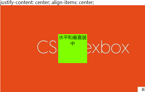
Webkit 内核的浏览器,必须加上-webkit前缀
.box{
  display: -webkit-flex; /* Safari */
  display: flex;
}

 浙公网安备 33010602011771号