
Matplotlib基础知识
目录
Matplotlib基础知识
Matplotlib基本用法
- pyplot是 matplotlib 中常用的画图模块,为 matplotlib 中底层绘图库提供了状态机界面。
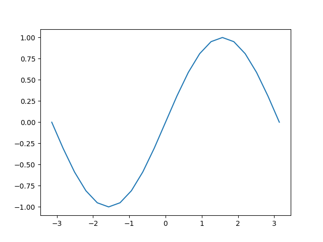
import numpy as np
import matplotlib.pyplot as plt  # 加载 pylot 子模块

x = np.linspace(-np.pi, np.pi, 21)
y = np.sin(x)
print("x = ", x)
print("y = ", y)

plt.figure()  # 定义一个图像窗口
plt.plot(x, y)  # 画图象
plt.show()  # 显示图像
x =  [-3.14159265 -2.82743339 -2.51327412 -2.19911486 -1.88495559 -1.57079633
 -1.25663706 -0.9424778  -0.62831853 -0.31415927  0.          0.31415927
  0.62831853  0.9424778   1.25663706  1.57079633  1.88495559  2.19911486
  2.51327412  2.82743339  3.14159265]
y =  [-1.22464680e-16 -3.09016994e-01 -5.87785252e-01 -8.09016994e-01
 -9.51056516e-01 -1.00000000e+00 -9.51056516e-01 -8.09016994e-01
 -5.87785252e-01 -3.09016994e-01  0.00000000e+00  3.09016994e-01
  5.87785252e-01  8.09016994e-01  9.51056516e-01  1.00000000e+00
  9.51056516e-01  8.09016994e-01  5.87785252e-01  3.09016994e-01
  1.22464680e-16]
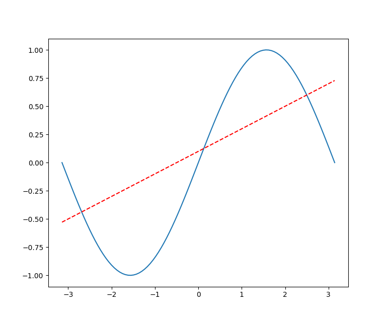
同时画多条线
import numpy as np
import matplotlib.pyplot as plt  # 加载 pylot 子模块

x = np.linspace(-np.pi, np.pi, 100)
y = np.sin(x)
linear_y = 0.2 * x + 0.1

plt.figure(figsize=(16, 12))  # 定义一个图像窗口

plt.plot(x, y)
plt.plot(x, linear_y, color='red', linestyle='--')

plt.show()  # 显示图像
添加坐标轴和标题
plt.title("y = sin(x) and y = 0.2 * x + 0.1")
plt.xlabel("x")
plt.ylabel("y")
指定坐标轴范围
plt.xlim((-np.pi, np.pi))
plt.ylim((-1, 1))
重新设置坐标轴的刻度
plt.xticks(np.linspace(-np.pi, np.pi, 5))
x_value_range = np.linspace(-np.pi, np.pi, 5)
x_value_strs = [r'$\pi$', r'$-\frac{\pi}{2}$', r'$0$', r'$\frac{\pi}{2}$', r'$\pi$']
plt.xticks(x_value_range, x_value_strs)
重新设置坐标轴的位置
ax = plt.gca()  # 获取坐标轴
ax.spines['right'].set_color('none')  # 隐藏右方的坐标轴
ax.spines['top'].set_color('none')  # 隐藏上方的坐标轴

# 设置左方和下方坐标轴的位置
# ax.xaxis.set_ticks_position('bottom')
ax.spines['bottom'].set_position(('data', 0))  # 将下方的坐标轴设置到y = 0的位置
ax.spines['left'].set_position(('data', 0))  # 将左方的坐标轴设置到 x = 0 的位置
Legend图例
- matplotlib 中的 legend 图例就是为了帮我们展示出每个数据对应的图像名称。
# 为曲线加上标签
plt.plot(x, y, label="y = sin(x)")
plt.plot(x, linear_y, color="red", linestyle='--', label='y = 0.2x + 0.1')

# 将曲线的信息标识出来
plt.legend(loc='lower right', fontsize=24)
plt.show()
legend方法中的loc 参数可选设置
| 位置字符串 | 位置编号 | 位置表述 |
|---|---|---|
| ‘best’ | 0 | 最佳位置 |
| ‘upper right’ | 1 | 右上角 |
| ‘upper left’ | 2 | 左上角 |
| ‘lower left’ | 3 | 左下角 |
| ‘lower right’ | 4 | 右下角 |
| ‘right’ | 5 | 右侧 |
| ‘center left’ | 6 | 左侧垂直居中 |
| ‘center right’ | 7 | 右侧垂直居中 |
| ‘lower center’ | 8 | 下方水平居中 |
| ‘upper center’ | 9 | 上方水平居中 |
| ‘center’ | 10 | 正中间 |
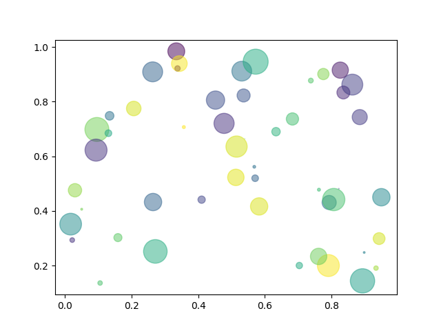
散点图
import numpy as np
import matplotlib.pyplot as plt

N = 50
x = np.random.rand(N)
y = np.random.rand(N)
colors = np.random.rand(N)
area = np.pi * (15 * np.random.rand(N)) ** 2

plt.scatter(x, y, s=area, c=colors, alpha=0.5)
plt.show()
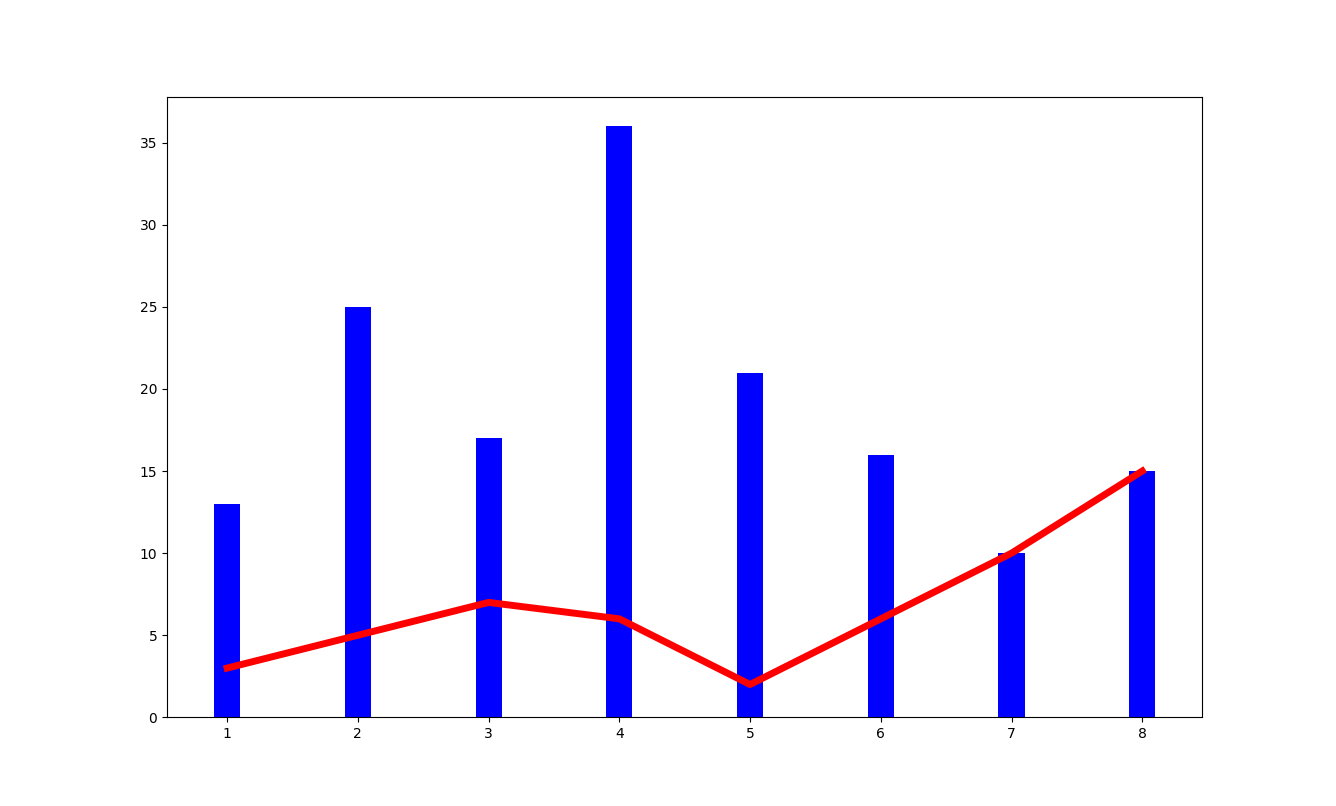
柱状图
- plt.bar
import numpy as np
import matplotlib.pyplot as plt

plt.figure(figsize=(16, 12))
x = np.array([1, 2, 3, 4, 5, 6, 7, 8])
y = np.array([3, 5, 7, 6, 2, 6, 10, 15])
plt.plot(x, y, 'r', lw=5)  # 指定线的颜色和宽度

x = np.array([1, 2, 3, 4, 5, 6, 7, 8])
y = np.array([13, 25, 17, 36, 21, 16, 10, 15])
plt.bar(x, y, 0.2, alpha=1, color='b')
plt.show()
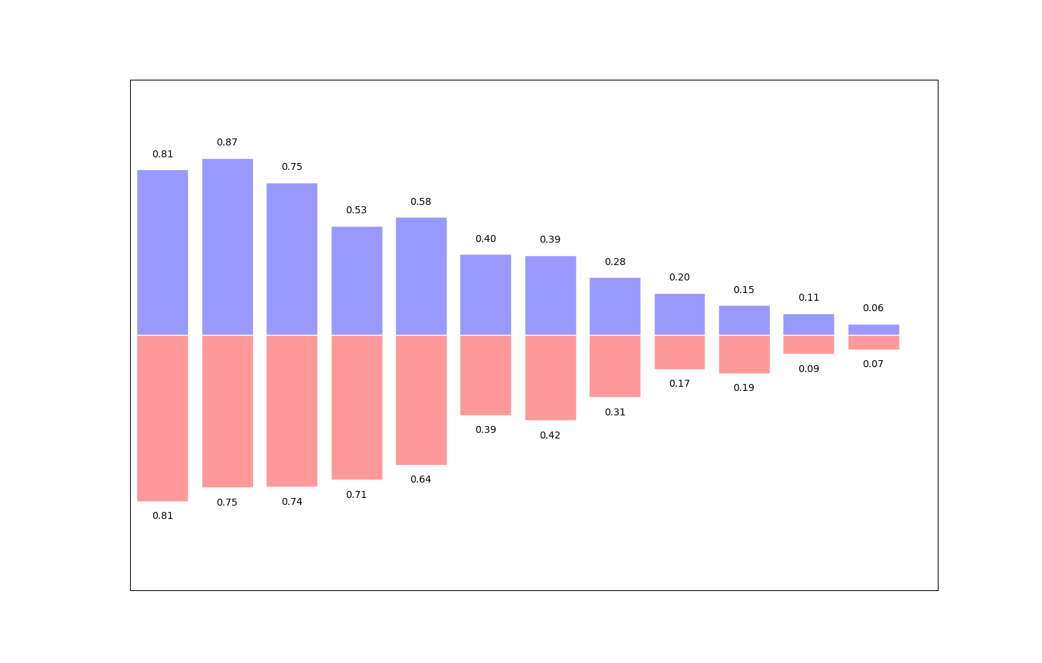
- 有的时候柱状图会出现在x轴的俩侧,方便进行比较
import numpy as np
import matplotlib.pyplot as plt

plt.figure(figsize=(16, 12))
n = 12
x = np.arange(n)  # 按顺序生成从12以内的数字
y1 = (1 - x / float(n)) * np.random.uniform(0.5, 1.0, n)
y2 = (1 - x / float(n)) * np.random.uniform(0.5, 1.0, n)

# 设置柱状图的颜色以及边界颜色
# +y表示在x轴的上方 -y表示在x轴的下方
plt.bar(x, +y1, facecolor='#9999ff', edgecolor='white')
plt.bar(x, -y2, facecolor='#ff9999', edgecolor='white')

plt.xlim(-0.5, n)  # 设置x轴的范围,
plt.xticks(())  # 可以通过设置刻度为空,消除刻度
plt.ylim(-1.25, 1.25)  # 设置y轴的范围
plt.yticks(())

# plt.text()在图像中写入文本,设置位置,设置文本,ha设置水平方向对其方式,va设置垂直方向对齐方式
for x1, y in zip(x, y2):
    plt.text(x1, -y - 0.05, '%.2f' % y, ha='center', va='top')
for x1, y in zip(x, y1):
    plt.text(x1, y + 0.05, '%.2f' % y, ha='center', va='bottom')
plt.show()
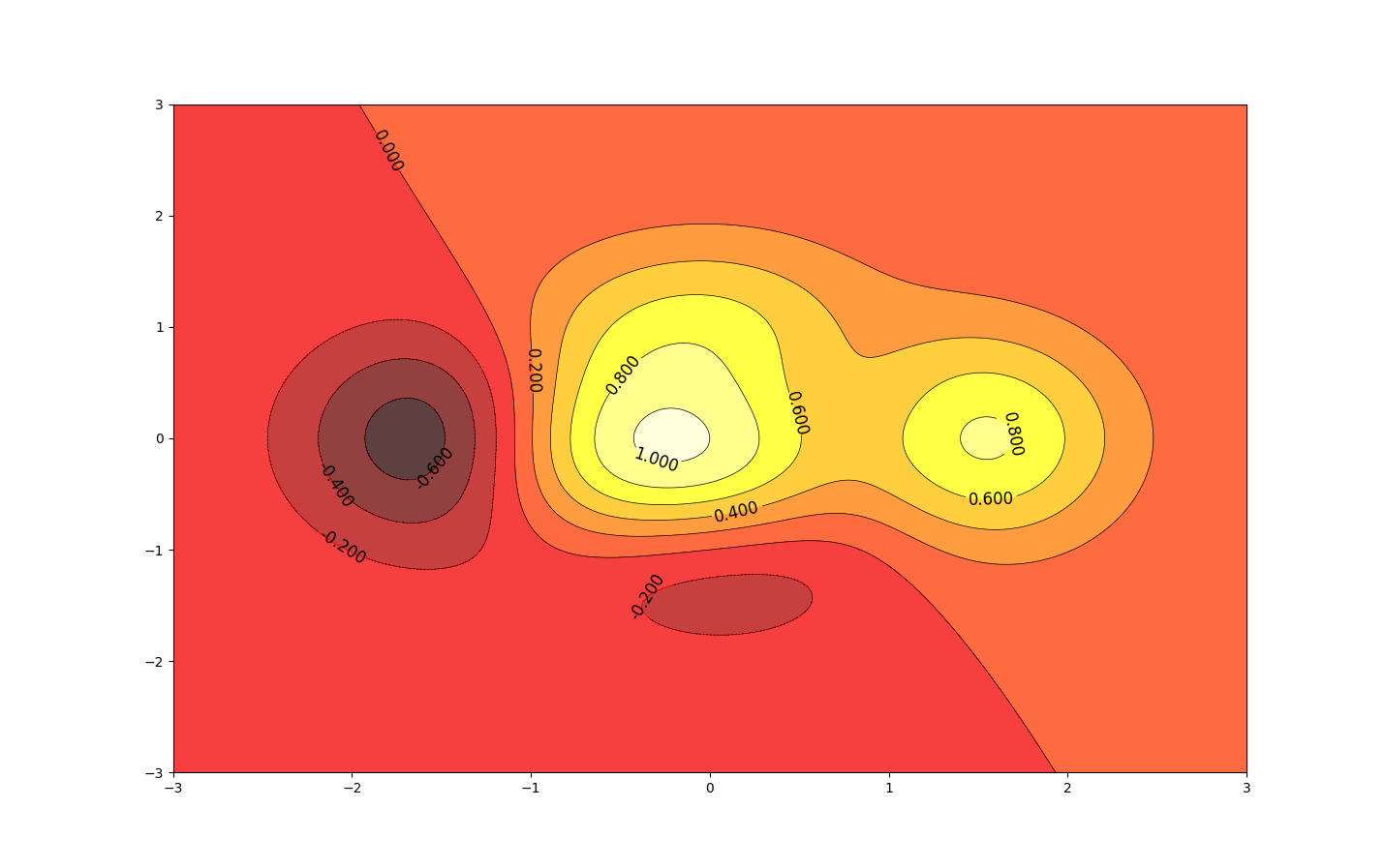
等高线图
import matplotlib.pyplot as plt
import numpy as np


def f(x, y):
    return (1 - x / 2 + x ** 5 + y ** 3) * np.exp(-x ** 2 - y ** 2)


n = 256
x = np.linspace(-3, 3, n)
y = np.linspace(-3, 3, n)
X, Y = np.meshgrid(x, y)  # 生成网格坐标
line_num = 10  # 等高线的数量

plt.figure(figsize=(16, 12))

C = plt.contour(X, Y, f(X, Y), line_num, colors='black', linewidths=.5)
plt.clabel(C, inline=True, fontsize=12)
plt.contourf(X, Y, f(X, Y), line_num, alpha=0.75, cmap=plt.cm.hot)

plt.show()
处理图片

import matplotlib.pyplot as plt
import matplotlib.image as mpimg  # 导入处理图片的库
import matplotlib.cm as cm  # 导入处理颜色的库colormap

plt.figure(figsize=(16, 12))
img = mpimg.imread('./stinkbug.png')  # 读取图片
print(img)  # numpy数据
print(img.shape)

plt.imshow(img, cmap=cm.gray)

plt.show()
[[0.40784314 0.40784314 0.40784314 ... 0.42745098 0.42745098 0.42745098]
 [0.4117647  0.4117647  0.4117647  ... 0.42745098 0.42745098 0.42745098]
 [0.41960785 0.41568628 0.41568628 ... 0.43137255 0.43137255 0.43137255]
 ...
 [0.4392157  0.43529412 0.43137255 ... 0.45490196 0.4509804  0.4509804 ]
 [0.44313726 0.44313726 0.4392157  ... 0.4509804  0.44705883 0.44705883]
 [0.44313726 0.4509804  0.4509804  ... 0.44705883 0.44705883 0.44313726]]
(375, 500)

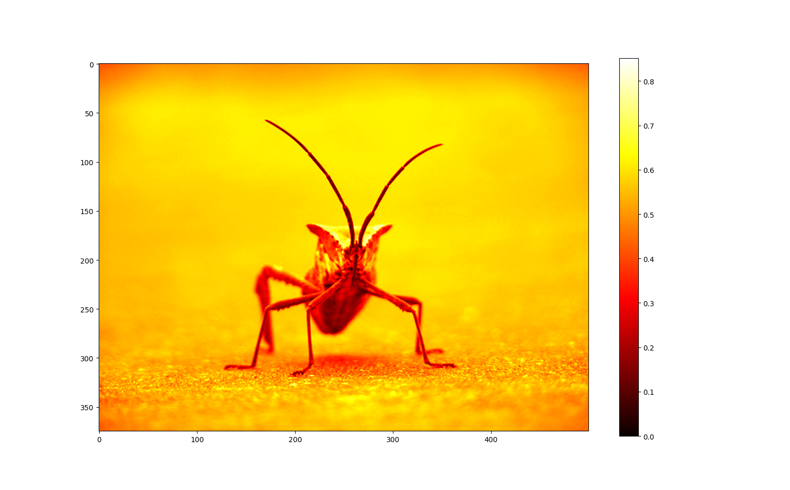
import matplotlib.pyplot as plt
import matplotlib.image as mpimg  # 导入处理图片的库

plt.figure(figsize=(16, 12))
img = mpimg.imread('./stinkbug.png')  # 读取图片

plt.imshow(img, cmap="hot")
plt.colorbar()

plt.show()
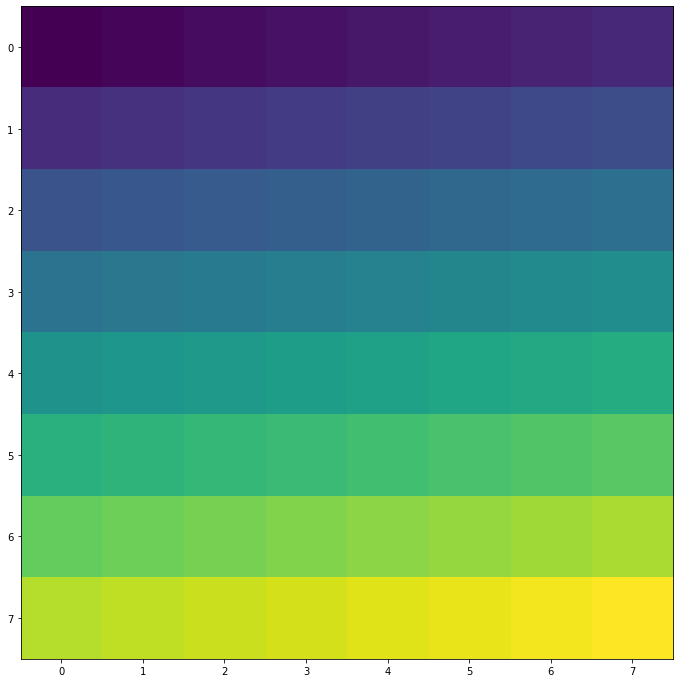
- 创造图片
import matplotlib.pyplot as plt
import numpy as np

size = 8
a = np.linspace(0, 1, size ** 2).reshape(size, size)  # 得到一个8*8数值在(0, 1)之间的矩阵

plt.figure(figsize=(16, 12))
plt.imshow(a)
plt.show()
Matplotlib 3D图
- Matplotlib 在画3D图时,需要首先创建一个 Axes3D 对象。
import matplotlib.pyplot as plt
from mpl_toolkits.mplot3d import Axes3D  # 导入Axes3D对象

fig = plt.figure(figsize=(16, 12))
ax = fig.add_subplot(111, projection='3d')  # 得到3d图像

plt.show()
- rstride 和 cstride 分别代表 row 和 column 的跨度
import numpy as np
import matplotlib.pyplot as plt
from mpl_toolkits.mplot3d import Axes3D  # 导入Axes3D对象

fig = plt.figure(figsize=(16, 12))
ax = fig.add_subplot(111, projection='3d')  # 得到3d图像

x = np.arange(-4, 4, 0.25)
y = np.arange(-4, 4, 0.25)
X, Y = np.meshgrid(x, y)  # 生成网格
Z = np.sqrt(X ** 2 + Y ** 2)

ax.plot_surface(X, Y, Z, rstride=1, cstride=1, cmap=plt.get_cmap('rainbow'))

plt.show()

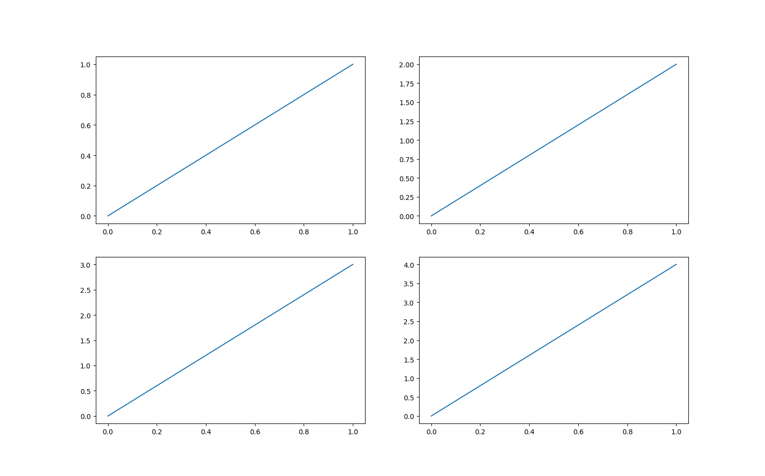
多图合并显示
- matplotlib 是可以组合许多的小图,放在一张大图里面显示的,使用到的方法叫做 subplot 。
import matplotlib.pyplot as plt

plt.figure(figsize=(16, 12))

plt.subplot(2, 2, 1)
plt.plot([0, 1], [0, 1])

plt.subplot(2, 2, 2)
plt.plot([0, 1], [0, 2])

plt.subplot(223)
plt.plot([0, 1], [0, 3])

plt.subplot(224)
plt.plot([0, 1], [0, 4])

plt.show()
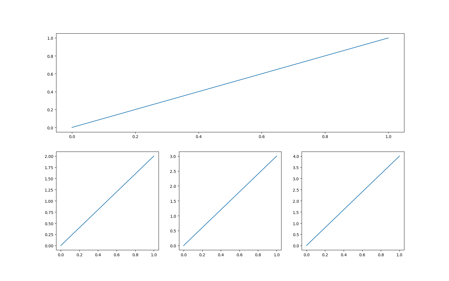
import matplotlib.pyplot as plt

plt.figure(figsize=(16, 12))

plt.subplot(2, 1, 1)
plt.plot([0, 1], [0, 1])

plt.subplot(2, 3, 4)
plt.plot([0, 1], [0, 2])

plt.subplot(235)
plt.plot([0, 1], [0, 3])

plt.subplot(236)
plt.plot([0, 1], [0, 4])

plt.show()

 浙公网安备 33010602011771号