echart图表demo
<!DOCTYPE html>
<html>
<head>
<title>echarts</title>
</head>
<script src="js/jquery-1.11.1.min.js"></script>
<script type="text/javascript" src="js/echarts.min.js"></script>
<body style="background-color:#333;"><!-- -->
<div id="_top" style="width:600px;height: 400px;margin-top:100px;margin-left: 300px;">
</div>
</body>
<script type="text/javascript">
// 基于准备好的dom,初始化echarts实例
var myChart = echarts.init(document.getElementById('_top'));
// 指定图表的配置项和数据
var option = {
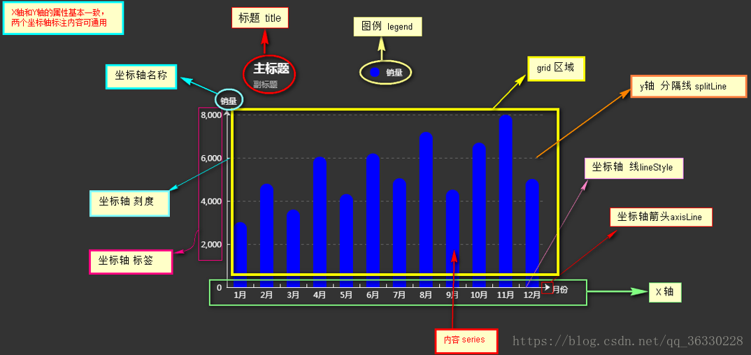
//-------------- 标题 title ----------------
title: {
text: '主标题',
textStyle:{ //---主标题内容样式
color:'#fff'
},
subtext:'副标题', //---副标题内容样式
subtextStyle:{
color:'#bbb'
},
padding:[0,0,100,100] //---标题位置,因为图形是是放在一个dom中,因此用padding属性来定位
},
//---------------- 图例 legend -----------------
legend: {
type:'plain', //----图例类型,默认为'plain',当图例很多时可使用'scroll'
top:'1%', //----图例相对容器位置,top\bottom\left\right
selected:{
'销量':true, //----图例选择,图形加载出来会显示选择的图例,默认为true
},
textStyle:{ //----图例内容样式
color:'#fff', //---所有图例的字体颜色
//backgroundColor:'black', //---所有图例的字体背景色
},
tooltip:{ //图例提示框,默认不显示
show:true,
color:'red',
},
data:[ //----图例内容
{
name:'销量',
icon:'circle', //----图例的外框样式
textStyle:{
color:'#fff', //----单独设置某一个图例的颜色
//backgroundColor:'black',//---单独设置某一个图例的字体背景色
}
}
],
},
//-------------- 提示框 -----------------
tooltip: {
show:true, //---是否显示提示框,默认为true
trigger:'item', //---数据项图形触发
axisPointer:{ //---指示样式
type:'shadow',
axis:'auto',
},
padding:5,
textStyle:{ //---提示框内容样式
color:"#fff",
},
},
//------------- grid区域 ----------------
grid:{
show:false, //---是否显示直角坐标系网格
top:80, //---相对位置,top\bottom\left\right
containLabel:false, //---grid 区域是否包含坐标轴的刻度标签
tooltip:{ //---鼠标焦点放在图形上,产生的提示框
show:true,
trigger:'item', //---触发类型
textStyle:{
color:'#666',
},
}
},
//------------- x轴 -------------------
xAxis: {
show:true, //---是否显示
position:'bottom', //---x轴位置
offset:0, //---x轴相对于默认位置的偏移
type:'category', //---轴类型,默认'category'
name:'月份', //---轴名称
nameLocation:'end', //---轴名称相对位置
nameTextStyle:{ //---坐标轴名称样式
color:"#fff",
padding:[5,0,0,-5], //---坐标轴名称相对位置
},
nameGap:15, //---坐标轴名称与轴线之间的距离
//nameRotate:270, //---坐标轴名字旋转
axisLine:{ //---坐标轴 轴线
show:true, //---是否显示
//------------------- 箭头 -------------------------
symbol:['none', 'arrow'], //---是否显示轴线箭头
symbolSize:[8, 8] , //---箭头大小
symbolOffset:[0,7], //---箭头位置
//------------------- 线 -------------------------
lineStyle:{
color:'#fff',
width:1,
type:'solid',
},
},
axisTick:{ //---坐标轴 刻度
show:true, //---是否显示
inside:true, //---是否朝内
lengt:3, //---长度
lineStyle:{
//color:'red', //---默认取轴线的颜色
width:1,
type:'solid',
},
},
axisLabel:{ //---坐标轴 标签
show:true, //---是否显示
inside:false, //---是否朝内
rotate:0, //---旋转角度
margin: 5, //---刻度标签与轴线之间的距离
//color:'red', //---默认取轴线的颜色
},
splitLine:{ //---grid 区域中的分隔线
show:false, //---是否显示,'category'类目轴不显示,此时我的X轴为类目轴,splitLine属性是无意义的
lineStyle:{
//color:'red',
//width:1,
//type:'solid',
},
},
splitArea:{ //--网格区域
show:false, //---是否显示,默认false
},
data: ["1月","2月","3月","4月","5月","6月","7月","8月","9月","10月","11月","12月"],//内容
},
//---------------------- y轴 ------------------------
yAxis: {
show:true, //---是否显示
position:'left', //---y轴位置
offset:0, //---y轴相对于默认位置的偏移
type:'value', //---轴类型,默认'category'
name:'销量', //---轴名称
nameLocation:'end', //---轴名称相对位置value
nameTextStyle:{ //---坐标轴名称样式
color:"#fff",
padding:[5,0,0,5], //---坐标轴名称相对位置
},
nameGap:15, //---坐标轴名称与轴线之间的距离
//nameRotate:270, //---坐标轴名字旋转
axisLine:{ //---坐标轴 轴线
show:true, //---是否显示
//------------------- 箭头 -------------------------
symbol:['none', 'arrow'], //---是否显示轴线箭头
symbolSize:[8, 8] , //---箭头大小
symbolOffset:[0,7], //---箭头位置
//------------------- 线 -------------------------
lineStyle:{
color:'#fff',
width:1,
type:'solid',
},
},
axisTick:{ //---坐标轴 刻度
show:true, //---是否显示
inside:true, //---是否朝内
lengt:3, //---长度
lineStyle:{
//color:'red', //---默认取轴线的颜色
width:1,
type:'solid',
},
},
axisLabel:{ //---坐标轴 标签
show:true, //---是否显示
inside:false, //---是否朝内
rotate:0, //---旋转角度
margin: 8, //---刻度标签与轴线之间的距离
//color:'red', //---默认取轴线的颜色
},
splitLine:{ //---grid 区域中的分隔线
show:true, //---是否显示,'category'类目轴不显示,此时我的y轴为类目轴,splitLine属性是有意义的
lineStyle:{
color:'#666',
width:1,
type:'dashed', //---类型
},
},
splitArea:{ //--网格区域
show:false, //---是否显示,默认false
}
},
//------------ 内容数据 -----------------
series: [
{
name: '销量', //---系列名称
type: 'bar', //---类型
legendHoverLink:true, //---是否启用图例 hover 时的联动高亮
label:{ //---图形上的文本标签
show:false,
position:'insideTop', //---相对位置
rotate:0, //---旋转角度
color:'#eee',
},
itemStyle:{ //---图形形状
color:'blue',
barBorderRadius:[18,18,0,0],
},
barWidth:'20', //---柱形宽度
barCategoryGap:'20%', //---柱形间距
data: [3020, 4800, 3600, 6050, 4320, 6200,5050,7200,4521,6700,8000,5020]
}
]
};
// 使用刚指定的配置项和数据显示图表。
myChart.setOption(option);
</script>
</html>

 浙公网安备 33010602011771号