
实用指南:Python数据可视化科技图表绘制系列教程(一)
2025-10-08 14:58 tlnshuju 阅读(47) 评论(0) 收藏 举报目录


【声明】:未经版权人书面许可,任何单位或个人不得以任何形式复制、发行、出租、改编、汇编、传播、展示或利用本博客的全部或部分内容,也不得在未经版权人授权的情况下将本博客用于任何商业目的。但版权人允许个人学习、研究、欣赏等非商业性用途的复制和传播。非常推荐大家学习《Python数据可视化科技图表绘制》这本书籍。
创建多个坐标图形(坐标系)
import matplotlib.pyplot as plt

plt.figure()
plt.axes([0.0,
0.0,
1,
1])
plt.axes([0.1,
0.1,
.5,
.5],facecolor='blue')
plt.axes([0.2,
0.2,
.5,
.5],facecolor='pink')
plt.axes([0.3,
0.3,
.5,
.5],facecolor='green')
plt.axes([0.4,
0.4,
.5,
.5],facecolor='skyblue')

plt.savefig("P54创建多个坐标图形(坐标系).png", dpi=600)
plt.show()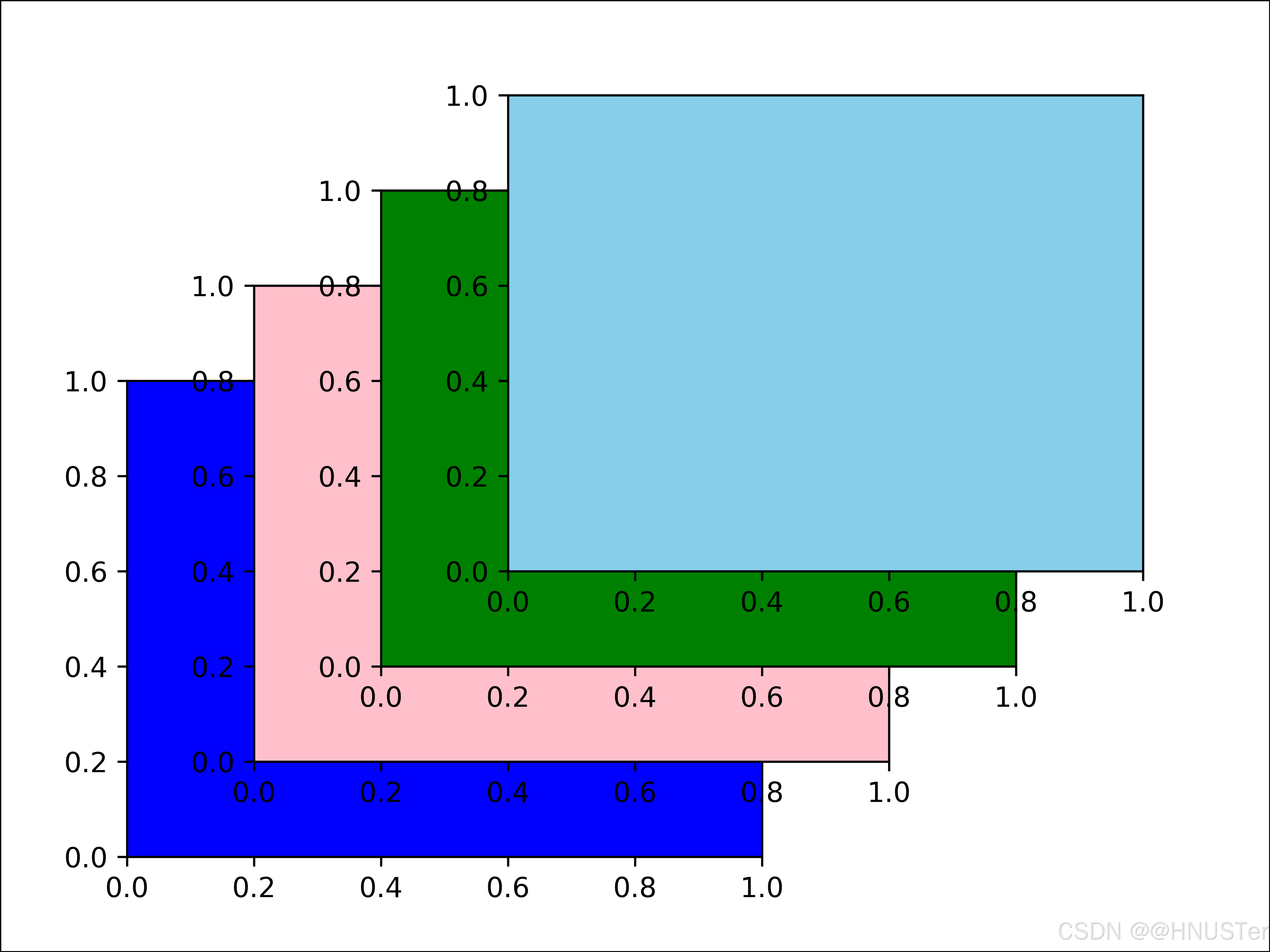
图表的组成
import matplotlib.pyplot as plt
import numpy as np

from matplotlib.patches import Circle
from matplotlib.patheffects import withStroke
from matplotlib.ticker import AutoMinorLocator,MultipleLocator

royal_blue=[0,
20/256,
82/256] # 自定义的颜色
# 创建图形
np.random.seed(19781101) # 固定随机种子,以便结果可复现

# 生成数据
X=np.linspace(0.5,
3.5,
100) # 生成等间隔的X值
Y1=3+np.cos(X) # 第一组数据,基于余弦函数
Y2=1+np.cos(1+X/0.75)/2 # 第二组数据,变化的余弦函数
Y3=np.random.uniform(Y1,Y2,len(X)) # 第三组数据,Y1与Y2之间的随机数

# 创建并配置图形和轴
fig=plt.figure(figsize=(7.5,
7.5)) # 创建图形,指定大小
ax=fig.add_axes([0.2,
0.17,
0.68,
0.7],aspect=1) # 添加轴,设置宽高比

# 设置主要和次要刻度定位器
ax.xaxis.set_major_locator(MultipleLocator(1.000)) # X轴的主要刻度间隔
ax.xaxis.set_minor_locator(AutoMinorLocator(4)) # X轴的次要刻度间隔
ax.yaxis.set_major_locator(MultipleLocator(1.000)) # Y轴的主要刻度间隔
ax.yaxis.set_minor_locator(AutoMinorLocator(4)) # Y轴的次要刻度间隔
ax.xaxis.set_minor_formatter("{x:.2f}") # 设置次要刻度的格式

# 设置坐标轴的显示范围
ax.set_xlim(0,
4)
ax.set_ylim(0,
4)

# 配置刻度标签的样式
ax.tick_params(which='major',width=1.0,length=10,labelsize=14) # 主刻度
ax.tick_params(which='minor',width=1.0,length=5,
labelsize=10,labelcolor='0.25') # 次刻度

# 添加网格
ax.grid(linestyle="--",linewidth=0.5,
color='.25',zorder=-10) # 设置网格样式和图层顺序

# 绘制数据
ax.plot(X,Y1,c='C0',lw=2.5,label="Blue signal",
zorder=10) # 绘制第一组数据,设置图层顺序
ax.plot(X,Y2,c='C1',lw=2.5,label="Orange signal") # 绘制第二组数据
# 绘制第三组数据作为散点图
ax.plot(X[::3],Y3[::3],linewidth=0,markersize=9,
marker='s',markerfacecolor='none',markeredgecolor='C4',
markeredgewidth=2.5)

# 设置标题和轴标签
ax.set_title("Anatomy of a figure",fontsize=20,verticalalignment='bottom')
ax.set_xlabel("x Axis label",fontsize=14)
ax.set_ylabel("y Axis label",fontsize=14)
ax.legend(loc="upper right",fontsize=14) # 添加图例

# 标注图形
def annotate(x,y,text,code):
# 添加圆形标记
c=Circle((x,y),radius=0.15,clip_on=False,zorder=10,linewidth=2.5,
edgecolor=royal_blue+[0.6],facecolor='none',
path_effects=[withStroke(linewidth=7,foreground='white')])
# 使用路径效果突出标记
ax.add_artist(c)

# 使用路径效果为文本添加背景
# 分别绘制路径效果和彩色文本,以避免路径效果裁剪其他文本
for path_effects in [[withStroke(linewidth=7,foreground='white')],[]]:
color='white' if path_effects else royal_blue
ax.text(x,y-0.2,text,zorder=100,
ha='center',va='top',weight='bold',color=color,
style='italic',fontfamily='monospace',
path_effects=path_effects)

color='white' if path_effects else 'black'
ax.text(x,y-0.33,code,zorder=100,
ha='center',va='top',weight='normal',color=color,
fontfamily='monospace',fontsize='medium',
path_effects=path_effects)

# 通过调用自定义的annotate函数来添加多个图形标注
# 具体标注调用代码,每次调用都是标注图形的一个特定部分和相关的Matplotlib命令
annotate(3.5,-0.13,
"Minor tick label",
"ax.xaxis.set_minor_formatter")
annotate(-0.03,
1.0,
"Major tick",
"ax.yaxis.set_major_locator")
annotate(0.00,
3.75,
"Minor tick",
"ax.yaxis.set_minor_locator")
annotate(-0.15,
3.00,
"Major tick label",
"ax.yaxis.set_major_formatter")
annotate(1.68,-0.39,
"xlabel",
"ax.set_xlabel")
annotate(-0.38,
1.67,
"ylabel",
"ax.set_ylabel")
annotate(1.52,
4.15,
"Title",
"ax.set_title")
annotate(1.75,
2.80,
"Line",
"ax.plot")
annotate(2.25,
1.54,
"Markers",
"ax.scatter")
annotate(3.00,
3.00,
"Grid",
"ax.grid")
annotate(3.60,
3.58,
"Legend",
"ax.legend")
annotate(2.5,
0.55,
"Axes",
"fig.subplots")
annotate(4,
4.5,
"Figure",
"plt.figure")
annotate(0.65,
0.01,
"x Axis",
"ax.xaxis")
annotate(0,
0.36,
"y Axis",
"ax.yaxis")
annotate(4.0,
0.7,
"Spine",
"ax.spines")
# 给图形周围添加边框
fig.patch.set(linewidth=4,edgecolor='0.5')

# 保存图片
plt.savefig('P55图表的组成.png', dpi=600, transparent=True)
plt.show()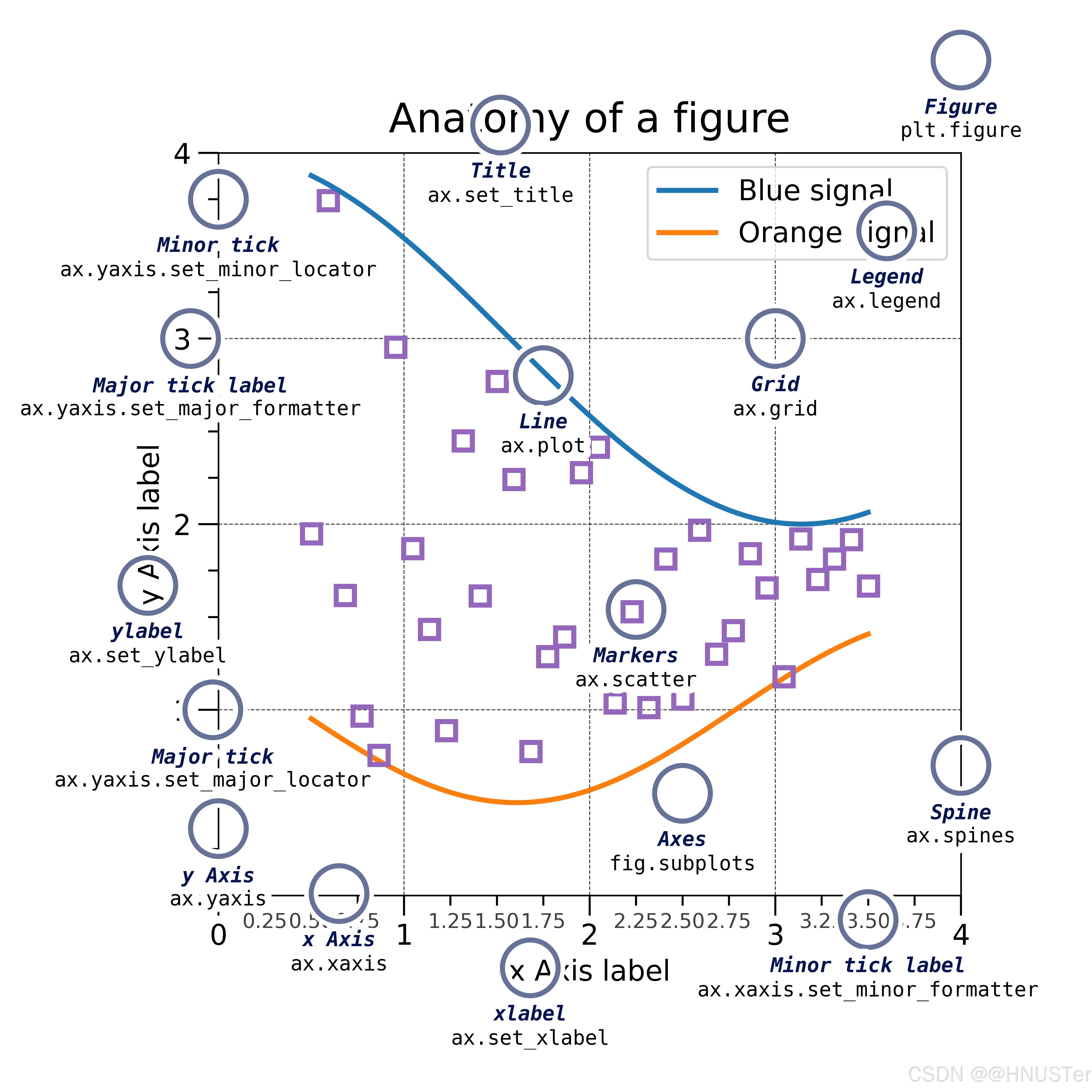
创建图形与子图
import matplotlib.pyplot as plt
from sklearn.datasets import load_iris

# 加载 iris 数据集
iris=load_iris()
data=iris.data
target=iris.target

# 提取数据
sepal_length=data[:,0]
petal_length=data[:,2]

# 创建图形和子图
fig,axs=plt.subplots(1,
2,figsize=(10,
5)) # 创建包含两个子图的图形
fig.suptitle('Sepal Length vs Petal Length',fontsize=16) # 设置图形标题

# 第1个子图:线图
axs[0].plot(sepal_length,label='Sepal Length',color='blue',
linestyle='-') # 绘制线图
axs[0].plot(petal_length,label='Petal Length',color='green',
linestyle='--') # 绘制另一个线图
axs[0].set_xlabel('Sample') # 设置x轴标签
axs[0].set_ylabel('Length') # 设置y轴标签
axs[0].legend() # 添加图例
axs[0].grid(True) # 添加网格线

# 第2个子图:散点图
scatter=axs[1].scatter(sepal_length,petal_length,c=target,
cmap='viridis',label='Data Points') # 绘制散点图
axs[1].set_xlabel('Sepal Length') # 设置x轴标签
axs[1].set_ylabel('Petal Length') # 设置y轴标签
axs[1].legend() # 添加图例
axs[1].grid(True) # 添加网格线
fig.colorbar(scatter,ax=axs[1],label='Species') # 添加颜色条

plt.tight_layout() # 自动调整子图布局

# 保存图片
plt.savefig('P58创建图形与子图.png', dpi=600, transparent=True)
plt.show()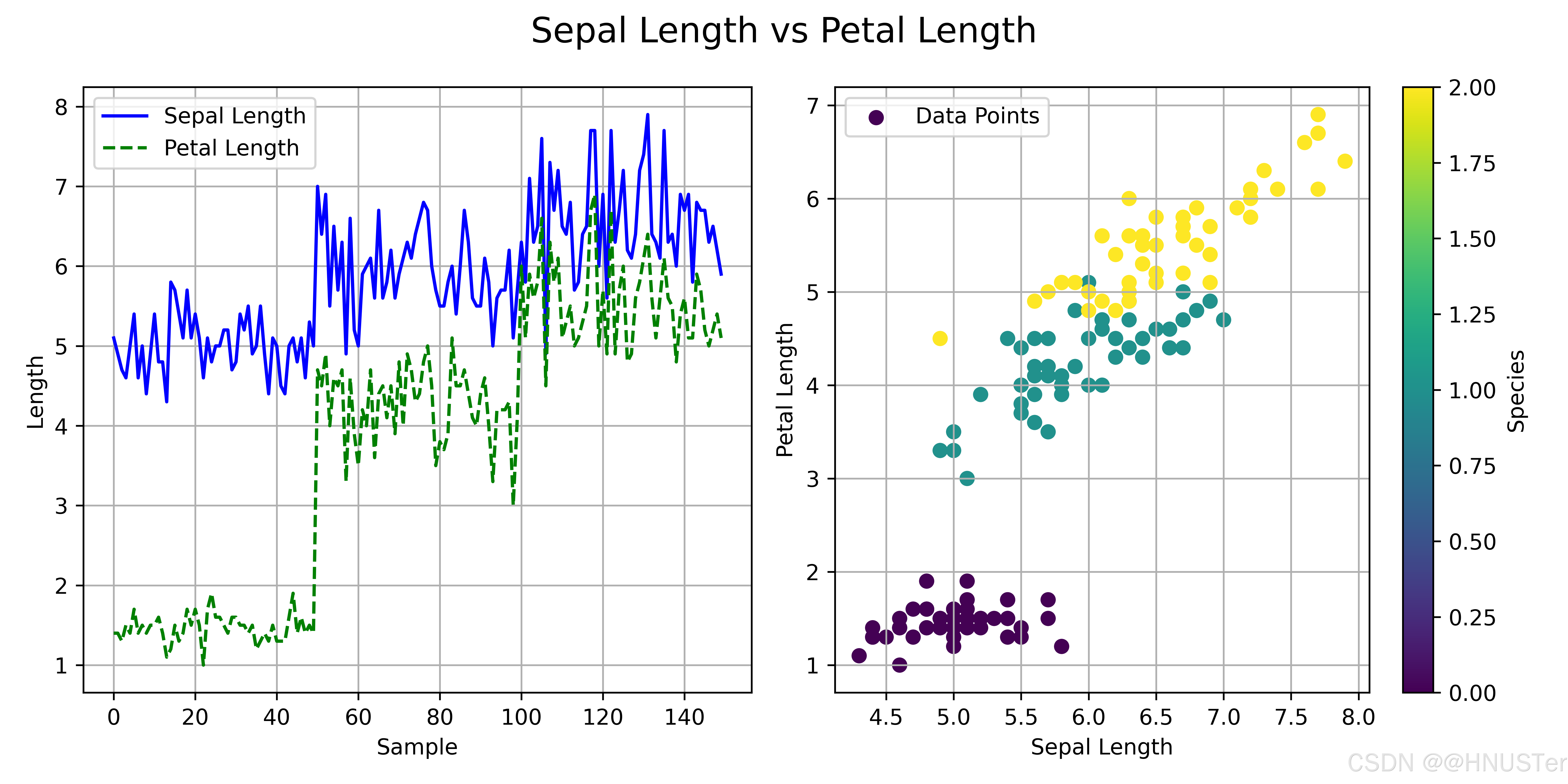
创建子图1
# 安装和导入必要的库:
import matplotlib.pyplot as plt
import seaborn as sns # seaborn 库内置了iris数据集

# 加载iris数据集并查看其结构
iris=sns.load_dataset('iris')
iris.head() # 输出略
plt.figure(figsize=(10,
6)) # 设置画布大小

# 第1个子图
plt.subplot(2,
2,
1) # 2行2列的第1个
plt.hist(iris['sepal_length'],color='blue')
plt.title('Sepal Length')
# 第2个子图
plt.subplot(2,
2,
2) # 2行2列的第2个
plt.hist(iris['sepal_width'],color='orange')
plt.title('Sepal Width')
# 第3个子图
plt.subplot(2,
2,
3) # 2行2列的第3个
plt.hist(iris['petal_length'],color='green')
plt.title('Petal Length')
# 第4个子图
plt.subplot(2,
2,
4) # 2行2列的第4个
plt.hist(iris['petal_width'],color='red')
plt.title('Petal Width')

plt.tight_layout() # 自动调整子图间距

# 保存图片
plt.savefig('P60创建子图1.png', dpi=600, transparent=True)
plt.show()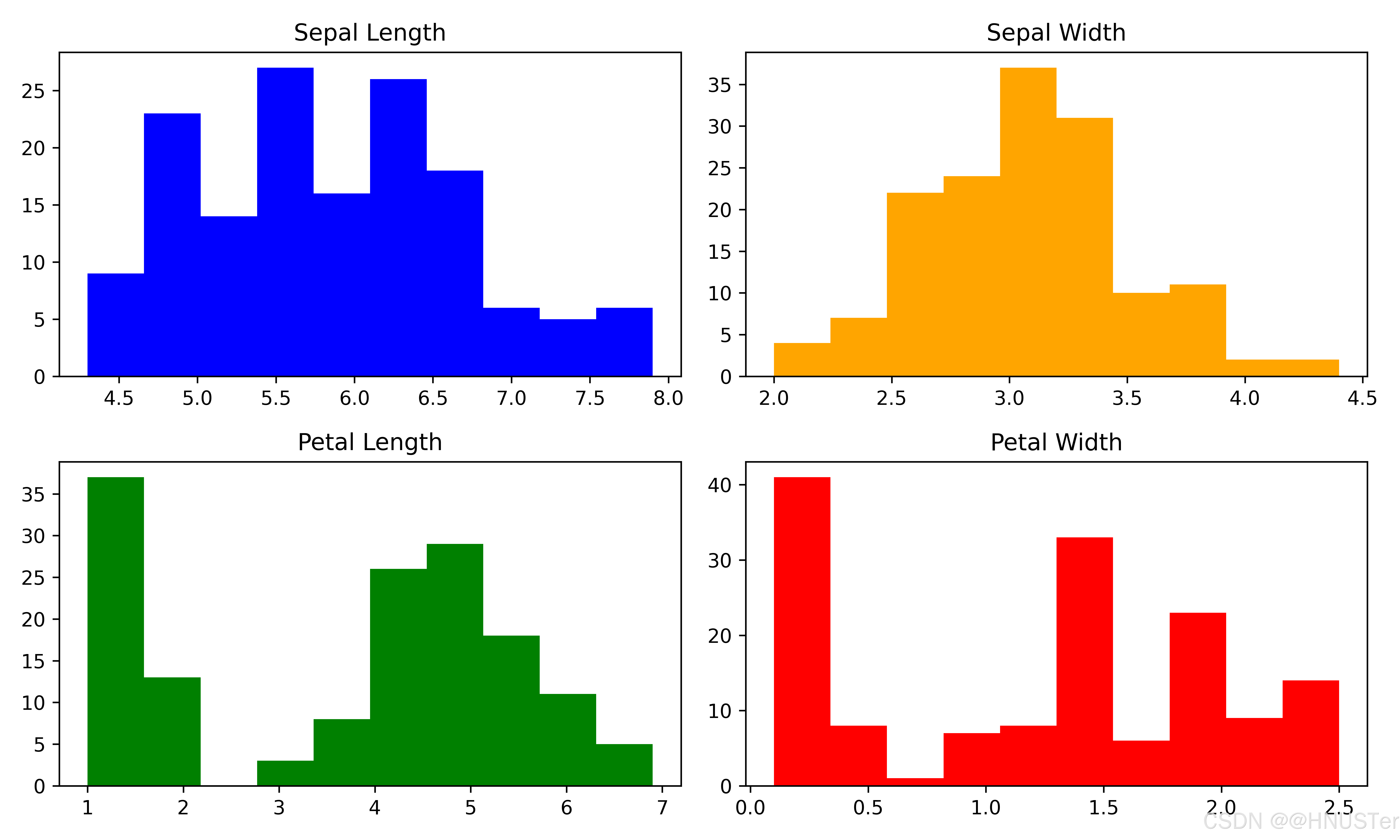
创建子图2
import matplotlib.pyplot as plt
import seaborn as sns

data=sns.load_dataset("iris") # 加载内置的iris数据集

# 使用plt.subplots()创建一个2行3列的子图布局
fig,axs=plt.subplots(2,
3,figsize=(15,
8))

# 第1个子图:绘制sepal_length和sepal_width的散点图
axs[0,
0].scatter(data['sepal_length'],data['sepal_width'])
axs[0,
0].set_title('Sepal Length vs Sepal Width')

# 第2个子图:绘制petal_length和petal_width的散点图
axs[0,
1].scatter(data['petal_length'],data['petal_width'])
axs[0,
1].set_title('Petal Length vs Petal Width')

# 第3个子图:绘制sepal_length的直方图
axs[0,
2].hist(data['sepal_length'],bins=20)
axs[0,
2].set_title('Sepal Length Distribution')

# 4个子图:绘制petal_length的直方图
axs[1,
0].hist(data['petal_length'],bins=20)
axs[1,
0].set_title('Petal Length Distribution')

# 第5和第6位置合并为一个大图,展示species的计数条形图
# 为了合并第二行的中间和最右侧位置,使用subplot2grid功能
plt.subplot2grid((2,
3),(1,
1),colspan=2)
sns.countplot(x='species',data=data)
plt.title('Species Count')

plt.tight_layout() # 调整子图之间的间距

# 保存图片
plt.savefig('P61创建子图2.png', dpi=600, transparent=True)
plt.show()
创建子图3
import matplotlib.pyplot as plt

fig = plt.figure(figsize=(8,
4)) # 创建一个图形实例

# 添加第1个子图:1行2列的第1个位置
ax1=fig.add_subplot(1,
2,
1)
ax1.plot([1,
2,
3,
4],[1,
4,
2,
3]) # 绘制一条简单的折线图
ax1.set_title('First Subplot')

# 添加第2个子图:1行2列的第2个位置
ax2=fig.add_subplot(1,
2,
2)
ax2.bar([1,
2,
3,
4],[10,
20,
15,
25]) # 绘制一个条形图
ax2.set_title('Second Subplot')

# 显示图形
plt.tight_layout() # 自动调整子图参数,使之填充整个图形区域

# 保存图片
plt.savefig('P63创建子图3.png', dpi=600, transparent=True)
plt.show()
创建子图4
import matplotlib.pyplot as plt
from sklearn.datasets import load_iris

# 载入鸢尾花数据集
iris=load_iris()
data=iris.data
target=iris.target
feature_names=iris.feature_names
target_names=iris.target_names

grid_size=(3,
3) # 定义网格大小为3x3

# 第1个子图占据位置 (0,0)
ax1=plt.subplot2grid(grid_size,(0,
0),facecolor='orange')
ax1.scatter(data[:,0],data[:,1],c=target,cmap='viridis')
ax1.set_xlabel(feature_names[0])
ax1.set_ylabel(feature_names[1])

# 第2个子图占据位置(0,1),并跨越2列
ax2=plt.subplot2grid(grid_size,(0,
1),colspan=2,facecolor='pink')
ax2.scatter(data[:,1],data[:,2],c=target,cmap='viridis')
ax2.set_xlabel(feature_names[1])
ax2.set_ylabel(feature_names[2])

# 第3个子图占据位置(1,0),并跨越2行
ax3=plt.subplot2grid(grid_size,(1,
0),rowspan=2,facecolor='grey')
ax3.scatter(data[:,0],data[:,2],c=target,cmap='viridis')
ax3.set_xlabel(feature_names[0])
ax3.set_ylabel(feature_names[2])

# 第4个子图占据位置 (1,1),并跨越到最后
ax4=plt.subplot2grid(grid_size,(1,
1),colspan=2,
rowspan=2,facecolor='skyblue')
ax4.scatter(data[:,2],data[:,3],c=target,cmap='viridis')
ax4.set_xlabel(feature_names[2])
ax4.set_ylabel(feature_names[3])

plt.tight_layout()

# 保存图片
plt.savefig('P64创建子图4.png', dpi=600, transparent=True)
plt.show()
创建子图5
import matplotlib.pyplot as plt
import matplotlib.gridspec as gridspec
from sklearn.datasets import load_iris

# 载入Iris数据集
iris=load_iris()
data=iris.data
target=iris.target
feature_names=iris.feature_names
target_names=iris.target_names

# 创建一个2x2的子图网格
fig=plt.figure(figsize=(10,
6))
gs=gridspec.GridSpec(2,
2,height_ratios=[1,
1],width_ratios=[1,
1])

# 在网格中创建子图
ax1=plt.subplot(gs[0,
0])
ax1.scatter(data[:,0],data[:,1],c=target,cmap='viridis')
ax1.set_xlabel(feature_names[0])
ax1.set_ylabel(feature_names[1])
ax1.set_title('Sepal Length vs Sepal Width')

ax2=plt.subplot(gs[0,
1])
ax2.scatter(data[:,1],data[:,2],c=target,cmap='viridis')
ax2.set_xlabel(feature_names[1])
ax2.set_ylabel(feature_names[2])
ax2.set_title('Sepal Width vs Petal Length')

ax3=plt.subplot(gs[1,:])
ax3.scatter(data[:,2],data[:,3],c=target,cmap='viridis')
ax3.set_xlabel(feature_names[2])
ax3.set_ylabel(feature_names[3])
ax3.set_title('Petal Length vs Petal Width')

plt.tight_layout() # 调整布局

# 保存图片
plt.savefig('P66创建子图5.png', dpi=600, transparent=True)
plt.show()
添加图表元素
import matplotlib.pyplot as plt
import numpy as np
from sklearn.datasets import load_iris

# 载入Iris数据集
iris=load_iris()
data=iris.data
target=iris.target
feature_names=iris.feature_names
target_names=iris.target_names

fig,ax=plt.subplots(figsize=(6,
4)) # 创建图形和子图
# 绘制散点图
for i in range(len(target_names)):
ax.scatter(data[target==i,0],data[target==i,1],label=target_names[i])
ax.set_title('Sepal Length vs Sepal Width',fontsize=16) # 添加标题
ax.legend(fontsize=12) # 添加图例
ax.grid(True,linestyle='--',alpha=0.5) # 添加网格线

# 自定义坐标轴标签
ax.set_xlabel(feature_names[0],fontsize=14)
ax.set_ylabel(feature_names[1],fontsize=14)
# 设置坐标轴刻度标签大小
ax.tick_params(axis='both',which='major',labelsize=12)

plt.tight_layout() # 调整图形边界

# 保存图片
plt.savefig('P68添加图表元素.png', dpi=600, transparent=True)
plt.show()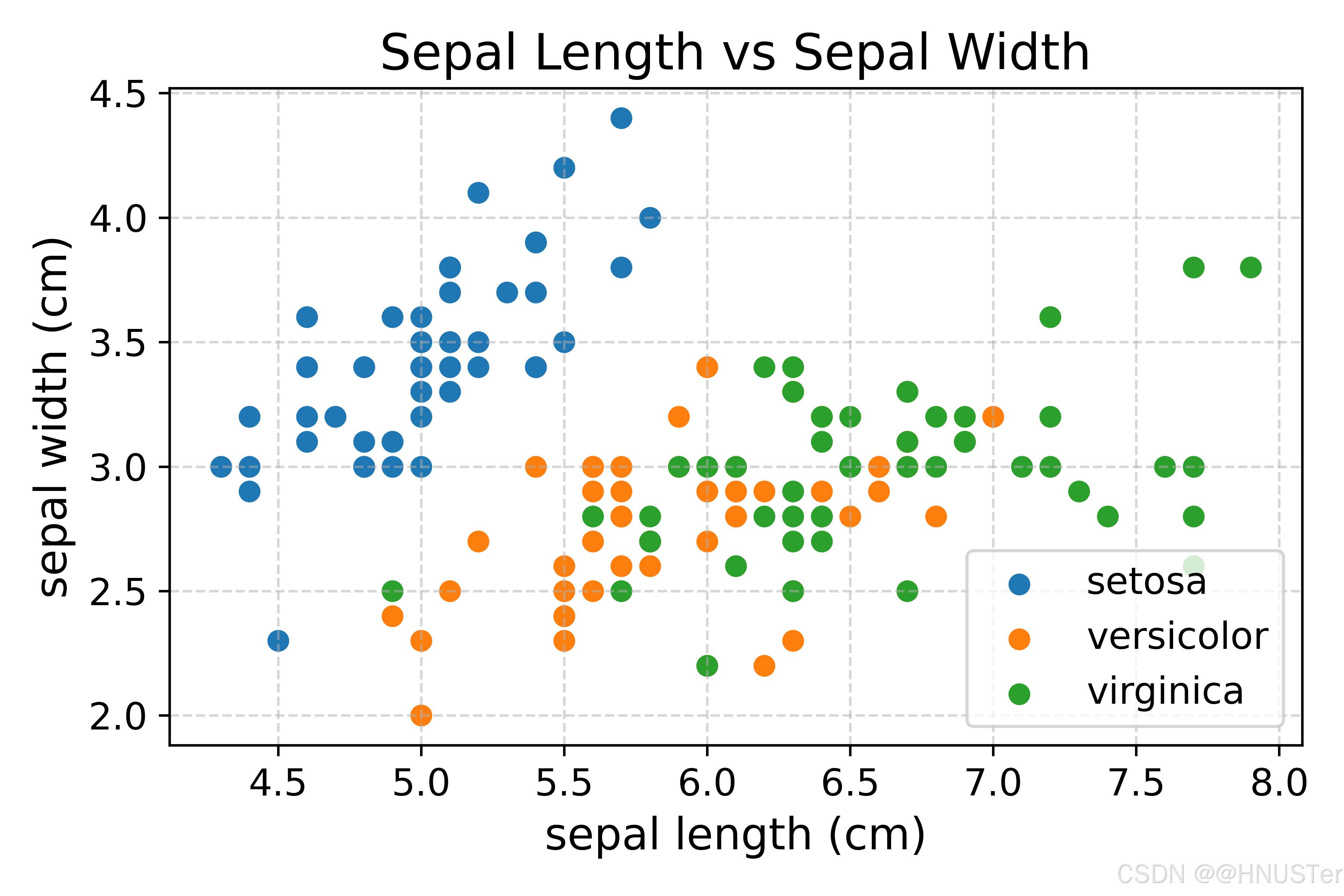
极坐标图1
import matplotlib.pyplot as plt
import numpy as np

# 创建一些示例数据
theta=np.linspace(0,
2*np.pi,100)
r=np.abs(np.sin(theta))

plt.figure(figsize=(6,
6))
ax=plt.subplot(111,projection='polar') # 创建极坐标系图形
ax.plot(theta,r,color='blue',linewidth=2) # 绘制极坐标系图形
ax.set_title('Polar Plot',fontsize=16) # 添加标题

# 保存图片
plt.savefig('P70极坐标图1.png', dpi=600, transparent=True)
plt.show()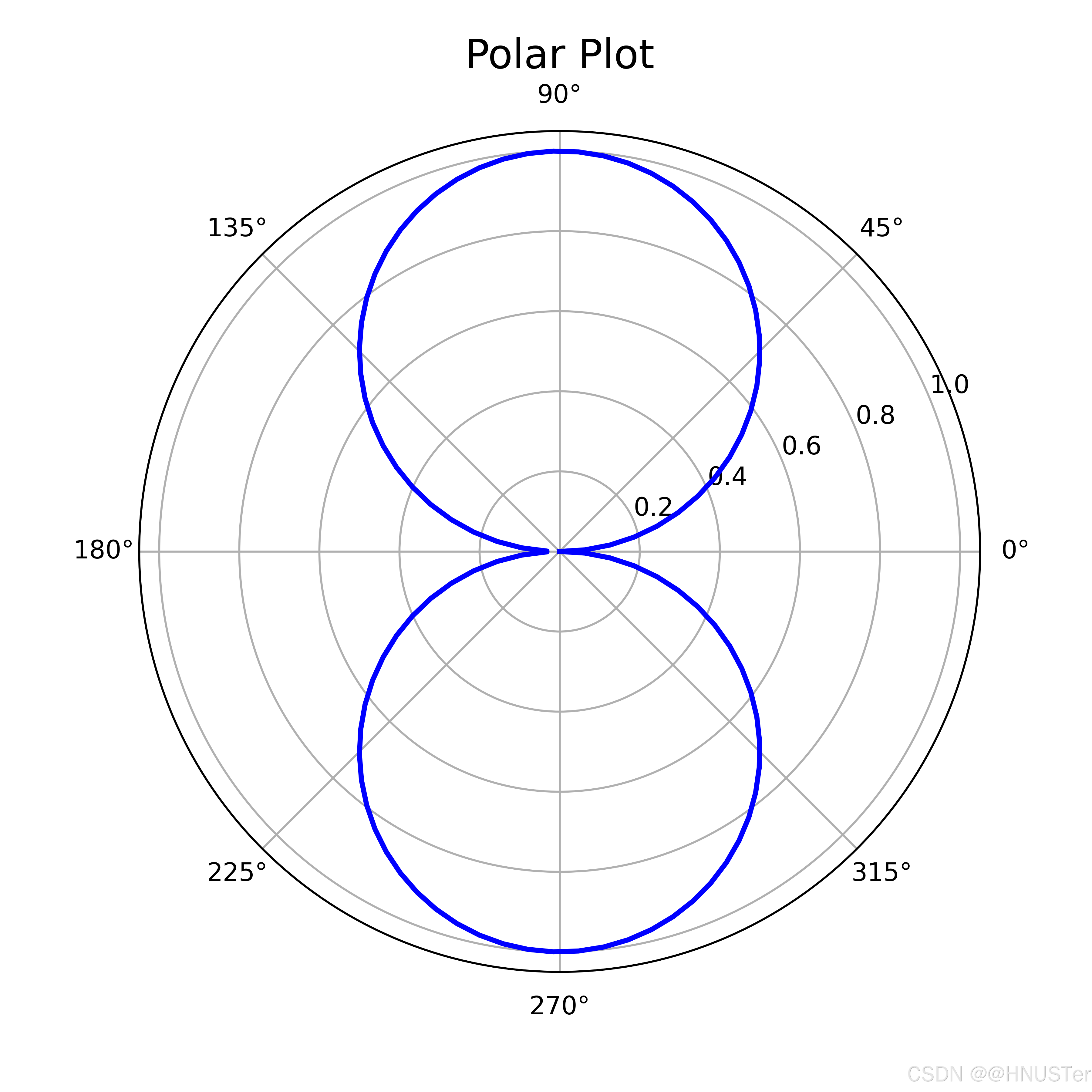
极坐标图2
import matplotlib.pyplot as plt
import numpy as np

#生成模拟的周期性数据
theta=np.linspace(0,
2*np.pi,100)
r=10+5*np.sin(6*theta)

plt.figure(figsize=(6,
6))
ax=plt.subplot(111,projection='polar') # 创建极坐标系图形
ax.plot(theta,r,color='blue',linewidth=2) # 绘制极坐标系图形
ax.set_title('Polar Plot',fontsize=16) # 添加标题

# 保存图片
plt.savefig('P70极坐标图2.png', dpi=600, transparent=True)
plt.show()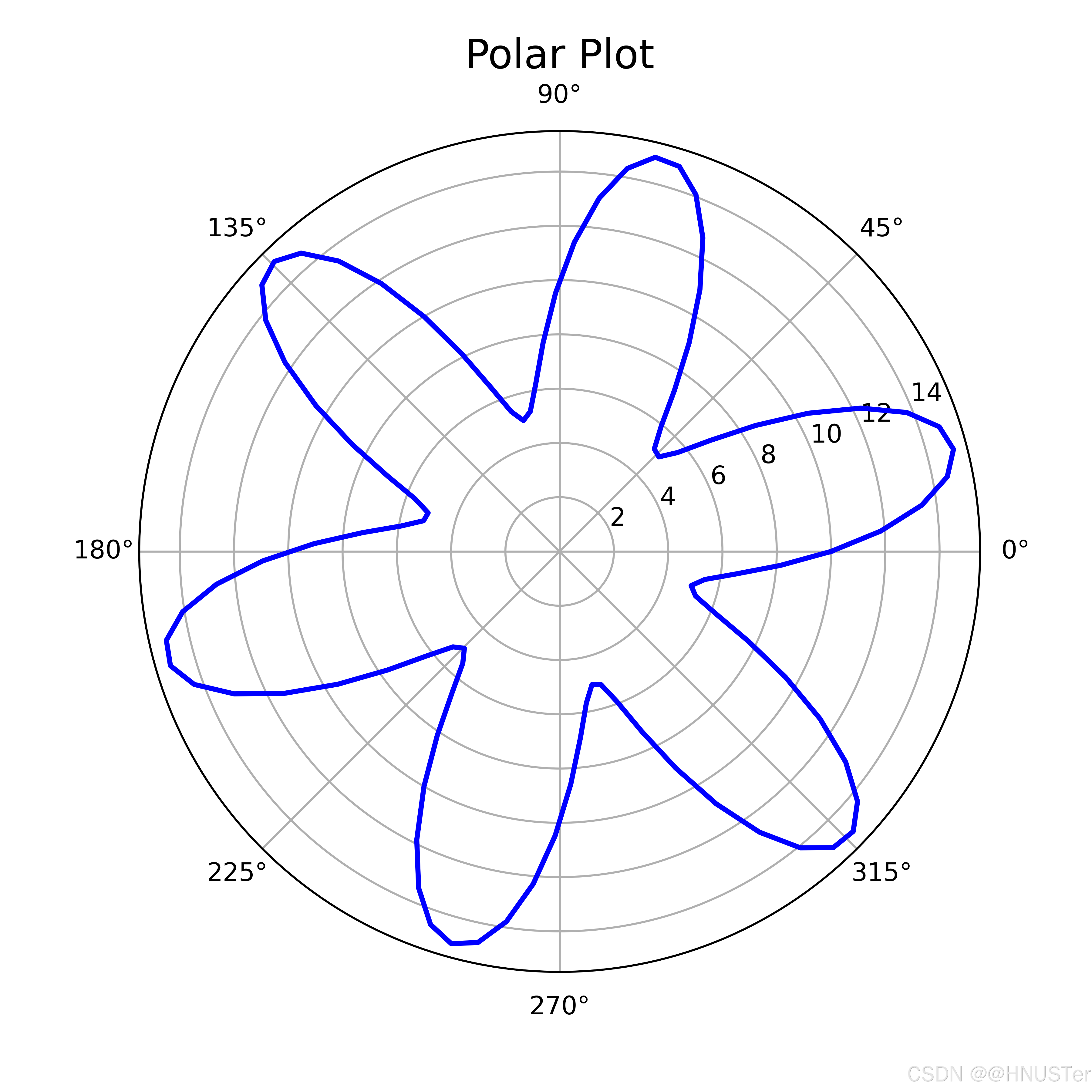

 浙公网安备 33010602011771号