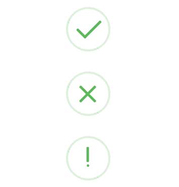
样式小收藏:完成、错误、提示动态图标样式
在表单提交的时候,用作提醒,下面样式直接复制使用
CSS样式:
.sweet-alert {
    background-color: #fff;
    width: 478px;
    padding: 17px;
    border-radius: 5px;
    text-align: center;
    position: fixed;
    left: 50%;
    top: 50%;
    margin-left: 256px;
    margin-top: 200px;
    overflow: hidden;
      /* display:none; */
    z-index: 2000;
}

.myalert {
    position: relative;
    margin-left: 0;
    margin-top: 0;
    padding: 0;
    width: 100%;
    left: 0;
    top: 0;
}

.sweet-alert .sa-icon {
    width: 80px;
    height: 80px;
    border: 4px solid gray;
    border-radius: 50%;
    margin: 20px auto;
    position: relative;
    box-sizing: content-box;
}

.sweet-alert .sa-icon.sa-success {
    border-color: #4cae4c;
}

.sweet-alert .sa-icon.sa-success .sa-line {
    height: 5px;
    background-color: #5cb85c;
    display: block;
    border-radius: 2px;
    position: absolute;
    z-index: 2;
}

.sweet-alert .sa-icon.sa-success .sa-line.sa-tip {
    width: 25px;
    left: 14px;
    top: 46px;
    transform: rotate(45deg);
}

.sweet-alert .sa-icon.sa-success .sa-line.sa-long {
    width: 47px;
    right: 8px;
    top: 38px;
    transform: rotate(-45deg);
}

.animateSuccessTip {
    animation: animateSuccessTip 0.75s;
}

.animateSuccessLong {
    animation: animateSuccessLong 0.75s;
}

.sweet-alert .sa-icon.sa-success .sa-placeholder {
    width: 80px;
    height: 80px;
    border: 4px solid rgba(92,184,92,0.2);
    border-radius: 50%;
    box-sizing: content-box;
    position: absolute;
    left: -4px;
    top: -4px;
    z-index: 2;
}

.sweet-alert .sa-icon.sa-success .sa-fix {
    width: 5px;
    height: 90px;
    background: #fff;
    position: absolute;
    left: 28px;
    top: 8px;
    z-index: 1;
    transform: rotate(-45deg);
}

.sweet-alert .sa-icon.sa-success::before,
    .sweet-alert .sa-icon.sa-success::after {
    content: '';
    border-radius: 50%;
    position: absolute;
    width: 60px;
    height: 120px;
    background: #fff;
    transform: rotate(45deg);
}

.sweet-alert .sa-icon.sa-success::before {
    border-radius: 120px 0 0 120px;
    top: -7px;
    left: -33px;
    transform: rotate(-45deg);
    transform-origin: 60px 60px;
}

.sweet-alert .sa-icon.sa-success::after {
    border-radius: 0 120px 120px 0;
    top: -11px;
    left: 30px;
    transform: rotate(-45deg);
    transform-origin: 0px 60px;
}

.sa-icon.sa-success.animate::after {
    animation: rotatePlaceholder 4.25s ease-in;
}

@keyframes animateSuccessTip {
    0% {
        width: 0;
        left: 1;
        top: 19px;
    }

    54% {
        width: 0;
        left: 1px;
        top: 19px;
    }

    70% {
        width: 50px;
        left: -8px;
        top: 37px;
    }

    84% {
        width: 17px;
        left: 21px;
        top: 48px;
    }

    100% {
        width: 25px;
        left: 14px;
        top: 45px;
    }
}

@keyframes animateSuccessLong {
    0% {
        width: 0;
        right: 46px;
        top: 54px;
    }

    65% {
        width: 0;
        right: 46px;
        top: 54px;
    }

    84% {
        width: 55px;
        right: 0;
        top: 35px;
    }

    100% {
        width: 47px;
        right: 8px;
        top: 38px;
    }
}

@keyframes rotatePlaceholder {
    0% {
        transform: rotate(-45deg);
    }

    5% {
        transform: rotate(-45deg);
    }

    12% {
        transform: rotate(-405deg);
    }

    100% {
        transform: rotate(-405deg);
    }
}
    /*错误提示 样式---开始*/
.sweet-alert .sa-icon.sa-success .sa-line.sa-wl {
    width: 44px;
    left: 17px;
    top: 38px;
    transform: rotate(45deg);
}

.sweet-alert .sa-icon.sa-success .sa-line.sa-wr {
    width: 44px;
    left: 17px;
    top: 38px;
    transform: rotate(-45deg);
}

.animateSuccessWl {
    animation: animateSuccessWl 0.75s;
}

.animateSuccessWr {
    animation: animateSuccessWr 0.75s;
}

@keyframes animateSuccessWl {
    0% {
        width: 0;
        left: 0;
        top: 10px;
    }

    5% {
        width: 0;
        left: 0;
        top: 10px;
    }

    12% {
        width: 20px;
        left: 17px;
        top: 28px;
    }

    100% {
        width: 44px;
        left: 17px;
        top: 38px;
    }
}

@keyframes animateSuccessWr {
    0% {
        width: 0;
        left: 45px;
        top: 24px;
    }

    5% {
        width: 0;
        left: 45px;
        top: 24px;
    }

    12% {
        width: 15px;
        left: 36px;
        top: 28px;
    }

    100% {
        width: 44px;
        left: 17px;
        top: 38px;
    }
}
    /*错误提示 样式---结束*/
    /*警告提示 样式---开始*/
.sweet-alert .sa-icon.sa-success .sa-line.sa-warn-line {
    width: 30px;
    transform: rotate(90deg);
    left: 24px;
    top: 30px;
}

.sweet-alert .sa-icon.sa-success .sa-line.sa-warn-disc {
    width: 5px;
    border-radius: 50%;
    left: 37px;
    top: 52px;
}

.animateSuccessWarnL {
    animation: animateSuccessWarnL 0.75s;
}

.animateSuccessWarnD {
    animation: animateSuccessWarnD 0.75s;
}

@keyframes animateSuccessWarnL {
    0% {
        width: 0px;
        left: 30px;
    }

    10% {
        width: 0px;
        left: 30px;
    }

    55% {
        width: 20px;
        left: 30px;
    }

    75% {
        width: 25px;
        left: 20px;
    }

    100% {
        width: 30px;
    }
}

@keyframes animateSuccessWarnD {
    0% {
        width: 0;
    }

    100% {
        width: 5px;
    }
}
    /*警告提示 样式---结束*/
HTML代码:
    <!-- 成功 -->
    <div class="sweet-alert myalert">
        <div class="sa-icon sa-success animate">
            <span class="sa-line sa-tip animateSuccessTip"></span>
            <span class="sa-line sa-long animateSuccessLong"></span>
            <div class="sa-placeholder"></div>
            <div class="sa-fix"></div>
        </div>
    </div>
    <!-- 错误 -->
    <div class="sweet-alert myalert">
        <div class="sa-icon sa-success animate">
            <span class="sa-line sa-wl animateSuccessWl"></span>
            <span class="sa-line sa-wr animateSuccessWr"></span>
            <div class="sa-placeholder"></div>
            <div class="sa-fix"></div>
        </div>
    </div>
    <!-- 警告 -->
    <div class="sweet-alert myalert">
        <div class="sa-icon sa-success animate">
            <span class="sa-line sa-warn-line animateSuccessWarnL"></span>
            <span class="sa-line sa-warn-disc animateSuccessWarnD"></span>
            <div class="sa-placeholder"></div>
            <div class="sa-fix"></div>
        </div>
    </div>
样式展示:
生活中不可能到处顺利,包括工作!

 浙公网安备 33010602011771号