

Material Designer的低版本兼容实现(十四)—— CardView

今天说的又是一个5.0中才有的新控件——CardView(卡片视图)。这个东东其实我们早就见过了,无论是微博还是人人客户端,它都有出现。通常我们都是通过自定义一个背景图片,然后通过给layout进行设置背景样式来实现这个卡片视图。虽然现在5.0和第三方库都有了这个view,但是我还是很建议去自定义这个view,为啥?能在编译器中直观的看到效果,而且可定制度好。最重要的是自己做也不难,引入第三方库反而会增大应用的体积。总之,本篇主要讲解的还是如何使用开源库和supportV7中的cardView。
一、通过开源库来引入CardView
在我写这篇文章的时候,这个开源库对于CardView没有做什么自定义的属性设置,也就能设置个背景色和大小。至于今后会不会有更多的属性加入呢?我感觉不太可能。这个开源库的思路就是用java和drawable进行结合产生view,这个drawable又是用图片来做的,当然没有用代码写的那么灵活了,如果要增加很多属性,只有一种办法:让作者对工程进行大刀阔斧的修改,改变自定义view的思路。
1.1 添加lib支持
首先还是下载lib,然后添加支持,并且写好命名空间。
https://github.com/navasmdc/MaterialDesignLibrary
添加lib支持后我们就可以用这个控件了,放入布局文件前还是要写命名空间的。
xmlns:app="http://schemas.android.com/apk/res-auto"
    <com.gc.materialdesign.views.Card
                android:layout_width="wrap_content"
                android:layout_height="wrap_content"
                android:layout_gravity="center_horizontal" />
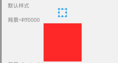
如果没设定背景,那么在编辑器中是看不到大体的效果的,所以还是推荐设置个背景色,比较直观。右图是实际的效果
1.2 在布局文件中设置大小和背景色
android:layout_width="100dp" 因为CardView继承自RelativeLayout所以直接设定控件宽高就可以啦
android:layout_height="100dp"
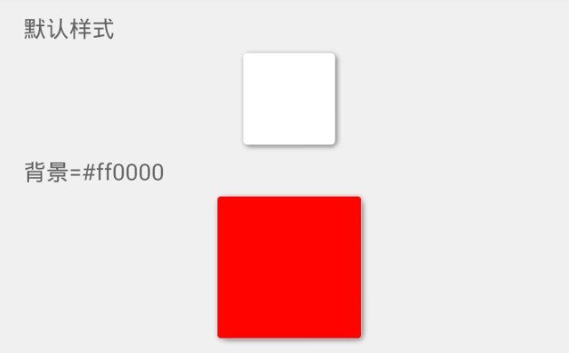
<com.gc.materialdesign.views.Card
                android:layout_width="100dp"
                android:layout_height="100dp"
                android:layout_gravity="center_horizontal"
                android:background="#ff0000" />
android:background="@color/blue" 设置背景色,默认是白色
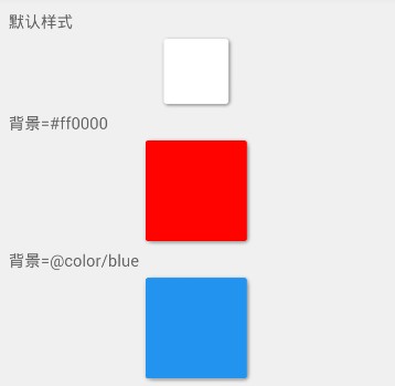
<TextView
                android:layout_width="wrap_content"
                android:layout_height="wrap_content"
                android:text="背景=#ff0000" />

            <com.gc.materialdesign.views.Card
                android:layout_width="100dp"
                android:layout_height="100dp"
                android:layout_gravity="center_horizontal"
                android:background="#ff0000" />

            <TextView
                android:layout_width="wrap_content"
                android:layout_height="wrap_content"
                android:text="背景=@color/blue" />

            <com.gc.materialdesign.views.Card
                android:layout_width="100dp"
                android:layout_height="100dp"
                android:layout_gravity="center_horizontal"
                android:background="@color/blue" />
1.3 通过代码进行设置背景色
因为CardView继承自relativeLayout,所以父类的设置内边界等属性都是可以用的~
package com.example.hhh;

import android.os.Bundle;
import android.support.v7.app.ActionBarActivity;

import com.gc.materialdesign.views.Card;

public class CardTest extends ActionBarActivity {

    @Override
    protected void onCreate(Bundle savedInstanceState) {
        super.onCreate(savedInstanceState);
        setContentView(R.layout.card);

        Card card01 = (Card)findViewById(R.id.card01);
        card01.setBackgroundColor(0xffff0000);

        Card card02 = (Card)findViewById(R.id.card02);
        card02.setBackgroundColor(getResources().getColor(R.color.orange));
    }
}
二、用google的SupportV7包中的cardView
这个CardView是google提供的,可以定制的东西就比较多啦
2.1 属性解释:
<resources>
    <declare-styleable name="CardView">
        <!-- Background color for CardView. -->
        <!-- 背景色 -->
        <attr name="cardBackgroundColor" format="color" />
        <!-- Corner radius for CardView. -->
        <!-- 边缘弧度数 -->
        <attr name="cardCornerRadius" format="dimension" />
        <!-- Elevation for CardView. -->
        <!-- 高度 -->
        <attr name="cardElevation" format="dimension" />
        <!-- Maximum Elevation for CardView. -->
        <!-- 最大高度 -->
        <attr name="cardMaxElevation" format="dimension" />
        <!-- Add padding in API v21+ as well to have the same measurements with previous versions. -->
        <!-- 设置内边距,v21+的版本和之前的版本仍旧具有一样的计算方式 -->
        <attr name="cardUseCompatPadding" format="boolean" />
        <!-- Add padding to CardView on v20 and before to prevent intersections between the Card content and rounded corners. -->
        <!-- 在v20和之前的版本中添加内边距,这个属性是为了防止卡片内容和边角的重叠 -->
        <attr name="cardPreventCornerOverlap" format="boolean" />
        <!-- 下面是卡片边界距离内部的距离-->
        <!-- Inner padding between the edges of the Card and children of the CardView. -->
        <attr name="contentPadding" format="dimension" />
        <!-- Inner padding between the left edge of the Card and children of the CardView. -->
        <attr name="contentPaddingLeft" format="dimension" />
        <!-- Inner padding between the right edge of the Card and children of the CardView. -->
        <attr name="contentPaddingRight" format="dimension" />
        <!-- Inner padding between the top edge of the Card and children of the CardView. -->
        <attr name="contentPaddingTop" format="dimension" />
        <!-- Inner padding between the bottom edge of the Card and children of the CardView. -->
        <attr name="contentPaddingBottom" format="dimension" />
    </declare-styleable>
</resources>
2.2 小例子:
    <android.support.v7.widget.CardView
        android:id="@+id/card_view"
        android:layout_width="200dp"
        android:layout_height="200dp"
        android:layout_gravity="center"
        app:cardBackgroundColor="#ff0000"
        app:cardCornerRadius="10dp"
        app:cardElevation="1dp"
        app:cardMaxElevation="10dp"
        app:cardPreventCornerOverlap="true"
        app:cardUseCompatPadding="true" >
    </android.support.v7.widget.CardView>
具体使用方式请参考我之前的一篇文章,其实用起来也相当简单了。
Android5.0新控件CardView的介绍和使用:http://www.cnblogs.com/tianzhijiexian/p/4067308.html

 浙公网安备 33010602011771号