
Css3 伪元素::before和::after_Css伪类对象使用案例
一、::before / ::after 简介
::before 和 ::after 是 CSS 中的伪类,它们基本功能是在 CSS 渲染中向元素的内容前面和后面插入内容。虽然在实际 HTML 中我们没有增加任何标签,并且会在浏览器中展现出来。
::before和::after必须配合content属性来使用,content用来定义插入的内容,content必须有值,至少是空。
默认情况下,伪类元素的display是默认值inline,可以通过设置display:block来改变其显示。
二、Content 属性的值
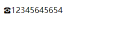
1. string
    <style>
        .phoneNumber::before {
            content: '\260E';
            font-size: 15px;
        }
    </style>


    <p class="phoneNumber">12345645654</p>
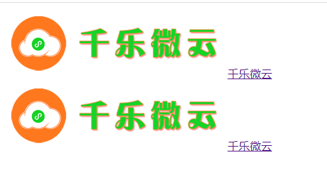
2.attr()
    <style>
        a::after {
            content: attr(href);
            color: red;
        }
    </style>

    <a href="http://www.jnqianle.cn">千乐微云</a>
    <br>

    <a href="http://www.jnqianle.cn">千乐微云</a>
    <br>

3.url()/uri()
    <style>
        a::before {
            content: url('http://www.jnqianle.cn/img/index/logo.png');

        }
    </style>

    <a href="http://www.jnqianle.cn">千乐微云</a>
    <br>

    <a href="http://www.jnqianle.cn">千乐微云</a>
    <br>
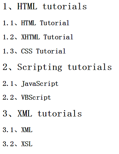
4.counter()
配合counter-increment和counter-reset属性使用:
h2:before { counter-increment: chapter; content: "Chapter " counter(chapter) ". " }


<style>
 2 body{
 3     counter-reset: section;
 4 }
 5 h1{
 6     counter-reset: subsection;
 7 }
 8 h1:before{
 9     counter-increment:section;
10     content:counter(section) "、";
11 }
12 h2:before{
13     counter-increment:subsection;
14     content: counter(section) "." counter(subsection) "、";
15 }
16 </style>
17 ------------------------------------------------
18 <body>
19 <h1>HTML tutorials</h1>
20 <h2>HTML Tutorial</h2>
21 <h2>XHTML Tutorial</h2>
22 <h2>CSS Tutorial</h2>
23
24 <h1>Scripting tutorials</h1>
25 <h2>JavaScript</h2>
26 <h2>VBScript</h2>
27
28 <h1>XML tutorials</h1>
29 <h2>XML</h2>
30 <h2>XSL</h2>
31
32 </body>
三、使用案例和技巧
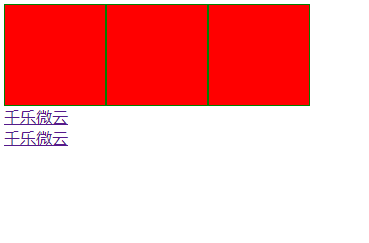
1.清楚浮动,强烈推荐
    <style>
        .block {
            width: 100px;
            height: 100px;
            background: red;
            float: left;
            border: 1px solid green;
        }
        /*去除首尾浮动*/
        .out::before,
        .out::after {
            content: "";
            display: table;
            clear: both;
        }
    </style>

    <div class="out">
        <div class="block"></div>
        <div class="block"></div>
        <div class="block"></div>
    </div>

    <a href="http://www.jnqianle.cn">千乐微云</a>
    <br>

    <a href="http://www.jnqianle.cn">千乐微云</a>
    <br>
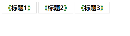
2.标题效果处理
    <style>
     .title{
         font-size: 20px;
         font-weight: bold;
         padding: 5px 10px;
         display: inline-block;
         border: 1px solid #ddd;
     }
     .title::before{
         content: '《';
         color: green;
     }
     .title::after{
         content: '》';
         color: green;
     }
    </style>

    <div class="title">标题1</div>
    <div class="title">标题2</div>
    <div class="title">标题3</div>
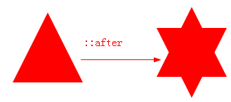
3.多边形
<style>
#star-six {
    width: 0;
    height: 0;
    border-left: 50px solid transparent;
    border-right: 50px solid transparent;
    border-bottom: 100px solid red;
    position: relative;
}

#star-six::after {
    width: 0;
    height: 0;
    border-left: 50px solid transparent;
    border-right: 50px solid transparent;
    border-top: 100px solid red;
    position: absolute;
    content: "";
    top: 30px;
    left: -50px;
}
</style>

<div id="star-six"></div>
    <style type="text/css">
        #phone {
            width: 50px;
            height: 50px;
            border-left: 6px solid #EEB422;
            border-radius: 20%;
            transform: rotate(-30deg);
            -webkit-transform: rotate(-30deg);
            margin: 20px;
            margin-right: 0px;
            position: relative;
            display: inline-block;
            top: -5px;
        }

        #phone:before {
            width: 15px;
            height: 15px;
            background: #EEB422;
            border-radius: 20%;
            content: "";
            position: absolute;
            left: -2px;
            top: 1px;
        }

        #phone:after {
            width: 15px;
            height: 15px;
            background: #EEB422;
            border-radius: 20%;
            content: "";
            position: absolute;
            left: -3px;
            top: 34px;
        }
    </style>
    <div id="wraper">
        <div id="phone"></div>
    </div>

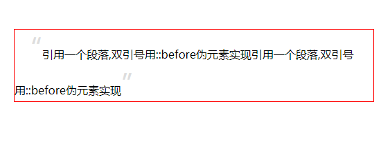
4.给blockquote添加引号
    <style type="text/css">
        blockquote{
            border: 1px solid red;
        }
        blockquote::before {
            content: open-quote;
            color: #ddd;
            z-index: -1;
            font-size: 40px;
        }
        blockquote::after {
            content: close-quote;
            color: #ddd;
            z-index: -1;
            font-size: 40px;
        }
    </style>
    <blockquote>引用一个段落,双引号用::before伪元素实现引用一个段落,双引号用::before伪元素实现</blockquote>
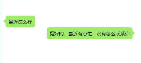
5.会话框箭头效果
    <style>
        .left,
        .right {
            min-height: 40px;
            position: relative;
            display: table;
            text-align: center;
            border-radius: 7px;
            background-color: #9EEA6A;
            margin: 0;
        }

        .left {
            left: 10px;
        }

        .left::before,
        .right::after {
            position: absolute;
            content: '';
            display: inline-block;
            width: 0;
            height: 0;
            border: 8px solid transparent;
            top: 11px;

        }

        .left::before {
            border: 8px solid transparent;
            border-right: 8px solid #9EEA6A;
            left: -16px;
        }

        .right::after {
            right: -16px;
            border-left: 8px solid #9EEA6A;
        }

        .left p,
        .right p {
            display: table-cell;
            vertical-align: middle;
            padding: 0 10px;
        }

        .right {
            right: -150px;
        }
    </style>
    <!-- 对话框 -->
    <div class="left">
        <p>最近怎么样</p>
    </div>
    <div class="right">
        <p>挺好的,最近有点忙,没有怎么联系你</p>
    </div>
6.其他动画效果等
更多等待其他分享
四、CSS 伪元素:before&:after 与z-index
父元素不设置z-index值,伪元素设置负z-index 值,父元素位移效果不使用transform,简单说下原因。
- 同一个层叠上下文里面, 层叠顺序从后向前依次是: 背景和边框、负z-index、块级盒、浮动盒、行内盒、z-index:0、正z-index.
- 伪元素相当于子元素,也就是包含在元素内的,二者不在同一个层叠上下文中。
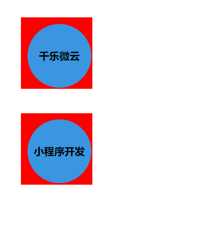
案例:
        .circle{
            width: 100px;
            height: 100px;
            border-radius: 50%;
            background:#3a96e1;
            text-align: center;
            line-height: 100px;
            font-weight: bold;
            position: relative;
        }
        .circle::after{
            background:red;
            content: '';
            position: absolute;
            width: 110%;
            height: 110%;
            left: -10%;
            top: -10%;
            z-index: -2;
            border: 1px solid red;
        }
Css 伪元素控制进度条_Css控制滚动条_Css ::-webkit-scrollbar整理

 浙公网安备 33010602011771号