2_CSS3
1、CSS概述
1.1、CSS简单介绍
Cascading Style Sheet:层叠样式表
CSS:表现(美化网页)
字体、颜色、边距、高度、宽度、背景图片、网页定位、网页浮动……
1.2、CSS发展史
- CSS1.0
- CSS2.0:DIV(块)+ CSS,提出了HTML与CSS结构分离的思想,网页变的简单,利于SEO
- CSS2.1:添加了浮动和定位
- CSS3.0:添加了圆角、阴影、动画……,但是会有浏览器兼容的问题
1.3、CSS快速入门
1、页面内部直接在style标签中写
<!DOCTYPE html>
<html lang="en">
<head>
<meta charset="UTF-8">
<title>Title</title>
<!--
1、style标签内编写CSS代码
2、写一个声明,分号结尾
语法:
选择器 {
声明1;
声明2;
声明3;
}
-->
<style>
h1 {
color: red;
}
</style>
</head>
<body>
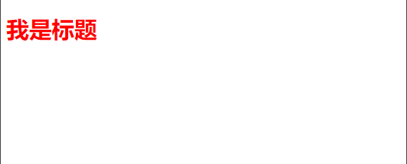
<h1>我是标题</h1>
</body>
</html>
2、通过css文件外部引用(建议使用这种)
html页面:
<!DOCTYPE html>
<html lang="en">
<head>
    <meta charset="UTF-8">
    <title>Title</title>
    <link rel="stylesheet" href="css/style.css">
</head>
<body>
    <h1>我是标题</h1>
</body>
</html>
css文件:
h1 {
    color: red;
}
效果:
css的优势:
- 内容和表现分离
- 网页结构表现统一,可以实现复用
- 样式十分丰富
- 建议使用独立于html的css文件
- 利于SEO,容易被搜索引擎收录
1.4、CSS的3种导入方式
-
行内样式:在标签元素中,编写一个style属性,编写样式即可
<h1 style="color:red">我是标题</h1>弊端:当标签很多的时候这样编写会很乱
-
内部样式:在head标签中的style标签中编写样式
<style> h1 { color: red; } </style> -
外部样式:通过css文件来引入
<link rel="stylesheet" href="css/style.css">h1 { color: red; }
优先级:就近原则,谁离元素标签近就使用谁的样式
拓展:外部样式两种写法
-
链接式
<link rel="stylesheet" href="css/style.css"> -
导入式(CSS 2.1特有)
@import url(css/style.css);弊端:网页元素比较多的情况下,会先展示网页结构,再渲染样式
2、选择器
作用:选择页面上的某一个或某一类元素
2.1、基本选择器
-
标签选择器
会选择到页面上所有的这个标签的元素
<html>
    <body>
        <h1>我是标题</h1>
        <p>我是内容</p>
    </body>
</html>
html, body {} h1 {} p {} -
类选择器
在标签上定义一个class属性
 <h1 class="test">我是标题1</h1>
 <h1 class="test">我是标题2</h1>
.test {}好处:可以多个标签归类,使用同一个class样式效果,可以复用
-
id选择器
在标签上定义个id属性,id必须保证全局唯一
<h1 id="test">我是标题1</h1>#test {}
注:优先级不遵循就近原则,id > class > 标签
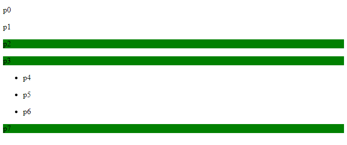
2.2、层次选择器
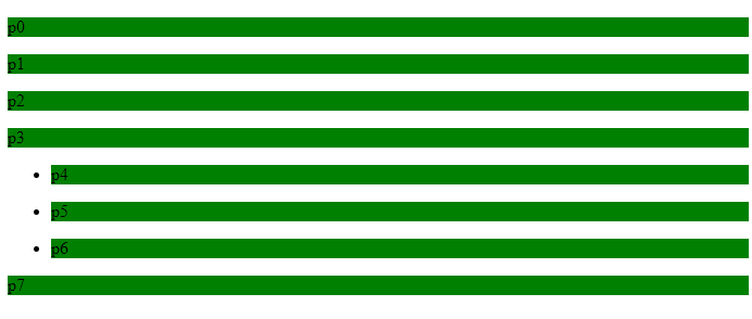
<body>
    <p>p0</p>
    <p class="active">p1</p>
    <p>p2</p>
    <p>p3</p>
    <ul>
        <li><p>p4</p></li>
        <li><p>p5</p></li>
        <li><p>p6</p></li>
    </ul>
    <p class="active">p7</p>
</body>
-
后代选择器
body p {
    background:green
}
选中body标签下面的所有p标签
-
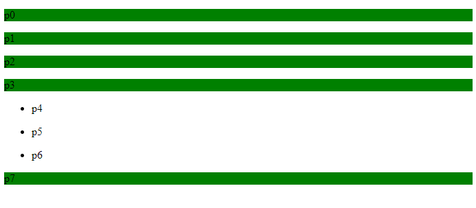
子选择器
body > p {
    background:green
}
选中body标签下面的同一层级的所有p标签
-
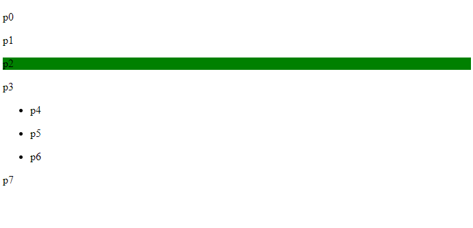
相邻兄弟选择器
.active + p {
    background:green
}
选中当前元素向下的一个同一层级兄弟标签
-
通用兄弟选择器
.active ~ p {
    background:green
}
选中当前元素向下的所有同一层级兄弟标签
2.3、结构伪类选择器
格式:标签名:具体属性
<body>
    <h1>h1</h1>
    <p>p1</p>
    <p>p2</p>
    <p>p3</p>
    <ul>
        <li>li1</li>
        <li>li2</li>
        <li>li3</li>
    </ul>
</body>
1、选中ul的第一个子元素
ul li:first-child {
    background: red;
}
2、选中ul的最后一个子元素
ul li:last-child {
    background: green;
}
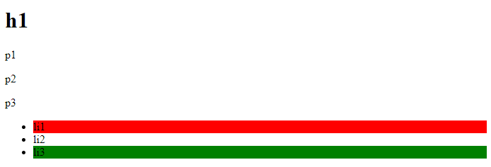
3、选择p1标签
 p:nth-child(2) {
 	background: red;
 }
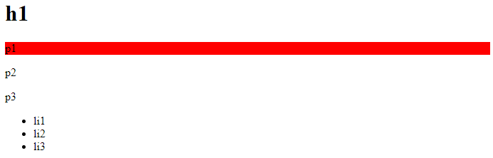
注:会先选择当前p元素的父级元素,然后根据序号选择,所以这里的序号为2,而p:nth-of-type则不受影响
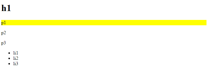
p:nth-of-type(1) {
    background: yellow;
}
2.4、属性选择器(常用)
格式:标签名[属性名]、标签名[属性名=属性值(正则)]
<!DOCTYPE html>
<html lang="en">
<head>
    <meta charset="UTF-8">
    <title>Title</title>
    <style>
      a {
        float: left;
        display: block;
        background: blue;
        width: 50px;
        height: 50px;
        margin-right: 10px;
        color: white;
        text-align: center;
        font-size: 22px;
        font-weight: bold;
        line-height: 50px;
        text-decoration: none;
        border-radius: 10px;
      }
    </style>
</head>
<body>
    <a href="https://www.baid.com" class="links item first" id="first">1</a>
    <a href="https://www.hao123.com" class="links item active" target="_blank">2</a>
    <a href="images/1.html" class="links item">3</a>
    <a href="images/2.png" class="links item">4</a>
    <a href="images/3.jpg" class="links item">5</a>
    <a href="abc" class="links item first">6</a>
    <a href="a.pdf" class="links item first">7</a>
    <a href="b.pdf" class="links item first">8</a>
    <a href="c.doc" class="links item first">9</a>
    <a href="d.doc" class="links item first">10</a>
</body>
</html>
-
选择存在id属性的元素
a[id] {
    background: green;
}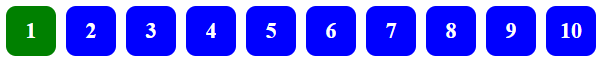
-
选择属性id为first的元素
a[id=first] {
    background: red;
}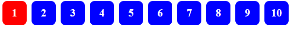
-
选择属性class中含有links的元素
a[class*="links"] {
    background: orange;
}
-
选择属性href中以http开头的元素
a[href^=http] {
    background: green;
}
-
选择属性href中以pdf结尾的元素
a[href$=pdf] {
    background: red;
}
补充 (正则表达式通配符):
=   绝对等于
*=  包含这个元素
^=  以这个开头
$=  以这个结尾
3、美化网页元素
3.1、为什么要美化网页
- 有效的传递页面信息
- 页面漂亮才能吸引用户
- 突显页面的主题
- 提高用户的体验
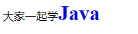
span标签:重点突出的字,使用span套起来
<!DOCTYPE html>
<html lang="en">
<head>
    <meta charset="UTF-8">
    <title>Title</title>
    <style>
      #title {
          color: blue;
          font-weight: bold;
          font-size: 30px;
      }
    </style>
</head>
<body>
大家一起学<span id="title">Java</span>
</body>
</html>
3.2、字体样式
-
font-family:字体
-
font-size:字体大小
-
font-weight:字体粗细
-
color:字体颜色
-
font:合并设置字体,粗细、大小、行高、字体可以一起设置
font: oblique bold 30px 楷体; //斜体 加粗 大小30 字体楷体
font: bold 22px/50px Arial;   //加粗 大小22px/行高 字体Arial
3.3、文本样式
- 颜色
- 单词 :red、green……
- 16进制色:#FFFAFA
- rgb:rgb(255,250,250),每位取值范围0~255
- rgba:rgba(250, 250, 250, 0.5),a表示透明度,取值范围0~1
- 文本对齐的方式
- text-align:取值center、left、right
- 首行缩进
- text-indent:2em
- 行高
- line-height,行高与高度一致,就可以垂直居中
- 装饰
- text-decoration: underline 下划线
- text-decoration: line-through 中划线
- text-decoration: overline 上划线
- text-decoration: none 超链接去除下划线
- 文本图片水平对齐
- vertical-align: middle
3.4、阴影
/*text-shadow: 阴影颜色,水平便宜,垂直偏移,阴影半径*/
#price {
    text-shadow: #3cc7f5 10px -10px 2px;
}
3.5、超链接伪类
<a href=#>我是超链接</a>
a {
    text-decoration: none;
    color: #000
}
/*鼠标悬浮的状态*/
a:hover {
    color: orange;
}
/*鼠标按住未释放的状态*/
a:active {
    color: green;
}
3.6、列表
<ul>
    <li>11111</li>
    <li>22222</li>
    <li>33333</li>
</ul>
/*
list-style:
	none 去掉原点
	circle 空心圆
	decimal 数字
	squre 正方形
*/
ul li {
    height: 30px;
    list-style: none;
    text-indent: 1em
}
3.7、背景
-
背景图片
<!DOCTYPE html>
<html lang="en">
<head>
    <meta charset="UTF-8">
    <title>Title</title>
    <style>
        div {
            width: 600px;
            height: 200px;
            border: 5px solid red;
            margin-bottom: 10px;
            /*默认全部铺满*/
            background-image: url("img/pic.jpg");
        }

        /*水平平铺*/
        .div2 {
            background-repeat: repeat-x;
        }

        /*垂直平铺*/
        .div3 {
            background-repeat: repeat-y;
        }

        /*不平铺*/
        .div4 {
            background-repeat: no-repeat;
        }
    </style>
</head>
<body>
    <div></div>
    <div class="div2"></div>
    <div class="div3"></div>
    <div class="div4"></div>
</body>
</html>
-
背景颜色
/*综合写法*/
.div {
    /*颜色,图片,图片位置,平铺方式*/
    background: red url("img/pic.jpg") 300px 20px no-repeat;
}
3.8、渐变
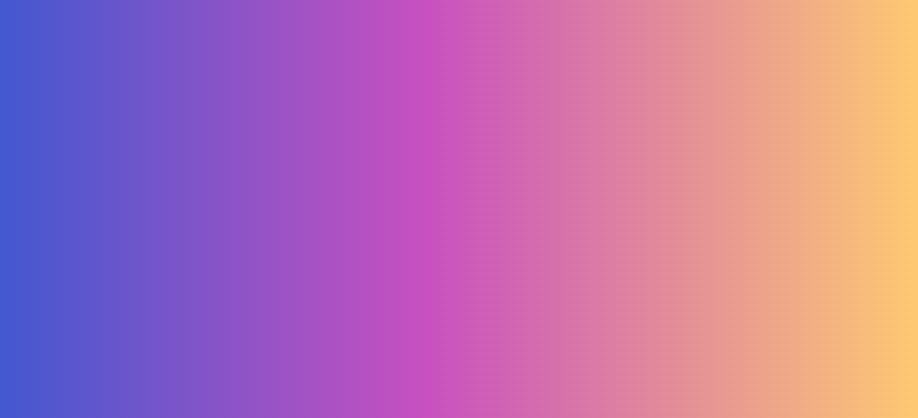
<!DOCTYPE html>
<html lang="en">
<head>
    <meta charset="UTF-8">
    <title>Title</title>
    <style>
        body {
            background-color: #4158D0;
            background-image: linear-gradient(43deg, #4158D0 0%, #C850C0 46%, #FFCC70 100%);
        }
    </style>
</head>
<body>

</body>
</html>
4、盒子模型
4.1、什么是盒子模型
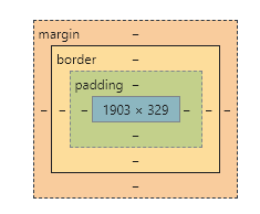
- margin:外边距
- padding:内边距
- border:边框
4.2、边框
- 边框的粗细
- 边框的样式
- 边框的颜色
//设置四个边框
border: 1px solid red; //粗细 样式  颜色
//设置上边框
border-top: 1px solid red;
//设置下边框
border-bottom: 1px solid red;
//设置左边框
border-left:1px solid red;
//设置右边框
border-right: 1px solid red;
//边框宽度
border-width: 1px;
//边框样式
border-style: solid;
//边框颜色
border-color: yellow;
4.3、内外边距
内边距:
padding: 0 //上下左右都为0
padding: 0 auto;  //上下为0,左右auto,则为水平居中
padding: 0 10px 10px 10px;  //依次为上右下左(顺时针)的边距值
padding-top: 0;
padding-right: 10px;
padding-bottom: 10px;
padding-left: 10px;
外边距:
margin: 0 //上下左右都为0
margin: 0 auto;  //上下为0,左右auto,则为水平居中
margin: 0 10px 10px 10px;  //依次为上右下左(顺时针)的边距值
margin-top: 0;
margin-right: 10px;
margin-bottom: 10px;
margin_left: 10px;
4.4、圆角边框
div {
    width: 100px;
    height: 100px;
    border: 10px solid red;
    //左上  右上  右下  左下
    border-radius: 20px;
}
4.5、盒子阴影
div {
    width: 100px;
    height: 100px;
    border: 10px solid red;
    border-radius: 100px;
    box-shadow: 10px 10px 100px yellow;
}
5、浮动
5.1、标准文档流
文档流指的是元素排版布局过程中,元素会默认自动从左往右,从上往下的流式排列方式。并最终窗体自上而下分成一行行,并在每行中从左至右的顺序排放元素。
块级元素:独占一行
h1~h6 p div ul li ……
行内元素:不独占一行
span a img strong ……
行内元素可以被包含在块级元素中,反之,则不可以~
5.2、display
display取值说明:
- block:块元素
- inline:行内元素
- inline-block:保持块元素的特性,并且可以写在一行
- none:让元素消失
这也是一种实现行内元素排列的方式,但是我们很多情况都是使用float
5.3、float
float取值说明:
- left:往左浮动
- right:往右浮动
清除浮动:clear:both
5.4、父级边框塌陷的问题
clear取值说明:
- right:右侧不允许有浮动元素
- left:左侧不允许有浮动元素
- both:两侧都不允许有浮动元素
- none:可以浮动
解决方案:
-
增加父级元素的高度(不建议使用)
#father { border:1px solid #000; height: 800px; } -
增加一个空的div标签,清除浮动(不建议使用)
<div class="clear"></div>.clear { clear: both; margin: 0; padding: 0; } -
overflow(避免使用)
在父级元素中增加一个overflow:hidden;
-
父类添加一个伪类:after(推荐使用)
#father:after {
    content: '';
    display: block;
    clear: both;
}
5.5、对比
-
display:inline-block
方向不可以控制
-
float
浮动起来的话会脱离标准文档流,所以要解决父级边框塌陷的问题
6、定位
6.1、相对定位
div {
    position: relative;  //相对于其本身原来的位置
    top: -20px;   //相对于其原来的位置向上移20px
    left: -20px;  //相对于其原来的位置向左移20px
    right: -20px; //相对于其原来的位置向右移20px
    bottom: -20px;//相对于其原来的位置向下移20px
}
相对于原来的位置,进行指定的偏移,相对定位的话,它仍然在标准的文档流中,原来的位置会被保留
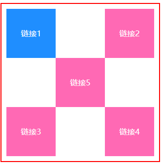
示例代码:
<!DOCTYPE html>
<html lang="en">
<head>
    <meta charset="UTF-8">
    <title>Title</title>
    <style>
        div {
            width: 300px;
            height: 300px;
            border: 2px solid red;
            padding: 10px;
        }

        a {
            width: 100px;
            height: 100px;
            background: hotpink;
            text-decoration: none;
            color: white;
            display: block;
            text-align: center;
            line-height: 100px;
        }

        a:hover {
            background: #1f8eff;
        }

        .a2, .a4 {
            position: relative;
            top: -100px;
            left: 200px;
        }

        .a5 {
            position: relative;
            top: -300px;
            left: 100px;
        }
    </style>
</head>
<body>
    <div>
        <a class="a1" href="#">链接1</a>
        <a class="a2" href="#">链接2</a>
        <a class="a3" href="#">链接3</a>
        <a class="a4" href="#">链接4</a>
        <a class="a5" href="#">链接5</a>
    </div>
</body>
</html>
6.2、绝对定位
div {
    position: absolute;
    top: 10px;
    left: 10px;
    right: 10px;
    bottom: 10px;
}
基于XXX定位,上下左右
- 没有父级元素定位的前提下,相对于浏览器定位
- 假设父级元素存在定位,我们通常会相对于父级元素进行偏移
- 在父级元素范围内移动
相对于父级或浏览器的位置,进行指定的偏移,绝对定位的话,它不在标准的文档流中,原来的位置不会被保留
6.3、固定定位
div {
    position: fixed;
    top: 10px;
    left: 10px;
    right: 10px;
    bottom: 10px;
}
相对于浏览器的位置,进行指定的偏移,不会随着浏览器的滚动而动,定死在某个位置。
6.4、z-index及透明度
z-index:默认是0,最高无限制(一般使用999)
opacity:取值单位0~1
div {
   z-index: 999;
   //背景透明度
   opacity: 0.5;   //所有浏览器都可以使用
   filter: alpha(opacity=50); //IE8之前的版本可以是使用
}

 浙公网安备 33010602011771号