scale 解决大屏兼容问题 仅需要几行代码
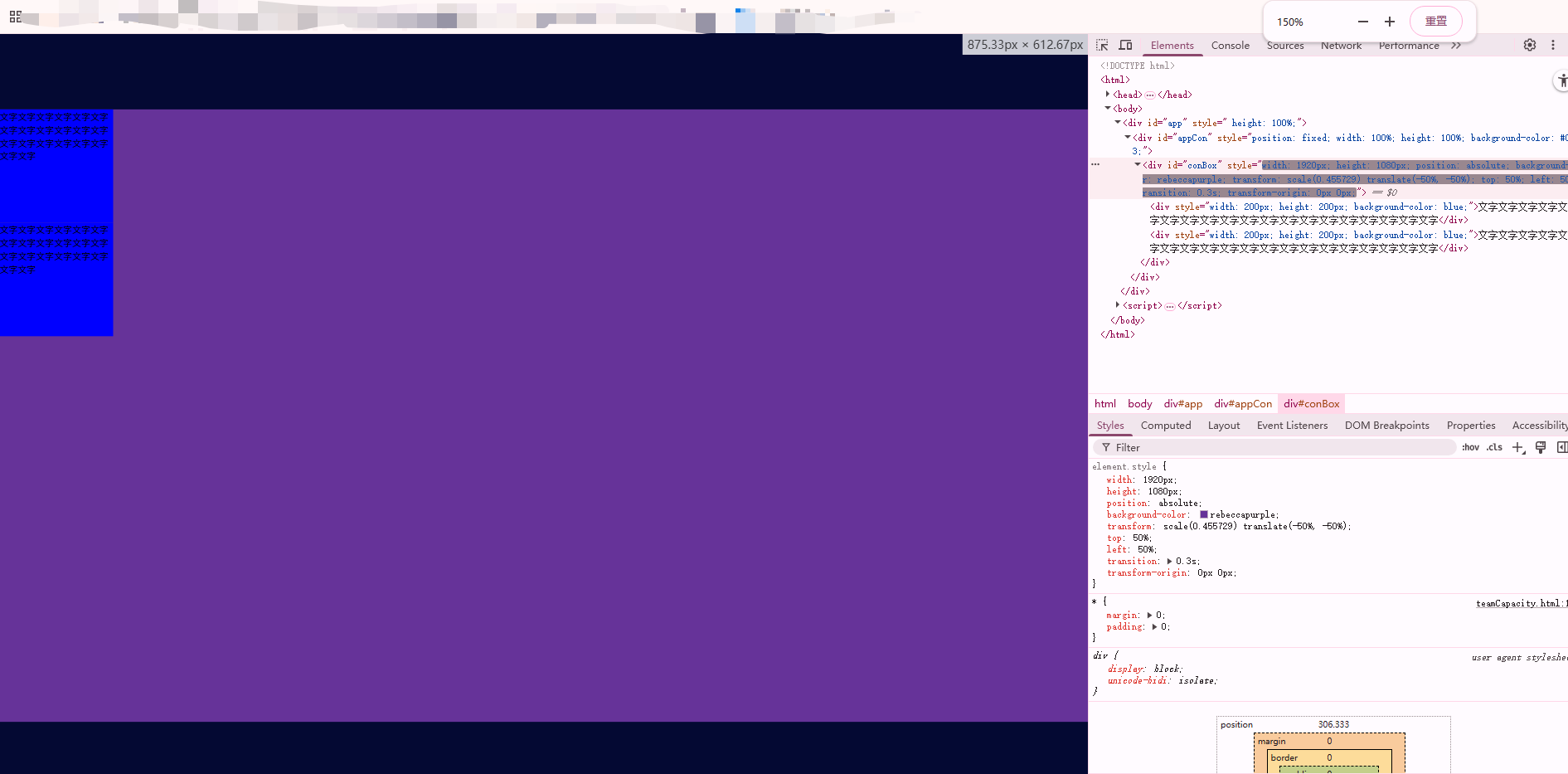
<!DOCTYPE html>
<html>
<head>
  <meta charset="utf-8" />
  <meta http-equiv="X-UA-Compatible" content="IE=edge" />
  <meta name="viewport" content="width=device-width,initial-scale=1.0" />
  <meta http-equiv="Pragma" content="no-cache" />
  <meta http-equiv="Cache-Control" content="no-cache" />
  <meta http-equiv="Expires" content="0" />
  <title>大屏</title>
</head>
<style>
  * {
    margin: 0;
    padding: 0;
  }
</style>
<body>
  <div id="app" style=" height: 100%;">
    <div id="appCon" style="position: fixed; width: 100%; height: 100%; background-color: #040933;">
      <div id="conBox" style="width: 1920px; height: 1080px; position: relative; background-color: rebeccapurple;">
        <div style="width: 200px; height: 200px; background-color: blue;">文字文字文字文字文字文字文字文字文字文字文字文字文字文字文字文字文字文字文字文字</div>
        <div style="width: 200px; height: 200px; background-color: blue;">文字文字文字文字文字文字文字文字文字文字文字文字文字文字文字文字文字文字文字文字</div>
      </div>
    </div>
  </div>
</body>
<script>
  // 定义全局变量
  var loadingTime = 100;
  var timeLoading = null;
  // 页面加载完成后执行
  document.addEventListener('DOMContentLoaded', function() {
    setScale();
  });

  // 设置比例
  function setScale() {
    var appCon = document.getElementById('appCon');
    conBox.style.transform = 'scale(' + getScale() + ') translate(-50%, -50%)';
    conBox.style.position = 'absolute';
    conBox.style.top = '50%';
    conBox.style.left = '50%';
    conBox.style.transition = '.3s';
    conBox.style.transformOrigin = '0 0';
  }

  // 获取缩放比例的函数(需要根据实际需求实现)
  function getScale() {
    // 这里需要根据窗口大小计算缩放比例
    // 示例实现:
    var windowWidth = window.innerWidth;
    var windowHeight = window.innerHeight;
    var scaleWidth = windowWidth / 1920;
    var scaleHeight = windowHeight / 1080;
    return Math.min(scaleWidth, scaleHeight);
  }

  // 窗口大小改变时重新设置缩放
  window.addEventListener('resize', function() {
    setScale();
  });
</script>
</html>
进行缩放屏幕也会进行判断当前可视窗口的最佳展示比例
本文来自博客园,作者:樱桃树下的约定,转载请注明原文链接:https://www.cnblogs.com/tcyweb/p/19087337

 浙公网安备 33010602011771号