

[css3] 看博客学习别人的旋转的星球
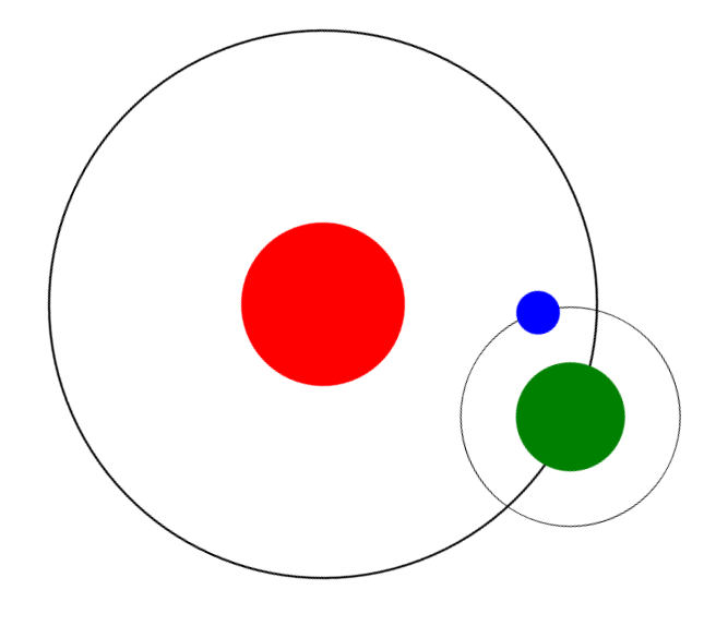
定义一个div 太阳轨道sunline,边框显示出来,定义position为relative
#sunline{
width: 500px;
height: 500px;
border:2px solid #000;
border-radius: 50%;
margin:50px auto;
position: relative;
animation:sunRotate 5s;
}
定义一个div 太阳sun,把红太阳放在中间,居中显示,定义position为absolute,
距左50%,剧上50%,左边距负的宽度的一半,上边距负的高度的一半
#sun{
background: red;
width: 150px;
height: 150px;
position: absolute;
left: 50%;
top:50%;
margin-left:-75px;
margin-top: -75px;
border-radius: 50%;
}
定义一个地球的轨道 earthline,边框显示出来,定义position为absolute,距左50%,剧上负的高度一半,左边距负的宽度的一半
#earthline{
width: 200px;
height: 200px;
border:1px solid #000;
border-radius: 50%;
position: absolute;
left: 50%;
top: -100px;
margin-left: -100px;
}
定义一个div 地球 earth,把地球放在水平居中,太阳轨道垂直地球居中,定义position为absolute,距左50%,剧上50%,左边距负的宽度的一半,上边距负的高度的一半
#earth{
background: green;
width: 100px;
height: 100px;
border-radius: 50%;
position: absolute;
left: 50%;
margin-left: -50px;
top: 50%;
margin-top: -50px;
}
定义一个月球moon,定义position为absolute,距左50%,剧上负的高度一半,左边距负的宽度的一半
#moon{
width: 40px;
height: 40px;
background: blue;
border-radius: 50%;
position: absolute;
left: 50%;
margin-left: -20px;
top: -20px;
}
定义动画@keyframes,100%的进度的时候,旋转一圈
@keyframes sunRotate{
100%{
transform:rotate(360deg);
}
}
为太阳轨道sunline绑定动画,使用属性animation,参数:规则名称,执行时间,速度曲线,延迟时间,播放次数,是否反向
animation:sunRotate 10s linear 0s infinite;
速度曲线: linear(线性匀速) ease(缓动)
播放次数:infinite(无限次数)
为地球轨道earthline绑定动画
animation:sunRotate 5s linear 0s infinite; 运行时间不一样,这个快
<!DOCTYPE html PUBLIC "-//W3C//DTD XHTML 1.0 Transitional//EN" "http://www.w3.org/TR/xhtml1/DTD/xhtml1-transitional.dtd">
<html xmlns="http://www.w3.org/1999/xhtml">
<head>
<meta http-equiv="Content-Type" content="text/html; charset=utf-8" />
<title></title>
<style>
#sunline{
  width: 500px;
  height: 500px;
  border:2px solid #000;
  border-radius: 50%;
  margin:100px auto;
  position: relative;
  animation:sunRotate 10s linear 0s infinite;
}
#sun{
  background: red;
  width: 150px;
  height: 150px;
  position: absolute;
  left: 50%;
  top:50%;
  margin-left:-75px;
  margin-top: -75px;
  border-radius: 50%;
}
#earthline{
  width: 200px;
  height: 200px;
  border:1px solid #000;
  border-radius: 50%;
  position: absolute;
  left: 50%;
  top: -100px;
  margin-left: -100px;
  animation:sunRotate 5s linear 0s infinite;
}
#earth{
  background: green;
  width: 100px;
  height: 100px;
  border-radius: 50%;
  position: absolute;
  left: 50%;
  margin-left: -50px;
  top: 50%;
  margin-top: -50px;
}

#moon{
  width: 40px;
  height: 40px;
  background: blue;
  border-radius: 50%;
  position: absolute;
  left: 50%;
  margin-left: -20px;
  top: -20px;
}
@keyframes sunRotate{
  100%{
    transform:rotate(360deg);
  }
}
</style>
</head>
<body>
<div id="sunline">
  <div id="sun"></div>
  <div id="earthline">
    <div id="earth"></div>
    <div id="moon"></div>
  </div>
</div>
</body>
</html>

 浙公网安备 33010602011771号